The Sorcerer's Apprentice Season 6: ODYSSEY

AceAstro

Well-Known Member
eCuNzwE.png
So what is the significance of May 28 2014? I thought maybe the start date of season 2 but that was June (or is it a typo and I should quickly delete this post?)
 

DisneyManOne

Well-Known Member
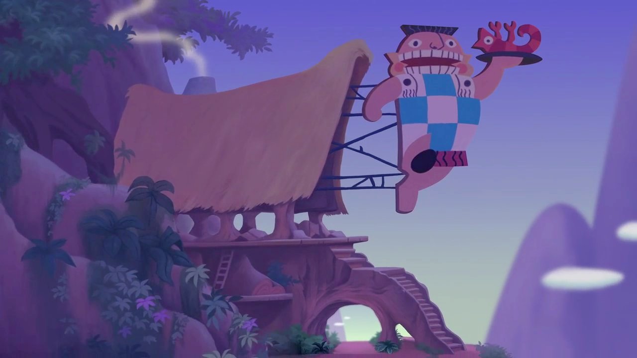
The teams make it to Puerto Escondido sub-land to ride Fire Mountain! A thrilling roller coaster ride through the heart of the grand volcano, Mount Xbalanque! While there, they get to say hi to an old friend...

"Volcano Bat!!! Oh, how I've missed you!" @D Hindley exclaims! A lot of the older forum members share his excitement, much to the confusion of newer members.

RZHrybp.png

Yay, Volcano Bat!

Also, I would like to wish the teams luck in this endeavor: You shall be angering a great number of Muppet fans with this concept. Therefore, take the advice Pi gave you well. Give them something that will make it worth it to bid a bittersweet tchau to the Muppets in Disneyland Brazil.
 

Pi on my Cake

Well-Known Member
Original Poster
In the Parks
Yes
pi reviews.png


Team Tomorrow Logo.png


Better late than never on reviews!

I really liked this project and the ideas you guys were throwing around. I'll admit, I was really hoping you guys would go for the more slow paced, interactive ride. I loved the idea of using flashlights to explore a tomb and triggering traps by mistake! It caught my attention right away in a big way. The final project is less exciting to me, but still a very cool ride and strong concept. Just a slight let down from the other idea.

That being said, I think Indiana Jones was a good choice for you guys. It give you a chance to make a ride centered around Moroccan culture while not being about Moroccan culture. Which was smart since your team seemed pretty disinterested with Morocco. Granted, while its the best choice for your team, it may not have been the best choice for EPCOT. Is it truly about the culture or what is important to Morocco? Or is it just about an epic Indiana Jones Adventure that just so happens to be in Morocco?
  • I like the presentation. Its simple, but well executed. The art is great! Changing up the fonts is great! The organization is great! Its a very basic presentation, but it works for this ride. I'd love to see more "plusses" added to projects. Things that can elevate these. Team Yesterday had the EPCOT D23 poster for the ride and the podcast. Things like some original music, an ad campaign, a gimmick, etc...​
  • Fun fact, in the SAU this is not the first Duel Power Coaster. Legoland New York has an attraction using this ride system! (Season 5, Stanza 4 if my memory serves). Its a really dynamic and interesting ride system that allows for some really interesting stuff!​
  • The focus on Berbers was a really clever choice! That's a great bit of history to base this around. It shows the dedication to research and details that the SA game is known for!​
  • The Exterior is just stunning! D's drawing is stunning. The description is stunning. The picture by Puffs is stunning. The whole exterior is just stunning! I love the map too. It's very simple visually, but also very clear and easy to understand. And shows a realistic scale​
  • The queue does a great job transitioning from the real life Morocco Pavilion into the the world of Indiana Jones. It does a good job dividing the queue into different rooms. Its a little thing, but it is great way to make queues feel like they are moving faster. Its why 3 hours in line for Flight of Passage feels just as short as 45 minutes for Navi River Journey.​
  • I love the parrot drawing!​
  • The first pre-show is perfect! It sets up the concept of the ride fantastically, including the historical/cultural aspects, its amazing!​
  • Huh, this seems to set everything up perfectly. Yet, this is just pre-show 1.​
  • I was watching Bad Boys 2 (I had never seen it before) since the the new one just came out and it looked good. There's a point about 90 minutes in where I thought "Wow, this was a solid movie that I am expecting to end soon because it has told all the story it needs to tell." Then, I noticed there was another hour left in the movie. Then I thought "Huh, why keep going? Its done?"​
  • The point is, I don't see the need for more pre-show. Not when this first one has told all the story that needs to be told.​
  • The Second Pre-Show is astoundingly amazing! Like, honestly so cool. I don't know how much of that is taken from Rise of the Resistance (I've done decently well at avoiding spoiler surprisingly), but its amazing! It's as amazing as it is unnecessary. We enter the pre-show joining Indy's Berber allies in a race against the Brotherhood for the Sword of Destiny. We end it in the same position. It is super super cool, but doesn't add anything to the story beyond adding needless complications.​
  • The Ride Statistics was a great addition to help "plus" the project. I'm skeptical of the capacity numbers, but I trust you did the math lol​
  • I realize this is super nerdy, but gonna again compliment the font choices.​
  • Act 1 sounds amazing! I love the slow pacing to start the ride off. It sounds like a great, cryptic start followed by the showstopping sword in the stone scene. A great start to the thrills!​
  • Act 2 is a little light on details. Its a thrill section, so you don't need too much more than you have. But this ride system gives you a lot of unique possibilities for sequences and other than the free fall you don't really describe any of them. You chose a complicated, unique ride system. Why? Almost everything you mention in the writeup could've been done 20 years ago with a regular launch coaster.​
  • Act 3 is again great! I like the race against the other car concept and setting it up so that they are the Brotherhood!​
  • The pacing in this ride is really well done! With each act having a distinct focus with a real build up to the action!​
  • It feel like for all their focus in the pre-shows, the Brotherhood seems kinda unimportant to the actual ride. Basically just coming into play briefly in act 3.​
  • The store is great! A gift shop is maybe not needed considering most of the World Showcase is shops or food already. But this was a really great write up for a gift shop with some really clever theming.​
Overall, I really liked the project! Some really great ideas at a really grand scale! It's just maybe a bit more complicated than is needed. And the ride through needs a bit more detail.


Pi on my Cake

Well-Known Member
Original Poster
In the Parks
Yes
pi reviews.png


Team Yesterday Logo.png


This project is full of "plusses." Little things that help add a lot!

The Podcast is a great introduction! So many fun references and in-jokes. Always great to see Hipster Donald show up lol. Way to make me briefly sad with the Bojack reference lol. The poster recreating the D23 style is so well done! It is so perfectly well done that it just looks so real! It reminds me of Season 4 when @D Hindley did a recreation of the mid-80s World Showcase Map with the Turkey Pavilion blended in seamlessly. This poster is seamless with the real life Epcot expansion. @Disney Dad 3000 is always great at little plusses like this! And I love the outside the box thinking of TMNT and the rest of Yesterday!
  • Google Sites is great! And I have to commend @NateD1226 for all the excellent work on them! That being said, I'd love to see some more variety in presentations. Three times in a row is enough for now. But again, it has always looked nice and this one is no exception.​
  • Getting some negatives out of the way to start with: The base concept of this ride is very similar to the one for Turkey. I don't really like punishing people for not fully memorizing the SAU and 2 year old projects and all, so its not a big deal. But you mention Turkey in your intro. So, someone on the team was aware (@Disney Dad 3000 helped design Turkey if I remember correctly?)​
  • The suspended ride system means that there is a lot of stuff to hide. There's gonna be a lot of fake pillows on these magic carpets to hide all the needed supports and seats and safety feature. So many fake pillows that it might not even still look like a magic carpet anymore.​
  • Morocco isn't in the Arabian Peninsula. Right? I'm no expert on geography, but I'm pretty sure "Arabian" Nights wouldn't include Morocco?​
  • Alright, now that some initial concerns are out of the way, let's have some good!​
  • This concept is great! With Team Tomorrow I remember thinking their earlier concepts were stronger than what it developed into (Though that could have been personal bias), with your team it was the reverse. I liked the way your project evolved more than the initial pitch!​
  • Using the mythology as a way to accent a dream-like tour of the country is so cool!!​
  • I don't have much to say about the exterior/location section. Just that its amazing! One thing both teams excelled at was blending their attractions into the existing pavilion aesthetically and adding some really beautiful environments!​
  • The Google Maps 3D model thing is excellent for showing off sightlines. Another great "plus" for this project!​
  • The Ride System is really interesting. It is clear how incredibly well thought out it is! A lot of effort and care went into this and it is plain to see. I could see this leading to a really interesting attraction!​
  • The queue/First scene being in an average Moroccan home is really unique. A really interesting way to showcase Moroccan culture and lifestyles while also setting up the story and themes.​
  • Anytime you have a mdoern home, it can get dated fast. I'd recommend setting things like this in specific time periods in future projects. Look at how dated Carousel of Progress and the house in Figment look? They're only 10-20 years old. That's not a long time before it would need a big refresh to stay current!​
  • A turntable for a Journey into Imagination style extended intro scene is cool! I like the two different paths/narrators which could really add a lot of re-rideability!!!​
  • Starting off with the "obvious" scene of the Peter Pan's Flight style fly over is a great!​
  • The ride is just stunning! A really amazing ride with some great descriptions of the sensory experience of soaring through these environments!​
  • "This scene is very much meant to represent a child's vision of the city and not the actual location" - I love this. Absolutely love it.​
  • Mixing projections with forced perspective sets to create some truly grand, exciting, and beautiful scenes is absolutely brilliant!​
  • The Cave Hercules is a great change of pace and a great way to switch up the styles and effects!​
  • The mythology aspect doesn't seem to be a big focus in the actual ride. I think it is the better for it. Keeping it simple and subtle is great! But just a bit more of a connection to tie it more to the bedtime story set up would be nice.​
  • Or, perhaps, just rename the ride. Because the more I think about it, the main thing that set me up to expect more of a mythology focus is the name. The Arabian Nights don't really come into play here. But instead the actual ride is basically just a dream like tour of the country.​
  • The ride layout map is a great help for clarifying the ride. It would be more helpful if this was at the top of the ride through instead of the bottom.​
Overall, this ride has more problems/nit-picks than Tomorrows, but the strengths are so strong and this team has such a great sense of how to elevate a project. It is a great ride that I definitely wish was real!​
 

Evilgidgit

Well-Known Member
Where in the World are Yensid and Figment?
Postcard 3.png


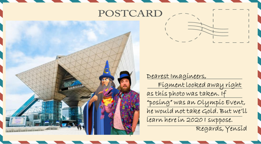
Can you figure out where Figment and Yensid went on their vacation this week based on this postcard?
(Sound Trivia arrives midway through the Stanza)

Ooh! Ooh! I know this one!

That is the Tokyo Big Sight, or the Tokyo Interntional Exhibition Centre, located in Odaiba, Tokyo, Japan! How do I know this? Because A. Digimon is educational, and B. My best friend is moving to Japan for a year in October.
 

D Hulk

Well-Known Member
Tips & Trivia

Stanza IV Program Guide

------

Ru1qqwl.png


------

Where in the World are Yensid and Figment?


View attachment 447701

Can you figure out where Figment and Yensid went on their vacation this week based on this postcard?
(Sound Trivia arrives midway through the Stanza)
Fun fact: The Microverse Pavilion which Team Brava created for Epcot in Season 4 was largely inspired by that building.

DaYh8LOVwAIuRK4.jpg
 

Voxel

President of Progress City

Fun fact: The Microverse Pavilion which Team Brava created for Epcot in Season 4 was largely inspired by that building.

DaYh8LOVwAIuRK4.jpg
I still love this design. Microverse is still one of my favorite projects I've ever been part of.


Also I'm kinda bored, so if anyone is interested, I will be sporatically answering questions about the Original Disneyland Brazil design on the Thread for that. I will also be dropping random facts about the Original Design.
 

Outbound

Well-Known Member
OUTBOUND'S (LATE) REVIEWS
I'm back! Everyone's hyped for the current stanza, but I'd advise looking back here and getting some feedback... who knows, you might use it this time around!


K3bumpq16cvweoei3qtAEo8hgW7eGgKtHN2W57won0ZsiXJ4Ml6nEj5LAWCS4E6GT2M4NK8IcID7LRf31Js0BS0gK7g7a0STkE6xDsQ-8itxKwz_A0EjP0RDNMYv3AKmBsgVbmF0

INDIANA JONES AND THE TOMB OF DESTINY
Despite using a Vacation Day, Team Tomorrow was active through the stanza. You used it to complete what you wanted out of the project, not to last-ditch save it. This was a smart move.

Again, the teams are active. @Fire Mountain couldn’t compete much this week, but he did exactly what he was supposed to do: let the team know so they can plan. With that in mind, @Disneypugs did a superb job stepping up to the plate. You are learning quickly!

The artwork here is spectacular across the board, from D Hindley raising the standard to preposterous levels, Pugs learning more and more, and Brer Panther’s great parrot design.

The Presentation is also good. It’s nothing revolutionary, but it gets the job done, and it wasn’t a back-to-back model.

THE QUEUE
This Queue is the greatest of any Disney park in the SAU (I’ve avoided spoilers of Rise of the Resistance so I may be soon proven wrong). This could count as it’s own attraction: one sprawling walkthrough. In fact, I would go so far as to call it part of the attraction, rather than a prelude.

This does become an issue in a few places. There’s tons of individual components I love, but when pieced together they border on unrealistic. The biggest being the kidnapping part. Let’s break down what Disney needs to do for this subplot -​
  1. Hire a cast-member to “betray” the guests.
  2. Build a truck simulator to convincingly transport guests, complete with a sandstorm effect.
  3. Hire an unknown number of extras to “free” the guests and then encourage them onto the ride.

And the result is… nothing? We start the queue joining Dr. Jones’s team and start the ride on Dr. Jone’s team. This part could have been cut. I suspect this is related to the plot of Rise of the Resistance, and you guys wanted to emulate that.

In conclusion: I think a better Queue would have been just the first pre-show (love the parrot repeating key phrases) followed by an “secret passage” being opened in the room that leads us directly to the Tomb of Destiny.

THE RIDE
There is very little I can nitpick on for the ride. It feels like the perfect hybrid of the Forbidden Eye, Aerosmith, and Radiator Springs Racers. It is especially smart to trick guests into thinking another guest’s vehicle is the bad guys.

I also should mention I appreciate the emphasis on the French Foreign Legion’s deserters being the villains. Avoids the potentially controversial Nazis, keeps the focus on the Morrocoan people, and even manages to escape any potential discontent from France. Very smart.

THE SCALE
This harkens back to my points on the queue, but the most interesting part of this project to me was the massive scale of this attraction.

This works in both positives and negatives. On one hand, you’ve got such a big attraction I really want to watch it. But on the other, I wonder if it really fits the EPCOT World Showcase. Is it too big?

Another point to consider is the Morocco Pavilion itself. Pi said it best. You’ve made a great attraction in Morocco, and in most rounds would have won, but because the other team made an attraction about Morocco, one fit the land better.

Still, this was the closet round yet, and you should be VERY proud of this finished project. I am looking forward to what’s next in Brazil!

lYRM3qN2nxH9L1FZYo9JYoRq3mLLEtWdhCBk_Vi4d5MP0BhIW6XGmUVzo3OC9ztWO6waxYUI9Md51O3-gb17DJgtAQhKSWo29gIlZqFn62qlID41udQ8-O3kdOIsipKMt8ROAyHZ

ARABIAN NIGHTS
Team Yesterday was slow but steady. I adore your premise and podcast presentation. There was some great leadership by Tiki. The Google Site is a shame, though. This is the third same presentation format in a row, and the podcast single-handedly saves your team in that category (this is a very close round so stuff like this is going to matter). Ironically this is your best site yet, so I feel bad for criticizing something that is simultaneously very good.

I started out with the podcast, then read the site. The podcast was an absolute highlight! Amazing it was made at the last second. @TheOriginalTiki kept it entertaining by bringing in other characters and both he and Mickeyfan were obsessed with congratulating this “mysterious” Team Yesterday. I wonder who they could be?

UJ2iGpMJtDtFB0BkDC8-DMWwtpPPnJ-jyorRlgq8s-sUYTEJ3cERnBVTUb7US8dOsDGKVZt5I0bqmJ-hKN9Nds8GLd4mz3TyRxDxafayrDB1JU8EnGTbf-ktx9F8YKaRGAJ4em1j

It's actually a very effective way to pitch yourself in a format you cannot in formal writing.

Moving beyond the podcast and into the site. The idea is fantastic. One thing EPCOT has always struggled with is the balance between entertainment and education (“edutainment”). When we tasked you with creating an “e-ticket” this prevented you from going the typical educational route of show. You needed an exciting ride, and a good part of this prompt was a test to see if you would switch to full entertainment or attempt to inform as well. Both teams passed (Tomorrow used mythology) but you aced it.

In fact, the only nitpick I have for your entire project is the name. "Arabian Nights" implies something related to the classic story, where it’s really a journey across Moroccan history and culture. I understand this was part of the evolving concept, plus the name is iconic. But IMO, "Moroccan Nights" would have worked better.

Everything else I give full marks. The Princess Bride like story! The unique ride mechanism! The surrounding location transitioning the area from the clustered marketplace to the regal gardens! All perfect!

Great work team, and I am looking forward to seeing what’s next in Brazil!​
 
Last edited:

Pi on my Cake

Well-Known Member
Original Poster
In the Parks
Yes
Stanza IV - Fantasmic 2000

With just under 2 days left in the fourth Stanza, let's take some time for some behind the scenes info! Our plan is for each stanza (or most stanzas) to have a Fantasmic 2000 post that shares some fun facts and info about the making of this competition by @Outbound @PerGronStudio and me! It can also serve as a convenient reminder that the current stanza is almost done!

The Winding Path to Stanza IV

For Stanza IV's Fantasmic 2000 post, I'm gonna talk a bit about the way the prompt for Stanza IV evolved over the last few weeks!

We knew we wanted to go back to Disneyland Brazil! Personally, that was perhaps the most fun and memorable prompt for me from Season 4. Plus, it is the only Disney Resort (so far) to exist only in the SAU! It is the ultimate symbol for what makes this game so unique! It started as a completely blank slate and was shaped by our very own imagineers from the ground up!

First, it was created in season 2. It wasn't fully finished and thus lost the round. Then, while prepping for Season 4, @spacemt354 and the other hosts for SA4 worked together to mostly complete the park and add it into the SAU canon. In the course of season 4 (Stanza IV of that season), the park was completed with the addition of Adventure Bay by Team Brave. Season 5 focused on other locations, but we knew we wanted to return to the resort.

Our initial plan was to not be in the park itself! We were going to have the project be rounding out the resort itself. Focused around either a Downtown Disney/Disney Springs style shopping district. Or maybe a hotel with elements of a shopping district like the Boardwalk Resort. This helped inform the name for the stanza. The Brazil Identity. The goal was to complete the resort and give it an identity beyond just the park.

The problem became clear pretty quickly once we started doing more research. While Space's guide focused on the park, the actual original project spent a lot of time (too much probably) on the Resort rather than the park. Especially Downtown Disney. So, a project focused on doing that wasn't a good idea lol.

We still wanted to focus on the Resort rather than the park though. But figured the obvious "Design a Hotel" prompt wasn't really exciting. Especially since the Cruise Ship Prompt was basically "Design a Floating Hotel with more food." So, we sought a new idea. Then I remembered one of my all time favorite projects from this forum:

The Dog with a Blog Campground from the Creator Games: Project Revival!

l4to1s6_orig.jpg


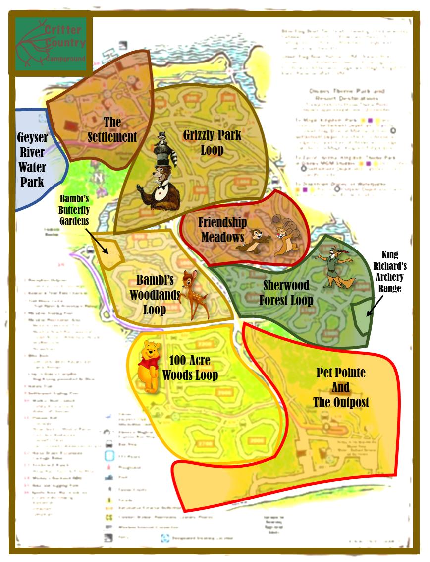
The prompt would be to design a campground for Disneyland Brazil Resort!

So, why did we change it this time?

Well... some people weren't crazy about cruise ships (Which do share some similarities to Campgrounds, even if there are a lot of differences). So, after Stanza II, we started discussing possible different prompts. Then with Stanza III, there were people who rather disliked the very limited focus. Some people really loved Stanza 2/3, but we didn't want to alienate the ones who weren't feeling the more niche prompts. So, we decided it wasn't a smart idea to do a third limited/niche prompt in a row. Perhaps a campground can happen another time (Even if its another season)

So, we started looking for options for prompts that would give players more creative freedom.

@spacemt354 (Who, as a past host, has been offering us feedback on prompts as we've been developing the stanzas). Admitted that Toon Town and Muppets Land were both put in as filler for the park when he was finishing it up. He suggested replacing or revitalizing one of them.

The first thought was to replace Muppets with... Muppets! We know we have some big Muppet fans in the cast here and thought it would be a lot of fun!

But Muppet Lands tend to all be pretty similar. Basically all either a city or a studio. So, we decided on a Muppet Land, but banning cities and studios as settings. Some of the best Muppet movies involve the characters stepping outside their comfort zones (Muppet Treasure Island and Christmas Carol).

Of course, the problem with a single IP prompt is that anyone who doesn't care about Muppets won't be interested. Thus, it would still be a niche project.

So, after a few more small changes and different ideas, we wound up with the prompt we currently have. Basically a blank slate for a new land in Brazil. A mostly total creative playground in the heart of the SAU!

Here's hoping no future prompts require 18 different version before we settle on a theme lol
*Stares nervously at the host discussion thread for Stanza V*


That's it for Stanza IV's Fantasmic 2000! Next week we'll have a new topic for some more BTS info. If there's anything you're interested in learning about, let us know!
 

Pi on my Cake

Well-Known Member
Original Poster
In the Parks
Yes

The teams successfully distracted the members of L.A.N.D. long enough for Hatbox Ghost, John Progress, and Abraham Lincoln to finish hacking into Maleficent's Codex! And made Disneyland Brazil even better while doing it!

The info in the codex is being transmitted back to S.E.A. H.Q. in Paris. Bob Iger and his trusted advisor, Bob Chapek, will decode the information to find the map to the stolen artifacts

"While we have a bit of time till we get our next mission, maybe we should go ride Fire Mountain one last time! See Volcano Bat again!" says @D Hindley

"Of course! But first we gotta do my favorite thing: discuss the mythology of an armchair imagineering competition!" @TheOriginalTiki exclaims, "L.A.N.D. left way too easily without really putting up a fight. What are they planning? And we still don't know who their leader is!"

The teams discuss the possibilities that lay ahead while riding a last ride or two.

Team Tomorrow and Team Yesterday are together enjoying Disneyland Brazil while they await their next mission. Bob Iger and Bob Chapek are deciphering Maleficent's Codex to find the map to the stolen artifacts back at S.E.A. H.Q., the next mission will begin by 23:59 EST Sunday once the files are fully downloaded.


wYOZ8QL.gif


Until then, sit back and enjoy some roller coasters while you wait for the reviews!
 

Pi on my Cake

Well-Known Member
Original Poster
In the Parks
Yes
pi reviews.png

Team Tomorrow Logo.png

(How come the logo is so tiny in your post lol)
  • Love the logo fitting in perfectly with the other Brazil logos! And how perfectly the map fits in with the rest of Brazil!​
  • I love the concept for this land! An updated take on Beastly Kingdom is very smart. And focusing mostly on Greek and Asian myths was a good choice! It's a theme that blends IP and non-IP very very well and fits a Castle Park like a glove.​
  • With Africa and Mexico in Adventure Bay and Greece and East Asia here, this helps tie Brazil together very well with a more international focus that helps distinguish it from other castle parks.​
  • @D Hindley once again topping himself with the art here!​
  • The Grand Bestiary is absolutely amazing! It ties the land together perfectly and works as a great centerpiece.​
  • Minor nitpick on organization: The Broom Closet is under the land aesthetics on the website. Feels like it should've been its own page since everything else was. Plus, the Bestiary, despite being the smallest, is the only land to haveits own page for the aesthetics rather than just tying it into the intro page​
  • @Brer Panther your artwork is fantastic! It looks like something straight out of a cartoon show. Extremely high quality with a great art style!​
  • Hydra's Lair is amazing and a great little touch to add. I like that it is an original Hydra design and not just the one from Hercules. Perfect amount of detail btw.​
  • Love the logo for Fantasy River Cruise! Love the ride too! The way it weaves through the land and ties into different landmarks is such a cool idea and so well executed! There are so many amazing scenes here that I could spend the next hour just writing about small details I loved from it! Definitely a fantastic E-Ticket to anchor the land!​
  • I try not to judge a project based on unused ideas, but this was originally proposed as a Jungle Cruise substitute. It's an amazing ride, but I would have loved a bit more comedy blended in to help emulate the Jungle Cruise. But again, I still love it!​
  • The Odyssey and Gardens of Wonder are both solid additions​
  • It was a smart touch to reuse the Muppet Land infrastructure. I was really hoping one of the teams would do that!​
  • Another little nitpick: Fabrica de Yokai is the only title not translated into English. Its a little touch, not a big deal at all. But as the team is doing final checks, this is the type of stuff that can be found and fixed​
  • " a conveyer belt (which is one of those conveyor belts you see at an airport (I’ll put in the mechanical term later)) " - I've left typos like this in by mistake before too lol. Another little thing to watch though.​
  • I wanted more info for Fabrica de Yokai. What is here is suuuupppeeerr intriguing! I love the idea of an interactive dark ride that isn't just a Buzz Lightyear arcade game. I wanted more. You don't even explain anything about Yokai. Maybe a picture or two. There just wasn't much to this. Just enough to make me want a lot more!​
  • More amazing art for the Land of the Dragon!​
  • American Adventure for China sounds like a super interesting idea. I'd love this show! But why is it here? It's great, but it has very little to do with monsters or mythological creatures. It fits about as well as America Sings in Tomorrowland.​
  • Origami No Umi is perfect! Exactly the right amount of detail, a great sampling menu, an interesting concept! It's great! BUT, again, why is this here? What does this have to do with beasts?​
  • The Oriental sub-land really feels disconnected from the them and the other sections. The only part that is well connected (Yokai), isn't finished.​
  • I'll talk about Main street later, but it seems odd that you'd change the layout of MAin Street for more room when half of your land is either future expansion pads or the under-developed/disconnected Oriental Land. That's a lot of wasted time and effort to "fix" Main Street only to not use the space well.​
  • I love how your transitions are described as so smooth! It is smart to think of that, and you manage to find good ties with architecture and Big Hero 6.​
  • The Greek Sub-Land already starts off stronger. It has a more naturalistic design and seems to blend the creatures with the land better. Plus, a flat ride for added kinetics!​
  • Having live actors playing the characters in the pre-show for Hercules is a really interesting idea! That hasn't really been done before, but there have been plenty of rides with live actors in pre-shows. Having them wear a Hercules costumes seems to be the next logical step!​
  • Is this Heracles based on mythology or Hercules based on the movie? Some parts use Heracles and the setting of "real" mythology. Others say Hercules and are based on the movie. I understand this was rushed since @FireMountain had some stuff come up and wasn't able to write it. But this is an important thing to have clarified. Especially for what feels like one of the big anchors for the land.​
  • Pretty good write up for the dining. Putting the menu below the title would've helped. Again, a nitpick. But you guys finished with like 12 hours to spare. These are the types of things to look for when editing going forward. But, again, it's a nitpick. I'm being extra nitpicky since we are nearing the end of Act 1. So far, most eliminations have been based on activity, but now just about everyone who is left is pretty active. Plus, both teams are incredibly closely matched. These kinds of nitpicks can add up fast and can make a big difference in later rounds just because of how evenly match everyone gets to be. So, now that we're heading into the second act I'm trying to point out stuff to look for more.​
  • Both the Training Ground meet and greet and the Pegasus Spinner are really fun ideas! I would have like something in the Greek area not based on Hercules just for variety sake though. As it stands, this is really just a Hercules land. Either adding in some non-Hercules would've helped a bit.​
  • Main Street.​
  • This is the SAU, changing reality is a big part of the game. But usually we are messing with stuff created by a group of people working in a corporate structure none of us will ever meet. This park is made from the ground up by members of these boards. If you are gonna change something big like the layout of a land, you should give a reason. Especially since @Voxel even logged on to explain the purpose of the original layout. We aren't getting rid of one of Eisner's questionable decisions, we are rewriting a project by an active member of this forum. Again, I would have been ok with this. But there was no explanation and the space it freed up really wasn't needed.​
  • Overall, this project started off very strong with a great concept, great art, and the Grand Bestiary, but it feels half baked and not quite finished. Which is a shame. This prompt was written with Team Tomorrow in mind. And this land had so much potential. It has some great aspect, but it just doesn't all come together​
 

pix

Well-Known Member
Hey, just a quick Q if any of the judges are up, I have been super spacey as of late are we or are we no longer doing "mini prompts" in between stanzas. Definitely not because I am searching for something other than homework. Nope. Me? Procrastinating? At midnight? Me? Pix? Me? Never.
 

Pi on my Cake

Well-Known Member
Original Poster
In the Parks
Yes
Hey, just a quick Q if any of the judges are up, I have been super spacey as of late are we or are we no longer doing "mini prompts" in between stanzas. Definitely not because I am searching for something other than homework. Nope. Me? Procrastinating? At midnight? Me? Pix? Me? Never.
We did that once, but no one did it, so we didn't keep it up lol.

Buuuuttttt since you asked!

SAU Extra Magic Hours.png


Stanza IV extra magic hours prompt!

Design a hotel for Disneyland Brazil Resort!
 

pix

Well-Known Member
We did that once, but no one did it, so we didn't keep it up lol.

Buuuuttttt since you asked!

View attachment 449251

Stanza IV extra magic hours prompt!

Design a hotel for Disneyland Brazil Resort!

UNPOPULAR OPINION! I love hotel prompts! I am horrible with the realism, how many rooms, space it will take up, ect but resort prompts are an entirely blank slate and so much fun.

Thanks for the help avoiding astronomy.
 

Pi on my Cake

Well-Known Member
Original Poster
In the Parks
Yes
pi reviews.png

Team Yesterday Logo.png
  • Love the logo fitting in perfectly with the other Brazil logos! And how perfectly the map fits in with the rest of Brazil!​
  • The trivia game idea was super neat! It's definitely a gimmick. but I like me a good gimmick. And you did some stuff with Google Slides I didn't know you could. Great job! IT was a lot of fun.​
  • Disneyland Brazil is actually a bit older than you noted. @spacemt354 and the other hosts for season 4 finished the park and compiled everything in 2018. The original design for Disneyland Brazil dates back to November of 2014! The finale of Season 2 of Sorcerer's Apprentice!
  • That intro post is fantastic! This is exactly what a good into should be. It gives context (The updated park map), back story, reasoning, and establishes the tone and aesthetic of the land! All without being too wordy. Very well done.​
  • The map is great! I appreciate having the logos on the tiny map for clarity, but I also appreciate them staying off the larger map for consistency sake.​
  • Quack Atack! It's amazing! But maybe a sliiigghtt tiiiinnnyyy biiiitttt waaaaaaaaaaaaaaaaaaaaaaaaayyyyyyyyyyyy too much going on for a thrill ride. Ducktales, Talespin, Quack Park, Three Cabelleros, more ducktales, Aracuan Bird, three musical numbers, turn tables, drop tracks, a shark, a tractor type thing... There is so much going on here! Maybe save one or two ideas for another stanza lol. I'm not expecting you to be in danger of elimination, you'll get more chances to write attractions in the future. This one ride doesn't need everything you can possibly think of lol. OR if you do want it to have all of this, perhaps a high capactity dark ride would have worked better than a thrill ride like an EMV.​
  • That being said. I do love this! Being fans of all these properties, I loved reading it! It was definitely overload, but I loved every second. I want this to be the plot of a new Ducktales movie rather than the plot of a 3 Cabs ride. It is just such a fun story with amazing set pieces.​
  • @TheOriginalTiki I love your hand drawn maps! They are always brimming with personality and just the right amount of detail! I'd love to challenge you to try a bit of digital art, even just something simple like making a logo in Google Slides. Just push you outside your comfort zone a bit. That being said, you're an old pro at imagineering stuff. You know what you're doing. If you have a comfort zone, its because it works well and you know it does.​
  • Aquarela Do Brazil is a triumph in that kinda weird way where it is such an oddball idea and would probably be a walk on that fans online never shut up about even if it never sells merch or has a movie based on it yet the people who take the time to ride it almost all call it a favorite. It's fantastic!​
  • Some of the effects sound somewhat less than possible, but I'll accept it. Nothing pushes realism too far. Personally, I prefer more grounded descriptions (I'm the guy who did a Tangled Dark Ride where I described which AAs were full motion, which were partial motion, and which were just statues), but this is written less like an engineer and more like a poet. It is a beautiful journey that I'd love to go on!​
  • It is a little funny to me that both teams did a Dumbo style flat ride themed to a horse like creature with wings. But it works really well in both lands lol​
  • What you did with the 3 Cabs restaurant is basically the opposite of what Team Tomorrow did with Main Street. You gave both an in universe explanation and a meta explanation for changing Adventure Bay and bringing this over here. Plus, it solves the issue of 3 Cabs being on both sides of the park!​
  • I'd b lying if I said I remembered the details of the old project enough to say how much has changed, but I definitely love what I see here​
  • The stores are both very solid. A picture for either of them would have helped. You can (almost) never have too many pictures. My rule of thumb is that if it is worth writing something about, it is worth 2 minutes in Google Images to find a reference photo for.​
  • I ADORE the boat transportation option. That is such a fun idea! I almost wish you took it to the impractical extreme and had stops in every land (The map does have a river connect them all ;p ).​
  • The Up house would make a really amazing walk through! There's a reason I try to include it as a concept anywhere I can. Very good execution of a good concept! And it makes up for the lack of a Swiss Family Robinson Treehouse in Adventureland.​
  • So, wait. The Spirit of Adventure Walkthrough and QSR are two differnet locations on the map. Are they meant to be seperate? Are there two blimps?​
  • Wait, is there a whole sub-land that is just two walkthroughs and a food stand? A flat ride would've helped round this out a lot. Or a playground type thing maybe​
  • I love UP, and this small would be great! Just maybe needs a bit more? Or maybe just tie it into something else.​
  • The Kuzco Coaster was great! The Yzma lab coaster is such an obvious idea that has been done to death in armchair imagineering (not saying it isn't good, just that I've seen it soooo many times). This is such a unique concept that feels totally and completely perfect for the wacky world of Emperor's New Groove! Plus, just the perfect amount of theming for a coaster!​
  • I also like the use of GIFs! Very good choice to add some life to the presentation!​
  • How to Speak Squirrel with Kronk is great! I think it would've worked better with a Turtle Talk type set up of being animated. The character designs of New Groove don't really lend themselves well to live actors. Plus, it would save a ton on puppetry. Plus plus, probably would work better for the scale of effects desired.​
  • 78e023ee3a857a0719f562a202f5dfe8.png
  • See what I mean? Do you really want that with a moving mouth in a room full of children working a puppet lol​
  • Mudka's and Kuzcotopia are both very solid again. As a big New Groove fan, I would love to see them! I've wanted to eat at Mudka's most of my life lol.​
  • Again, a picture is worth a thousand words.​
  • latest
  • 15.87 seconds. I pulled out my phone's stop watch to time myself. It takes roughly the time of a big sneeze to get a reference photo.​
  • Overall, there's a lack of cohesion in the land. New Groove and Up don't really have any kind of beach connection. Beyond being on the same continent, the three sub-lands don't have a strong connection at all really. But on their own they are all really great! And tonally New Groove fits in really well with the mad cap world of the 3 Cabs. I just would've liked a bit more to tie them together. But this project was still amazing and you created some wonderful, colorful worlds I'd love to explore!​
 

Register on WDWMAGIC. This sidebar will go away, and you'll see fewer ads.

Back
Top Bottom