So... here's my take on the AA figure.
I think the problem is 90% the eyes.
If you look at the profile view... it's pretty good
The problem is when you look at the figure head on. Two things really stand out..
1) The deep eye sockets. While Trump does have the feature, the eyebrows seem to crowd it more and you see less of the recess at the top of the eye.
2) The eyes don't feel as squinty as you normally perceive him to have
Here, you see the upper eye socket appears nearly flat or filled in. You don't get the IMPRESSION of deep recesses
Here, you see the eye sockets appearing even fuller. The makeup and facial don't give the IMPRESSION that his sockets are deep at all.. and his eye openings appear very horizontal vs round.
And here is an image that actually looks the closest to the AA figure..
Here you can see the shadows making his eye sockets appear more pronounced.. and his upper eyelids are very 'heavy' and pronounced. The bags under his eyes are noticeable
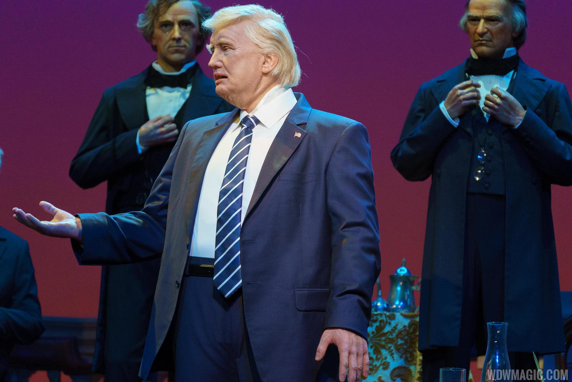
Now lets go back to the Disney AA
Notice.. the lack of heavy, visible upper eyelids. Notice the eye sockets appear more pronounced due to the shadows of the eye brow. This big eye stuff also makes the face appear 'squished' vertically compared to what we normally percieve his face to look like.. because normally his eyes are less pronounced vs his brow and forehead. But here, the eyes are large... and more pronounced.
I would imagine given the high articulation of the brow, and eyelids... the proportions and spacing in this area is very constrained by the mechanical design. I bet they have less creative control in this space and instead may be working with fixed locations for eyes vs mouth and offsets for depth or shallow.
I think Trump's normal use of heavy makeup also contributes to this where his face looks very FLAT under TV lighting conditions... where the stage lighting seems to exaggerate the shadow under his brow.
I think fixing the brow and upper eyelids is the key to making the face look more true to public perception of him.


