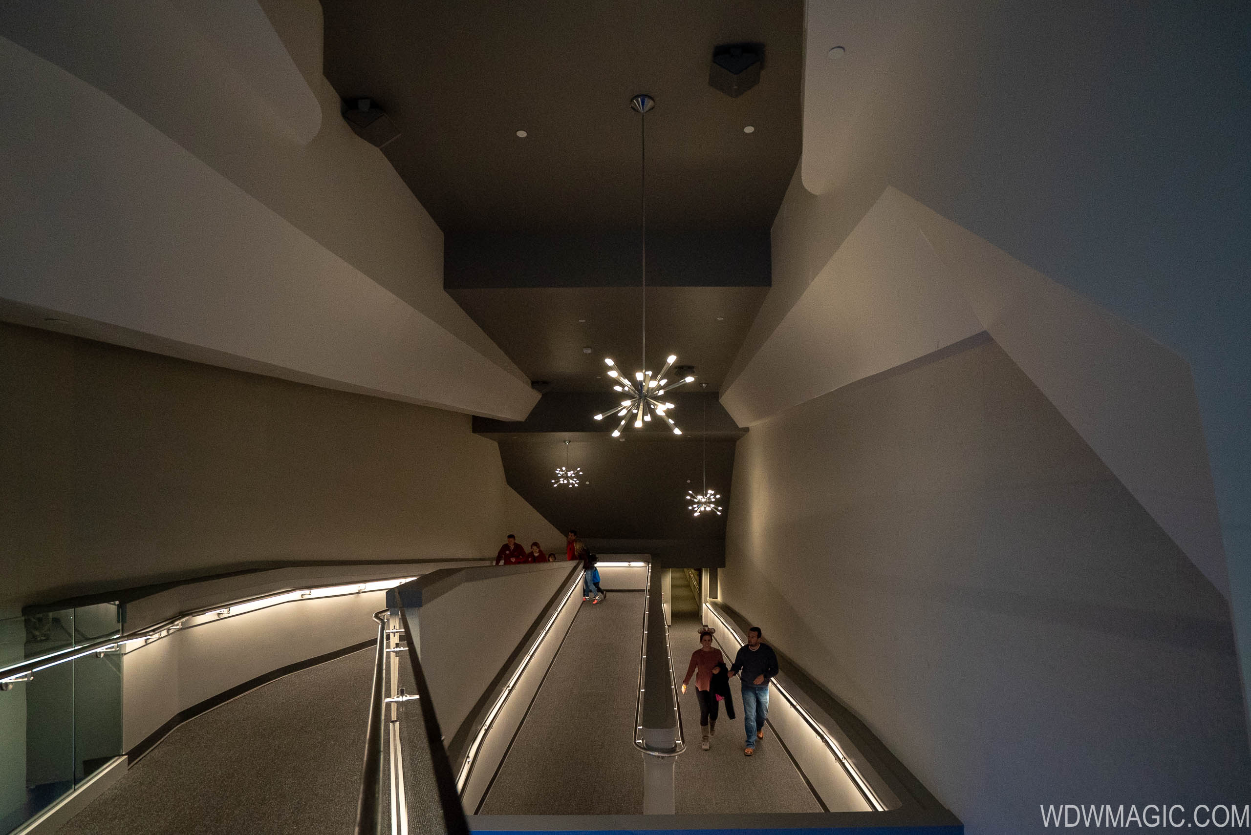
News Space Mountain exit being worked on

Cmdr_Crimson

Well-Known Member
It's interesting as both SM's got something that no one liked..And they were additions to either their queue or exit..
DL upstairs Starcade now an extended queue area..
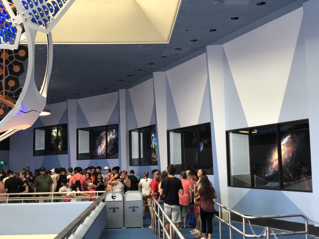
Di99An-V4AAe7JV.jpg

And then MK's Exit...
Space-Mountain_Full_34051.jpg

By the way......Did we ever find out what the reason of the Other hole they made to the left of the main entrance to MK's mountain as it was walled off ?
 
Last edited:

T.Will

Well-Known Member
It's interesting as both SM's got something that no one liked..And they were additions to either their queue or exit..
DL upstairs Starcade now an extended queue area..
Di99An-V4AAe7JV.jpg

And then MK's Exit...
Space-Mountain_Full_34051.jpg
I honestly think Disneyland got the worst deal. At least with MK's, it's the end of the exit, so you're in and out no problem. You'll be standing for a good while in the extended queue at DL's, and all you have to look at are a satellite and some space pics.
 

Oddysey

Well-Known Member
No I am belittling the complainers, and it appears you are one of them. Look, it is an exit and quite honestly it looks a heck of a lot better than the old one.

I would spend more attention to the stench/mold issues at the the two communicore areas. I get it, there is trash containment in the basement.

My point is, of all the complaints out there about Disney, this one is merit less. It solved a problem and improved Let’s save the constant complaining for when they do real cheap things.

Add me to the list of people you are belittling. As a 15 year pass holder, and someone who has visited the parks monthly for years, it becomes more and more apparent that it is the little things that make Disney stand out from competing vacation destinations. It is what makes the place feel like an escape from the mundane and makes it feel “magical.”

Little things like losing show scenes do matter because it is a catalyst to a larger problem that leads to declining show quality across the board. Yes it is more efficient now because the escalator was having problems, but that aspect of the show, and additional show items could have been maintained and/or improved upon instead of reducing show items in favor of long streches of drywall with no escalator at all.

Yes in my opinion, the little things do matter. Especially at a place like Disney where superior show quality was the standard for decades, and the cost of attendance is continually on a sharp rise.
 

Oddysey

Well-Known Member
Suprised they did not have a Vacation Club Kiosk half way through the walk..... Been going to WDW since it opened so have lots of nostalgia for all of the original stuff. Always loved the exit. Not sure why they changed. maybe too costly to maintain or someone got hurt... dont know.

I will say, ok with the walk,but maybe could have added a little more eye candy at the end... IMHO

Careful with the IMHO stuff. The people who misconstrue their opinions as facts are going to come after you.
 

Oddysey

Well-Known Member
Let's be honest - the ramp that was there was a disaster. While the new layout might be more utilitarian/cheaper, its only a disappointment in the context of what people could conceive a completely modernized ramp exit to be. I don't know what that costs, but can imagine its a lot more than what they ultimately went with. There are numerous areas of the park (including recent years) where no expenses have been spared in developing an amazing queue/exit experience. Perhaps they just didn't feel this upgrade was worth the cost outlay relative to the alternative. IMHO, until the ride experience is completely overhauled and updated the queuing isn't entirely worthy of an expensive fix at this point. I think too often many people measure changes introduced to the parks against "what could have been" as opposed to "what was previously there". When in reality perhaps "what could have been" wasn't all that practical, or necessary. I'll step down from my soap box now :)

This post is a great example of making a point without being dismissive or condescending to an opposing view point.

I disagree with you because Disney has with more frequency been violating their first operational tenant which is show quality above all. This tenant is often being abandoned in favor of cost effective ideas. I believe that this continually replacing good show in favor of cost efficiency leads to a lower quality guest experience. A typical guest may not always notice the difference directly or put much thought into it, but their brain notices.

Nevertheless, I think you provided a well thought out opinion that has relevance. Your opinion is well articulated and you didn’t tell anyone to “chill out” or belittle anyone. Civil discussion, even if we disagree, is what makes a discussion forum so great.

Edit: I apologize for the triple post
 
Last edited:

Bocabear

Well-Known Member
I like the "idea" of some of the colors and styling but the execution is terrible... A Sputnik Chandelier is great when it is scaled properly for the space, not a cheap onerdered from Wayfair... They should be exagerrated and unique looking, not like an apartment building foyer in Miami. This has been sort of a hallmark of their new building trend...Seems like the custom fixtures and details have all been replace with things you see every day or can be commonly ordered online.. not tho unique WDI built custom props we had in the past... it is all decline by degrees... and the degrees are adding up.
 

Movielover

Well-Known Member
It is usually hyperbole to say this, but the new exit really is Six Flags quality.

O.K. could someone please direct me to the Six Flags park that looks that nice? If so I'll buy a season pass on the spot because all the Six Flags parks I have been to look like crap with a DC logo slapped over it! I'm being serious, show me something from a Six Flags park that looks as nice as this.
Space-Mountain_Full_34051.jpg

This looks more like a natural history museum or yes a airport lounge... maybe a little too fitting since we did just arrive back on Earth from our trip to the stars. I do agree that it is a very different style than the rest of the Mountain but Six Flags? Really?

This is one of Six Flag's Over Texas latest addition.
1542458136682.png


Yeah absolutly the same quality as SM exit... :rolleyes:
 

Bocabear

Well-Known Member
O.K. could someone please direct me to the Six Flags park that looks that nice? If so I'll buy a season pass on the spot because all the Six Flags parks I have been to look like crap with a DC logo slapped over it! I'm being serious, show me something from a Six Flags park that looks as nice as this.
Space-Mountain_Full_34051.jpg

This looks more like a natural history museum or yes a airport lounge... maybe a little too fitting since we did just arrive back on Earth from our trip to the stars. I do agree that it is a very different style than the rest of the Mountain but Six Flags? Really?

This is one of Six Flag's Over Texas latest addition.
View attachment 326512

Yeah absolutly the same quality as SM exit... :rolleyes:
First of all, this is a particularly bad example,even for Six Flags... Also Six Flags is an amusement Park , not a theme park ...Six Flags is also a fraction of the price for admission... The comparison is not valid... No one is surprised if the bed linens are frayed in a Motel 6, but that simple thing would not be tolerated at a Ritz Carlton...and we are definitely in a Ritz Carlton price range. Disney Parks entireidiom is based on show quality and detail... the idea of "Good Enough" was not part of the thing that set Disney parks apart from Amusement Parks...
 

Bocabear

Well-Known Member
Right, I just want to know why so many people think this exit is on a Six Flags level? It's not. The exit looks really nice and IMO at a Ritz Carlton level. Now if the exit ties in thematically with the rest of the building is the big question, but this is a nice looking exit.
Clearly not at Ritz Carlton level, and honestly less interesting than what came before...not a plus up... The original moving walkway was part of the show...Part of the world of the future... Along with the displays... it is now just an exit hallway with some Home Depot chandeliers....It does not further the narrative of the ride. Is it OK/ yeah...I guess...But it is now less insteresting than it was, and now there is no post-show experience...
 

Movielover

Well-Known Member
Clearly not at Ritz Carlton level, and honestly less interesting than what came before...not a plus up... The original moving walkway was part of the show...Part of the world of the future... Along with the displays... it is now just an exit hallway with some Home Depot chandeliers....It does not further the narrative of the ride. Is it OK/ yeah...I guess...But it is now less insteresting than it was, and now there is no post-show experience...

O. K. please explain to me how an upwards grade moving ramp is different on a narrative level from a upwards grade non moving ramp? If I'm reading all the reports correctly all the post show scenes are still along the corridor? So how is this any narrative difference when compared to the older setup? And speaking of narrative, exactly how is it that we arrive and disembark from the space station itself? You walk through a door on Earth and suddenly you're on a space station in orbit, and then after arriving back on the station and riding a moving ramp we are all of a sudden back on Earth? Where's the explanation for that location jump?
 

peter11435

Well-Known Member
O. K. please explain to me how an upwards grade moving ramp is different on a narrative level from a upwards grade non moving ramp? If I'm reading all the reports correctly all the post show scenes are still along the corridor? So how is this any narrative difference when compared to the older setup? And speaking of narrative, exactly how is it that we arrive and disembark from the space station itself? You walk through a door on Earth and suddenly you're on a space station in orbit, and then after arriving back on the station and riding a moving ramp we are all of a sudden back on Earth? Where's the explanation for that location jump?

Somehow people consider these pictures to be superior design.
89690B7E-5BC6-430D-BE46-070842A2B33C.jpeg


F3CA3C03-2263-463D-B0A4-F0A196C2193D.jpeg
 

marni1971

Park History nut
Premium Member
Still no answer on how the old setup is on a thematic level explaining how we get back to Earth from the Spaceport......
You won’t get one since SM has a flawed backstory and always has.

How did you walk through a tunnel from earth and end up in space? There’s only so much you can do. Alcatraz may be the first attraction to correctly have a narrative to fill the gap.
 

Movielover

Well-Known Member
You won’t get one since SM has a flawed backstory and always has.

How did you walk through a tunnel from earth and end up in space? There’s only so much you can do. Alcatraz may be the first attraction to correctly have a narrative to fill the gap.

Right, and honestly you shouldn't think about that. Once you step inside you are in a completely different location captivated by the experience surrounding you. The thought of how you got there is for the most part irrelevant. The same applies to the exit, I just don't understand how some think that the new exit somehow detracts from the story of SM? Now should they have tried to mimic more of the interior style from the queue in this new exit? sure. Should they have kept the moving walkway? Sure, albeit extensly modified for accessibility, but IMO the quality of the exit itself is as equal to the quality of the rest of the building. This is not Six Flags jank.
 

Expo_Seeker40

Well-Known Member
What a waste. Seeing yourself on TV goes all the way back to the Home of Future Living exit in 1975.

It’s so cold, barren, and empty.

One now walks past the Robot that is no longer featured in the preshow video games, past cheaply revised displays from RYCA-1, and into some sort of Airport/IKEA ramp up with a sponge painted mural into a gift shop from the 1990s.

Bravo!
 

FerretAfros

Well-Known Member
It's interesting as both SM's got something that no one liked..And they were additions to either their queue or exit..
DL upstairs Starcade now an extended queue area..
Di99An-V4AAe7JV.jpg

And then MK's Exit...
Space-Mountain_Full_34051.jpg

By the way......Did we ever find out what the reason of the Other hole they made to the left of the main entrance to MK's mountain as it was walled off ?
Except that DL's overflow queue room was generally well received. No, it wasn't the headliner of a splashy summer promotion (that honor goes to the unfortunate Pixar Pier), but people saw it as a good thing for what it was. The only real focus of any disappointment seemed to be the lackluster space images in the "windows," which are no worse than WDW's much-overhyped Star Tunnel. For proof, just look at the comments on this very forum, which are all tepidly positive:
https://forums.wdwmagic.com/threads/new-space-mountain-starcade-queue-open.945605/

Keep in mind that (thanks to FP) the majority of DL's queue time is spent in unthemed switchbacks on the roof of the Magic Eye theater. The canopies and floor paint job are upgrades themselves (as part of the 2003-05 rebuild) over the previous version, which was even less appealing.
space.png


The DL queue changes had 3 big things going for it:
  1. It improved the guest comfort, entertainment, and experience when compared to the previous version
  2. It reopened a long-abandoned guest facility in a park that has far too little elbow room for comfort
  3. It fit the general aesthetic of the attraction, even if it's somewhat low-key by contemporary trends
Only #3 could arguably apply to WDW's new exit, but even that misses the mark as many have already commented in this thread. The aesthetics don't quite match the existing queue and attraction, and the whole experience seems to become too utilitarian relative to the rest of the building

Contrary to what WDI (and the videos looped on DME) would have you believe, not every role is a starring role; sometimes it's important for certain elements to be more unassuming in order to support another experience. Unfortunately this new exit goes too far, making a supporting element so lackluster that it's forgettable-at-best
 
Last edited:

Register on WDWMAGIC. This sidebar will go away, and you'll see fewer ads.

Back
Top Bottom