Slowjack
Well-Known Member
The entrance to the corporate lounge was on the ground level on the right side; you may remember seeing it there.ah okay thanks, I dont know what made me think it was under off to the side.
The entrance to the corporate lounge was on the ground level on the right side; you may remember seeing it there.ah okay thanks, I dont know what made me think it was under off to the side.
Is there any chance that the video screens inside the restaurant will ever run a virtual ride through of Horizons?
OK stop making fun of me... A guy can dream can't he? If I can dream it, Disney can certainly do it!
Maybe they can get NASA to engineer the restrooms, where they know the importance of vacuum in the hygiene module...
Space bathrooms? There's one movie I instantly think of when I hear that:Maybe they can get NASA to engineer the restrooms, where they know the importance of vacuum in the hygiene module...
You beat me to it. It’s just a front on an otherwise ugly box. The best architecture at Disney shouldn’t have to settle for that sort of pastiche - it should soar as a whole building and reflect its purpose as well.I love Mission: SPACE's façade, but that also is my beef with it. It's a façade. Classic Epcot buildings were works of art in their entirety. Mission: SPACE's façade lacks depth.
The maître d' :
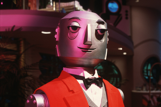
or the kitchen staff?
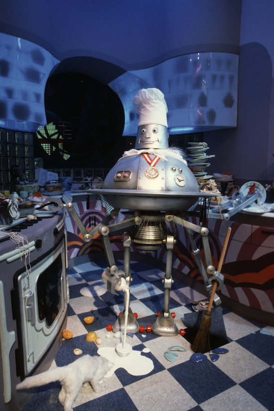
Now see, what if they put the wait staff in these outfits? That would be cool.The maître d' :

And of course you can also see how badly the Monorail track needs to be cleaned again!I believe this is what you can see of the restaurant construction from next to Test Track.
View attachment 297176
You can also see plenty of work being done from the outdoor portion of Test Track.
I believe this is what you can see of the restaurant construction from next to Test Track.
View attachment 297176
You can also see plenty of work being done from the outdoor portion of Test Track.
I just.......the Butler needs to be in this restaurant.
"Clean the beam up, Scotty!"I never really care about this stuff, but god that beam is disgusting.

Just like The Land and ImaginationYou beat me to it. It’s just a front on an otherwise ugly box. The best architecture at Disney shouldn’t have to settle for that sort of pastiche - it should soar as a whole building and reflect its purpose as well.
He does, but he'd really benefit from placement with the "ten foot rule." Way back when they had him on display in the EPCOT Center anniversary exhibit, he was up close in a glass case. He looks amazing from a distance, but if you're up close, you'll notice the glamor wears off a little... Those eyes? Jo-Ann's issue, from-the-bin styrofoam balls.
I love Mission: SPACE's façade, but that also is my beef with it. It's a façade. Classic Epcot buildings were works of art in their entirety. Mission: SPACE's façade lacks depth.
Better? Yes or no?
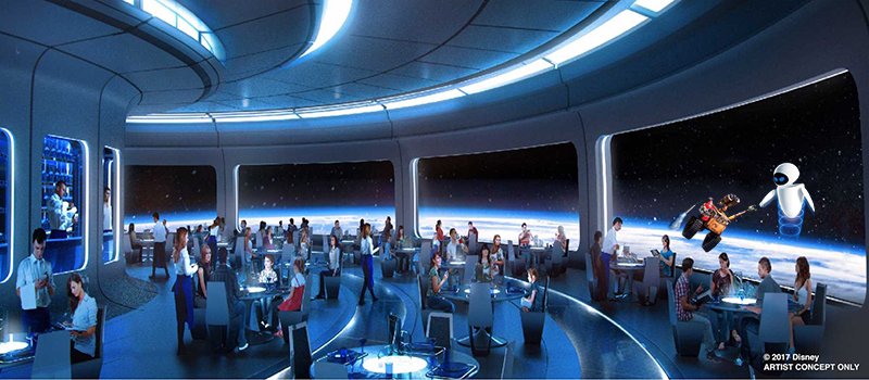
It has been proposed.There is no doubt in my mind that they will add characters in space. If I am not mistaking, I think there were reports about this a couple of weeks ago. Again, I wouldn't complain because it actually fits.
It has been proposed.
Register on WDWMAGIC. This sidebar will go away, and you'll see fewer ads.