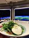
News Space 220 Restaurant dining experience at Epcot's Future World

Tom Morrow

Well-Known Member
The extended queue was essentially abandoned. It was not really usable when Green became a distinct offering and disregarded when the queues were redone with the refresh.

I did wait it in once sometime prior to the refresh a few years ago, and the way it worked was it was only for Orange. I'm guessing it isn't needed probably 95% of the time though and on really busy days they could just set up extended temporary queue in the plaza.
 

michmousefan

Well-Known Member
I think it's actually kind of interesting how much of backstage they're willing to show. I don't have a problem with it, but it would be cool to see some sort of imaginary idealized version of backstage.
It also seems that there is a rather conveniently placed cloud over the rest of World Celebration, including any hint of a festival center. Doesn't appear that the tacos are in WS Lagoon either.
 

hpyhnt 1000

Well-Known Member
If they can have lightsabers, they can have WALL-E! 😂
I'm not the biggest fan of the lightsaber fight, but looking at the video they are using "fake" lightsabers as you can see the faint outline of the light housings when they're turned off. So again, points for realism, even if the concept itself isn't my cup of tea.

Screenshot 2021-09-21 16.57.04.png
 

ᗩLᘿᑕ ✨ ᗩζᗩᗰ

HOUSE OF MAGIC
Premium Member
Personal opinions and all but I'd have preferred a more serious tone with the space scenes. The Star Wars nod seems out of step with the realistic theming. It's an all or nothing scenerio. Seeing WALL-E whizz by wouldn't really work either in it's current form. Not against IP inclusion just don't think it fits the tone. Kind of takes you out of it.

It's like seeing Disney's Planes in Soarin’. :shudders:
 
Last edited:

brettf22

Premium Member
From what I’ve seen, I love this addition. 99% free of IP, fun and somewhat edutainment oriented, plus it’s something you really can’t find anyplace else. But as I’ve said before, the food will really make or break the “re-rideability” of it.

I also don’t think the prix-fixe menu will last forever. Until it’s gone, this probably will be an adults-only dinner spot for us, as the food/price ratio will be very low for my two teenagers.
 

J4546

Well-Known Member
So far I love this. Club Cool, Creations Shop, Rat, Geletaria and now Space 220. Epcot is getting some much needed love. Cant wait to see Harmonious in action and the new center spine area take shape.
 

wedenterprises

Well-Known Member
My only MINOR nerdy complaint is that earth appears too small. I think they got it right in this concept art below where the surface of Earth was stretched across the entire width of the window. This is likely what the actual view would be like, no?

What they ended up with makes it seem like the space station is tilted and WAY out in space. Almost next to earth instead of on top of earth. It just doesn't line up in my brain.

It would be so cool if you actually orbited the earth with this view below, but of course orbiting would nix the amazing elevator idea.

Nitpicky because the whole thing is amazing.

Screen Shot 2021-09-21 at 3.48.51 PM.png
 

flynnibus

Premium Member
My only MINOR nerdy complaint is that earth appears too small. I think they got it right in this concept art below where the surface of Earth was stretched across the entire width of the window. This is likely what the actual view would be like, no?

What they ended up with makes it seem like the space station is tilted and WAY out in space. Almost next to earth instead of on top of earth. It just doesn't line up in my brain.

It would be so cool if you actually orbited the earth with this view below, but of course orbiting would nix the amazing elevator idea.

Nitpicky because the whole thing is amazing.

View attachment 588407

Disney probably spend $5million to send a camera into space to get their own data to setup the views.... because that's how they like to spend :)
 

Tom Morrow

Well-Known Member
My only MINOR nerdy complaint is that earth appears too small. I think they got it right in this concept art below where the surface of Earth was stretched across the entire width of the window. This is likely what the actual view would be like, no?

What they ended up with makes it seem like the space station is tilted and WAY out in space. Almost next to earth instead of on top of earth. It just doesn't line up in my brain.

It would be so cool if you actually orbited the earth with this view below, but of course orbiting would nix the amazing elevator idea.

Nitpicky because the whole thing is amazing.

View attachment 588407

Although I haven't been inside the restaurant myself, seems like valid criticism. They could also handwave the elevator concept by having the "station" detatch from the elevator dock and begin orbiting as part of your arrival and re-dock when you're leaving.
 

Casper Gutman

Well-Known Member
I generally like Universal’s Twitter jabs but I think they could use some self-awareness when talking about screens.
Yeah, why can’t they move away from screens with rides like Rat… er… Smugglers Run… um… MMRR… wait… Tron… you know what, never mind.

(For the record, I think MMRR is pretty close to a masterpiece, but the “screen” line will remain no matter what the two resorts actually build.)

Also, do people really prefer Disney’s PR tone - over-inflated self-important faux reverence and a hypocritical exploitation of the nostalgia they otherwise ignore - to Uni’s silly snark?
 

Register on WDWMAGIC. This sidebar will go away, and you'll see fewer ads.

Back
Top Bottom