Looking forward to seeing everyone’s coasters tonight!!! 


-
Welcome to the WDWMAGIC.COM Forums!
Please take a look around, and feel free to sign up and join the community.
You are using an out of date browser. It may not display this or other websites correctly.
You should upgrade or use an alternative browser.
You should upgrade or use an alternative browser.
So, You Want to be an Imagineer Season 19 - Madcap Circus [CONCLUDED]
- Thread starter JokersWild
- Start date
monkey92514
Well-Known Member
Wait, we're making coasters?Looking forward to seeing everyone’s coasters tonight!!!
[stealthily pushes Cool Cat aerial spinner into trash]
AceAstro
Well-Known Member
Team Bailey right now:Wait, we're making coasters?
[stealthily pushes Cool Cat aerial spinner into trash]
monkey92514
Well-Known Member
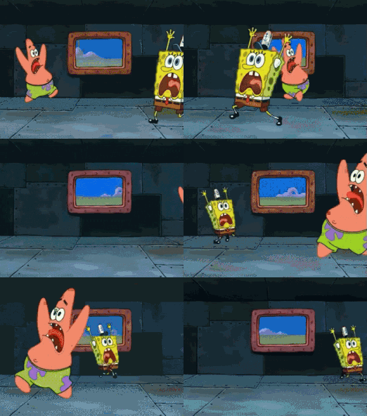
Guilty as charged, we did just retheme the spinner to SpongeBob and Patrick running around in circles.Team Bailey right now:

I’ll be so oddly satisfied if this is what you actually didGuilty as charged, we did just retheme the spinner to SpongeBob and Patrick running around in circles.
AceAstro
Well-Known Member
PRESENTS...
The Complete Timeline of Secret Weapon 9
(for the presentation, click present in the top right corner and move through the timeline using the arrow keys)
Last edited:
I love the way you did this as a timeline!! It’s super immersive. Great job yall.View attachment 564501
PRESENTS...
The Complete Timeline of Secret Weapon 9
(for the presentation, click present in the top right corner and move through the timeline using the arrow keys)
ThemeParkPriest
Well-Known Member
monkey92514
Well-Known Member
Sharon&Susan
Well-Known Member
If you want a shorter name it's Star Trek: The Final Frontier (Not to be confused with Star Trek V which actually doesn't exist
TheOriginalTiki
Well-Known Member
Big thanks to all the teams for getting the projects in on time. Were going to go ahead and jump right into the next prompt. Feedback will be posted throughout the next 24 hours or so. We will announce the PoMVP for this round during Saturday's live podcast.
Act Four: What Happens on Mulberry Street, Stays on Mulberry Street
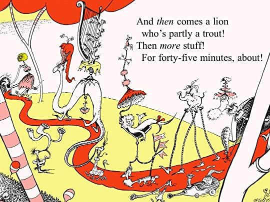
For this round, you're all going to be subjected to your very first specific IP based project. This round we'll be steering our attention towards one of the most divisive lands in Islands of Adventure...Seuss Landing. Just to be clear, were not going to be focusing on the "controversial" books in any sort of way this time around. Instead you'll be dividing up into tiers to create either a replacement, expansion, or refurbishment to the park's most family friendly area.
Ring Three - Replace Seuss Landing with a new land
Ring Two - Wall to wall refurb with a focus on Cat in the Hat
Center Ring - Whoville/Mt. Crumpet Expansion replacing The Lost Continent
Since @ThemeParkPriest opened Walt's Vault last round, he has unleashed "The Curse of Mike Myers"
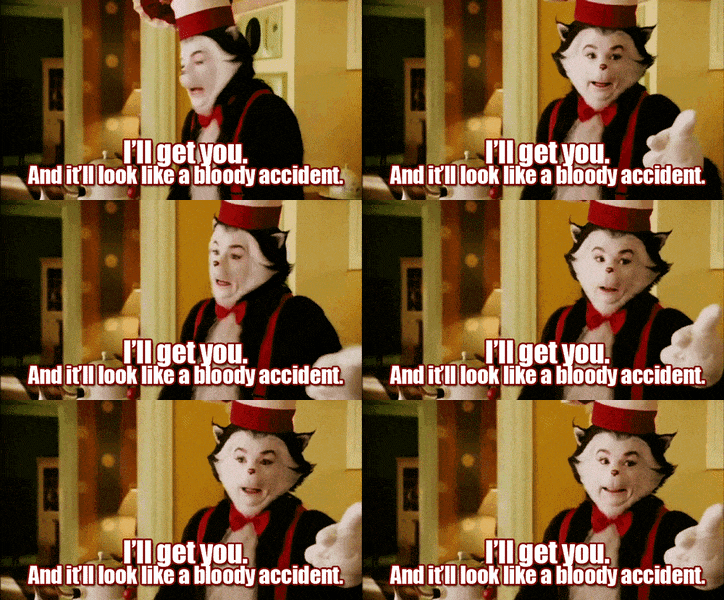
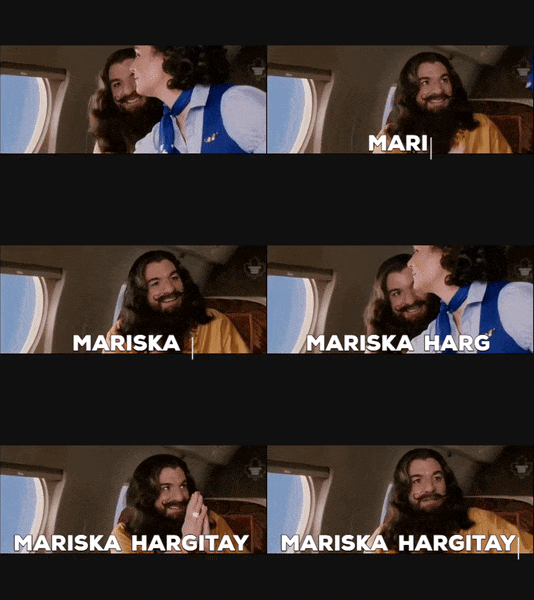
All teams MUST work Mike Myers into their park in some way. If you're doing Ring Three, you must choose an IP that Myers starred in. If you do Ring Two, the Cat in the Hat Mike Myers movie must be the focus of your refurbished dark ride. If you choose the Center Ring, you'll be designing a Jim Carey Grinch vs. Mike Myers Cat in the Hat E-Ticket as the centerpiece to the Whoville/Mt. Crumpett expansion. Good luck teams. This project is due Wednesday, June 23rd at 11:59PM Eastern/8:59PM Pacific. Everyone but @AceAstro and @Tegan pilots a chicken is eligible for a Project Leader position. Feedback and PoMVP will be announced and posted ASAP.
One last thing...if you go for Ring Three. The IP chosen CAN'T be Shrek. K? Kay!
Act Four: What Happens on Mulberry Street, Stays on Mulberry Street
For this round, you're all going to be subjected to your very first specific IP based project. This round we'll be steering our attention towards one of the most divisive lands in Islands of Adventure...Seuss Landing. Just to be clear, were not going to be focusing on the "controversial" books in any sort of way this time around. Instead you'll be dividing up into tiers to create either a replacement, expansion, or refurbishment to the park's most family friendly area.
Ring Three - Replace Seuss Landing with a new land
Ring Two - Wall to wall refurb with a focus on Cat in the Hat
Center Ring - Whoville/Mt. Crumpet Expansion replacing The Lost Continent
Since @ThemeParkPriest opened Walt's Vault last round, he has unleashed "The Curse of Mike Myers"


All teams MUST work Mike Myers into their park in some way. If you're doing Ring Three, you must choose an IP that Myers starred in. If you do Ring Two, the Cat in the Hat Mike Myers movie must be the focus of your refurbished dark ride. If you choose the Center Ring, you'll be designing a Jim Carey Grinch vs. Mike Myers Cat in the Hat E-Ticket as the centerpiece to the Whoville/Mt. Crumpett expansion. Good luck teams. This project is due Wednesday, June 23rd at 11:59PM Eastern/8:59PM Pacific. Everyone but @AceAstro and @Tegan pilots a chicken is eligible for a Project Leader position. Feedback and PoMVP will be announced and posted ASAP.
One last thing...if you go for Ring Three. The IP chosen CAN'T be Shrek. K? Kay!
Attachments
TheOriginalTiki
Well-Known Member
Avatar teaser for project five now up.
Chaos Cat
Well-Known Member
Oh, a restaurant project.Avatar teaser for project five now up.
TheOriginalTiki
Well-Known Member
The page counts this round were incredibly even, with two teams reaching ten pages and another one hitting nine. Love the consistency!
TheOriginalTiki
Well-Known Member
D Hulk
Well-Known Member

TEAM BAILEY
SECRET WEAPON 9
SW9!
With those three letters, you were already 95% of the way to a perfect project! Alton Towers truly is the ideal place for this prompt (inner ring), since they’ve basically been doing this exact challenge for decades. This was a great choice for a group project too, since the Towers’ unique approach to theming (super edgy) and advertising (super viral) meant non-coaster enthusiasts had plenty to work on with an immediately clear framework, all while brainstorming hand-in-hand with Bailey’s resident Alton Towers experts. Wonderful teamwork all around, always communicative and clear. Particular kudos go to @AceAstro for shepherding the wolf through its transformation, and to @b-wolf95 (who I’m starting to suspect might be a furry) for providing the initial inspiration and for constantly approaching the coaster design in a wonderfully logical manner. My mind instantly turned to “transforming coaster” when the werewolf theme came up (itself a well-reasoned choice), so I was doubly impressed when that was the route you went.
The website presentation style is completely in keeping with Alton Towers. So is the delightfully creepy backstory - another @PerGron masterpiece, no doubt recycling an idea Disney wouldn’t let him use when he first created Animal Kingdom. Often I don’t care for over-detailed backstories if they make the ride experience itself more confusing, but that’s not an issue here. The underlying idea - werewolves - is insanely simple, and everything you’ve built up around it totally fits the park which created Nemesis, Wicker Man, Smiler, and more.
The spell you began to weave with the early story and the concept art (that logo looks REAL) continues seamlessly with the queue. This is all so “Alton!” It’s like every one of you zeroed in on this park’s distinctive voice, and y’all enjoyed every twisted moment of it.
The Twitter account is...I’m smitten, this totally suits this project. I’m grinning ear to ear here! That commercial is also completely on-point. (In the Hall of the Mountain King is sampled on Smiler’s soundtrack, so it fits even better than you might’ve thunk.)
Regarding the technical aspects of the coaster transformation...this was an extensive team dialogue, bandying different concepts back-and-forth, carefully closing in on something safe & original & realistic. You guys did your due diligence. I do believe something like this would be feasible in the future - it’s been a discussion topic for coaster designers for some time now. Newer rides like Vekoma’s next-gen flying coaster (as seen on Phantasialand’s F.L.Y.) use rotating seats to make the loading process simpler; I feel that tech could suit the transforming coaster. Your approach is different, but similar, and especially well reasoned and justified for a game of this sort.
The coaster ride through certainly features enough wild elements to qualify as extreme. Given the overall tone of this presentation, going story-driven with your write-up works well. It would be nice to see a sample layout; that’s just about the only thing missing. This isn’t a very technical coaster description, but it totally gets across the experiential nature of the beast. (Which manufacturer do you imagine would make this ride?) I’d like to imagine that every moment of the transformed coaster is hidden from guests’ eyes, so that it is a total surprise while on-ride (like TH13TEEN’s drop track).
Overall, if you couldn’t tell, I tip my cap. This completely satisfied what I was hoping for with this round.
Creativity - 9/10
Realism - 10/10
Detail - 9/10
Presentation - 10/10
Group Work - 10/10
+5 Bonus Points
Total: 53/50
TEAM RINGLING
STAR TREK: THE FINAL FRONTIER
Sadly, Team Ringling saw their fearless leader @Orange Cat drop from the game in the final 24-hours of this challenge. To the remaining Ringing Family, good job pulling together to finalize this project in that remaining day. Teamwork-wise, this one was a little slow to get off the ground and go where no coaster has gone before. Like the team switch threw off your collective grooves, and with some folks less available. (And some folks just nervous about coaster design, which is a common trend with coaster prompts it seems.)
You might’ve hobbled yourselves a bit right out of the gate by insisting on an IP-driven concept, which (after eliminating Disney & Universal & Six Flags) sent you to Paramount’s 90s-era Kings Island. A great park, however a bit technologically limiting now that you’re stuck working with vintage Arrow Dynamics (may they rest in peace). Maybe this choice limited your presentation options as well, since the slideshow visuals feel a bit empty at times. Perhaps you could’ve really embraced a 90s-style presentation with, like, a reproduction of an internal memo between Paramount and Arrow?
The enclosed coaster concept made me anxious from its very foundation, and it still continues to do that in its finalized form. I’m simply not sold on the need for fusing simulator rides and roller coasters. You’re losing the tactile physicality which coasters do best. This concept, essentially, sacrifices what makes coasters fun at the altar of immersive theming.
And ironically you’ll be giving guests bigger headaches than even Son of Beast! Without synchronization of the individual ride vehicles with the on-ride video - something mid-90s technology wouldn’t be capable of - there’s no way you could synch up ride elements like the vertical loop. Plus the coaster cars would be so bulky and heavy, I doubt they could physically traverse the course as described. Ultimately I’m reminded of those VR coaster overlays which Six Flags briefly offered a few years ago...which turned out to be a short-lived fad. They simply didn’t satisfy coaster enthusiasts very much, not enough for how clunky and low-capacity they were...and those had 20 years of technological innovation over your concept.
The Minecraft artwork by @Mickeynerd17 is good, as always. Maybe their talents could do more than simply recreate the Enterprise, since there’s plenty of preexisting pics available.
The history section is a good nod to Kings Island’s, well, history. It’s sad how much was lost when Cedar Fair took over and the IPs began to vanish. Look into the park’s Tomb Raider ride sometime if you’ve never heard about it. Fascinating stuff!
Overall, the Star Trek aspects which were so fundamental to your concept feel glossed over. The presentation does very little to really sell the show’s unique setting or characters or anything. Star Trek has fantastic theme park potential, which would be better served by a more in-depth queue description and more precise on-ride storytelling. The enclosed coaster concept, while creative and original, is not terribly successful. This feels like it was an off week for Team Ringling, so take these critiques in stride (you’ve already suffered your elimination) and bounce back stronger than before!
Creativity - 8/10
Realism - 5/10
Detail - 5/10
Presentation - 6/10
Group Work - 7/10
+5 Bonus Points
Total: 36/50
TEAM BARNUM
CANDY CALAMITY
Hersheypark is an odd duck, since they do really well with roller coasters (although every one of them feels too short somehow), yet they totally whiff on theming. Usually that wouldn’t even matter with an iron park, yet Hershey has the potential to be something more. Witness that semi-related dark ride beyond the park’s gates (which I really enjoyed!). So Hershey is a good choice for a team looking to have fun with the theming side of this challenge. This is one of the few parks I can think of where cutesy characters and vomit-inducing thrills actually work together like peanut butter & chocolate.
Team Barnum sort of dilly-dallied for a spell before getting out of first gear. The presentation looks a little basic as a result...not bad by any means, simply not itself a standout element. Of course little touches like a hand drawn coaster layout by @Tegan pilots a chicken (who’s artwork keeps on improving!) do a lot to elevate the presentation. Would that the writing adopt a more distinctive tone, since it follows our community’s standard format pretty closely. (And please don’t remove Candemonium before I have a chance to experience it!)
A factory tour - which is slightly unoriginal since the dark ride covers this topic - is a perfect coaster concept. You can do anything with it! And you did! That’s Tegan’s Chaos-Verse influence, tossing in every conceivable thing. The ride through feels fairly random as a result, more a grab bag collection of every element you could think of than something focused and driven. Which to an extent works with your Hershey candy characters, though at the expense of the coaster experience.
There’s nothing bad in this coaster. It’s just random, and with more time the same ride elements could be re-organized into a better flow. Starting with an inline twist, then going straight into an inverted tophat...if the train has enough speed to clear that tophat, it would absolutely wreck the preceding twist. That’s the sort of element which works best at a ride’s climax when the train is losing kinetic energy. Though on the other hand, since y’all aren’t coaster people, I can excuse that and simply appreciate that crazy things like tophats and twists found their way into this ride. There’s no doubt you made this extreme.
Curiously my least favorite element in the coaster is the much-touted “curved reverse incline magnetic lift hill.” I guess this is your “new ride system” feature? I’d really classify it as a new element, rather than a whole new ride type. Though point given for trying. And it feels kind of unneeded once the ride gets underway. Something simpler is called for...I don’t believe there’s been a launched floorless coaster before, so that could’ve worked. Candy Calamity rivals Hagrid’s at Universal for complexity, with its shuttle coaster style lift and it launch track and assorted MCBRs, and all the theming. Expect lots of downtime for maintenance. (Mack Rides is a good manufacturer choice, BTW. I could see Premier Rides working as well.)
With a few tweaks, with better pacing and layout, I could really enjoy riding this manic mechanism. Despite any critiques, a good, honest effort from our credited coaster novice.
The theming stuff throughout is detailed and wholly on-point. The team clearly excels on this front. Ride elements pair well with the various candies. Candy doesn’t especially lend itself to coaster design, so in that regard you handled yourselves well to make something so wonky and wacky and effective. (You do of course know that the final spinning animation is ridiculous?)
Creativity - 10/10
Realism - 7/10
Detail - 8/10
Presentation - 8/10
Group Work - 8/10
+5 Bonus Points
Total: 46/50
Last edited:
Sharon&Susan
Well-Known Member
Great review, but I should note that with the final version we dropped the screen and focused instead on the lights and audio inside the vehicles which is why we have a whole section on the audio clips as they're pretty much the lone part left to tell the story. But point taken on the other difficulties with the ride system.

TEAM BAILEY
SECRET WEAPON 9
SW9!
With those three letters, you were already 95% of the way to a perfect project! Alton Towers truly is the ideal place for this prompt (inner ring), since they’ve basically been doing this exact challenge for decades. This was a great choice for a group project too, since the Towers’ unique approach to theming (super edgy) and advertising (super viral) meant non-coaster enthusiasts had plenty to work on with an immediately clear framework, all while brainstorming hand-in-hand with Bailey’s resident Alton Towers experts. Wonderful teamwork all around, always communicative and clear. Particular kudos go to @AceAstro for shepherding the wolf through its transformation, and to @b-wolf5 (who I’m starting to suspect might be a furry) for providing the initial inspiration and for constantly approaching the coaster design in a wonderfully logical manner. My mind instantly turned to “transforming coaster” when the werewolf theme came up (itself a well-reasoned choice), so I was doubly impressed when that was the route you went.
The website presentation style is completely in keeping with Alton Towers. So is the delightfully creepy backstory - another @PerGron masterpiece, no doubt recycling an idea Disney wouldn’t let him use when he first created Animal Kingdom. Often I don’t care for over-detailed backstories if they make the ride experience itself more confusing, but that’s not an issue here. The underlying idea - werewolves - is insanely simple, and everything you’ve built up around it totally fits the park which created Nemesis, Wicker Man, Smiler, and more.
The spell you began to weave with the early story and the concept art (that logo looks REAL) continues seamlessly with the queue. This is all so “Alton!” It’s like every one of you zeroed in on this park’s distinctive voice, and y’all enjoyed every twisted moment of it.
The Twitter account is...I’m smitten, this totally suits this project. I’m grinning ear to ear here! That commercial is also completely on-point. (In the Hall of the Mountain King is sampled on Smiler’s soundtrack, so it fits even better than you might’ve thunk.)
Regarding the technical aspects of the coaster transformation...this was an extensive team dialogue, bandying different concepts back-and-forth, carefully closing in on something safe & original & realistic. You guys did your due diligence. I do believe something like this would be feasible in the future - it’s been a discussion topic for coaster designers for some time now. Newer rides like Vekoma’s next-gen flying coaster (as seen on Phantasialand’s F.L.Y.) use rotating seats to make the loading process simpler; I feel that tech could suit the transforming coaster. Your approach is different, but similar, and especially well reasoned and justified for a game of this sort.
The coaster ride through certainly features enough wild elements to qualify as extreme. Given the overall tone of this presentation, going story-driven with your write-up works well. It would be nice to see a sample layout; that’s just about the only thing missing. This isn’t a very technical coaster description, but it totally gets across the experiential nature of the beast. (Which manufacturer do you imagine would make this ride?) I’d like to imagine that every moment of the transformed coaster is hidden from guests’ eyes, so that it is a total surprise while on-ride (like TH13TEEN’s drop track).
Overall, if you couldn’t tell, I tip my cap. This completely satisfied what I was hoping for with this round.
Creativity - 9/10
Realism - 10/10
Detail - 9/10
Presentation - 10/10
Group Work - 10/10
+5 Bonus Points
Total: 53/50
TEAM RINGLING
STAR TREK: THE FINAL FRONTIER
Sadly, Team Ringling saw their fearless leader @Orange Cat drop from the game in the final 24-hours of this challenge. To the remaining Ringing Family, good job pulling together to finalize this project in that remaining day. Teamwork-wise, this one was a little slow to get off the ground and go where no coaster has gone before. Like the team switch threw off your collective grooves, and with some folks less available. (And some folks just nervous about coaster design, which is a common trend with coaster prompts it seems.)
You might’ve hobbled yourselves a bit right out of the gate by insisting on an IP-driven concept, which (after eliminating Disney & Universal & Six Flags) sent you to Paramount’s 90s-era Kings Island. A great park, however a bit technologically limiting now that you’re stuck working with vintage Arrow Dynamics (may they rest in peace). Maybe this choice limited your presentation options as well, since the slideshow visuals feel a bit empty at times. Perhaps you could’ve really embraced a 90s-style presentation with, like, a reproduction of an internal memo between Paramount and Arrow?
The enclosed coaster concept made me anxious from its very foundation, and it still continues to do that in its finalized form. I’m simply not sold on the need for fusing simulator rides and roller coasters. You’re losing the tactile physicality which coasters do best. This concept, essentially, sacrifices what makes coasters fun at the altar of immersive theming.
And ironically you’ll be giving guests bigger headaches than even Son of Beast! Without synchronization of the individual ride vehicles with the on-ride video - something mid-90s technology wouldn’t be capable of - there’s no way you could synch up ride elements like the vertical loop. Plus the coaster cars would be so bulky and heavy, I doubt they could physically traverse the course as described. Ultimately I’m reminded of those VR coaster overlays which Six Flags briefly offered a few years ago...which turned out to be a short-lived fad. They simply didn’t satisfy coaster enthusiasts very much, not enough for how clunky and low-capacity they were...and those had 20 years of technological innovation over your concept.
The Minecraft artwork by @Mickeynerd17 is good, as always. Maybe their talents could do more than simply recreate the Enterprise, since there’s plenty of preexisting pics available.
The history section is a good nod to Kings Island’s, well, history. It’s sad how much was lost when Cedar Fair took over and the IPs began to vanish. Look into the park’s Tomb Raider ride sometime if you’ve never heard about it. Fascinating stuff!
Overall, the Star Trek aspects which were so fundamental to your concept feel glossed over. The presentation does very little to really sell the show’s unique setting or characters or anything. Star Trek has fantastic theme park potential, which would be better served by a more in-depth queue description and more precise on-ride storytelling. The enclosed coaster concept, while creative and original, is not terribly successful. This feels like it was an off week for Team Ringling, so take these critiques in stride (you’ve already suffered your elimination) and bounce back stronger than before!
Creativity - 8/10
Realism - 5/10
Detail - 5/10
Presentation - 6/10
Group Work - 7/10
+5 Bonus Points
Total: 36/50
TEAM BARNUM
CANDY CALAMITY
Hersheypark is an odd duck, since they do really well with roller coasters (although every one of them feels too short somehow), yet they totally whiff on theming. Usually that wouldn’t even matter with an iron park, yet Hershey has the potential to be something more. Witness that semi-related dark ride beyond the park’s gates (which I really enjoyed!). So Hershey is a good choice for a team looking to have fun with the theming side of this challenge. This is one of the few parks I can think of where cutesy characters and vomit-inducing thrills actually work together like peanut butter & chocolate.
Team Barnum sort of dilly-dallied for a spell before getting out of first gear. The presentation looks a little basic as a result...not bad by any means, simply not itself a standout element. Of course little touches like a hand drawn coaster layout by @Tegan pilots a chicken (who’s artwork keeps on improving!) do a lot to elevate the presentation. Would that the writing adopt a more distinctive tone, since it follows our community’s standard format pretty closely. (And please don’t remove Candemonium before I have a chance to experience it!)
A factory tour - which is slightly unoriginal since the dark ride covers this topic - is a perfect coaster concept. You can do anything with it! And you did! That’s Tegan’s Chaos-Verse influence, tossing in every conceivable thing. The ride through feels fairly random as a result, more a grab bag collection of every element you could think of than something focused and driven. Which to an extent works with your Hershey candy characters, though at the expense of the coaster experience.
There’s nothing bad in this coaster. It’s just random, and with more time the same ride elements could be re-organized into a better flow. Starting with an inline twist, then going straight into an inverted tophat...if the train has enough speed to clear that tophat, it would absolutely wreck the preceding twist. That’s the sort of element which works best at a ride’s climax when the train is losing kinetic energy. Though on the other hand, since y’all aren’t coaster people, I can excuse that and simply appreciate that crazy things like tophats and twists found their way into this ride. There’s no doubt you made this extreme.
Curiously my least favorite element in the coaster is the much-touted “curved reverse incline magnetic lift hill.” I guess this is your “new ride system” feature? I’d really classify it as a new element, rather than a whole new ride type. Though point given for trying. And it feels kind of unneeded once the ride gets underway. Something simpler is called for...I don’t believe there’s been a launched floorless coaster before, so that could’ve worked. Candy Calamity rivals Hagrid’s at Universal for complexity, with its shuttle coaster style lift and it launch track and assorted MCBRs, and all the theming. Expect lots of downtime for maintenance. (Mack Rides is a good manufacturer choice, BTW. I could see Premier Rides working as well.)
With a few tweaks, with better pacing and layout, I could really enjoy riding this manic mechanism. Despite any critiques, a good, honest effort from our credited coaster novice.
The theming stuff throughout is detailed and wholly on-point. The team clearly excels on this front. Ride elements pair well with the various candies. Candy doesn’t especially lend itself to coaster design, so in that regard you handled yourselves well to make something so wonky and wacky and effective. (You do of course know that the final spinning animation is ridiculous?)
Creativity - 10/10
Realism - 7/10
Detail - 8/10
Presentation - 8/10
Group Work - 8/10
+5 Bonus Points
Total: 46/50
Last edited:
goofyyukyuk
Well-Known Member
Lol yeah that was something I thought about… I wanted to be sure to get the effect across without it looking lame I guess? Like it obviously wouldn’t be going as quick as it looked, but the alternative animation was really slow(You do of course know that the final spinning animation is ridiculous?)
monkey92514
Well-Known Member
I’ve always thought Ego’s planet from GOTG Vol2 would be awesome to do in the parks, especially that big main room in his palace thing.Avatar teaser for project five now up.
Register on WDWMAGIC. This sidebar will go away, and you'll see fewer ads.

