Season Of The Force - Tomorrowland Overlay Opens November 16th

TP2000

Well-Known Member
Original Poster
Here is the new Marvel HQ area.


While that's nothing groundbreaking, it's certainly an improvement. Things seem cleaned up, smoothed out and polished up, and purposefully rebuilt. And more importantly, none of it looks like leftovers from the Paul Pressler and Cynthia Harriss era.

Unlike the old mish-mash of boring 1990's corporate displays from Innoventions sitting next to hastily installed Marvel meet n' greets.

The repurposing of this building was long overdue, and a good way to string it along for three or four years until a proper Tomorrowland redo can begin.

Can we all agree that no one will miss Innoventions?
 

George Lucas on a Bench

Well-Known Member
Looks to me like Marvel really got the short end of the stick. I mean, at least on the first floor, there are props from the original Star Wars Trilogy and an attempt to theme it to movie environments. It's kinda classy. Marvel looks like the same area I walked by on the way to see ASIMO with some additional really plain looking areas with Xboxes and merchandise AKA nothing worth ever seeing.
 
D

Deleted member 107043

Can we all agree that no one will miss Innoventions?

Yes, but the 2nd floor looks like an elaborate Marvel department store to me. Is there at least a simulator ride or something up there fun to do besides what can be seen in the video? This doesn't seem as exciting as the SW floor to me, but I admit that I'm biased because I like SW more than Marvel. :p
 

flynnibus

Premium Member
While that's nothing groundbreaking, it's certainly an improvement. Things seem cleaned up, smoothed out and polished up, and purposefully rebuilt. And more importantly, none of it looks like leftovers from the Paul Pressler and Cynthia Harriss era

If this were a tradeshow, traveling mall show, or D23... ok. But for DL? meh. The company seems motivated to do things.. but lacks ambition and creativity on what to actually do.
 
D

Deleted member 107043

OK, good to know. For a minute I thought it was just me who thought that it looked less interesting than SW Launch Bay.
 

Phroobar

Well-Known Member
I'm a little disappointed that Launch Bay doesn't look like the concept art with the temples and vines. I wish they made room for the JTA inside but I guess the store was more important. Disneyland can't have enough stores selling star wars and marvel crap.
 

George Lucas on a Bench

Well-Known Member
You're right, the concept art was way better. It looked like more of an immersive themed environment. Even the stuff they did theme looks cheapy.

I honestly think this looks shoddy:

IMG_1192_1024x768.jpg


Not her skirt, which seems to be made from vintage 1980 Empire Strikes Back bed sheets, but the environment. I'm sure they're making dreams come true giving geeks the opportunity to meet Lord Vader and the suit is on point, but by Disney standards, that set looks cheap. Like something from a school play. It could've been better.
 
D

Deleted member 107043

Yeah, I can see that too. I guess I'm willing to give this a pass because it's 1) temporary, and 2) because it's STAR WARS! ;)

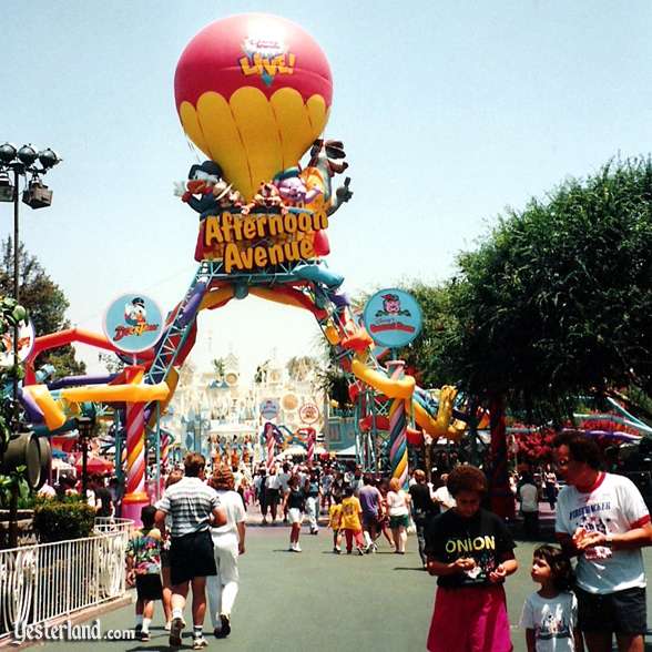
Generally speaking DLR's temporary installations are rarely expensive looking or elaborately detailed. For instance, does anyone else remember this atrocious IP promotion for Disney's syndicated cartoon shows back in the 90s?

afternoon2_cb.jpg


It featured the fabulous Motor Boat Cruise (To Gummi Glen) attraction. Just look at the feat of imagineering design in the ride's facade! :jawdrop:

gummiglen.jpg


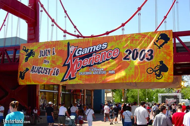
Moving on, who could forget the X Games Experience at DCA? :cry:

xgames_banner2003tm.jpg


:eek: Ugh.

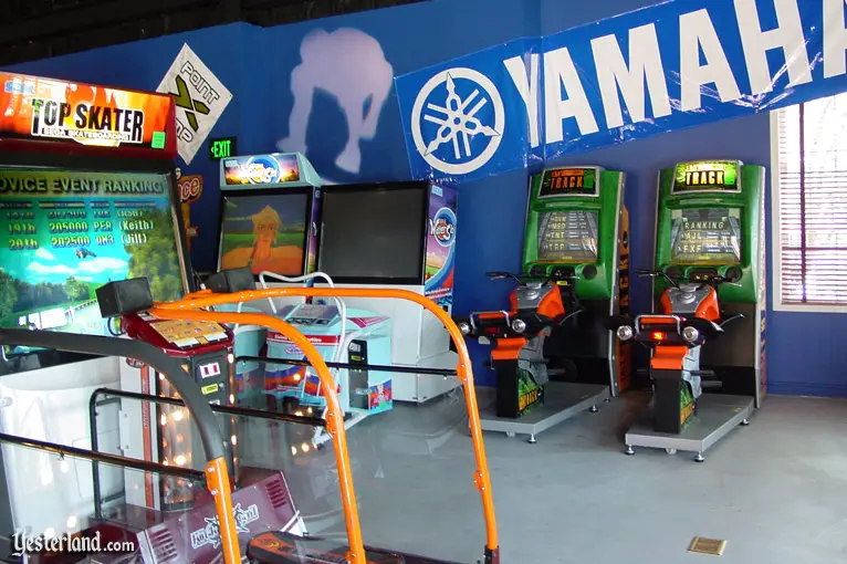
Check out thr interior of the Xcade arcade, located where Embarcadero Gifts is now.

xgames_insidexcade2003tm.jpg


Classy. :rolleyes:

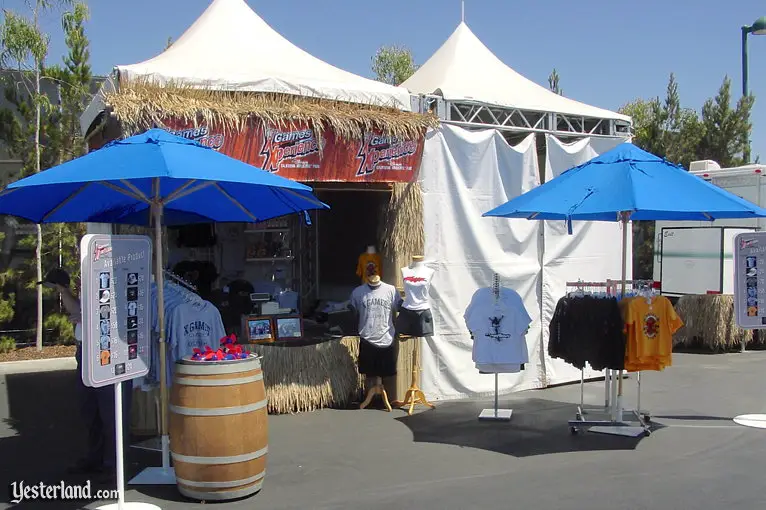
xgames_radical2003tm.jpg


There are plenty of examples of cheap looking IP overlays and decorations in the parks over the years. In comparison to the junk shown here the majority of Seasons of The Force looks well executed and will most likely satisfy anticipated demand for SW experiences as the brand goes through its resurgence.
 
Last edited by a moderator:

TP2000

Well-Known Member
Original Poster
If this were a tradeshow, traveling mall show, or D23... ok. But for DL? meh. The company seems motivated to do things.. but lacks ambition and creativity on what to actually do.

I know, I know. We all want some elaborate Audio-Animatronics spectacular scored by the Sherman Brothers to return to the Carousel Theater. But that type of entertainment hasn't been in that building in almost 30 years. Three decades. Half of the existence of Disneyland.

This is a very nice update and re-think of what was a temporary exhibit space upstairs. It looks much slicker, much more purposeful, much more thought out. And they spent some money on it too.

The kids under 20 love these Marvel guys, and the place is already packed with people on a slow November Monday afternoon. This is a good thing.

Or were you hoping for this upstairs space to return to its original Walt-approved and WED designed use from the 1960's; as a General Electric post-show display area where GE hostesses would thrill exiting audiences with scripted spiels about the latest in GE toaster ovens and air conditioners and hair dryers?
tumblr_m7orqgdV9o1rz4i0fo4_1280.jpg
 
Last edited:

Californian Elitist

Well-Known Member
You're right, the concept art was way better. It looked like more of an immersive themed environment. Even the stuff they did theme looks cheapy.

I honestly think this looks shoddy:

IMG_1192_1024x768.jpg


Not her skirt, which seems to be made from vintage 1980 Empire Strikes Back bed sheets, but the environment. I'm sure they're making dreams come true giving geeks the opportunity to meet Lord Vader and the suit is on point, but by Disney standards, that set looks cheap. Like something from a school play. It could've been better.

This looks incredibly cheesy.
 
D

Deleted member 107043

Or were you hoping for this upstairs space to return to its original Walt-approved and WED designed use from the 1960's; as a General Electric post-show display area where GE hostesses would thrill exiting audiences with scripted spiels about the latest in GE toaster ovens and air conditioners and hair dryers?

That was a thing? I always assumed the only thing up there back then was the Progressland model. Fascinating. Look at the hostess' spiffy white gloves! Tim Gunn would be so impressed.
 

Phroobar

Well-Known Member
The problem with Chewie is the mask is adds no dimension to the face. You can't see Chewie's eyes and their is too much hair. He looks more like Big Foot from the Six Million Dollar Man then Chewie. Looking at that picture, being Chewie is a pretty good gig if you can get it.
 

Register on WDWMAGIC. This sidebar will go away, and you'll see fewer ads.

Back
Top Bottom