
lazyboy97o
Well-Known Member
Cabana Bay Beach Resort would be an example of using the color panels to create a mid-century look.
That's an amazing photo of the US Science Pavilion! It's still there! ...and they haven't painted the panels all different colors.

My sincere apologies for giving you a hard time. I was being snarky, and I should not have been. You very much "get it" with regard to those two.Sorry I didn't explain my thoughts on that better. It just seems that MCM used to a certain extent the theme of "blocks" of color in the designs of the day. Sometimes the blocks were more like blobs or stripes but the pallet often included alternating or contrasting colors. I'm not sure if it was because of artists like Alexander Calder or Piet Mondrian and their vivid use of colors but to me it's something I notice was in vogue. So to me, the paint scheme on the Innoventions buildings makes me think of that period of design -- blocks of color -- that's all.
It's cool you are such an admirer of Mary Blair and Ray Eames. They are definitely worthy examples to study. There was recently an excellent exhibit on Ray Eames in Sacramento. Ray didn't seem to use as saturated colors as Mary but she had a wonderful sense of color combinations and I love the biomorphic shapes she used in her work. Here's an example of one of her paintings.
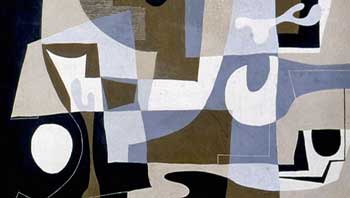
I also like this photo of Ray Eames with some tall stacking forms which I recall from the exhibit. They were a prototype for "The Toy".
View attachment 51532

Nah, it's not that sophisticated.So the future is a kaleidoscope of earth tones set against a carnival of 90s color signage?
I guess it does represent the chaos of our current state, but the future?
Yes it's all still there, and more related to current day Epcot than we may realize.
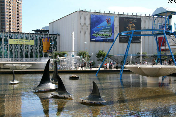
Have you been to the Seattle Center lately? It's brilliantly updated and modern in parts of the fairgrounds, but is really showing its age in others. The former US Science Pavilion, now the Pacific Science Center, desperately needs help. It needs a deep cleaning, a painting, moderate repairs to surfaces and pavements, and the removal of several layers of "FUN!" decorations and promo banners and random artwork and patio umbrellas and a Wheel Of Death and some dinosaurs (?!?) added from 1985 to 2010 in an attempt to attract the kiddies attention. Also the fountains don't work, cause water is so scarce in Seattle.
Compare the elegant cohesive look of the 1962 World's Fair, to the jumbled mess of today.
Seattle's Pacific Science Center is the saddest corner of the World's Fairgrounds to look at today because they just have no coherent design direction, a limited upkeep budget, and no one on staff who understands the brilliant purpose the facility had upon opening decades ago. Kind of like Epcot and Future World!
My sincere apologies for giving you a hard time. I was being snarky, and I should not have been. You very much "get it" with regard to those two.
It has been said that Mary Blair understood color as well as the great impressionists like Monet.
I feel they are doing this to Innoventions:
Wouldn't a retro paint job in the Blair/Eames style be wondrous?
So, kind of along with the paint job, I had a random thought this morning that involves a question maybe someone here may know the answer. Have there been large glass panels done with the same technology used on glasses with Transitions? I know one of the excuses they used for covering up the windows was because the inconsistent sunlight caused lighting issues with the exhibits and atmosphere inside. While in the brightest conditions that would activate the darkening of the glass using that technology, you can also generally see through the lens from the "outside," which would allow folks outside around the fountain the opportunity to see a bit what is going on inside while still providing a more controlled lighting situation inside. However it would also allow a more open feel to the space by allowing guests inside the buildings to see outside. Of course you then have to address the arrangement and setup of the exhibits, but maybe this would provide a workable solution? Heck, could the tinting be controlled electronically?


Personally, I am more of the camp that would prefer the buildings be understated as they were intended to be, remove the covers on all those windows, and allow the excitement to be created in other ways. Or even better, go Syd Mead "supersonic baroque" in the design. But that's just me.

More like metastasize.I'm going to miss the old color scheme, but maybe it's just a nostalgia thing. I'm sure the new color scheme will grow on me
Walt called EPCOT, “the heart of everything we’ll be doing in Disney World.”The website Da Mouse had a pretty thorough article on why the color scheme basically sucks. I'll have to find the link if I can link to that site. Not sure how that site is received here. I really never visit it but stumbled across it. I'd love to send it to whoever's in charge to remind them of what Epcot should be.
http://damouse.com/2014/04/20/disne...ed-paint-scheme-on-old-future-world-problems/The website Da Mouse had a pretty thorough article on why the color scheme basically sucks. I'll have to find the link if I can link to that site. Not sure how that site is received here. I really never visit it but stumbled across it. I'd love to send it to whoever's in charge to remind them of what Epcot should be.
Register on WDWMAGIC. This sidebar will go away, and you'll see fewer ads.