News Remy's Ratatouille Adventure coming to Epcot

Disnutz311

Disney World Purist
Are they really going to leave these backstage doors here like this???
How tacky!! Must have cost too much and our new CEO Chapstick said "nobody will notice"...
Remy.png
 

Soluna16

Well-Known Member
Are they really going to leave these backstage doors here like this???
How tacky!! Must have cost too much and our new CEO Chapstick said "nobody will notice"...
View attachment 452242

I've brought this up a few times in this thread and no one has ever responded to it so it seems no one cares.

That looks horrific and needs to be addressed but they painted around it so clearly it's not a concern.
 

Prototype82

Well-Known Member
The iron and glass canopy to divert the eye from seeing how close the Eiffel tower is was a pretty clever idea. I don't know how they're going to make those lightly-themed formerly backstage facades work though. It's gonna take some antiquing and weathering. Hopefully some awnings or other kinds of embellishments will come along. The windows were blown up in proportion just to be barely seen from a distance and the roofline visibly hangs off the edge when you are close to it. I'm surprised the entire walls weren't remodeled. I think they'll make it work... Just wondering how they will.
 

rkleinlein

Well-Known Member
Can you link or show the specific pictures or views that bugged you? I saw these pics a few pages back on this thread and I thought the theming looked good.
View attachment 452094
View attachment 452095
All of the buildings, including the ones posted here look fake, flat, and cartooney. I honestly can't think of any building in any of the theme parks that look this bad. Somebody else mentioned plastic buildings from a model railroad set; an apt description I think. Part of the problem is the stupid Crayola crayon color scheme. But mostly, the architectural design is not authentically French/Parisian looking. Everything is just sort of guessed at. Balance is off. Proprtions are wrong. Shutters don't fit the windows. What the heck is that arch held up by columns with a window with a vertical divider? One gets the sense that the designers didn't bother to look at French architecture let alone study it. I never really got that feeling when watching the cartoon or when walking around any of the pavilions in Epcot--which are successful and impressive blends of authenticity and fantasy. This looks ridiculous and is far below Disney standards.
 

lazyboy97o

Well-Known Member
Definitely they could do a better job with this but I give them a tentative pass for trying to retroactively make a backstage area look like a show area.

As for authentic vs toylike and crayola colors ... do you recognize these 2 locations?
View attachment 452466
View attachment 452467
Main Street, USA is not Marceline and that is even more so at the Magic Kingdom. Main Street, USA at the Magic Kingdom definitely has the problem looking plastic, because a lot of it is plastic. The same elevations at Disneyland Paris where they are realized with actual brick and wood are world’s better. Especially at Disneyland, the color palette of Main Street, USA has also brightened over the year, with each repaint skewing more towards a Painted Lady and away from the more earthy tones of the era.
 

The Empress Lilly

Well-Known Member
I am so confused as to why it was thought adding a random structure in the center of the new area was a good idea.

View attachment 452145
For interest's sake, the metal structure is a miniaturised pavilion of Baltard's Halles. Les Halles were a famous market in central Paris which stood from 1850's to 1971. They have already been copied once before in WS, but not in a fully realised form: the gift shop too is based on this model.

000859349_620x393_c.jpg


copie_de_dsc03133.jpg
 

Bocabear

Well-Known Member
I am totally with you on almost everything... If you look past the yellow building at the rest of the pavilion, it does feel more French and correct... but I agree this side corridor to the attraction should have had a facelift....and truly the architecture is baffling considering it could always be seen from International gateway...
 

rkleinlein

Well-Known Member
Definitely they could do a better job with this but I give them a tentative pass for trying to retroactively make a backstage area look like a show area.

As for authentic vs toylike and crayola colors ... do you recognize these 2 locations?
View attachment 452466
View attachment 452467

I don't understand the point you're making with these four photographs. An ugly, run-down, contemporary "small town" street compared to a Disney Main Street: what's the connection? And real Paris compared to Epcot? What I see is that the Disney Main Street is beautiful, painstakingly detailed, and lacks any blatant architectural errors. The new Disney version of Paris (unlike the original pavilion) looks fake because it lacks the attention to details and is full of errors. Look at the windows on Main Street and compare them to the windows in Epcot. Nobody complains that Disney Main Streets look fake because they are prettier, cleaner, and painted with brighter colors than a real turn of the century American Main Street ever was. Main Street is a successful balance of fantasy and authenticity. The problem is not that Disney's new Paris doesn't look EXACTLY like Paris. The problem is that it's ugly, clumsy design. (And it doesn't matter if this used to be backstage. It's not now.)
 
Last edited:

Josh Hendy

Well-Known Member
The new Disney version of Paris (unlike the original pavilion) looks fake because it lacks the attention to details and is full of errors.
While budget restraints are probably partly to blame, I believe that most of the problems are due to the fact that Disney is trying to retrofit a former backstage area that was never designed to be seen and critiqued by the public. Inevitably there is not enough space for a full 3D perspective effect, and things like service doors, ventilation ducts, dumpsters must be accommodated.

If I understand what is being done to France, all of this is to theme an area which guests will only view for less than 30 seconds as their skyliner approaches or leaves the International gateway. They won't be wandering around this area posing for pictures so the architectural lapses and other "bad show" can be forgiven. Likewise ... is the crowd overflow corridor behind the east side of Main Street also a little bit sketchy?

Speaking of which ... that "before" picture is Marceline, MI !!! 😁
 

lazyboy97o

Well-Known Member
While budget restraints are probably partly to blame, I believe that most of the problems are due to the fact that Disney is trying to retrofit a former backstage area that was never designed to be seen and critiqued by the public. Inevitably there is not enough space for a full 3D perspective effect, and things like service doors, ventilation ducts, dumpsters must be accommodated.

If I understand what is being done to France, all of this is to theme an area which guests will only view for less than 30 seconds as their skyliner approaches or leaves the International gateway. They won't be wandering around this area posing for pictures so the architectural lapses and other "bad show" can be forgiven. Likewise ... is the crowd overflow corridor behind the east side of Main Street also a little bit sketchy?

Speaking of which ... that "before" picture is Marceline, MI !!! 😁
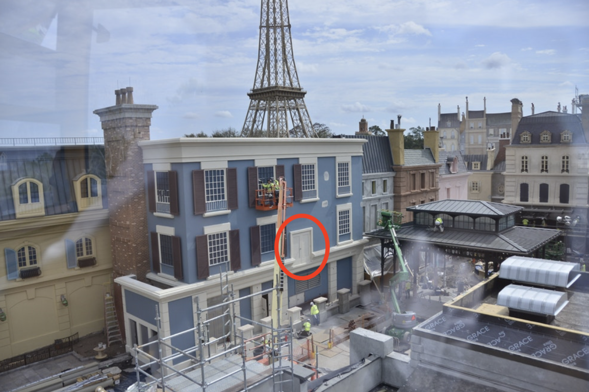
People will be walking in this area to get to Ratatouille and the new crêperie. Trying to just glue stuff into existing walls is the problem. They could have built out new walls that would have had room for some depth.
 

Josh Hendy

Well-Known Member
People will be walking in this area to get to Ratatouille and the new crêperie. Trying to just glue stuff into existing walls is the problem. They could have built out new walls that would have had room for some depth.
Ok thanks for this. I will be as harsh as anyone on this if the front stage show is bad.

Is there a map, layout or diagram anywhere of how Ratatouille etc will work?
 

Register on WDWMAGIC. This sidebar will go away, and you'll see fewer ads.

Back
Top Bottom