-
Welcome to the WDWMAGIC.COM Forums!
Please take a look around, and feel free to sign up and join the community.
You are using an out of date browser. It may not display this or other websites correctly.
You should upgrade or use an alternative browser.
You should upgrade or use an alternative browser.
EPCOT Remy's Ratatouille Adventure coming to Epcot
- Thread starter wdwmagic
- Start date
lazyboy97o
Well-Known Member
That is old but generally correct. The western most hatched area is restrooms on this plan and is now the crêperie. The restrooms now face the attraction at the end of the walkway. You have to walk around two backsides of the Impressions de France theater to get to the ride. Facades that were cheaply installed to improve the view when the International Gateway was built are being enhanced but not replaced so things like the yellow building will remain.
Josh Hendy
Well-Known Member
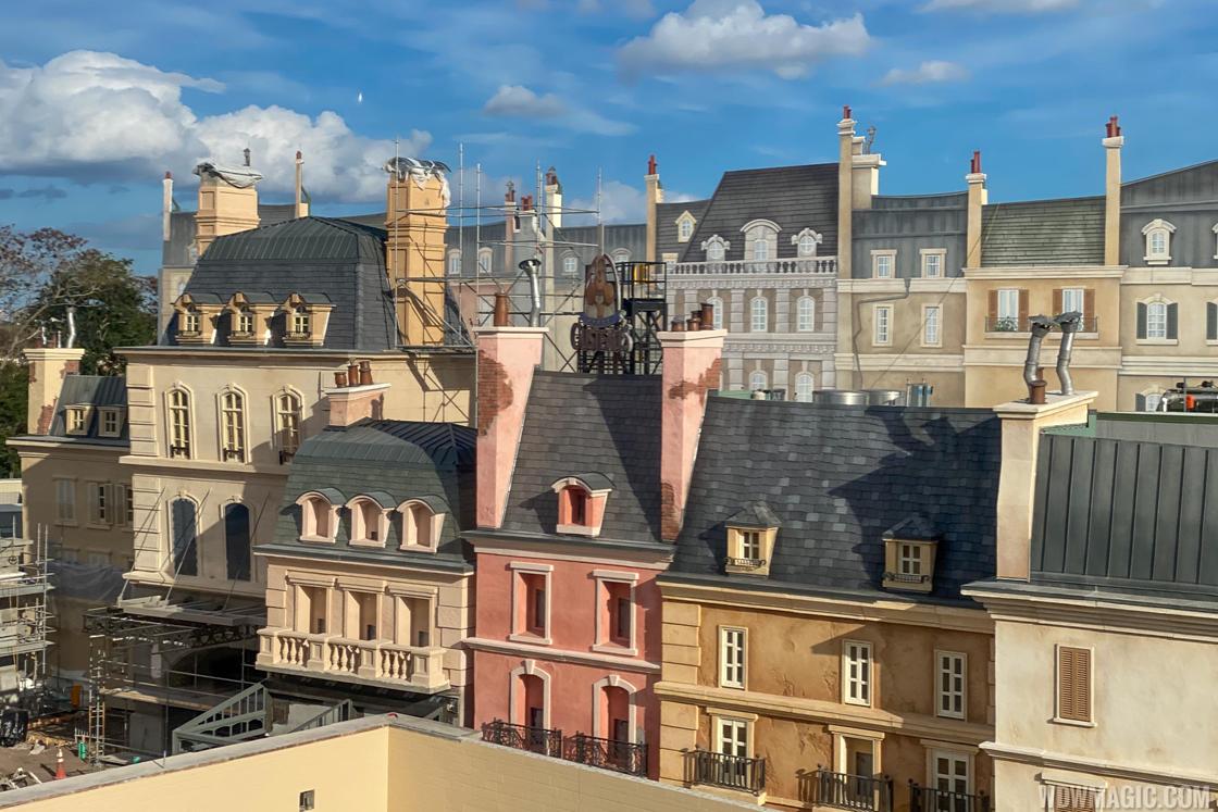
It appears that the 2D flats will only be visible from the skyliner. People approaching the ride will walk across the front of the 3D buildings and won't see the flats ... if I interpreted the diagram correctly.

lazyboy97o
Well-Known Member
The flats are behind the main entrance to the ride. You will see them as you turn the corner and first face the ride. They block the showbuilding which is taller than the queue building.It appears that the 2D flats will only be visible from the skyliner. People approaching the ride will walk across the front of the 3D buildings and won't see the flats ... if I interpreted the diagram correctly.
View attachment 452606
michmousefan
Well-Known Member
You'll still see some of the flats from the ground, but it will be background-level stuff, as designed. Of course, someone will post a telephoto photo from the ground depicting the obvious difference between the flats and the 3D facade and proclaim it a massive imagineering failure, but what are you going to do? You won't satisfy everyone.
Part of the issue may well be that flats have not been utilized in Epcot to much, if any extent. They are kinda new in this park.
Part of the issue may well be that flats have not been utilized in Epcot to much, if any extent. They are kinda new in this park.
Bocabear
Well-Known Member
Aside from DHS and their obvious ones on the "backlot" themed areas, Flats have not been used at all in the parks...You'll still see some of the flats from the ground, but it will be background-level stuff, as designed. Of course, someone will post a telephoto photo from the ground depicting the obvious difference between the flats and the 3D facade and proclaim it a massive imagineering failure, but what are you going to do? You won't satisfy everyone.
Part of the issue may well be that flats have not been utilized in Epcot to much, if any extent. They are kinda new in this park.
I think it is a new thing since Tokyo Disney Seas...
And honestly it's a cute solution... From where they are viewed they will look great... And it sure beats a sky blue visible show building...
Epcot82Guy
Well-Known Member
Unless they make some big changes, they are also very visible from the ground on the whole walk in the Park from International Gateway. At least as of Feb 1.
Missing20K
Well-Known Member
MrHappy
Well-Known Member
So can we hope for a May 1-10 opening?
2-3 week overlap with SSE.
Then we get a Tier 1 of Rat vs Frozen, Tier 2 of Soarin vs TT, Tier 3 of Other.
Not out of the question I would think. Seems like the Chapster is motivated to get this open ASAP - looks like lots of activity. No?
*please, please, please*
2-3 week overlap with SSE.
Then we get a Tier 1 of Rat vs Frozen, Tier 2 of Soarin vs TT, Tier 3 of Other.
Not out of the question I would think. Seems like the Chapster is motivated to get this open ASAP - looks like lots of activity. No?
*please, please, please*
Goofyque'
Well-Known Member
I would refer you back to the Norway threads where every layer of paint was met with pages and pages of hysteria.All of the buildings, including the ones posted here look fake, flat, and cartooney. I honestly can't think of any building in any of the theme parks that look this bad. Somebody else mentioned plastic buildings from a model railroad set; an apt description I think. Part of the problem is the stupid Crayola crayon color scheme. But mostly, the architectural design is not authentically French/Parisian looking. Everything is just sort of guessed at. Balance is off. Proprtions are wrong. Shutters don't fit the windows. What the heck is that arch held up by columns with a window with a vertical divider? One gets the sense that the designers didn't bother to look at French architecture let alone study it. I never really got that feeling when watching the cartoon or when walking around any of the pavilions in Epcot--which are successful and impressive blends of authenticity and fantasy. This looks ridiculous and is far below Disney standards.
JenniferS
When you're the leader, you don't have to follow.
Neither does the monorail, and people seldom complain about that for some reason.... and the skyline is not going to have perfect views ever!
PeopleMover too, come to think of it.
gmajew
Premium Member
or splash mountain. Can see all the old roof tops and ac units.Neither does the monorail, and people seldom complain about that for some reason.
PeopleMover too, come to think of it.
lazyboy97o
Well-Known Member
What attraction was placed to improve Monorail views?Neither does the monorail, and people seldom complain about that for some reason.
PeopleMover too, come to think of it.
Josh Hendy
Well-Known Member
Yeah the green is puzzling ... maybe they're planning to put trees in front of it.I like that they painted the building and facade supports go-away-green to blend in with the green sky. Very smart.
lazyboy97o
Well-Known Member
No room. There is a road running parallel to the showbuilding and a drainage ditch next to that. Trees also wouldn’t help with the view from in front of the pavilion.Yeah the green is puzzling ... maybe they're planning to put trees in front of it.
Josh Hendy
Well-Known Member
From the back it looks like they have space for trees, from the front I don't know what they're planning.No room. There is a road running parallel to the showbuilding and a drainage ditch next to that. Trees also wouldn’t help with the view from in front of the pavilion.
lazyboy97o
Well-Known Member
Those are detention ponds.From the back it looks like they have space for trees, from the front I don't know what they're planning.
View attachment 452873
View attachment 452874
Register on WDWMAGIC. This sidebar will go away, and you'll see fewer ads.

