Ponderer
Well-Known Member
I never had to look at a Buick in my resort hotel room. Except for that one time… but I can’t blame them for making a wrong turn.
Heh. I can find you a room with a Porsche at Art of Animation.
I never had to look at a Buick in my resort hotel room. Except for that one time… but I can’t blame them for making a wrong turn.
They literally changed Figment’s color because Kodak was upset that he had Fuji’s color. The Making Memories song was a defacto jingle for them too. Marty Sklar said they were developing a pavilion specifically to highlight GE and the “GE Style”, which became Horizons. Corporate sponsorship and integration was literally in the DNA of at least Future World. And God knows it was all over Disneyland, Walt’s baby.
View attachment 573366
View attachment 573367
View attachment 573368
View attachment 573369
View attachment 573370
View attachment 573371
And let's not forget that Figment is purple because Kodak requested he be changed from Fuji films green, and that his sweater is yellow and red to match Kodak.
In use today.
using decor/furniture that some feel is more trend and flash vs. timeless and substance.
The rooms have always been "of the period" and more trend. I'll put some old room photos below from Tikiman's Facebook page as examples showing how not timeless the rooms have always been. I liked what was just replaced and also like the new. What's now won't exist forever either and will eventually be replaced by the next designs of the next period.
View attachment 573394View attachment 573395View attachment 573396View attachment 573397View attachment 573398View attachment 573399View attachment 573400
View attachment 573393
I can practically smell the cigarette smoke just by the looks of those rooms
I saw those photos and immediately imagined my grandma sitting in the room with a cigarette in her hand.I can practically smell the cigarette smoke just by the looks of those rooms
I saw those photos and immediately imagined my grandma sitting in the room with a cigarette in her hand.
It sure looks like that. It completely takes away from the illusion that the roof is thatched. Makes even less sense considering most people will see the underside more than the top or sides.So... I guess they're just going to leave the underside the way it is? That's unfortunate.
Because the theme of the Polynesian is not actually the South Pacific.Why is it great for Aulani, but not the Polynesian? They're the same price point and service level.
It looks to me like @Sir_Cliff might've been right and I was wrong. In those images, it looks like it's a tan or cream color rather than a bare factory finish, so it may have already been painted. If so, I think this color is less effective than the darker golds and burnt oranges used for the undersides of similar structures elsewhere in the resort.So... I guess they're just going to leave the underside the way it is? That's unfortunate.
I generally was not a fan when they were announced and photos were released but seeing it on videos has changed my mind a bit. It is better, IMO, to get this instead of the bland rooms we’ve been seeing in the past decade.
+ extra points for hidden Mickeys
It’s not painted. It’s a factory finish and those can come in all sorts of colors.It looks to me like @Sir_Cliff might've been right and I was wrong. In those images, it looks like it's a tan or cream color rather than a bare factory finish, so it may have already been painted. If so, I think this color is less effective than the darker golds and burnt oranges used for the undersides of similar structures elsewhere in the resort.
It looks to me like @Sir_Cliff might've been right and I was wrong. In those images, it looks like it's a tan or cream color rather than a bare factory finish, so it may have already been painted. If so, I think this color is less effective than the darker golds and burnt oranges used for the undersides of similar structures elsewhere in the resort.
I agree with this 1000% - the awful Contemporary room updates makes me more grateful the Polynesian got the better of the room refurbishments ( and a vastly improvised arrival as well)I don't love these Moana rooms (the rooms at Universal's Royal Pacific are better for something with a relatively similar theme), but the Incredibles reveal at the Contemporary went a long way towards making them look great. The Incredibles rooms are terrible.
It seems the kind of roof they're referring to is actually fashioned in this way, with a thin layer of thatching over a base of close-set planks:It completely takes away from the illusion that the roof is thatched.

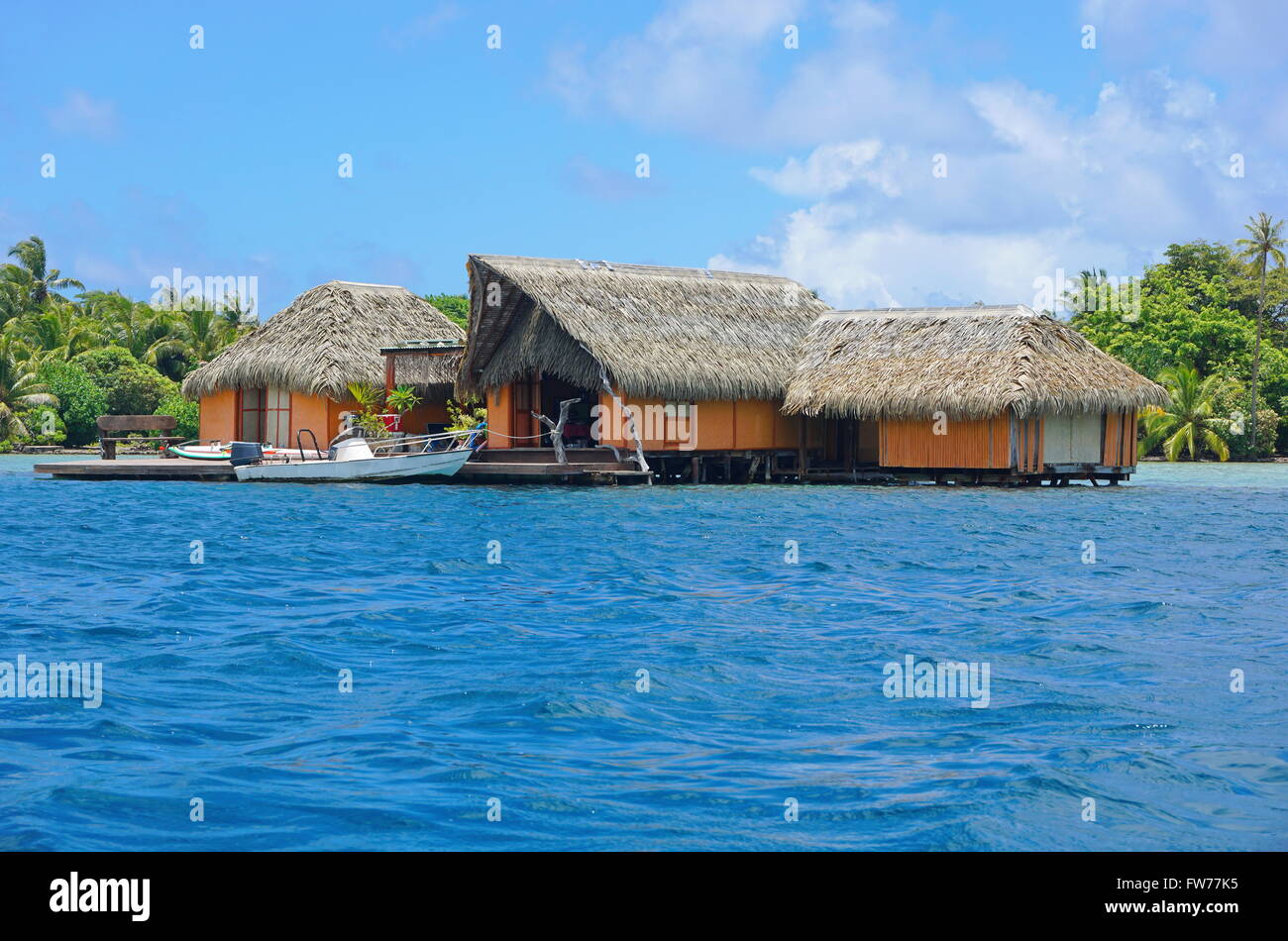
I generally was not a fan when they were announced and photos were released but seeing it on videos has changed my mind a bit. It is better, IMO, to get this instead of the bland rooms we’ve been seeing in the past decade.
+ extra points for hidden Mickeys
I feel like you both completely missed my point; none of this disagrees with what I said. Yes, the pavilions were sponsored. But the attractions themselves had little advertising whatsoever (except Universe of Energy and Magic Journeys, I guess, if you want to call Making Memories a Kodak ad). Even the post show areas were mostly free of overt advertising, with a couple of exceptions. Also, Making Memories had nothing to do with Journey into Imagination. It was part of a separate attraction.
The pavilions (again, with the exception of original Universe of Energy, to an extent) almost never functioned as an outright commercial for their sponsor. Most people who visited EPCOT would not have even been able to tell you who sponsored any of the pavilions -- especially based on the attractions -- because it was so in the background. That's also why some of them were able to switch sponsors without really having to change anything.
Corporate sponsorship is not remotely the same thing as a "nonstop commercial". I would love to have corporate sponsorship back if it meant they would build attractions and post show areas like they built at EPCOT, though.
EDIT: As for the Figment thing -- I don't really get your point. That shows that the corporations were involved (which should be obvious) but it really has nothing to do with being an advertisement. It's not like Figment was branded with the Kodak logo; his color scheme didn't tell guests, "This is Kodak; go buy Kodak!" which is why they haven't needed to change anything about his design.
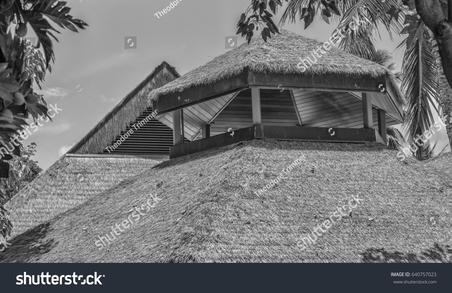
It seems the kind of roof they're referring to is actually fashioned in this way, with a thin layer of thatching over a base of close-set planks:


Polynesian Thatched Grass Roof Wooden Struts Stock Photo 640757023 | Shutterstock
Find Polynesian Thatched Grass Roof Wooden Struts stock images in HD and millions of other royalty-free stock photos, 3D objects, illustrations and vectors in the Shutterstock collection. Thousands of new, high-quality pictures added every day.www.shutterstock.com


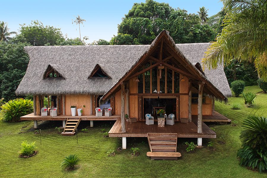
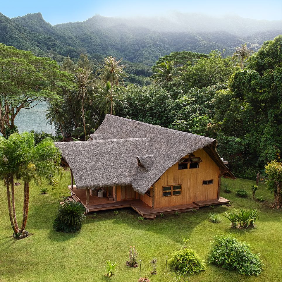
Escape to French Polynesia in style
Offering the luxury of seclusion without compromising on style, discover the real French Polynesia at an exclusive private rental on the island of Taha'awww.fabricmagazine.co.uk
Register on WDWMAGIC. This sidebar will go away, and you'll see fewer ads.