-
The new WDWMAGIC iOS app is here!
Stay up to date with the latest Disney news, photos, and discussions right from your iPhone. The app is free to download and gives you quick access to news articles, forums, photo galleries, park hours, weather and Lightning Lane pricing. Learn More -
Welcome to the WDWMAGIC.COM Forums!
Please take a look around, and feel free to sign up and join the community.
You are using an out of date browser. It may not display this or other websites correctly.
You should upgrade or use an alternative browser.
You should upgrade or use an alternative browser.
Planet Hollywood unveils redesign for Disney Springs
- Thread starter roj2323
- Start date
JEANYLASER
Well-Known Member
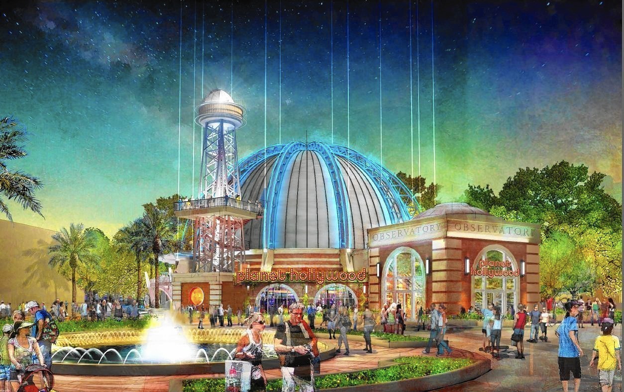
I love the concept art of the new Planet Hollywood and I can't wait for Nov 2016! What is the website for Planet Hollywood?
dstrawn9889
Well-Known Member
well, let me google that for you...I love the concept art of the new Planet Hollywood and I can't wait for Nov 2016! What is the website for Planet Hollywood?
http://planethollywoodintl.com/locations/orlando/
halltd
Well-Known Member
That's six months of work, and it appears just from walking by that most of the interior demo (and a lot of the exterior) is already complete. So, that seems feasible to me. Tight, but feasible. At least they don't have to rely on strange site access to the building like say, the MK hub.The pic someone posted from March 8 really doesn't speak to me that PH will be ready for a Summer 2016 open date. The entire outside looks like crap, compared to what the concept art says it will look like. Unless all they will do is put on a fresh coat of paint.
The new renderings are sweet! I love to see that the exterior space survived!
*Q*
Well-Known Member
From the planet hollywood website.
I laugh at the idea that there will be no hand railings along the water.
WDWtraveler
Well-Known Member
Photo update as of Tuesday, March 15. The Planet Hollywood ball on top of the tower has been partially removed.

Miss Heinous
Well-Known Member
I hope it will look better when it's finished because the concept art for the interior looks really boring.
JEANYLASER
Well-Known Member
Awesome! I can't wait to eat at the Planet Hollywood Observatory in Nov 2016!
DisneyJeff
Well-Known Member
- In the Parks
- No
I personally like the look of the original concept art over the new version. I prefer the look of the observation tower and the "Observatory" entrance way. Although both are a vast improvement over the old Planet Hollywood ball.


Adam N
Well-Known Member
Technically they're two different angles. The first is a few from Orange Garage and the second is the backside... Probably from the spring by STK. So I believe that the brick observatory entrance is still in the works.I personally like the look of the original concept art over the new version. I prefer the look of the observation tower and the "Observatory" entrance way. Although both are a vast improvement over the old Planet Hollywood ball.


Disneyhead'71
Well-Known Member
What? You need more than Edward and Bella?I hope it will look better when it's finished because the concept art for the interior looks really boring.
jensenrick
Well-Known Member
View attachment 134089 There's an interior rendering on the Planet Hollywood website too.
(*GASP*) So many screens!
articos
Well-Known Member
It is.Technically they're two different angles. The first is a few from Orange Garage and the second is the backside... Probably from the spring by STK. So I believe that the brick observatory entrance is still in the works.
WDWtraveler
Well-Known Member
Photo update as of Tuesday, March 22.

JEANYLASER
Well-Known Member
I love the pictures thanks for sharing! WDWtraveler!
JordanKing
Active Member
The outside of this building really looked terrible. Revamp is much needed.
JohnWD
Well-Known Member
It's been bad a long time. We ate there a long time ago, and we were not impressed with the interior or food either. Maybe we will be lured back.... The concept art looks nice!The outside of this building really looked terrible. Revamp is much needed.
WDWtraveler
Well-Known Member
Photo update as of Thursday, May 5. Structural steel going up for the observatory building in front of Planet Hollywood.

Register on WDWMAGIC. This sidebar will go away, and you'll see fewer ads.
