-
The new WDWMAGIC iOS app is here!
Stay up to date with the latest Disney news, photos, and discussions right from your iPhone. The app is free to download and gives you quick access to news articles, forums, photo galleries, park hours, weather and Lightning Lane pricing. Learn More -
Welcome to the WDWMAGIC.COM Forums!
Please take a look around, and feel free to sign up and join the community.
You are using an out of date browser. It may not display this or other websites correctly.
You should upgrade or use an alternative browser.
You should upgrade or use an alternative browser.
DHS PizzeRizzo announced for Disney's Hollywood Studios - Was: Rumor: Pizza Planet/Mama Melrose closing?
- Thread starter WhatJaneSays
- Start date
DisneyFan33
New Member
If you study art and the use of complimentary colors there is a very specific reason for the use of red and green. Using the color green within the red because they are complimentary colors you can read it but your eye is visually drawn only to the white to read Pizza Planet which of course paying a compliment and reminder of what came before. There are very specific reason for the theming choice and colors on every item.My only issue with it is that it's hard to read the whole sign. 'The', 'Best', and 'on the' is hard to read, and should probably be repainted.
Princess Leia
Well-Known Member
I'm not saying they look bad, I just think some of the letters need to be touched up.If you study art and the use of complimentary colors there is a very specific reason for the use of red and green. Using the color green within the red because they are complimentary colors you can read it but your eye is visually drawn only to the white to read Pizza Planet which of course paying a compliment and reminder of what came before. There are very specific reason for the theming choice and colors on every item.
Bacon
Well-Known Member
If the reviews are harsh ill go in sit down and have a coca-colaI just hope the food is much better and not as disgusting looking as Pizza Planet did.
Last edited:
danlb_2000
Premium Member
If you study art and the use of complimentary colors there is a very specific reason for the use of red and green. Using the color green within the red because they are complimentary colors you can read it but your eye is visually drawn only to the white to read Pizza Planet which of course paying a compliment and reminder of what came before. There are very specific reason for the theming choice and colors on every item.
Or it was just the colors they had laying around in central shops.
DisneyFan33
New Member
Same green throughout the whole sign specific to that job. Also notice the knod to the ears on the A's that ties to the green aliens from Toy StoryOr it was just the colors they had laying around in central shops.
danlb_2000
Premium Member
Same green throughout the whole sign specific to that job. Also notice the knod to the ears on the A's that ties to the green aliens from Toy Story
I was being sarcastic.
KikoKea
Well-Known Member
I'm with you. Ate there once and never went back. HS needs better QS options, so hope they go with a good quality product and a variety of non-pizza options.I just hope the food is much better and not as disgusting looking as Pizza Planet did.
DlpPhantom
Well-Known Member
It was always supposed to be this.This building already just 'feels better' as PizzeRizzo than pizza planet. It's like it was always meant to be this...can't wait to see inside!
Weather_Lady
Well-Known Member
DH and I are huge Muppets fans -- I think we're as excited to see PizzeRizzo as we are about any of the new attractions that have debuted since we last visited (e.g., Frozen Ever After, 7DMT). We plan to have lunch there in November, no matter how bad the reviews might be once it opens. If the food is good, we win! If the food is terrible -- well, we can spend some extra quality time at Gonzo's Royal Flush. (How weird is it that a set of bathrooms is on our to-do list for Disney!??! It's not the first time either (e.g., Tangled restrooms).
Bacon
Well-Known Member
Same green throughout the whole sign specific to that job. Also notice the knod to the ears on the A's that ties to the green aliens from Toy Story
SpaceMountain77
Well-Known Member
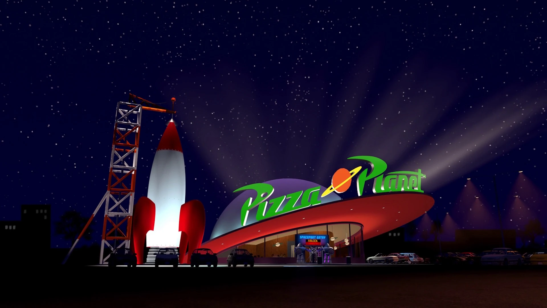
Why does Pizza Planet appear on the right of the sign over the main entrance?
There is always homage to what was in that spot previously. Maybe this is that homage.Why does Pizza Planet appear on the right of the sign over the main entrance?
brb1006
Well-Known Member
The salads also looked disgusting and this is coming from a person who's seen better and edible looking salads from my cousin's place.I'm with you. Ate there once and never went back. HS needs better QS options, so hope they go with a good quality product and a variety of non-pizza options.
SpaceMountain77
Well-Known Member
There is always homage to what was in that spot previously. Maybe this is that homage.
Yes, but this is not subtle. A previous name shares an entrance sign with a reimagined restaurant.
brb1006
Well-Known Member
And while Planet Hollywood in DS is not an arcade. It's as close as we can get to an actual "Pizza Planet" that looks decent.Props to Imagineering for taking Pizza Planet and giving us lemonade. Awesome upgrade from a theming disaster by previous management.
This makes up for potentially losing Star Tours. IMO.


Pam Hates Penguins
Well-Known Member
There is always homage to what was in that spot previously. Maybe this is that homage.
HISTORY
J. D.
Well-Known Member
Since when do the Muppets do anything subtle? Besides, it says "the best PIZZA on the PLANET."Yes, but this is not subtle. A previous name shares an entrance sign with a reimagined restaurant.
Register on WDWMAGIC. This sidebar will go away, and you'll see fewer ads.
