-
Welcome to the WDWMAGIC.COM Forums!
Please take a look around, and feel free to sign up and join the community.
You are using an out of date browser. It may not display this or other websites correctly.
You should upgrade or use an alternative browser.
You should upgrade or use an alternative browser.
PHOTOS - Temporary store to open during a major update to World of Disney at Disney Springs
- Thread starter wdwmagic
- Start date
Nick Pappagiorgio
Well-Known Member
I'm going to go against the majority and say I really like the new look. I think it fits better with the style of Disney Springs (which I personally really like), and this type of store lets the merchandise be more the star of the show.
Another big plus is that the open layout lets you see everything on offer, rather than dealing with those little crowded rooms.
Functionally it should be a massive improvement. It also should cut down on the people, like me, that wander through the store every trip but rarely buy anything at WoD. There is nothing to look at other than the merch.
smile
Well-Known Member
do admit, i like it better than the 'plastered crap everywhere' motif...
but is it wrong to expect this location at this location to entertain just a pinch?
nothing screams disney difference louder than perusing wares in corporate store #3814384, is all
but, i suppose...

but is it wrong to expect this location at this location to entertain just a pinch?
nothing screams disney difference louder than perusing wares in corporate store #3814384, is all
but, i suppose...
... that's what the gates are forThere is nothing to look at other than the merch.

Last edited:
Donaldfan1934
Well-Known Member
I can see why making the layout more open and accessible was necessary, but the store was just fine aesthetically speaking. And since a vast majority of the cost was spent on the latter, it was indeed a colossal waste.Except it's not a waste. The old store was a colossal disaster and deserved to be destroyed forever. This is Disney doing us all a service by making the store more easily accessible and less offensive on the senses
note2001
Well-Known Member
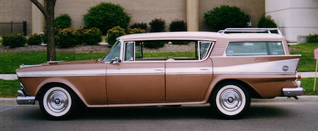
You're right. I see no reason why we should ever move forward for aesthetic reasons alone. I mean, those tail fin cars worked fine and they were very fashionable in the 50s.I can see why making the layout more open and accessible was necessary, but the store was just fine aesthetically speaking. And since a vast majority of the cost was spent on the latter, it was indeed a colossal waste.
Just leaving this here:
Last edited:
I am Timmy
Well-Known Member
OMG. That looks like a spaceship. I want one.You're right. I see no reason why we should ever move forward for aesthetic reasons alone. I mean, those tail fin cars worked fine and they were very fashionable in the 50s.
Just leaving this here:
disney4life2008
Well-Known Member
Tragic
Uncle Lupe
Well-Known Member
Agree!Maybe I look at this store from a child's mind because as a child, seeing the beautiful colors, sparkling lights, wonderful stained glass of classic stories made you feel like you were on a quest or an adventure of some sort regardless of it being a store. That's what I meant that it felt Disney.
Now? If I were a child and my mother took me here, I would feel like I was just at any other mall. There's no story. There's no sparkle.
But then I guess this store is mainly for adults now anyway...
I wish I would have filmed more of my child's wonder and amazement. You should get a feeling of excitement from the store, as much as from the merchandise that translates to sales. Retail-tainment is a way to engage shoppers both actively and passively.
Wish I could take her back right know to see what her reaction would be to the new design.
Donaldfan1934
Well-Known Member
I can't tell if you're being sarcastic or not because that car actually does look very cool.You're right. I see no reason why we should ever move forward for aesthetic reasons alone. I mean, those tail fin cars worked fine and they were very fashionable in the 50s.
Just leaving this here:

Are you nuts?!The new store looks amazing. I'm so glad Disney is doing away with that horrendous and tacky and truly ugly design of the original...it literally deserved to be burned down. This new design fits the vibe of the incredible Disney springs!! Way to go to who ever approved this 're imagining!!!!!!
Nick Pappagiorgio
Well-Known Member
You're right. I see no reason why we should ever move forward for aesthetic reasons alone. I mean, those tail fin cars worked fine and they were very fashionable in the 50s.
Just leaving this here:

Because new designs never miss the mark. I'm looking at you Pontiac Aztek.
I am Timmy
Well-Known Member
But, look at all that trunk space!Because new designs never miss the mark. I'm looking at you Pontiac Aztek.
KBLovedDisney
Well-Known Member
Alright WoD. I will give you the benefit of a doubt because after seeing all of the light locations and scrim covers, I'm getting a vibe that they may be doing something like they did for one of their cruise ship restaurants and add a color change effect to the place, or something along those lines. But that is just my guess, I just hope we haven't lost the Disney feeling to SodoSopa overall.
World of Disney WAS our favorite store. Such a beautiful store. We made sure to go to Disney springs just for it..which ended in us spending much more money everwhere else...And well now I feel like I can just head over to the outlet mall if I want to shop at a warehouse.
I remember when they gave this away to contestants on survivor! HahahaBut, look at all that trunk space!I can't turn my suv into a tent. Honestly, I didn't even know this existed until you mentioned it, lol. It is hideous.
Parrain
Active Member
The World of Disney store was recently renovated, and there are reports that a lot of the whimsy has been removed, causing some "Disney Fanatics" to react in a manner that some may feel is irrational.
I agree that the World of Disney store was in need of updates, as the floor plan did not facilitate an efficient shopping experience for the traffic it attracted. However, the over-the-top Disney theming, especially the intricate whimsical creations hanging from the ceiling, made this a destination store. My family and I spent a lot of time looking up at the ceiling and marveling at the over-the-top works of art. We looked forward to that experience. Per the posted pictures I have seen so far, the store now appears similar to most above average department stores that one finds in any nice shopping mall. I doubt my family will experience that Disney inspired excitement (get their "Disney fix") from walking into the store I have seen in the pictures, but the optimist in me is hoping that we will be pleasantly surprised. I also hope that this is only "step one" of an ongoing renovation, and there is more Disney Imagineering to come.
We will stop in to see on our next trip. If it no longer conveys the magic we expect, we will limit our visits to when we are in need of specific things or in passing while in Disney Springs, but this will not be a must-do for us anymore.
To all who are dismissing the reactions of some of us Disney fanatics, let me put this into perspective with a comparison I believe most can relate to:
Imagine if you will, Disney removing the large Walt Disney World arches with Mickey on one side and Minnie on the other, and replacing them with more conventional/modern markers, similar to what you might see near the entrance to an exclusive, upscale gated community. Now remember how your family feels and reacts upon arrival to the World when driving under the current arches, then imagine how your family would feel and react if driving past some brick and marble markers instead.
And by the way, we are ALL Disney fanatics who come to WDW for ALL of the magic it brings, or we wouldn't be reading this, right?
What say you? Have you seen the newly renovated store, and do you feel the "magic" was diminished?
hpyhnt 1000
Well-Known Member
^Sure to be an unpopular opinion but... I think the WDW entrance arches could use a makeover. They're stuck in a very 90s aesthetic, especially the colors, though it does mean they compliment the road signs throughout the property. Something more updated and modern wouldn't necessarily be a bad thing.
In terms of the remodeled WoD store, it's not done yet. I happen to like the new look so far. But can't we at least wait until the end of 2018 once it is "complete?"
Also, Disney has gotten into a habit of opening guest areas ASAP even if final theming and details aren't yet in place. The Market at Ale and Compass at the Yacht Club is just one example. It was derided upon opening for being stark with no details or anything on the walls. But more were added in the months that followed:
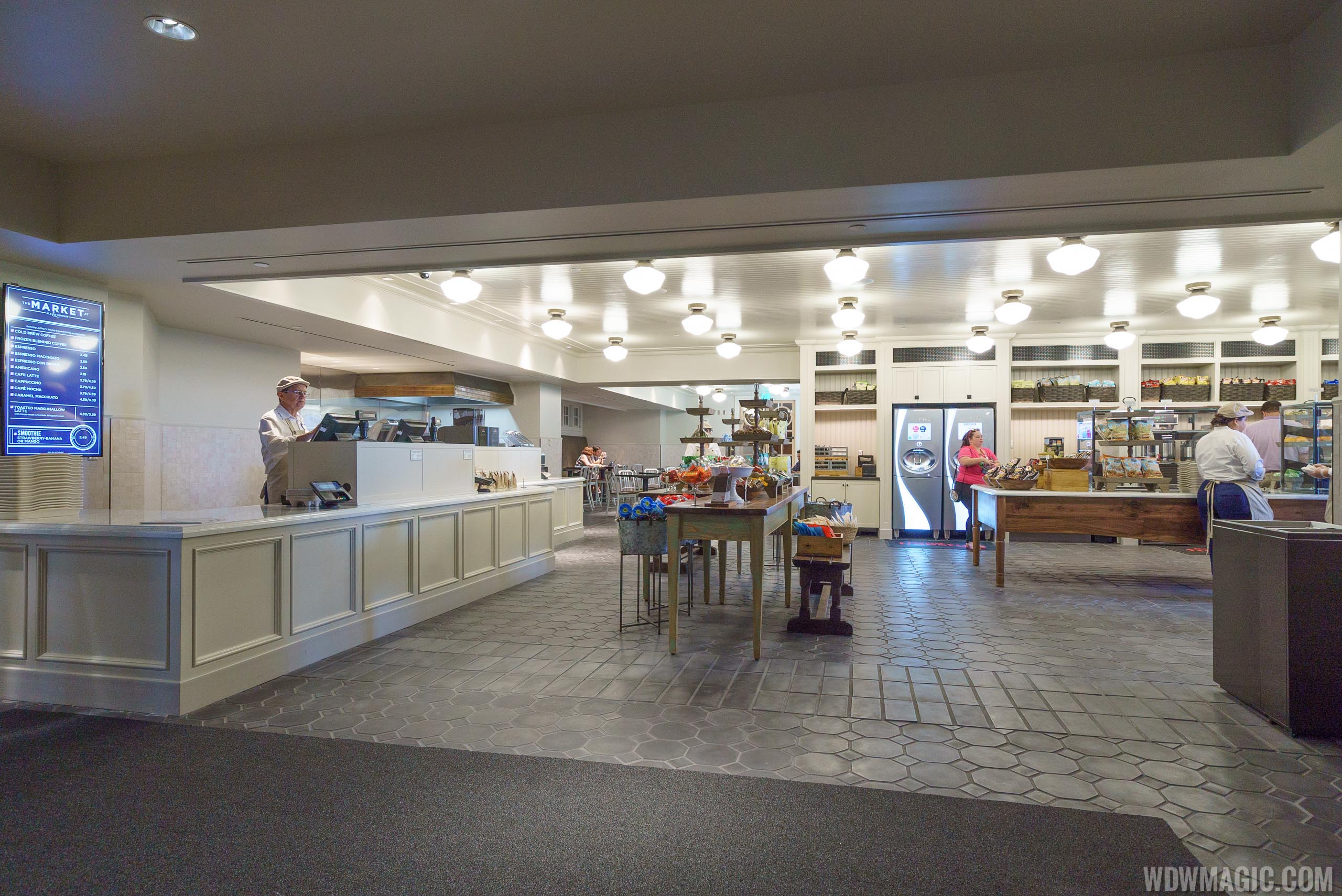
Order area BEFORE (note the plain white register screens and blank wall behind the counter):
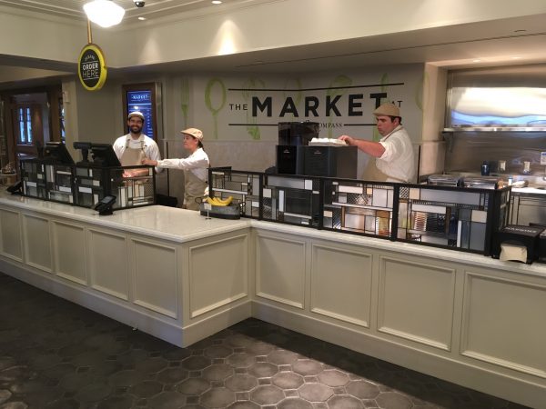
Order area AFTER (now with stylized transparent screens and wall graphic behind the counter, and an "Order Here" sign with I think a complimenting "Pick-up Here" sign just out of frame):
Seating area BEFORE (all blank walls):
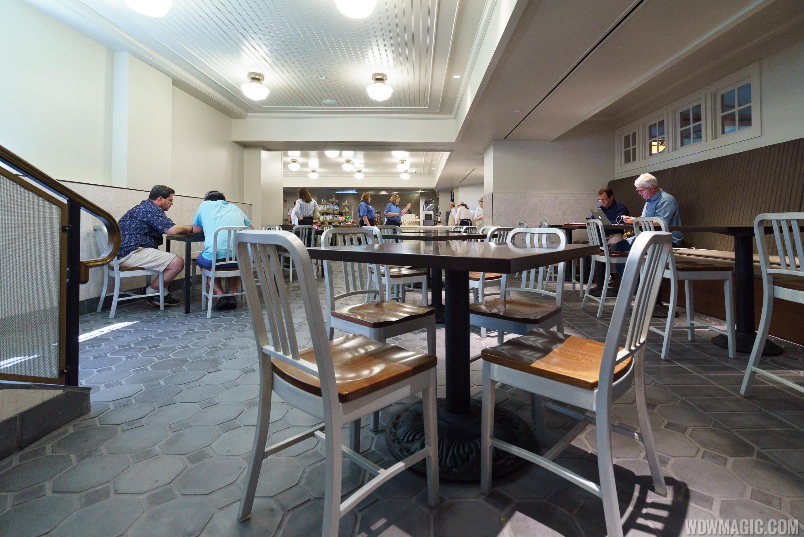
Seating area AFTER (continuation of the full wall graphics from the order counter):
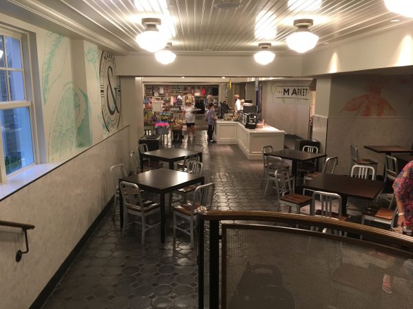
Now, is it the most "Disney" look in the world? No, so that could still be a criticism for some. But the area is certainly not as plain as it was on opening day.
At any rate, The Market shows that Disney often adds additional details in the weeks and months after something opens. We could very well see "Disney" touches re-added to WoD, perhaps with murals or framed pictures or animation sketches or hanging props. Let's just wait and see for the moment. At least the store is brighter and easier to wander through now, a big improvement in my opinion over the previous iteration.
(After pics from https://allinwdw.com/2017/09/28/dining-recon-the-market-at-ale-compass-tons-of-food-pics/)
In terms of the remodeled WoD store, it's not done yet. I happen to like the new look so far. But can't we at least wait until the end of 2018 once it is "complete?"
Also, Disney has gotten into a habit of opening guest areas ASAP even if final theming and details aren't yet in place. The Market at Ale and Compass at the Yacht Club is just one example. It was derided upon opening for being stark with no details or anything on the walls. But more were added in the months that followed:
Order area BEFORE (note the plain white register screens and blank wall behind the counter):

Order area AFTER (now with stylized transparent screens and wall graphic behind the counter, and an "Order Here" sign with I think a complimenting "Pick-up Here" sign just out of frame):

Seating area BEFORE (all blank walls):

Seating area AFTER (continuation of the full wall graphics from the order counter):

Now, is it the most "Disney" look in the world? No, so that could still be a criticism for some. But the area is certainly not as plain as it was on opening day.
At any rate, The Market shows that Disney often adds additional details in the weeks and months after something opens. We could very well see "Disney" touches re-added to WoD, perhaps with murals or framed pictures or animation sketches or hanging props. Let's just wait and see for the moment. At least the store is brighter and easier to wander through now, a big improvement in my opinion over the previous iteration.
(After pics from https://allinwdw.com/2017/09/28/dining-recon-the-market-at-ale-compass-tons-of-food-pics/)
To all who are dismissing the reactions of some of us Disney fanatics
The first step to recovery is admitting you have a problem.
KBLovedDisney
Well-Known Member
But you're here tooThe first step to recovery is admitting you have a problem.

TwilightZone
Well-Known Member
I for one don't care for store makeovers. I care more about ride quality.
Though ride quality is subjective, I'd say I draw the line when an attraction is done REALLY cheaply, like incredicoaster.
Though ride quality is subjective, I'd say I draw the line when an attraction is done REALLY cheaply, like incredicoaster.
Register on WDWMAGIC. This sidebar will go away, and you'll see fewer ads.
