-
Welcome to the WDWMAGIC.COM Forums!
Please take a look around, and feel free to sign up and join the community.
You are using an out of date browser. It may not display this or other websites correctly.
You should upgrade or use an alternative browser.
You should upgrade or use an alternative browser.
PHOTOS - Temporary store to open during a major update to World of Disney at Disney Springs
- Thread starter wdwmagic
- Start date
KBLovedDisney
Well-Known Member
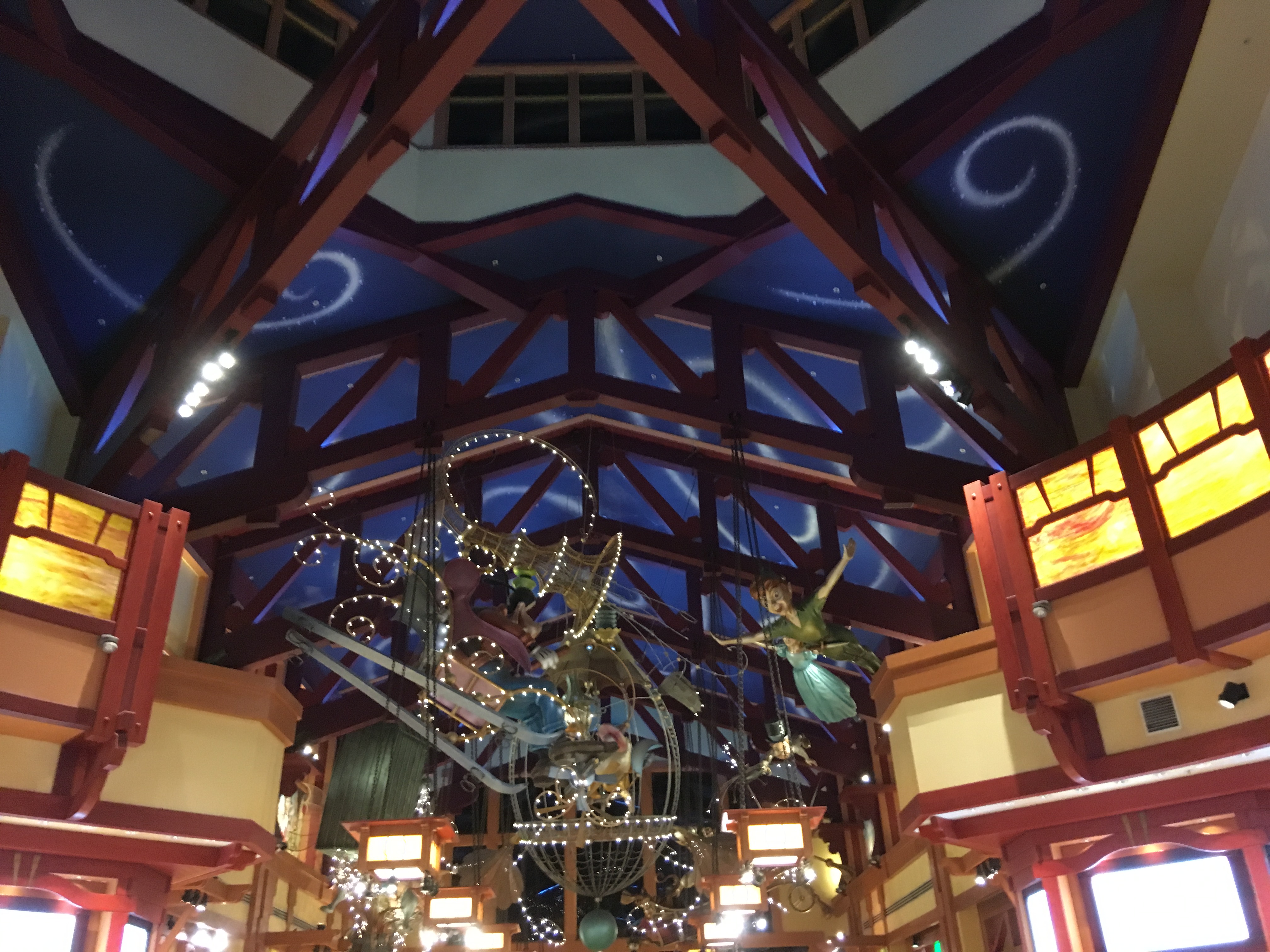
And the bright and dark contrasting colors with lighting. This was such a work of art.I really miss the character figurines on the ceiling.


jaklgreen
Well-Known Member
I honestly have no idea what you think Disney is. Because as far as I’m aware, Disney is fantasy. Baroque. Excessive. Even Disney locations meant to invoke the real world - Frontierland, say, or the AKL, do so in a way that exaggerates. It’s all hyperreality. It’s a place outside the real.
It is not sleek or minimalist. It’s not Apple. It’s not faux-industrial. It’s not the lifestyle center that can be found in every upscale suburb. It isn’t subdued or ashamed to be themed.
And Disney shouldn’t be a follower. It shouldn’t be looking at chain hotels or fancy malls and imitating that style. It should be creating something new, something fantastic and realer then real, something big that influences future pedestrian shopping centers, even though they’ll never have the guts or the resources to theme as completely as Disney.
You want sleek, generic, banal? You can get that in Anytown, USA. Disney needs to justify itself through the presentation of the exceptional.
Oh, and you might want to consider that some of those “middle aged adults” might have experience and perspective you lack. Fresh, young, enthusiastic eyes can be wonderful, but they can sometimes lack scope. If you don’t mind my asking, when did you first visit WDW?
Very well said!
brb1006
Well-Known Member
Don't forget these.And the bright and dark contrasting colors with lighting. This was such a work of art.
I really miss the character figurines on the ceiling.

Sorry, I don't see anything aesthetically pleasing about it. Some of the figurines are a bit... off, like Ariel's too-wide open eyes. This has Goofy sleighing right into Peter Pan and company. The 'whimsy' is out of scale being too thin and fine to be seen at a distance and falls into the uncanny valley of trying to look like something but really isn't, so... wha?
Like the Portlandia spoof of "put a bird on it", the art direction of WoD was "put some wings on it."
This was nothing I ever stopped to admire.
brb1006
Well-Known Member
I did
I did admire the Pinocchio figurine.Sorry, I don't see anything aesthetically pleasing about it. Some of the figurines are a bit... off, like Ariel's too-wide open eyes. This has Goofy sleighing right into Peter Pan and company. The 'whimsy' is out of scale being too thin and fine to be sern at a distance and falls into the uncanny valley of trying to look like something but really isn't, so... wha?
Like the Portlandia spoof of "put a bird on it", the art direction of WoD was "put some wings on it."
This was nothing I ever stopped to admire.
KBLovedDisney
Well-Known Member
To each their own. The atmosphere alone is what drew me to this place. The colors, the figurines, the night sky montage on the ceiling...made me feel like I had hopped right into a painted Disney hand drawn cel. Now, it just looks so SodaSopa. I live near a bunch of those alreadySorry, I don't see anything aesthetically pleasing about it. Some of the figurines are a bit... off, like Ariel's too-wide open eyes. This has Goofy sleighing right into Peter Pan and company. The 'whimsy' is out of scale being too thin and fine to be seen at a distance and falls into the uncanny valley of trying to look like something but really isn't, so... wha?
Like the Portlandia spoof of "put a bird on it", the art direction of WoD was "put some wings on it."
This was nothing I ever stopped to admire.
Gitson Shiggles
There was me, that is Mickey, and my three droogs
This exact thread is a prime example of the mental illness that plagues the Disney fandom. Emotional breakdowns over a store, it's literally hilarious and pathetic at the same time
Disney did secretly plan all along to cater to only hipsters who wanted to feel like they were on HGTV/DIY and walking into their local craft beer tap house.
smile
Well-Known Member
This exact thread is a prime example of the mental illness that plagues the Disney fandom. Emotional breakdowns over a store, it's literally hilarious and pathetic at the same time
just because this store is about as far as your imagination can take you doesn't mean it's the same for everybody
Jambo Joe
Well-Known Member
I don’t think he is incorrect - just has a differing opinion. I definitely fall more in the camp that the old store was cluttered and badly laid out. I will be there on vacation next week and am reserving judgment until I see it in person.You are absolutely incorrect in almost every way... but you should be hired by Disney because this exact mentality is what is destroying Disney's identity.
However, I will say that although I like the way Disney Springs looks and I love a lot of the restaurants - I think the overall vibe would benefit from more of a tie in to Disney. I don’t mean Disney merch stores though - there are several - but rather more nods to Disney and it’s characters throughout the shopping area. Some could be subtle - for example why name those great new parking decks ‘lime’ and ‘orange’ - would have been a small touch to name them after something Disney. How about a character themed restaurant in the springs? Any of us on the boards could come up with a good list pretty quickly.
Flynnwriter
Well-Known Member
For every post you put here make sure to write an email to Walt Disney World about how much you hate the new store they take all comment seriously
Gitson Shiggles
There was me, that is Mickey, and my three droogs
For every post you put here make sure to write an email to Walt Disney World about how much you hate the new store they take all comment seriously
*Writing snail mail to the Bobs as we speak, on wood beams and brick veneer. Ending letter by blaming ESPN.*
Jambo Joe
Well-Known Member
YES - good call. ESPN is also responsible for global warming. And cancer.*Writing snail mail to the Bobs as we speak, on wood beams and brick veneer. Ending letter by blaming ESPN.*
Last edited:
KC00
Active Member
I've been critical of this makeover since it was announced (worked at WoD when I was in college, I'll be the first to admit I have a bias). I can say that it's better than I expected.
I was afraid the floor would be concrete, so this is a much better look than I anticipated and it's still not complete. My guess is that more color will be seen as it finishes up, through special effects and lighting.
The only thing I hate is the lack of a real ceiling. I hate the trend and personally find it tacky (I know some like it, it's just my personal opinion). Maybe they'll fill in the space with something, I don't know, but I hope so. The bricks and woodwork that I've seen is nice. The wide space is nice (and needed). I love the tile/wood floor choice, looks nice and will make it easier for people on wheels (strollers and chairs) to get around.
Overall, could be better, but it could have been a lot worse. Outside of the ceiling, I'm actually pleasantly surprised. I look forward to seeing the final version so I can judge it more fairly. I do agree that the more open floor space though is a huge advantage.
This is where I am at too. I also had a soft spot for World of Disney and Downtown Disney in general from my College Program days as I would go to the SunTrust bank across the street to cash my check and then spend a couple of hours by myself wandering around on my day off. I really thought they were going to go with an Apple Store/Uniqlo look here and the thought of that broke my heart. This is much nicer looking than I was expecting and the store definitely needed some freshening up. I also agree with you on the ceiling.
AshaNeOmah
Well-Known Member
I'll be in the minority again...
I think it looks great. The existing WoD had become a mismatched, modpodge of themes great didn't work for me anymore. And crowd control in that maze was terrible.
I think the new look is great and more friendly for the shopper.
I think it looks great. The existing WoD had become a mismatched, modpodge of themes great didn't work for me anymore. And crowd control in that maze was terrible.
I think the new look is great and more friendly for the shopper.
I'll be in the minority again...
I think it looks great. The existing WoD had become a mismatched, modpodge of themes great didn't work for me anymore. And crowd control in that maze was terrible.
I think the new look is great and more friendly for the shopper.
And less friendly to shoplifters.
aladdin2007
Well-Known Member
And less friendly to shoplifters.
lol speaking of that, well in the temp store anyway but I have noticed it in most all the stores lately, they have way too many cast standing around doing nothing in every single merch area/isle, its somewhat annoying when your trying to shop.
Donaldfan1934
Well-Known Member
You know what's the worst part of this redo? The fact that Disney spent a large sum of money on both coasts to fix something no one honestly considered to be broken in any significant way when so many other areas and attractions across the resorts could've benifited more from the investment. It's a truly colossal waste of resources.
Last edited:
Register on WDWMAGIC. This sidebar will go away, and you'll see fewer ads.

