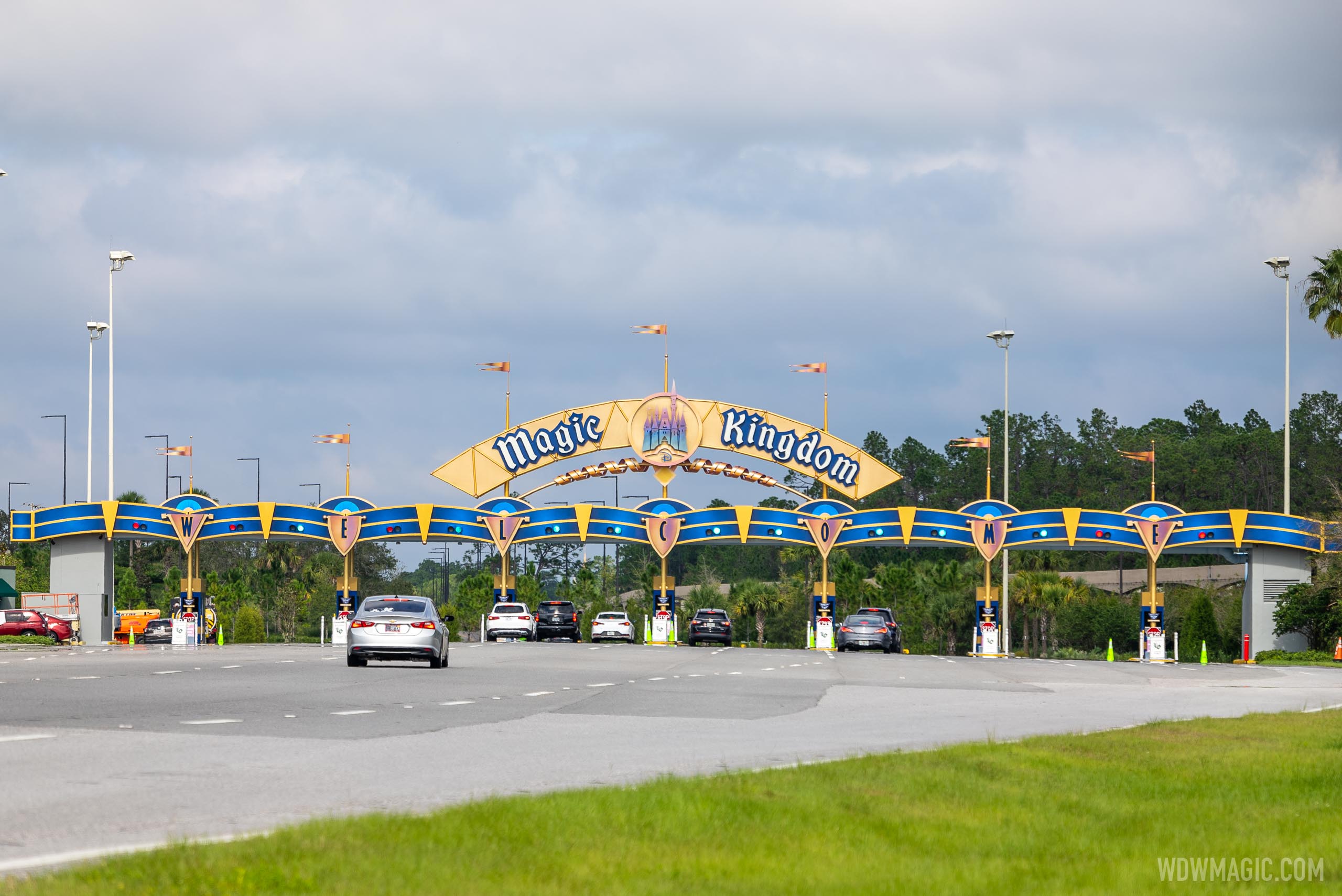
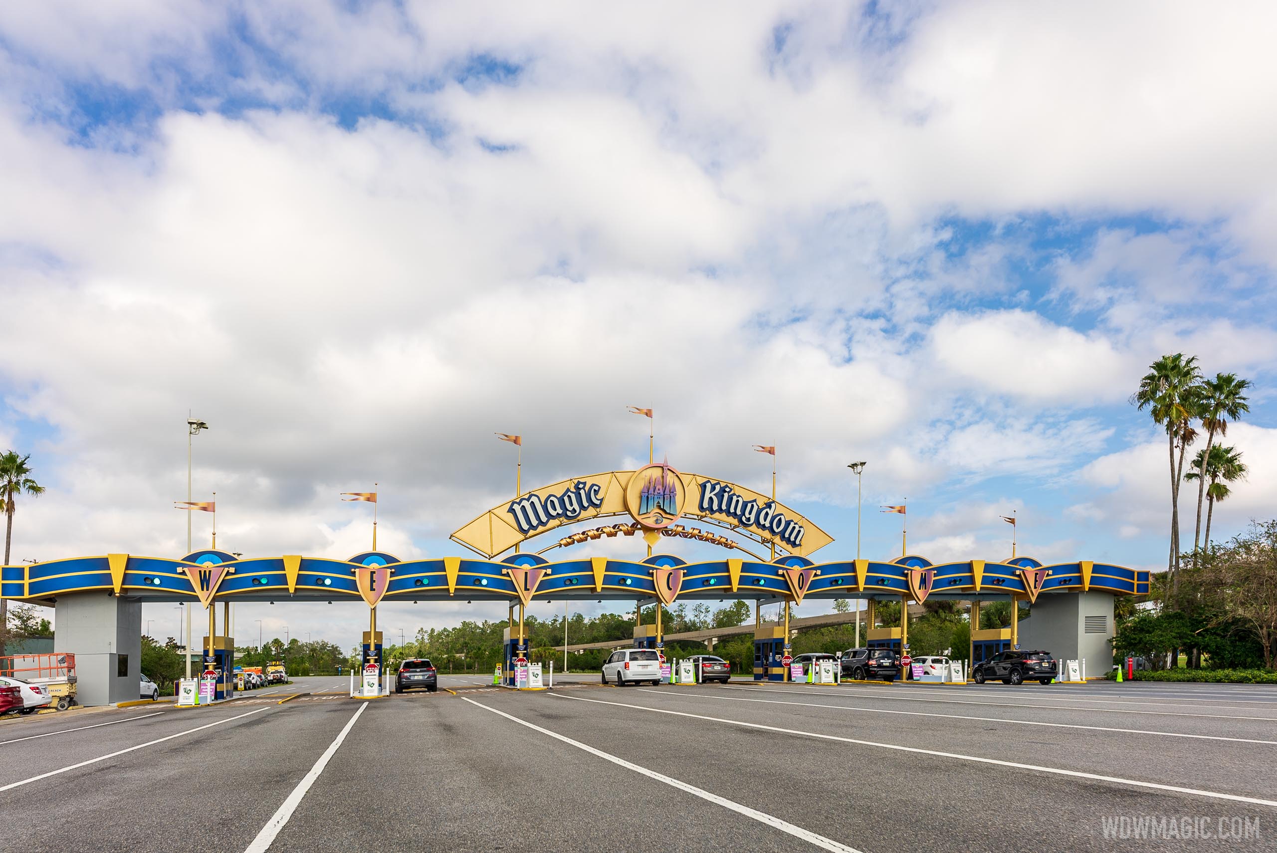
Not really a fan of the gradient paint color scheme on the castle, but the rest looks good.
-
The new WDWMAGIC iOS app is here!
Stay up to date with the latest Disney news, photos, and discussions right from your iPhone. The app is free to download and gives you quick access to news articles, forums, photo galleries, park hours, weather and Lightning Lane pricing. Learn More -
Welcome to the WDWMAGIC.COM Forums!
Please take a look around, and feel free to sign up and join the community.
You are using an out of date browser. It may not display this or other websites correctly.
You should upgrade or use an alternative browser.
You should upgrade or use an alternative browser.
News PHOTOS - New look Magic Kingdom auto-plaza shares similar color scheme with Cinderella Castle
- Thread starter wdwmagic
- Start date
Goofnut1980
Well-Known Member
The little half circles over the WELCOME look odd.. a couple are white... a few blue.. a few gold... hmmmmm
Amused to Death
Well-Known Member
Not really a fan of the gradient paint color scheme on the castle, but the rest looks good.
The castle and W-E-L-C-O-M-E lettering reminds me of when titanium rainbow jewelry was all the rage back in the '90s.
The road paint needs work...
UNCgolf
Well-Known Member
The road paint needs work...
Looks like the whole thing could use repaving, actually. Some noticeable cracks and it looks like relatively old asphalt.
Probably should have done it while everything was closed for the pandemic.
Lora Baines Bradley
Well-Known Member
Glad it's getting a facelift. The old look screamed Downtown Disney, Eisner-era 90's Disney to me.
Parker in NYC
Well-Known Member
How I miss it, so.Glad it's getting a facelift. The old look screamed Downtown Disney, Eisner-era 90's Disney to me.
Lora Baines Bradley
Well-Known Member
I do enjoy some parts of that era, and I'm glad part of it is making a comeback in terms of design and style, but I think for the overall entrance to the entire resort it's too much. I know it's just capitalizing on the trend, but some of the merch they sell at Disney Style has that vibe, like PI shirts and dad caps. Plus the return of the "Peace, Love, Mickey" logo.How I miss it, so.
danlb_2000
Premium Member
There were a bunch of permits today for what appears to be the property entrance signs.
12620 ST RD 535(HOTEL PLAZA BLVD SIGNS) - General Construction
12620 ST RD 535(HOTEL PLAZA BLVD SIGNS) - General Construction
2000 EPCOT CENTER DR(ENTRY FEATURE STATE RD 536) - General Construction
2000 EPCOT CENTER DR(ENTRY FEATURE STATE RD 536) - General Construction
2000 EPCOT CENTER DR(ENTRY FEATURE STATE RD 536) - General Construction
2000 WESTERN WY(WESTERN WAY ENTRANCE FEATURE) - General Construction
12620 ST RD 535(HOTEL PLAZA BLVD SIGNS) - General Construction
12620 ST RD 535(HOTEL PLAZA BLVD SIGNS) - General Construction
2000 EPCOT CENTER DR(ENTRY FEATURE STATE RD 536) - General Construction
2000 EPCOT CENTER DR(ENTRY FEATURE STATE RD 536) - General Construction
2000 EPCOT CENTER DR(ENTRY FEATURE STATE RD 536) - General Construction
2000 WESTERN WY(WESTERN WAY ENTRANCE FEATURE) - General Construction
tirian
Well-Known Member
This looks pretty nice! I like it better than the Barbie pink version from a few years ago; at least one of the new paint schemes turned out okay.And MK Auto-Plaza from today
Lora Baines Bradley
Well-Known Member
Apopka-Vineland progress tonight, 11/20 (ignore pasty arm
jmuboy
Well-Known Member
Honestly I actually enjoy this refreshed look. The 1990s VHS colors had become dated looking. I love the iconic signage and the new paint gives it a fresh lease on life.
Haymarket2008
Well-Known Member
I just really wish they were going back to the original WDW font/logo. But it looks nice.
halltd
Well-Known Member
Niiiiiiiiice! The blue background for Mickey looks goooooood! I didn’t realize how dated the old version looked until they updated it.
gerarar
Premium Member
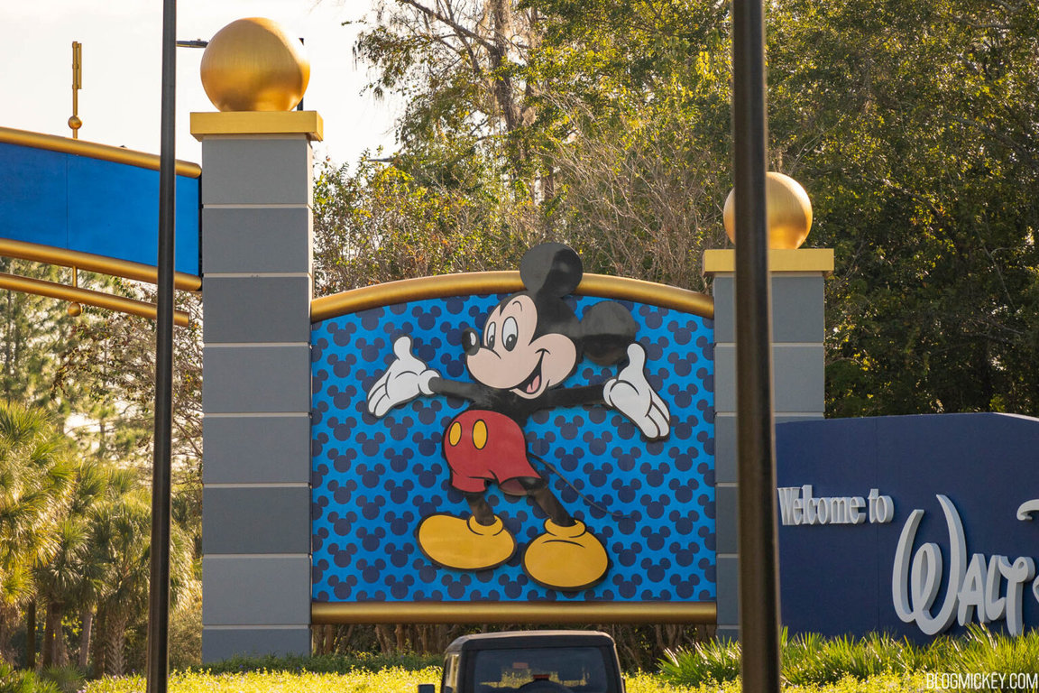
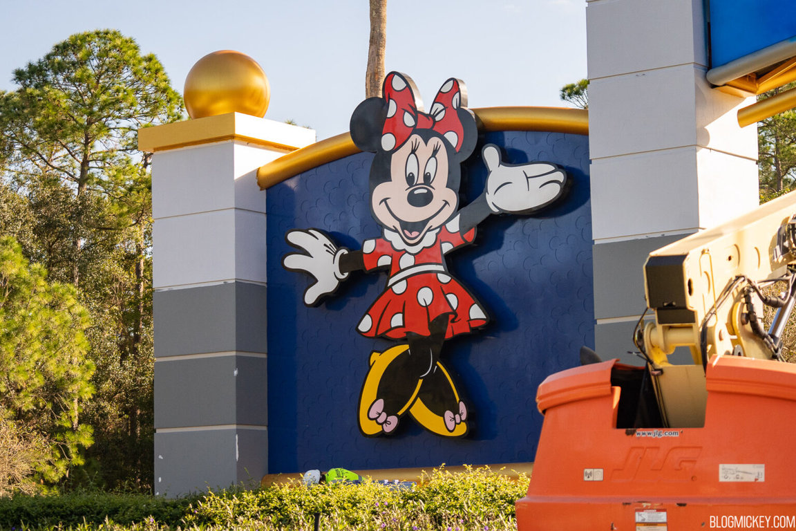
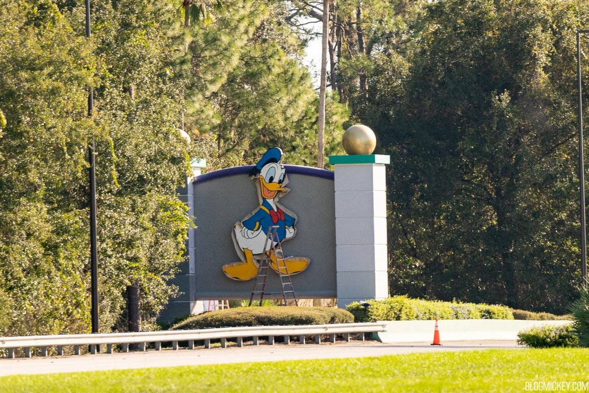
Pictures from BlogMickey this morning. Just like the auto plaza, the blue behind the WDW lettering is a gradient, which I really love imo!
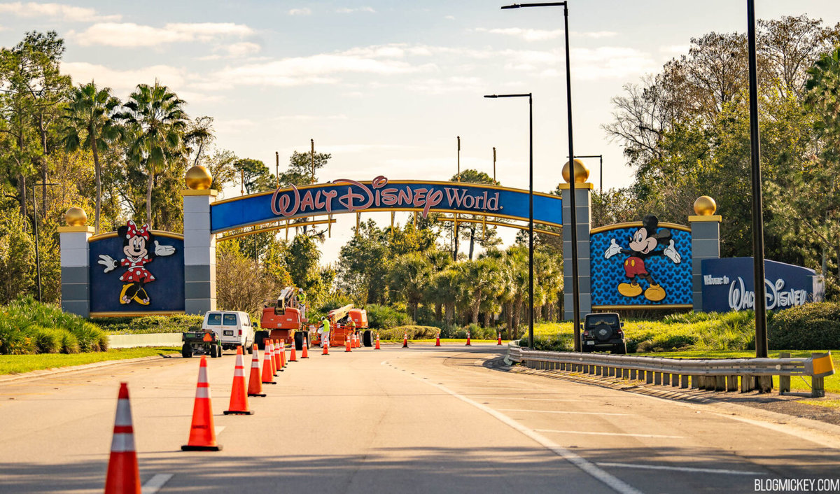
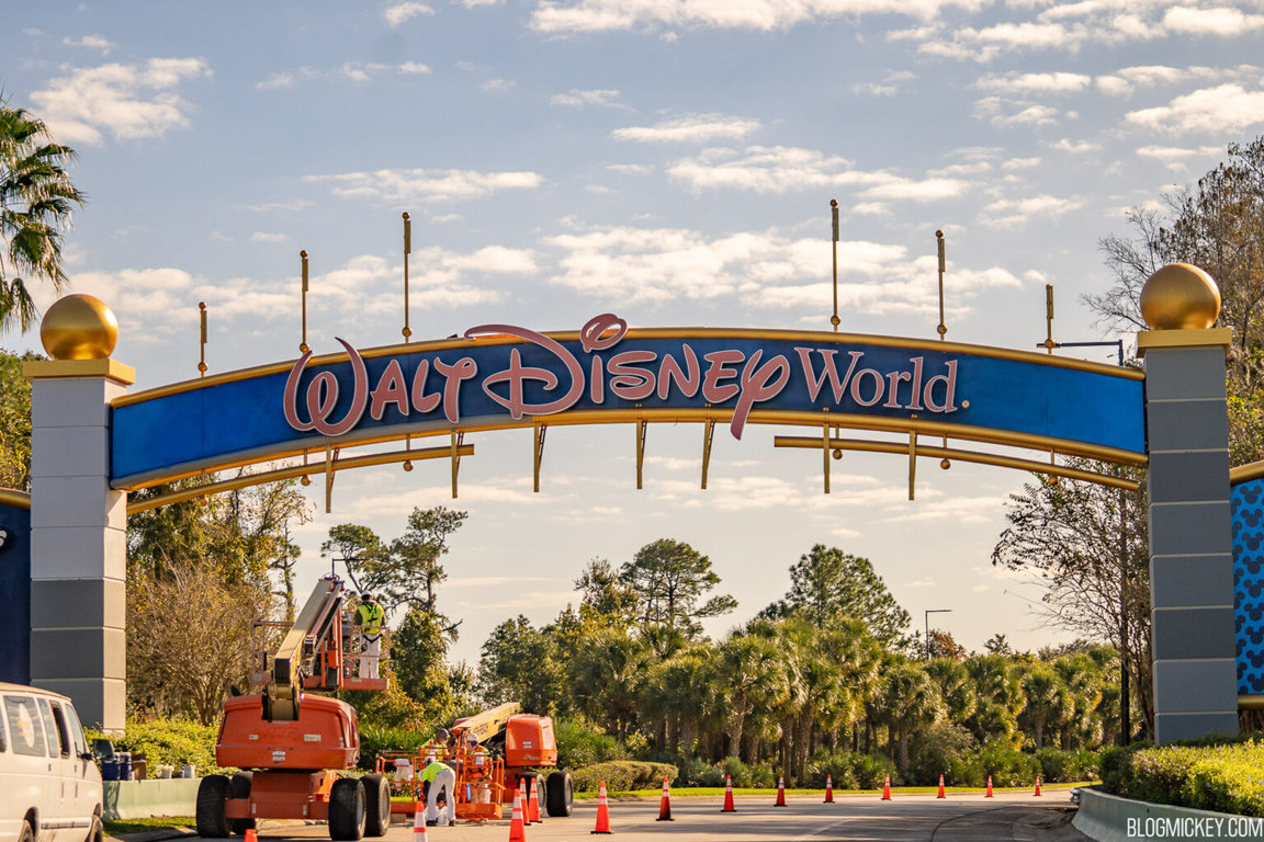
Mickey and his final look. Note the background difference between his and Minnie’s, while Donald still has a primer.
Source and more here:
Mickey and his final look. Note the background difference between his and Minnie’s, while Donald still has a primer.
Source and more here:
Register on WDWMAGIC. This sidebar will go away, and you'll see fewer ads.
