-
The new WDWMAGIC iOS app is here!
Stay up to date with the latest Disney news, photos, and discussions right from your iPhone. The app is free to download and gives you quick access to news articles, forums, photo galleries, park hours, weather and Lightning Lane pricing. Learn More -
Welcome to the WDWMAGIC.COM Forums!
Please take a look around, and feel free to sign up and join the community.
You are using an out of date browser. It may not display this or other websites correctly.
You should upgrade or use an alternative browser.
You should upgrade or use an alternative browser.
PHOTOS - Disney reveals new lobby design and Trader Sam's lounge for the Polynesian
- Thread starter wdwmagic
- Start date
MarkTwain
Well-Known Member
I stopped by the new Polynesian lobby last night. Everyone else in my party (who didn't even know it was going to be different) said they actually preferred the new lobby, and I hate to admit it, but I almost did myself. It's much more open and bright now; I didn't really realize how dark the old lobby was until I saw this one. The new lights are very colorful and eye-catching, and the colors in general around the lobby are really appealing. That said, the resort changes as a whole are certainly a mixed bag and I'll share some thoughts.
Couple of notes and observations:
- One thing I listened for specifically was whether the new fountain made enough ambient noise to be heard throughout the whole lobby, and I'm pleased to say that for the most part, it definitely does.
- Unfortunately, the new seats around the columns are as stiff and uncomfortable as others have posted; I couldn't imagine sitting on them for more than a minute or two. The red works pretty nicely in person though. In other words: better to look at than to sit on.
- The new art was one of my favorite parts of the new lobby. The art, whether Mary Blair paintings or concept art of Adventureland, does a great job of showcasing Disney's long associations with Polynesian culture. I was very pleased to see this, and the art looks very in-theme even if you weren't aware of the Disney connection.
- Speaking of art, the new Polynesian travel posters in Captain Cook's are WONDERFUL. I loved seeing some of the more obscure Pacific Islands featured, as well as the nod to King Kamehameha on the Hawaii poster. I hope Disney sells prints of these someday, because I'll snap up as many as I can.
- I greatly missed the 24-hour dole whip access in Captain Cook's.
- That said, the new Pineapple Lanai looks nice and conveniently located, and I love the idea of sitting out there with a dole whip on a warm day. It was closed when we stopped by though (like I said, I miss the 24-hour access).
All in all, and as a preface to my final point, I thought the lobby renovation was mostly successful. The lobby now recalls the feel of several historic hotels we've stayed at in Hawaii, and has that "tiki" feel of midcentury American interpretations of Hawaiian culture. The fountain was nice but the new lobby still stands on its own without it.
All that said, my LEAST favorite part of the redo was something that was actually celebrated on these boards previously. One of the most iconic aspects of the celebrated Hawaiian hotels is their dedication to lush tropical outdoor spaces. And it seems the Polynesian's gardens, for the time being at least, have been greatly compromised. As others noted earlier, one can now stand in the front entrance of the lobby and see directly out the back window, all the way to the castle.
While this may be nice for castle visibility, it also speaks to how much outdoor landscaping must have been ripped out to create that effect. Hopefully, this is a temporary side effect of the construction occupying many of the outdoor spaces, and the gardens will be filled with trees and waterways again soon. As it is, I would argue there are more than enough places around Seven Seas Lagoon to look at the castle (the Contemporary and its sister DVC resort are completely designed around it), but there was only one hotel on property that enjoyed such lush tropical landscaping.
I'll try and get some pictures up soon
Last edited:
aladdin2007
Well-Known Member
I stopped by the new Polynesian lobby last night. Everyone else in my party (who didn't even know it was going to be different) said they actually preferred the new lobby, and I hate to admit it, but I almost did myself. It's much more open and bright now; I didn't really realize how dark the old lobby was until I saw this one. The new lights are very colorful and eye-catching, and the colors in general around the lobby are really appealing. That said, the resort changes as a whole are certainly a mixed bag and I'll share some thoughts.
Couple of notes and observations:
- One thing I listened for specifically was whether the new fountain made enough ambient noise to be heard throughout the whole lobby, and I'm pleased to say that for the most part, it definitely does.
- Unfortunately, the new seats around the columns are as stiff and uncomfortable as others have posted; I couldn't imagine sitting on them for more than a minute or two. The red works pretty nicely in person though. In other words: better to look at than to sit on.
- The new art was one of my favorite parts of the new lobby. The art, whether Mary Blair paintings or concept art of Adventureland, does a great job of showcasing Disney's long associations with Polynesian culture. I was very pleased to see this, and the art looks very in-theme even if you weren't aware of the Disney connection.
- Speaking of art, the new Polynesian travel posters in Captain Cook's are WONDERFUL. I loved seeing some of the more obscure Pacific Islands featured, as well as the nod to King Kamehameha on the Hawaii poster. I hope Disney sells prints of these someday, because I'll snap up as many as I can.
- I greatly missed the 24-hour dole whip access in Captain Cook's.
- That said, the new Pineapple Lanai looks nice and conveniently located, and I love the idea of sitting out there with a dole whip on a warm day. It was closed when we stopped by though (like I said, I miss the 24-hour access).
All in all, and as a preface to my final point, I thought the lobby renovation was mostly successful. The lobby now recalls the feel of several historic hotels we've stayed at in Hawaii, and has that "tiki" feel of midcentury American interpretations of Hawaiian culture. The fountain was nice but the new lobby still stands on its own without it.
All that said, my LEAST favorite part of the redo was something that was actually celebrated on these boards previously. One of the most iconic aspects of the celebrated Hawaiian hotels is their dedication to lush tropical outdoor spaces. And it seems the Polynesian's gardens, for the time being at least, have been greatly compromised. As others noted earlier, one can now stand in the front entrance of the lobby and see directly out the back window, all the way to the castle.
While this may be nice for castle visibility, it also speaks to how much outdoor landscaping must have been ripped out to create that effect. Hopefully, this is a temporary side effect of the construction occupying many of the outdoor spaces, and the gardens will be filled with trees and waterways again soon. As it is, I would argue there are more than enough places around Seven Seas Lagoon to look at the castle (the Contemporary and its sister DVC resort are completely designed around it), but there was only one hotel on property that enjoyed such lush tropical landscaping.
I'll try and get some pictures up soon
Great review, makes me feel a little better about it before I see it in person....and I think Disney is trying to get downsize horticulture left and right so they have less to maintain and spend money...what about the lush entry way with the koy ponds and foliage etc? Is that still intact?
asianway
Well-Known Member
I have bad news for you then, the entire goal of the project was to create castle visibility all the way from the front doorI stopped by the new Polynesian lobby last night. Everyone else in my party (who didn't even know it was going to be different) said they actually preferred the new lobby, and I hate to admit it, but I almost did myself. It's much more open and bright now; I didn't really realize how dark the old lobby was until I saw this one. The new lights are very colorful and eye-catching, and the colors in general around the lobby are really appealing. That said, the resort changes as a whole are certainly a mixed bag and I'll share some thoughts.
Couple of notes and observations:
- One thing I listened for specifically was whether the new fountain made enough ambient noise to be heard throughout the whole lobby, and I'm pleased to say that for the most part, it definitely does.
- Unfortunately, the new seats around the columns are as stiff and uncomfortable as others have posted; I couldn't imagine sitting on them for more than a minute or two. The red works pretty nicely in person though. In other words: better to look at than to sit on.
- The new art was one of my favorite parts of the new lobby. The art, whether Mary Blair paintings or concept art of Adventureland, does a great job of showcasing Disney's long associations with Polynesian culture. I was very pleased to see this, and the art looks very in-theme even if you weren't aware of the Disney connection.
- Speaking of art, the new Polynesian travel posters in Captain Cook's are WONDERFUL. I loved seeing some of the more obscure Pacific Islands featured, as well as the nod to King Kamehameha on the Hawaii poster. I hope Disney sells prints of these someday, because I'll snap up as many as I can.
- I greatly missed the 24-hour dole whip access in Captain Cook's.
- That said, the new Pineapple Lanai looks nice and conveniently located, and I love the idea of sitting out there with a dole whip on a warm day. It was closed when we stopped by though (like I said, I miss the 24-hour access).
All in all, and as a preface to my final point, I thought the lobby renovation was mostly successful. The lobby now recalls the feel of several historic hotels we've stayed at in Hawaii, and has that "tiki" feel of midcentury American interpretations of Hawaiian culture. The fountain was nice but the new lobby still stands on its own without it.
All that said, my LEAST favorite part of the redo was something that was actually celebrated on these boards previously. One of the most iconic aspects of the celebrated Hawaiian hotels is their dedication to lush tropical outdoor spaces. And it seems the Polynesian's gardens, for the time being at least, have been greatly compromised. As others noted earlier, one can now stand in the front entrance of the lobby and see directly out the back window, all the way to the castle.
While this may be nice for castle visibility, it also speaks to how much outdoor landscaping must have been ripped out to create that effect. Hopefully, this is a temporary side effect of the construction occupying many of the outdoor spaces, and the gardens will be filled with trees and waterways again soon. As it is, I would argue there are more than enough places around Seven Seas Lagoon to look at the castle (the Contemporary and its sister DVC resort are completely designed around it), but there was only one hotel on property that enjoyed such lush tropical landscaping.
I'll try and get some pictures up soon
Next Big Thing
Well-Known Member
I have bad news for you then, the entire goal of the project was to create castle visibility all the way from the front door
There is still plenty of landscaping to be done and those that actually are in the know on the project could back me up on that. Much has been ripped out right now due to pool construction. With the new hot tub, kid's area and pool deck going in, things had to go out to reconfigure the space. Once all of that is done, it will be redone with lush outdoor landscaping.
Last edited by a moderator:
ford91exploder
Resident Curmudgeon
Nope TDO ripped out most of that as well, I'm thinking the lush landscaping will be AstroTurf as it's cheaper to maintainGreat review, makes me feel a little better about it before I see it in person....and I think Disney is trying to get downsize horticulture left and right so they have less to maintain and spend money...what about the lush entry way with the koy ponds and foliage etc? Is that still intact?
ford91exploder
Resident Curmudgeon
I have bad news for you then, the entire goal of the project was to create castle visibility all the way from the front door
As soon as I saw the castle pictures I also had that oh no moment. It's magical we can see the castle and fireworks from the lobby. Blech....
Sage of Time
Well-Known Member
I think that was ripped out to necessitate construction on the roof of the Ceremonial House.Nope TDO ripped out most of that as well, I'm thinking the lush landscaping will be AstroTurf as it's cheaper to maintain
I'd expect the entranceway's ponds and lush setting to return... and maybe to be plussed.
ford91exploder
Resident Curmudgeon
I think that was ripped out to necessitate construction on the roof of the Ceremonial House.
I'd expect the entranceway's ponds and lush setting to return... and maybe to be plussed.
When I was there a couple of weeks ago there was a lot of NEW concrete walkway where landscaping used to be, Used a camera on a monopod to look over the wall.
I don't like the effect but the sidewalk at the entrance always was borderline unsafe so adding addional space is a good idea. (wish they would do it the OLD way where the road would have been reconstructed)
Sage of Time
Well-Known Member
Where? By the front of the resort? There's a path leading away from the door to the GCH?When I was there a couple of weeks ago there was a lot of NEW concrete walkway where landscaping used to be, Used a camera on a monopod to look over the wall.
I don't like the effect but the sidewalk at the entrance always was borderline unsafe so adding addional space is a good idea. (wish they would do it the OLD way where the road would have been reconstructed)
ford91exploder
Resident Curmudgeon
Where? By the front of the resort? There's a path leading away from the door to the GCH?
Yes - Talking about the street entrance under the monorail.
Sage of Time
Well-Known Member
Yeah, I would expect that to look pretty good and lush once the project is complete.Yes - Talking about the street entrance under the monorail.
Father Robinson
Well-Known Member
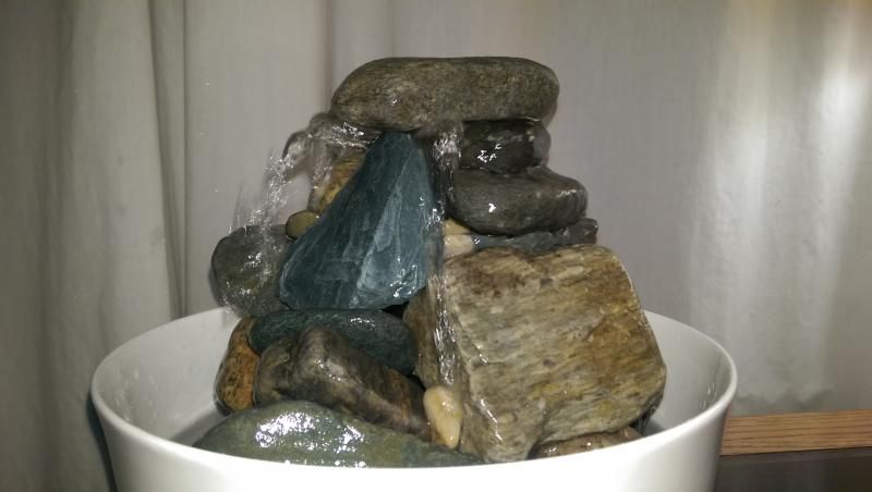
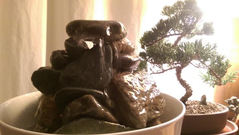
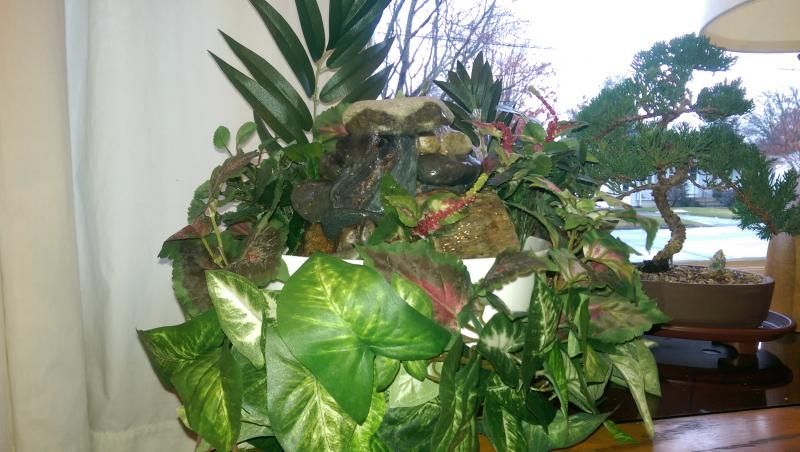
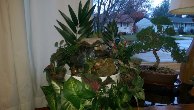
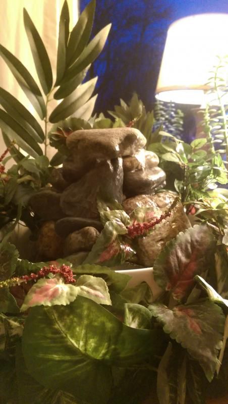
Because I'm sentimental as well as nostalgic, I thought I'd share some photos of my home-made, tabletop tribute to the former Poly water feature. I made this for less than $30. and am pleased with the result.


RayTheFirefly
Well-Known Member
This is true-to-life scale to the real new one, right?Because I'm sentimental as well as nostalgic, I thought I'd share some photos of my home-made, tabletop tribute to the former Poly water feature. I made this for less than $30. and am pleased with the result.


Hahaha sorry, I had to. It looks great
Last edited:
Father Robinson
Well-Known Member
This is true-to-life scale to the real one, right?
Perhaps to the current one
RayTheFirefly
Well-Known Member
That's what I meantPerhaps to the current one.
Father Robinson
Well-Known Member
Oh, then no, this one is bigger.That's what I meant.
ford91exploder
Resident Curmudgeon
Because I'm sentimental as well as nostalgic, I thought I'd share some photos of my home-made, tabletop tribute to the former Poly water feature. I made this for less than $30. and am pleased with the result.


It seems to have more plants than the prototype!
Sage of Time
Well-Known Member
Can't decide if I'm amused or horrified that it's bigger and in a better shape than the one in the lobby. Kudos. LOLOLBecause I'm sentimental as well as nostalgic, I thought I'd share some photos of my home-made, tabletop tribute to the former Poly water feature. I made this for less than $30. and am pleased with the result.


ford91exploder
Resident Curmudgeon
Can't decide if I'm amused or horrified that it's bigger and in a better shape than the one in the lobby. Kudos. LOLOL
I'm going with horrified.
Register on WDWMAGIC. This sidebar will go away, and you'll see fewer ads.
