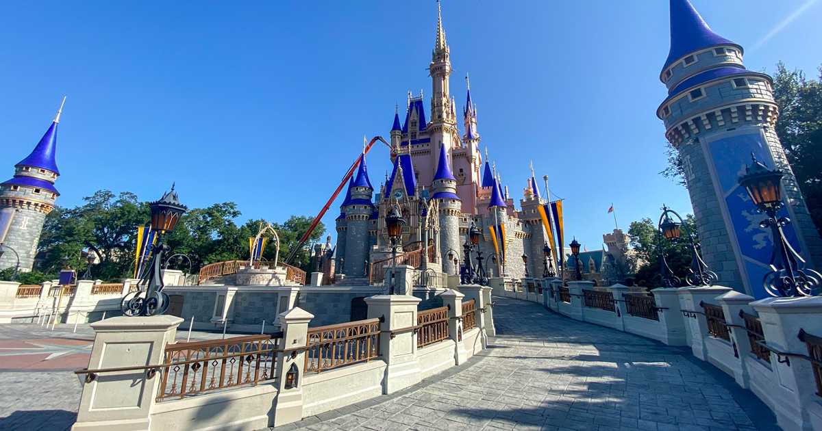
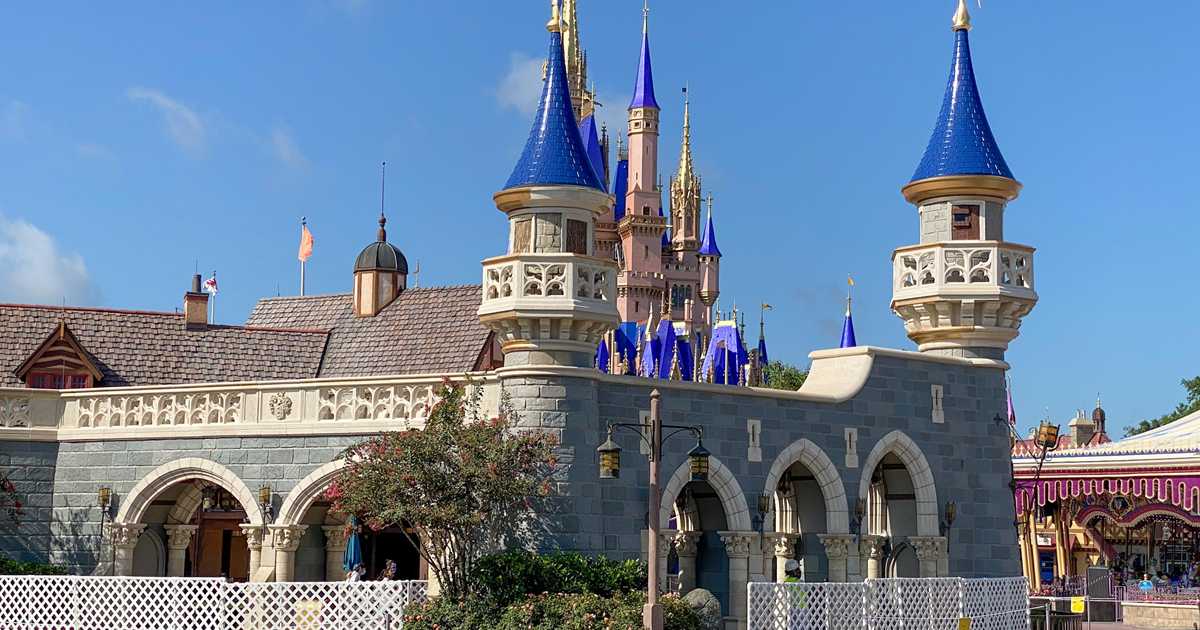
First, thanks for the group of untouched photos from various angles. You’re the first website to do this!
At first I had many conflicting thoughts since some angles look pretty good and others are hideous. Then I realized, the conflict itself is the problem. This color scheme doesn’t account for real-life lighting conditions such as sunlight, cloud cover, harsh shadows, humid haze, etc. The colors only look decent in full sunlight, a condition which cannot be controlled. WDI knows better than this.
Whites and greys work because the castle constantly reflects the harsh Floridian sun.
Also, the architecture itself wasn’t meant to have such a complicated color scheme, and those vast flat areas now look splotchy as the paint reflects the sunlight, especially because metallic paint is splotchy. Like black light paint, metallics are impossible to get completely flat in normal daylight conditions. Only true metal panels can do that. The solution might have been to have painted the areas to look brick, but that would be intricate and would probably bust the budget.
Combined with the ultra-plastic blue-violet shingles, this looks incredibly amateurish.
Years ago, Tokyo updated its color scheme to look darker on the fortress base and more aged on the fairy-tale “plaster.” The castle looks real from top to bottom; all telltale fiberglass is camouflaged. With its recent repaint, Tokyo’s castle looks better than WDW’s ever did.

www.wdwmagic.com

