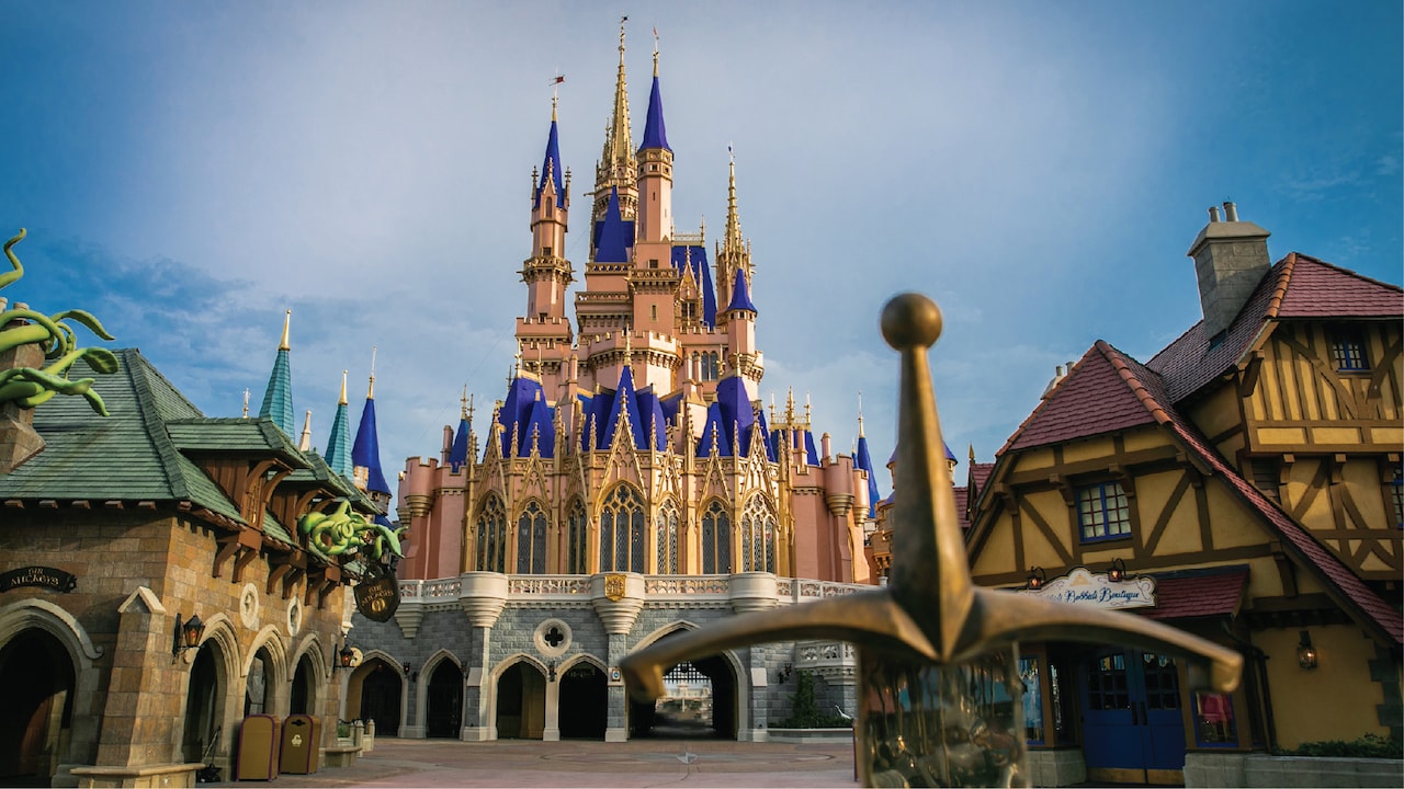
News PHOTOS - Cinderella Castle at the Magic Kingdom to receive enhancements this summer

wdwmagic

Administrator
Moderator
Premium Member
Original Poster
Here is a look with an overcast sky

DSC06590-1-2.jpg
 

Kevin_W

Well-Known Member
I must digress my comments of HIDEOUS. After looking at different angle in different light, it does not look bad...just different than hat we are use to. I think for the most part, it will 'grow' on guests!

I tend to agree. I prefer the white color, but I'm not sure how much of that is that I prefer white and how much is because that's what color it's *nearly) always been.
 

wdwmagic

Administrator
Moderator
Premium Member
Original Poster
I have seen some pictures that I say it looks good and others that I just go no no please....

Bottom line the blue is really to much but it will fade and I am assuming that is part of the plan.... Does anyone have a picture of the blue the last time it was fresh?
Here are the turrets when they were brand new
 

tirian

Well-Known Member
I tend to agree. I prefer the white color, but I'm not sure how much of that is that I prefer white and how much is because that's what color it's *nearly) always been.
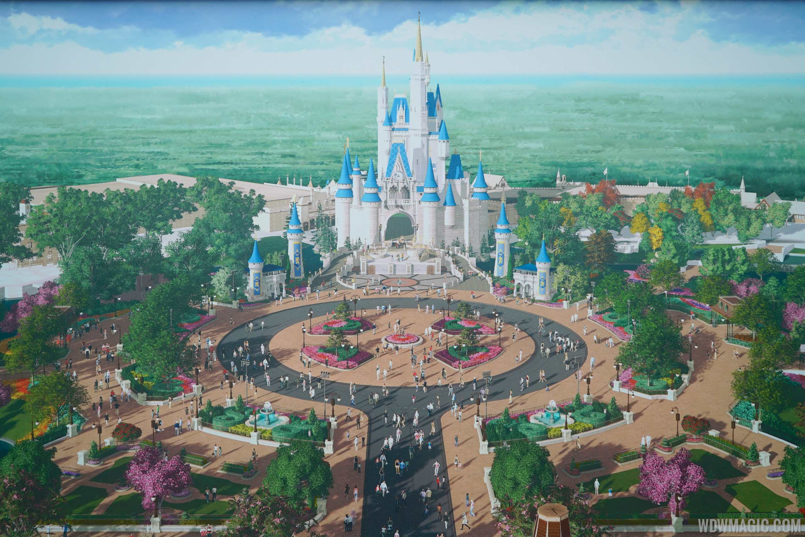
Because it was designed to look best in its original color scheme. ;)

There’s no doubt that the paint job from the ‘70s through ‘80s was too uniform and fake; the later brick details added some depth. But the overall scheme stayed consistent until the mid 2000s, when Iger decreed it should go a bit pinker to match the new WDP castle card for “Enchanted.” This latest paint job pushes the synergy even harder.

Tokyo’s latest update uses aging techniques to enhance the original scheme, and it looks better than ever before.
 

JoeCamel

Well-Known Member
This looks much more like the concept and much better in my opinion. Wow, what a difference! It's amazing how a shade of blue can really make this much of a difference.
They have something in the blue paint that really changes with the UV from sunlight. LIke DuPont Imron paint. Not a good effect IMO and should have been left out.
 

tirian

Well-Known Member
It's less than ideal (and I'd rather have the original colours), but darker spires would've helped tremendously:

EMxyCmY.jpg
That looks better! Lighten the top of the main tower as it ascends upwards, and this would look pretty good as a temporary paint job for a 50th anniversary celebration. :D
 

DCBaker

Premium Member
"Here is a sneak peek at the regal new look, which you might see our painters applying the final coats of paint and adding the finishing touches to if you’re planning to visit Magic Kingdom Park over the next several weeks:"


Register on WDWMAGIC. This sidebar will go away, and you'll see fewer ads.

Back
Top Bottom