Wikkler
Well-Known Member
Most people in line aren't going to know it exists until it's too late.Which I'm going to beat alot of guests will be using that day.
...Did you just say you were going to beat guests?
Most people in line aren't going to know it exists until it's too late.Which I'm going to beat alot of guests will be using that day.
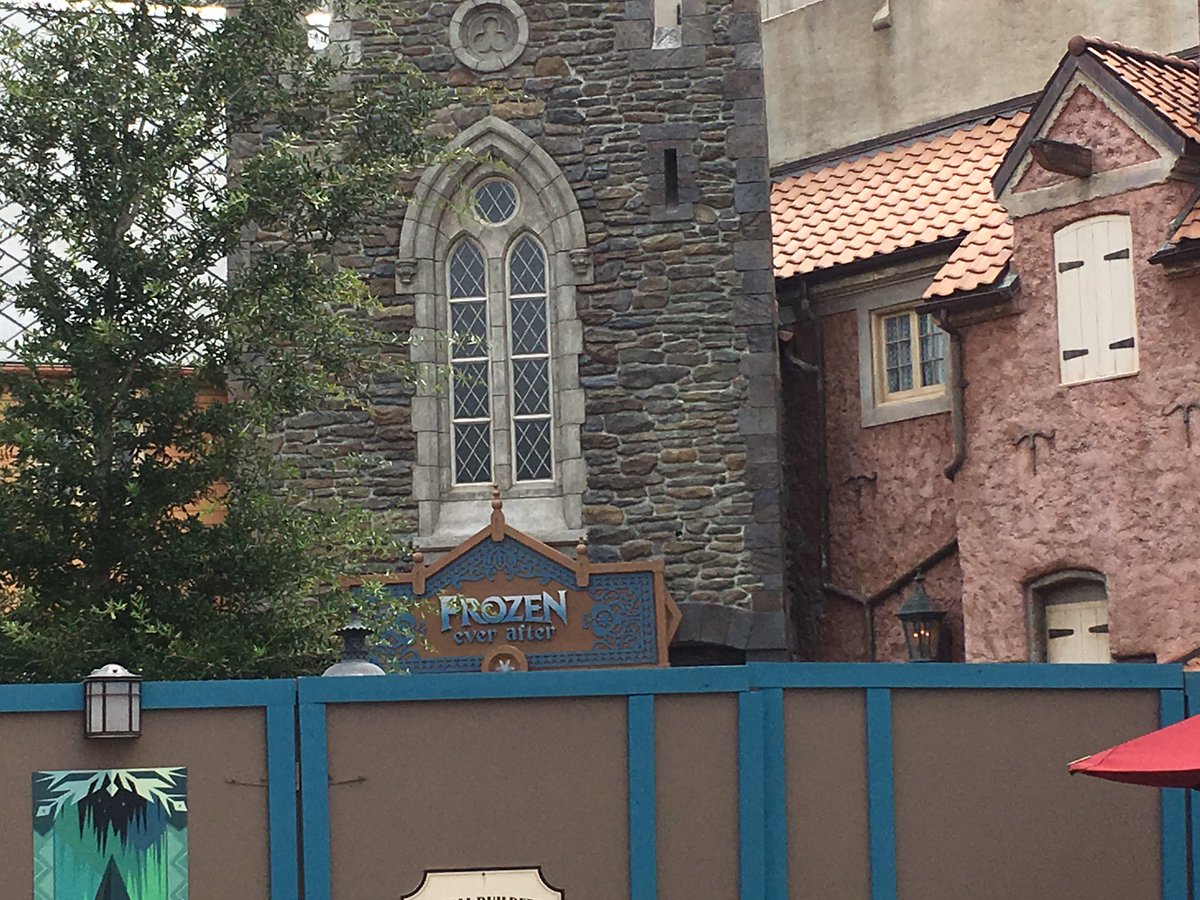
Hate how "Ever After" is lowercase. It's bothersome.
That is KristoffThe sign looks a little, big, to me. Maybe because I was expecting one of similar size to Maelstrom's. That little dude looks like Kristoff btw.
I meant betMost people in line aren't going to know it exists until it's too late.
...Did you just say you were going to beat guests?
The sign looks a little, big, to me. Maybe because I was expecting one of similar size to Maelstrom's. That little dude looks like Kristoff btw.
That's a nice, interesting touch- wonder if it's a traditional Norwegian decoration.
OK. Had the notion it was Celtic, but wasn't sure how it was part of the Norwegian culture.It's a symbol of the Trinity, which can be found in art and architecture throughout Europe. It's most frequently associated with Celtic designs, but given how much the Celts and Norse overlapped and influenced one another late in the first millennium, it's tough to say exactly where the symbol originated
https://en.wikipedia.org/wiki/Triquetra
A similar shape was carved into the railings in front of Cinderella Castle prior to its recent construction, with more of a French-gothic style

As much as I'm sure people will attempt to claim, it's not a Hidden Mickey.
It's not just the off-centered arrow. The windows are also different sizes. This project was brought to you by the people who did this to New Orleans Square:
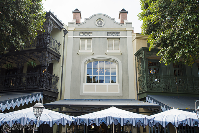
Okay, but to be fair, some houses are designed to have asymmetrical windows, and some people like them as an aesthetic choice. Just because you or I don't like them (which I don't, they drive me insane), that doesn't mean they're the result of a design flaw or a mid-construction aneurism.
I guess I'm exaggerating about the Sommerhus, but my other example still holds. Club 33 at Disneyland got refurbished a few years back... at the expense of New Orleans Square and its forced perspective.

talk about botched, Ill never understand why or who approved that.
There is an obvious problem at NOS, but from what I've seen of the Norwegian wooden houses they often look a little off-kilter in terms of the placement and size of the windows. Like it or not, I imagine that was a deliberate creative choice rather than incompetence, unlike the what they did at NOS where they kind of wrecked the facade to suit the layout of the expanded Club 33 inside.
Please tell me the left is after and right is before...
It's my understanding that the window is not off centre when viewed from inside the Club.
Nope lol
To think someone got paid to do that.
Your point?
Sometimes a room is not designed to be centered in the building that houses it. If a window needs to be centered in the middle of that room for esthetics from inside then that window may not be centered on the outside of the building.
Somethings are more important than other things.
But I think with a little clever Imagineering, it could be centered in both.
Not without major building reconstruction.
Sometimes you have to pick your battles.
All they really have to do is put some props on the left where the space is and it'd look wayyyyyy better.
They are more concerned with it looking proper from inside for the paying guests than what it looks like from outside for the peons.
It'd cost next to nothing to put some light theming up.
Like I said....they have picked their battle. They really could not care less.
And that's the problem
Or maybe you don't install a gigantic picture window at all and preserve that sense of secrecy Club 33 is meant to hold. Because all that giant window does is say "Hey average guest on the ground whose paying an arm and a leg just to be here, check out these 1-percenters having a good time eating good food in a place you'll never see in person"
Well they fixed the problem for the inside of the room...it's like the minimalist themeing of the backside of Expedition Everest. Everyone was all up in arms about it not being "Completed" for a while. The drama died after a while when people realized it really makes no difference to the actual attraction. Just as the window not being centered on the outside of a building makes no difference to the people eating on the inside of the building.
It cuts both ways.
I work for a new home Builder, and back in the day, windows were located to maximize the interior of the home, ie - maximize light flow, facilitate furniture placement (especially in bedrooms), provide balance to the interior rooms ....
Then the "Architectural Control" beast got stronger and stronger, and now the number one concern is a pleasing exterior, contributing to an overall pleasant streetscape; and interior aesthetics be darned.
I can't tell you how often I am asked, "But Jenny-fer, where do I put my couch (bed, tv, armoire, table), the window is in the way.
This was poor planning. There is no battle.
Not to the people on the inside of Club 33.
There is a difference between "poor planning" and a design choice you just don't like.
Sorry guys, I lost track of the conversation. I thought you had gone back to talking about the random yellow wall in Norway.
Or you just make the frame on the outside large so it's looks centered and the come up with a way to hide the fact that you can't see through the entire thing.
I think it "died off" because we then became much more concerned about the centerpiece of the attraction once he went all Donna Summers.
I wouldn't call the unfinished backside "minimalist". That said - there is a good reason for a lot of the varied opinion on this - it depended on how you entered the park. From the bus terminal, it didn't look that bad. Certainly unfinished, but wasn't horrible. But if you came in from the parking lot, it was really sad looking - one step away from walking behind a street facade over at the Studios. That shouldn't have flown at the more realistically themed park.
(Note, speaking in past tense because I have no idea what it looks like at the moment - I believe they added a "army" style camo tarp at one point?)
How do you do that without affecting the building that is connected to it. What they could have done is use a smaller window. Width wise! Wanna, bet that someone order the wrong size and they just decided to go with it, since only about three people on WDWmagic were ever going to notice it anyway.
Since that is in DLR and I have no intention of going to DLR, plus, even if I did Club 33 has no impact on me I would just have walked on by. What would I care about the architecture on something I'm never going to go into to begin with?
Part of the window is fake and doesn't go through the wall, it just overlays the outside of the structure for make the window look larger, or as you point out, just use a smaller window.
exactly the select few are put ahead of the millions....got it.
good news is a handful of VIPs are put before millions of guests each year. but most guests wont care so why have standards?
This is a theme park. The aesthetics of the outside are all that matters. There is literally no justification for this. I can't believe that anybody is even trying to defend this.
And a complete fact that beauty is in the eye of the beholder.
Symmetry does not define beauty.
I think they just have opinions like you do. Personally I don't understand why there's any discussion about it. But to each their own!
Exactly...I also pick my battles, and this just isn't one of them. It's no big deal to me.
But it's not an opinion. It's a complete fact that the window is very noticeably off-center. It is also a fact that Club 33 is meant to be a secret area of the park and that it did just fine for 40 years without a giant poorly-placed picture window.
No design choice should be made that negatively impacts the theming of an area within the park. That's just common sense. This should have been designed with the outside appearance in mind.
Your facts are much appreciated. But for me, I go by there a few times a month, and it never bothered me. Subjective, I know.")
You cannot be serious. This is not a purposeful design choice to have the building look that way. This is poor planning at best, or at worst, a complete lack of concern for the show experience of paying guests in order for a select few to have a centered view from within the new dining room. If symmetry doesn't matter, why did it matter so much inside the club that it had to negatively affect the theming of the area?
Either way, Disney used to be better than that. Not to mention that they thoroughly destroyed the charm and brilliant design of New Orleans Square. An area of WED-era design that is often considered the pinnacle of Disney theming.
Wow...this thread could be a Sharknado remake...talk about some over-(re)acting!!!
Great argument.
Now I wanna go to Vegas.
Omg the window/symmetry convo needs to move
Says the moderator....
Uh, those guests paid, bro - much, much more than you! LOL. Or someone did, in order to be able to grant them admittance.
But I think you know that. That's why you are so bent out of shape about this. Hey, work hard, save your money, and you too may someday spend a ridiculous amount of money to be a member. Or marry well, into someone who has one in the family. But for either of those to happen, you'll need to clam down because your blood pressure is going to have you six feet under if you keep on about this.
Oh my...please, come back in from the deep end. If you are hysterical enough to say that, you shouldn't be in the pool.
They installed the window to entice new members with the promise of viewing space for Fantasmic! Hence the inappropriate size. The decision was made to improve things for the few guests who travel through Club 33 rather than the many, many more guests who experience the building from below.
I think it was centered when viewed from inside.
If you see. There is a chandelier and its down in the center of the "window".
I still wonder why they didnt just add more tall windows. if there is a barrier there, just add 5 consecutive windows with very short separation on each one.
Good views ANd no off center.
yeah.. we all agree the window needs TO MOVE to the left")
Actually what I said is pretty much the general consensus of most, to the point that a lot of people thought they couldn't possibly be done. Very little care was put into the exteriors of the work that was done. Not to mention the closing of Court of Angels, one of the most wel designed areas of Disneyland. WED put careful consideration into making sure that Club 33 did not disrupt the design of New Orleans Square. The people in charge of this redesigned Club 33 project literally did not put any consideration into the changes as viewed from the outside. All that mattered was how it looked from the inside to people that they are making more money off of, who cares about the other guests? It just smacks all over of modern Disney.
I can only assume that all you've seen is this one example of the shoddy work that was done. The laughably off-center window is only one of many many questionable design choices.
I'm sorry that you seem to have no understanding or concept of themed design. I'm also sorry that you can only argue by belittling me. Cool life, bro.
Anyways, enough of this. This thread is not the place.
While we are at it... let's all agree that it is not going to move to the left anytime soon unless California is hit with another big earthquake!
and even then, it would move TOWARD the lagoon, based on its physical position and orientation in the park
Indeed. Perfectly sums up the contemporary management of the Company - they would much rather please the 1/2 of 1% with the fat wallets than care about the base-level admission purchasers (whom they are close to admitting contempt for in a lot of ways). Seems to be the case more and more across the company. Thank goodness the three-hour MK "bonus" event failed; that's been about the only "win" in that endeavor recently.
Is it just me, or does that building on the right look like it's crying out in pain?
its in pain because someone snatched its mouth to the RT really hard
Bro, take a breath and collect yourself.
He does have a point
Let's not rehash that again.
Oh Walt, I've contributed to thread drift. I'm so sorry.I don't have to, the points have been made.
I'll end this discussion by saying one final thing.There is a difference between "poor planning" and a design choice you just don't like.
Oh Walt, I've contributed to thread drift. I'm so sorry.
I'll end this discussion by saying one final thing.
Yes, there's a difference. The window just happens to fall under "poor planning", though.
to be honest, it kinda looks like Kristoff or a Ice cutter person.agree, still dont like that title though. but check out the new viking man on the yellow wall.
It is Kristoffto be honest, it kinda looks like Kristoff or a Ice cutter person.
absolutely love the sign!!!! <3 <3 <3
from @skippercameron
Guess we know what that arrow was now.
i love that part!Hate how "Ever After" is lowercase. It's bothersome.
It doesn't sound like any sort of attraction at all, let alone a boat ride.that and also the title does not sound like a boat ride, at all.
It doesn't sound like any sort of attraction at all, let alone a boat ride.

from @skippercameron
Guess we know what that arrow was now.
.Indeed, the arrow was as I had said it was earlier, the baseplate for a wooden sculpture of a man holding something that looks like an axe
Register on WDWMAGIC. This sidebar will go away, and you'll see fewer ads.