Texas84
Well-Known Member
Sure, I ate glue in Kindergarten. If there's a demand, why not? They're selling cookie dough now. Bleh.Some kids like to eat glue. Should that be added to the menus?
Sure, I ate glue in Kindergarten. If there's a demand, why not? They're selling cookie dough now. Bleh.Some kids like to eat glue. Should that be added to the menus?
To you, maybe not to others. Love of Disney does not gift you with pushing your opinions as facts. why does a bus need to be "tasteful, authentic, high-quality, thoughtfully considered, impeccably designed, and painstakingly detailed" ?Well, some people could care less about design. But for those who do, it's not just about bus wraps. It's yet another example in a growing list of the "tackification"--both visually and conceptually--of Disney under the current leadership. One used to go to Disney and notice how nice most things (with some notable exceptions) looked: tasteful, authentic, high-quality, thoughtfully considered, impeccably designed, and painstakingly detailed--far above what you would see at any other theme park. Now more and more things look tacky, garish, cartooney, cheap, clumsy, and out of place.
Sure, I ate glue in Kindergarten. If there's a demand, why not? They're selling cookie dough now. Bleh.

The new dispatch software is just starting to get introduced. This has been in the planning stages for well over a year. We are currently using it in Fort Wilderness, next will be Disney Springs. This same software is being used in many municipalities and is performing very well. It will be about a year before All hubs are up to speed, be patient relief is on the way.I don’t mind them. I personally hate the WDW bus situation. It’s the least pleasant part of my vacation. The characters make my kids happy. When waiting for who-knows-how-long-cuz-the-time-keeps-changing, happier kids makes my vacation better.
I’m not for overuse of IP either. But the buses already sucked.
Yes, to me and several others in this forum who have criticized these.To you, maybe not to others.
I'm just stating my opinion in this forum as you and everybody else are, my friend.Love of Disney does not gift you with pushing your opinions as facts.
Nothing NEEDS to be designed well and I think the new bus wraps demonstrate this. But I and others have come to expect design that is a cut above from Disney and are disappointed when, in our opinions, it falls short. And it's not limited to the bus wraps. Others have offered examples of what they consider tacky, out of place design. (And does your question mean that you don't think it matters if a bus wrap is well-designed?)why does a bus need to be "tasteful, authentic, high-quality, thoughtfully considered, impeccably designed, and painstakingly detailed" ?
Nobody's foaming or seething: just stating opinion and analysis about design and engaging in a dialogue with others who are interested in design. Disagree if you want or offer your own critique, as others have, or if you think it's a silly discussion you're free to ignore it, but there's no need to chastise people for having an interest and expressing their opinions, especially in a forum intended for that very purpose.Whatevs, seeth at the buses all you like
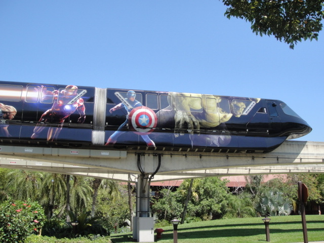
Personally, I liked the wraps on the monorails.All the people living these tacky wraps will be the first to moan when a new monorail is introduced and covered in wraps, all Disney will say is "guests told us they loved the wraps on the buses and skyliner so we decided to unify the tackiness based on guest feedback, just see the wdwmagic forums for proof, we have been monitoring them"
Personally, I liked the wraps on the monorails.
I have found most of the monorail wraps, on both coasts, have been tasteful and have felt intentionally designed to complement the monorails' shape. Admittedly, I love the classic unwrapped look of both the Mark VI and VII, and that should never stop being the default.Which ones? The current ones in California with Mickey are ok... I prefer the sleek non-wrap design but I don’t hate the current wraps.
Nope there were other versions..I’m actually surprised the Florida monorails have stayed unwrapped for this long.... it’s been since tron correct?
The California monorails have not been so lucky.


Nope there were other versions..
Iron Man 3

Avengers

Plus Monsters University, Zootopia and Toy Story 3 had minimal wraps similar to the What would you celebrate ones..
To you, maybe not to others. Love of Disney does not gift you with pushing your opinions as facts. why does a bus need to be "tasteful, authentic, high-quality, thoughtfully considered, impeccably designed, and painstakingly detailed" ?
Whatevs, seeth at the buses all you like
Well, then, don't think of it as advertising -- think of it as mood-setting.I actually didn't completely hate the Mickey/Donald/Minnie/etc. ones, but the Guardians one just looks like another generic ad to me. I hate paying thousands of dollars to go to a resort and be advertised to.
Register on WDWMAGIC. This sidebar will go away, and you'll see fewer ads.
