
The Hatbox Ghost
Active Member
I agree, the warm gold/brown rocks would have been better suited for Cars Land.
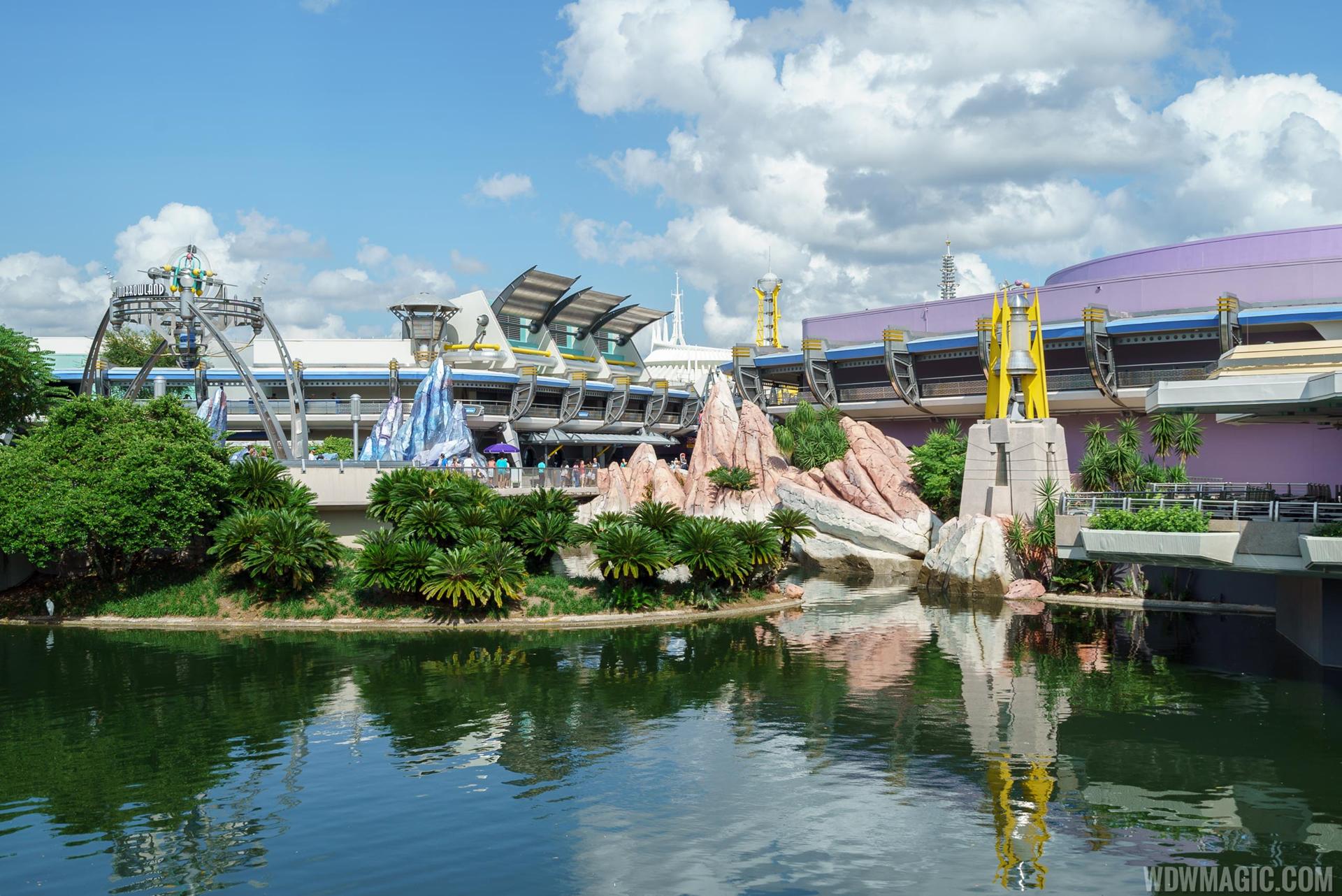
From last night.
Painted:
View attachment 160767 View attachment 160768 View attachment 160769
Not so painted:
View attachment 160770 View attachment 160771
As with most things, they look better in person.
Also, I don't like the red SouthWest rock look, period.
")
Here's what Tommorowland look at dawn at Tokyo Disneyland.

IMO steam punk was played out 5 years ago. I am so tired of that being a thingI am just happy they are staying away from the whole steampunk / golden Tomorrowland.
I kind of wish they would go back to the retro look like the one in Tokyo. That way it would never look outdated as it's a retro tomorrow, and it would never need an extensive overhaul like it does now.
Retro video games are like arcade games like PAC man. If they keep a 1960's version of the future it will always be that. So I agree on the Retro, but if you lock it into a time period it will always be locked to that. So again if you theme it to the 1960's future it will always be themed to the 1960's future and never become outdated.There is a difference between "timeless" and "Retro"
I am afraid "Retro" still has the ability and often becomes dated again. For example the retro revival of swing dancing in the late '90s. It was retro and cool until about 2003..04 tops. Afterwards it became outdated again.
When I was younger, I always wondered why the Big Thunder Mtn rocks were at the entrance of Tomorrowland. I am waiting for the final look, but so far I like it.the metallic finish brings out the texturing on the rocks...which is a plus...I look forward to seeing the completed look... I do like it better than the Sedona rocks they used to have...
These rocks must be from Guardian of the Galaxy. #ThanksChappieAgree. The purple on the MILF building is particularly unpleasant.
The backside looks awful. It's bare, is basically a parking lot, and looks more like a shopping center from the 80's than a cohesively themed land. Tokyo, Shanghai, and Paris are great examples of how this land could and should look.Please don't "re-theme" the backside of Tomorrowland...it's the only place you can get a small taste of the original (spectacular) design. Who says the future has to be one aesthetic anyway? Our cities are not like that(and we are "somebodies" future)....you have buildings from all times and styles coexisting next to each other. Imagine a Tomorrowland narrative that accounts for an organic development over time...which is why you see the accumulative layers on top of each other.
When I was younger, I always wondered why the Big Thunder Mtn rocks were at the entrance of Tomorrowland. I am waiting for the final look, but so far I like it.
Awesome pics. I like that they have made the rocks less shiny. I wasn't a big fan of the Peoplemover/Star Jets new color scheme, but I love the changes to CoP, and this seems to be an improvement as well.From last night.
Painted:
View attachment 160767 View attachment 160768 View attachment 160769
Not so painted:
View attachment 160770 View attachment 160771
As with most things, they look better in person.
Also, I don't like the red SouthWest rock look, period.
I agree. Hopefully next up are the buildings, and cleaner looking landscaping.Awesome pics. I like that they have made the rocks less shiny. I wasn't a big fan of the Peoplemover/Star Jets new color scheme, but I love the changes to CoP, and this seems to be an improvement as well.
Register on WDWMAGIC. This sidebar will go away, and you'll see fewer ads.