Next Big Thing
Well-Known Member
Anaheim's is the worst, imp. And again with the stupid rock work. It's a huge tease too because the peoplemover track is just sitting there, taunting you.
Just remove the damn rocks. They make no sense within the land.
It's supposed to be "the future that never was". When I envision what TL should look like, it should be sleek, clean with sweeping lines. it would need to have a simplistic, cohesive color scheme too. Right now it's a bit of a jumbled mess.Because rocks don't exist in the future?
It's supposed to be "the future that never was". When I envision what TL should look like, it should be sleek, clean with sweeping lines. it would need to have a simplistic, cohesive color scheme too. Right now it's a bit of a jumbled mess.
I hear the "Little Alien Men" think they're tough. I'll smack the sense into them so hard their heads will spin! Sad!I imagine men on Mars, the manliest planet, doing manly things, like punching aliens in the face (if they have one). You know what they'd be punching them on? BIG MANLY ROCKS.
I think the biggest issue (as someone above mentioned) is that there are just too many different ideas going on. Space mountain remains the sleek white vision of the original, the new Carousel of Progress has the bright, primary 70's future feel, we still have some of the 90's pastel and metal stuff going on, and now apparently we are getting giant purple mineral rocks. JUST PICK ONE.
View attachment 154160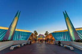

Paris Tokyo Shanghai
View attachment 154161 View attachment 154162
Hong Kong California
If anyone asks me, I don't think Tomorrowland should focus so much on outer space. It's the land of the future. Not space.
I guess people think of space since they've experienced these attractions in that section of the park -If anyone asks me, I don't think Tomorrowland should focus so much on outer space. It's the land of the future. Not space.
Toy Story 4 is coming out next year?You know, I just had a thought- maybe the purple is to make people subconsciously think of Buzz Lightyear, who does have a good deal of purple in his design.
Toy Story 4 is coming out next year?
I was pretty sure TS4 got pushed back to 2018, no?Wouldn't a monorail wrap be easier than a new color scheme.
(It's coming out 6.17.17 btw)
Anaheim's is the worst, imp. And again with the stupid rock work. It's a huge tease too because the peoplemover track is just sitting there, taunting you.
I was pretty sure TS4 got pushed back to 2018, no?
Did it? Ugh. Now I can't trust Wikipedia or Google.I was pretty sure TS4 got pushed back to 2018, no?

Register on WDWMAGIC. This sidebar will go away, and you'll see fewer ads.
![dgfoldauto3[1].jpg](https://d3ofq03apmfb8c.cloudfront.net/data/attachments/149/149236-33c6533e4098fd5c649dd5df9c45cc0d.jpg?hash=M8ZTPkCY_V)