News New Park Entrance coming to Epcot

wedenterprises

Well-Known Member
The refurbished Future World East restrooms do a much better job incorporating the brighter scheme. Note how everything complements in this picture, right down to the signs and trash can, all using the reds and pinks of the East/World Discovery pavilion logos.

View attachment 572387

Compare to the newly painted SSE East restrooms. It doesn't come together in the same way because we've used the entrance booth application scheme with World Discovery colors in an area that should have the SSE/World Celebration scheme of grays, whites, and blues.

View attachment 572390

Here's a quick mock up using colors similar to what's above Gateway Gifts and the Camera/Pin Center. Now we have a scheme that ties the entire area together visually while still bringing a pop of color and contrast.

View attachment 572397
great point
 

Sir_Cliff

Well-Known Member
The refurbished Future World East restrooms do a much better job incorporating the brighter scheme. Note how everything complements in this picture, right down to the signs and trash can, all using the reds and pinks of the East/World Discovery pavilion logos.

View attachment 572387

Compare to the newly painted SSE East restrooms. It doesn't come together in the same way because we've used the entrance booth application scheme with World Discovery colors in an area that should have the SSE/World Celebration scheme of grays, whites, and blues.

View attachment 572390

Here's a quick mock up using colors similar to what's above Gateway Gifts and the Camera/Pin Center. Now we have a scheme that ties the entire area together visually while still bringing a pop of color and contrast.

View attachment 572397
While interesting to see the mock-up, I think I actually prefer with the mix of colours they went with. Both options look good to me, though.

My impression is that with the colours and fonts they're finding a good way of leaning into the architecture and adding a slight 1980s flavour while still making it look fresh rather than simply retro. Whether that is just aesthetics and not so much in terms of content is another issue, though.
 

DCBaker

Premium Member
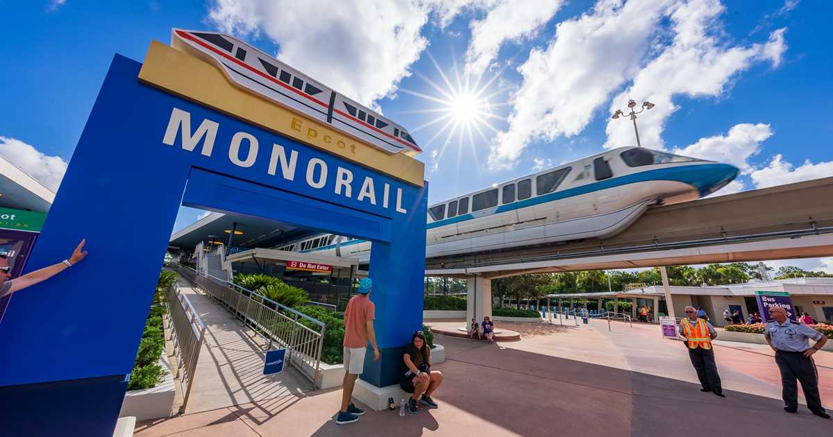
Monorail Station has received new signage.

Picture of the new sign -

E6h0GJlXMAEE3ks.jpg


180º

Well-Known Member
The new Epcot font is growing on me. At first I doubted its readability due to its excess of style, but mostly I’m finding it dresses up the place and does its job very well.

Even if the new logo looks like EPOOT. ;)
 

MisterPenguin

President of Animal Kingdom
Premium Member
I know it's not popular around here, but are the lights on outside of Spaceship Earth still on track to be ready by October 1?

I'm looking forward to seeing it.
As Steve said, yes, because it's part of "The Beacons of Magic" in which a iconic building in each of the four parks gets specially lit up in an iridescent way (the other three being the castle, ToT, and ToL) for the 50th.
 

dreday3

Well-Known Member
As Steve said, yes, because it's part of "The Beacons of Magic" in which a iconic building in each of the four parks gets specially lit up in an iridescent way (the other three being the castle, ToT, and ToL) for the 50th.

I know I read it, but didn't really sink in...ToT? I'm very curious to see how that turns out!
 

Register on WDWMAGIC. This sidebar will go away, and you'll see fewer ads.

Back
Top Bottom