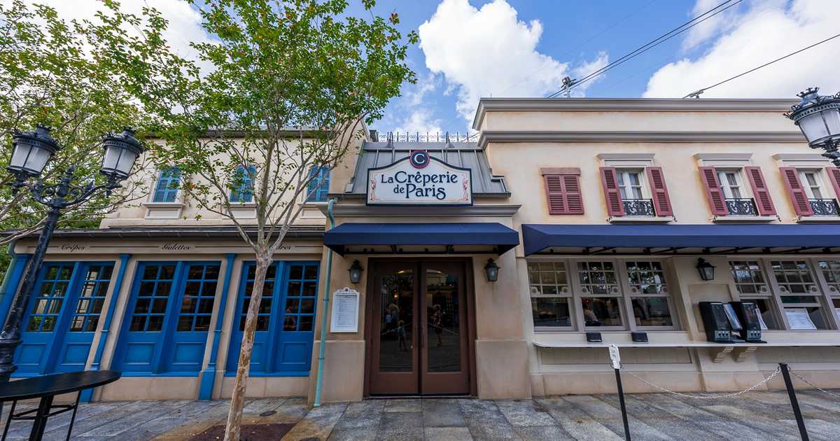
News New Crêperie restaurant coming to Epcot's France Pavilion as part of Ratatouille expansion

bpiper

Well-Known Member
You can’t paint them but a variety of colors are available.
So that they blend in.....

I so want to believe someone transposed a digit on the part number when they ordered them, but after all the other design failures lately, it was probably by design.

Or they got a good deal from the wholesaler on some leftovers.
 

lazyboy97o

Well-Known Member
So that they blend in.....

I so want to believe someone transposed a digit on the part number when they ordered them, but after all the other design failures lately, it was probably by design.

Or they got a good deal from the wholesaler on some leftovers.
That’s deliberate. There’s a whole process by which the contractor gets materials and finishes approved before ordering them.

The linear diffusers also have that basic, large white frame instead of something that matches the ceiling, a thinner profile or even a concealed frame.
 

Tha Realest

Well-Known Member
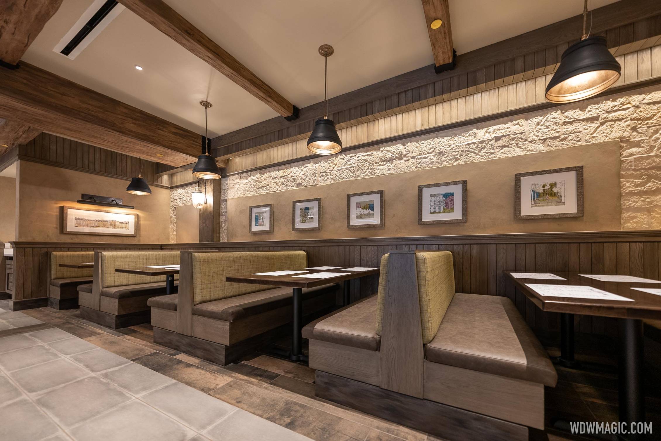
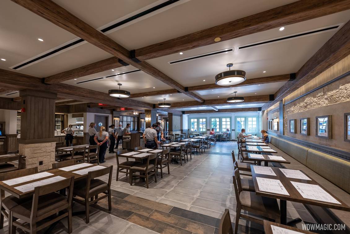
A better look at the interior design.


Creperie_Full_43930.jpg
Honest question - they have how many thousands of Imagineers on staff, and this is what they come up with?
this, the Poly refurb, and the Riviera has me thinking they’ve gotten extremely lazy and have lost their theming touch. Seriously, this looks like a first draft for a terrible update to a chain restaurant.
 

UNCgolf

Well-Known Member
Honest question - they have how many thousands of Imagineers on staff, and this is what they come up with?
this, the Poly refurb, and the Riviera has me thinking they’ve gotten extremely lazy and have lost their theming touch. Seriously, this looks like a first draft for a terrible update to a chain restaurant.

Wasn't it a late addition to the expansion? It almost feels like they just outsourced it to a contractor and let them build whatever.

I'm sure they didn't, though. And the Riviera is just as bad on a much larger scale.
 

lazyboy97o

Well-Known Member
Wasn't it a late addition to the expansion? It almost feels like they just outsourced it to a contractor and let them build whatever.

I'm sure they didn't, though. And the Riviera is just as bad on a much larger scale.
Outside a specific type of arrangement and very small projects, a contractor can’t do commercial design the way they can with single family residential work. This not only had Walt Disney Imagineering doing design and supervision, but also a hired architect (and team) and interior designer (and team).

This building is full of just bad design choices but almost none of them have anything to with the project being a late addition, or a fast project or a cheaper project. So many of the weird choices actually require more work, and it’s not just this project where that is happening.
 

hpyhnt 1000

Well-Known Member
It's not just that the styling is bland and uninspired, but even the basic building systems are done sloppily. In addition to the nonsensical faux-architectural details that have already been discussed in this thread, the air conditioning vents are plainly visible and distracting on the flat ceiling.

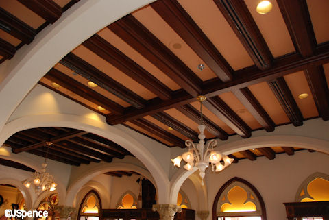
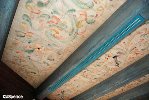
One of Disney's classic tricks that they've used in countless buildings throughout the parks is how they "hid" its HVAC vents in the faux wooden beams:
d36f57c0b66effa4310bb8ed7c7ead44.jpg


It%27s-All-Over-My-Head-038.jpg


It%27s-All-Over-My-Head-024.jpg


As an alternative, Tangerine Cafe "hid" them along the border where the white sloped parts meet the blue flat ceiling:
tangierine-cafe-epcot-2.jpg


None of these examples truly hide the vents from view, but instead they do that magical thing that tricks your eye into looking beyond the obvious and seeing something that isn’t really there.

Meanwhile, the new creperie just sort of places them randomly all over the place. They're not incorporated into the theming, nor are they evenly spaced between the beams. They're just sort of there, taking up space.
Creperie_Full_43934.jpg


In this area, they don't even seem to run between the beams, but are oriented perpendicular to them:
Creperie_Full_43930.jpg


It's not like this building has unique structural constraints that wouldn't allow a solution like this; it’s new construction and a simple box of a building. They clearly cared enough to make them the long linear vents, rather than the standard square or rectangular vents found in most commercial construction, and then just sort of gave up after that.

Yes, of course it's more difficult to incorporate things like that: it takes the foresight to anticipate where the utilities will be located, coordination to obscure them from view, and detailed work to install and maintain them. It takes designers who are experienced enough to know in advance that it will be an issue, creative enough to find a solution, and dedicated enough to ensure it is done.

It's not the easy thing to do, but it's literally the Disney Difference that set their parks apart from their competitors. The Disney Difference was never truly about the characters or the flashy shows, it was the way that they concealed the necessary-but-ugly infrastructure in a way that tricked your eye into ignoring it and focusing elsewhere. That was Disney's bread and butter for so very long that it came to define the brand.

And now they're not even getting the most basic elements of it right.
Excellent post. When folks talk about an area feeling "off" or looking not quite right, this is the stuff that creates that feeling.

And nail on the head about the Disney Difference being more than just characters and rides. It was about exceptional guest service, along with unparalleled theming, close attention to detail, and exemplary artistic and architectural design. It's unfortunate that many new builds are lacking in these areas (Rat expansion, Poly entrance, anything Harmonious, Riviera...).
 

Tha Realest

Well-Known Member
Excellent post. When folks talk about an area feeling "off" or looking not quite right, this is the stuff that creates that feeling.

And nail on the head about the Disney Difference being more than just characters and rides. It was about exceptional guest service, along with unparalleled theming, close attention to detail, and exemplary artistic and architectural design. It's unfortunate that many new builds are lacking in these areas (Rat expansion, Poly entrance, anything Harmonious, Riviera...).
It’s probably a good thing they’ve shelved so many new attractions and experiences. Imagine how terrible the new Spaceship Earth or Mary Poppins would have turned out under the current regime
 

James Alucobond

Well-Known Member
This building is full of just bad design choices but almost none of them have anything to with the project being a late addition, or a fast project or a cheaper project. So many of the weird choices actually require more work, and it’s not just this project where that is happening.
It's weird because the materials feel like they're straight out of a WDW restroom, which often has a similar brown-and-tan palette with natural stone ceramics. It's as if they couldn't shake what the building was originally supposed to be. In an odd reversal, some of the materials in the expansion restrooms would actually work better in the crêperie to help brighten the space, like the embossed wallpaper.
 

UNCgolf

Well-Known Member
Outside a specific type of arrangement and very small projects, a contractor can’t do commercial design the way they can with single family residential work. This not only had Walt Disney Imagineering doing design and supervision, but also a hired architect (and team) and interior designer (and team).

This building is full of just bad design choices but almost none of them have anything to with the project being a late addition, or a fast project or a cheaper project. So many of the weird choices actually require more work, and it’s not just this project where that is happening.

No, I know.

I wasn't suggesting they'd actually done that. I was merely saying that's the quality level -- not necessarily build quality but design/theme quality.
 

castlecake2.0

Well-Known Member
Ok I’ve changed my mind, it looks rushed and although it looks nice, sticks out from the rest of works showcase with its sterile design. Perhaps because WSC hasn’t had any new updates for so long it sticks out more while being surrounded by an almost 40 year old theme park. I think it was also added late at a request by the third party that operates the food services. All of that coupled with Covid possibly restricting budgets we get this. While nice looking, it feels off and the pavilion deserves better.

I’ve said this in many threads, but it’s worth emailing GR about if you’re not happy. Yes you’ll get the “thanks for being such a great fan” standard letter back, but your feedback does go to the park’s executive leadership team. The amount of time we spend on here discussing these things on here we could take a moment to send our thoughts to the mouse himself.

guest.services@disneyworld.com
 

ᗩLᘿᑕ ✨ ᗩζᗩᗰ

HOUSE OF MAGIC
Premium Member
Ok I’ve changed my mind, it looks rushed and although it looks nice, sticks out from the rest of works showcase with its sterile design. Perhaps because WSC hasn’t had any new updates for so long it sticks out more while being surrounded by an almost 40 year old theme park. I think it was also added late at a request by the third party that operates the food services. All of that coupled with Covid possibly restricting budgets we get this. While nice looking, it feels off and the pavilion deserves better.

I’ve said this in many threads, but it’s worth emailing GR about if you’re not happy. Yes you’ll get the “thanks for being such a great fan” standard letter back, but your feedback does go to the park’s executive leadership team. The amount of time we spend on here discussing these things on here we could take a moment to send our thoughts to the mouse himself.

guest.services@disneyworld.com

Mickey reads our feedback here too.
 

HauntedPirate

Park nostalgist
Premium Member
Oh that looks wonderful, authentically Parisian!!!

Wait…

*Thinks back to visiting a few places in Paris*

No, no it doesn’t. This is more of the bland generic “modern” design that has infected Disney these days like … a bad disease that you can’t get rid of (keeping it family friendly). Minimal effort, maximum profit.

#ThanksBobs
 

SpoiledBlueMilk

Well-Known Member
Oh that looks wonderful, authentically Parisian!!!

Wait…

*Thinks back to visiting a few places in Paris*

No, no it doesn’t. This is more of the bland generic “modern” design that has infected Disney these days like … a bad disease that you can’t get rid of (keeping it family friendly). Minimal effort, maximum profit.

#ThanksBobs
Well if you wanted authentically Parisian, it would be a storefront covered in graffiti.
 

Tha Realest

Well-Known Member
Oh that looks wonderful, authentically Parisian!!!

Wait…

*Thinks back to visiting a few places in Paris*

No, no it doesn’t. This is more of the bland generic “modern” design that has infected Disney these days like … a bad disease that you can’t get rid of (keeping it family friendly). Minimal effort, maximum profit.

#ThanksBobs
(Bob Iger clears throat)

“This is…Authentically Disney and distinctly Applebee’s”
 

Register on WDWMAGIC. This sidebar will go away, and you'll see fewer ads.

Back
Top Bottom