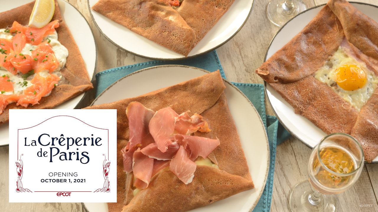
News New Crêperie restaurant coming to Epcot's France Pavilion as part of Ratatouille expansion

Missing20K

Well-Known Member
Will there be walking crepe options from the walk up window? Where they wrap it in paper?

Can’t speak for anyone else but I just love the brackets on the wood beams that are just wrapped on the end without even the slightest pretense of the brackets actually doing any work.
A17D7F0E-DBAD-4833-AC7E-948B10EB3DDB.jpeg
 

UNCgolf

Well-Known Member

This is meaningless. You can find restaurants that look like that in all of the represented countries, but I don't think anyone is suggesting they should remodel everything in the World Showcase to look like them. It's a disingenuous and lazy argument.

It's supposed to be a themed space that makes you feel like you're elsewhere/represents the country's unique aspects, not modern homogenous design. The fact that there are modern spaces in Paris (or London, or Beijing, or Tokyo, or Munich...) isn't some gotcha moment; everyone knows that. It's a giant metropolitan center. That's not the point of the World Showcase, though.

Also, none of those are actually ugly inside the way this is, but that's a separate (and subjective) issue.
 
Last edited:

Little Green Men

Well-Known Member
This is meaningless. If it was a good argument, Disney should just demolish everything and build a shopping mall for World Showcase because you can find modern strip malls in basically all of the represented companies too. It's disingenuous and lazy.

It's supposed to be a themed space that makes you feel like you're elsewhere. The fact that there are modern spaces in Paris isn't some gotcha moment; everyone knows that. It's a giant metropolitan center. That's not the point of the World Showcase, though.

Also, none of those are actually ugly inside the way this is, but that's a separate (and subjective) issue.
WS evokes all sorts of periods. Nobody is asking to theme everything modern but not everything has to be from certain eras. People acting like it’s some random strip is inaccurate.
 

UNCgolf

Well-Known Member
WS evokes all sorts of periods. Nobody is asking to theme everything modern but not everything has to be from certain eras. People acting like it’s some random strip is inaccurate.

Theming something to modern design in the World Showcase is essentially pointless, though, because in the present global culture you can find modern designs nearly everywhere. The creperie looks like something you could walk into in any random spot all over the United States, or in numerous other countries.

If it was a specific modern design that had a direct connection to a particular culture, that would be different, but I can't imagine anyone would argue that anything in the design of the creperie is really associated with France beyond the actual food.

If you put this in Disney Springs, it's fine. It would still be a poorly designed interior, but it wouldn't affect the theme. It just doesn't belong in the World Showcase.
 
Last edited:

rkleinlein

Well-Known Member
It's so frustrating when people express their critiques of Disney's theming and design and then there is an attempt to defend Disney with a comparison of something that's also ugly or generic. What's the point? That there's ugly and generic design in the world so it's ok for Disney theming and design to be ugly, generic, and inauthentic? I don't get it.

And though these pics do show design that I would describe as generic, I think they make Disney's bad design look even worse: pics are fuzzy but I don't see anything in them that jumps out as obviously fake, pasted on, or architecturally inaccurate or silly--unlike what Disney had done so sloppily here and elsewhere.
 

TikibirdLand

Well-Known Member
It's so frustrating when people express their critiques of Disney's theming and design and then there is an attempt to defend Disney with a comparison of something that's also ugly or generic. What's the point? That there's ugly and generic design in the world so it's ok for Disney theming and design to be ugly, generic, and inauthentic? I don't get it.

And though these pics do show design that I would describe as generic, I think they make Disney's bad design look even worse: pics are fuzzy but I don't see anything in them that jumps out as obviously fake, pasted on, or architecturally inaccurate or silly--unlike what Disney had done so sloppily here and elsewhere.
I'm not so sure they're trying to show something ugly or generic. Maybe this is what a Crepe shop actually looks like in France? 🤷‍♂️
 

Andrew C

You know what's funny?
I'm not so sure they're trying to show something ugly or generic. Maybe this is what a Crepe shop actually looks like in France? 🤷‍♂️
I think the expectation some people have is for it not to look like modern France, but more like historic France or at least a caricature of it.
 

UNCgolf

Well-Known Member
I think the expectation some people have is for it not to look like modern France, but more like historic France or at least a caricature of it.

Basically, yes -- mainly because modern spaces in France don't really look all that different than modern spaces in the UK, Germany, United States, or even China.
 

michmousefan

Well-Known Member
Well, somebody at the Park Blog seems to have the right accents placed... perhaps they can consult with the sign shop:
 

note2001

Well-Known Member
I'm disappointed in the menu. What is with Disney's love of hazlenut spread that it makes it's appearance all over creation. They must have a steal of a deal going on with nutella.

Crepes should be made to order. Yes, this could be hard given the huge number of folks Disney is trying to serve, but they're basicly pancakes, fill with whatever you like, super simple and fast. My mom's family is pure french, these items offered are too forced and not among anything they would make. Let your customers choose the fillings.
 

MisterPenguin

President of Animal Kingdom
Premium Member

UNCgolf

Well-Known Member
Everyone is ok that Via Napoli just looks like a Cheesecake Factory though right? Also the inside doesn’t match the structure at all. And the sliding automatic doors at the front? *chefs kiss*.
View attachment 582952

I don't think Via Napoli is very good either. They at least attempted to make it vaguely Italian, though. It doesn't look like anyone even tried to theme the creperie.
 

Register on WDWMAGIC. This sidebar will go away, and you'll see fewer ads.

Back
Top Bottom