News New Crêperie restaurant coming to Epcot's France Pavilion as part of Ratatouille expansion

LittleBuford

Well-Known Member
This is probably the most bizarre aspect of Disney fandom.

People willing to spend thousands of dollars on a product they love to act indifferent towards and criticize others for caring about. 🤨

To be fair, she’s never acted indifferent to Disney. She may not concern herself with those aspects of the park that matter to you and others, but that doesn’t mean she doesn’t value or care about the parks in other ways.
 

Castle Cake Apologist

Well-Known Member

I was just observing. They were your words, not mine. At one point you essentially told somebody with considerable knowledge in this field that themed design is not an artistic medium because it's in a theme park. This is not only patently untrue, but is also quite insulting to thousands of artists who have chosen this as their medium. Your only response to very reasoned postings regarding the design choices in this art has been to shrug and say over and over that you don't care.

So, what exactly would you like for us to discuss in this thread? The art is basically all we have at this point, but you seem to think that we shouldn't be allowed to discuss it if we take issue with it.
 
Last edited:

Tony the Tigger

Well-Known Member
I was just observing. They were your words, not mine. At one point you essentially told somebody with considerable knowledge in this field that themed design is not an artistic medium because it's in a theme park. This is not only patently untrue, but is also quite insulting to thousands of artists who have chosen this as their medium. Your only response to very reasoned postings regarding the design choices in this art has been to shrug and say over and over that you don't care.

So, what exactly would you like for us to discuss in this thread? The art is basically all we have at this point, but you seem to think that we shouldn't be allowed to discuss it if we take issue with it.

See, it really annoys me when people take what you say and then draw their own conclusions from it. I don't think you were "observing;" I think you were assuming and reading into what I'm saying. I take some offense to that.

I never said what anybody should or should not discuss. I am allowed to present my opinion, whether agreeing or disagreeing. So is everyone else.

And no, it's not "patently untrue;" you disagree with my opinion.

It's. Not. Art. That's my opinion. It's a commodity. Giving someone the instruction to create a French storefront is not art. It's an assignment. It must meet certain criteria based on the needs of the business. I've never heard of common storefronts considered "art." Are there artistic elements? There can be. Are there creative elements? There can be. Is it something impressive that few others can do and may end up in a museum or worth a lot of money? No. I've had some fine art training (many moons ago.) There's a difference between commercial art such as package design, etc., and fine art such as painting, etc., and architecture.

My opinion is that some of you guys elevate this stuff to a level it does not merit. A theme park will always be a theme park. A fast food restaurant will always be a fast food restaurant, even if it has amazing architecture, design, or even food.

That's my opinion and you can all disagree as much as you want; that's fair.

Yes, plenty of thought goes into design and ideas. I get it. I don't think that makes it art.

Again, some elements are artistic; sure. You can't make something look like Snow White if you have no artistic ability.

But this was designed to be a park for families to hang out, not to be some genius key to the universe and perfection.

Have standards. Yes, of course. And they do. Customers holding a company to their standards is arbitrary. And my opinion is if you feel that strongly about it, go work for the company and try to change things to how you think they should be done. Otherwise: a company is putting out a product. Consume it or don't. Make a constructive suggestion or observation here or there. Don't tell them they're doing it wrong - it's their prerogative to do it however they want.

Above all, though, we have zero to go on here but a drawing. Nothing has been built. Therefore, all this critique is hypothetical and pointless, especially since (presumably) none of us here are decision makers. So no matter what, if any, consensus is reached here, it's all "academic."

You do you. If I think you sound a little out there, I might say so, as might others. Feel free to say the same. It's a free country.

As far as the credentials of individual posters: that is not made clear here. You could be an engineer or a housewife, or a housewife who is an engineer. Don't expect everyone to know who you are, and if "who you are" is important to you, that's a shame. Nobody is more important than anybody else, IMO; and the people here who act like they are special are the first to put me off. I tend to tune them out or call them out.

I can't believe I even had to get into all this.

Discuss whatever you want, however you want. Don't keep summoning me back if you don't want my opinion. I hadn't been here in some time until someone referenced me for whatever petty reason.
 

lazyboy97o

Well-Known Member
There's a difference between commercial art such as package design, etc., and fine art such as painting, etc., and architecture.
How is the crêperie not architecture?

Don't tell them they're doing it wrong - it's their prerogative to do it however they want.
Being able to do something and whether it is right or wrong are two separate things. I can sell the Sex Pistols as K-Pop, but that doesn’t make them K-Pop.

As far as the credentials of individual posters: that is not made clear here. You could be an engineer or a housewife, or a housewife who is an engineer. Don't expect everyone to know who you are, and if "who you are" is important to you, that's a shame. Nobody is more important than anybody else, IMO; and the people here who act like they are special are the first to put me off. I tend to tune them out or call them out.
You’re the one asking “Are you an Imagineer?” If credentials are unimportant to you then there should be no purpose in asking such a question.
 

LittleBuford

Well-Known Member
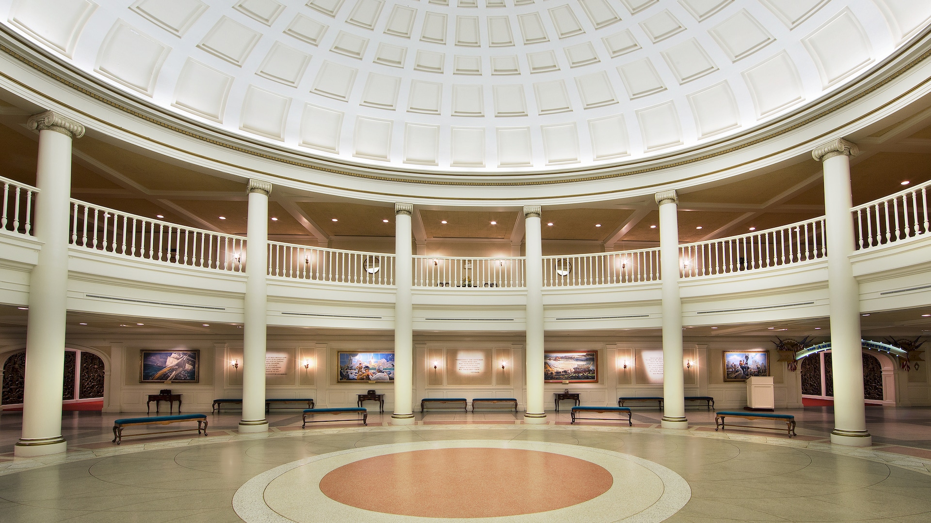
Please forgive me this tangent, but I have a question for the more architecturally knowledgeable posters here. Why are the column capitals of the rotunda in the American Adventure perpendicular to the architrave? Doesn't this go against the rules of the classical orders? Is it modelled on a real-life example? It's always bothered me!

American Adventure:

american-adventure-gallery01.jpg


A "standard" rotunda, with the capitals oriented the "correct" way:

National_Gallery_of_Art_interior.jpg
 

Missing20K

Well-Known Member
Please forgive me this tangent, but I have a question for the more architecturally knowledgeable posters here. Why are the column capitals of the rotunda in the American Adventure perpendicular to the architrave? Doesn't this go against the rules of the classical orders? Is it modelled on a real-life example? It's always bothered me!

American Adventure:

american-adventure-gallery01.jpg


A "standard" rotunda, with the capitals oriented the "correct" way:

National_Gallery_of_Art_interior.jpg
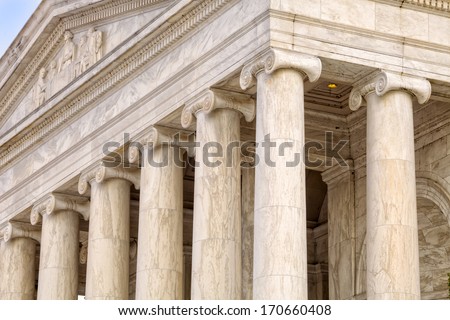
It happens at the Jefferson Memorial (see below). But I have no idea the reasoning. It's certainly a bit odd looking to see an ionic scroll capital perpendicular to the architrave or entablature.

Great catch by the way!

ionic-columns-jefferson-memorial-washington-450w-170660408.jpg
 

lazyboy97o

Well-Known Member
Please forgive me this tangent, but I have a question for the more architecturally knowledgeable posters here. Why are the column capitals of the rotunda in the American Adventure perpendicular to the architrave? Doesn't this go against the rules of the classical orders? Is it modelled on a real-life example? It's always bothered me!

American Adventure:

american-adventure-gallery01.jpg


A "standard" rotunda, with the capitals oriented the "correct" way:

National_Gallery_of_Art_interior.jpg
I want to say it is a very specific reference, possibly to something that no longer exists, but cannot remember. A big part of why I think it is very specific is because it is several steps down the rabbit whole of particular choices. You’re photo of a “standard” rotunda isn’t actually very standard. Corinthian columns are more common with interior rotundas because it is associated with more complexity. When the the Ionic order is used, the four-sided capital is more common than the two-sides version in your photos.
 

LittleBuford

Well-Known Member
It happens at the Jefferson Memorial (see below). But I have no idea the reasoning. It's certainly a bit odd looking to see an ionic scroll capital perpendicular to the architrave or entablature.

Great catch by the way!

ionic-columns-jefferson-memorial-washington-450w-170660408.jpg

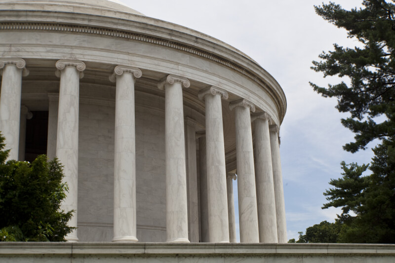
Thanks for this example. Here, the "mistake" elegantly avoids the issue one typically has when Ionic colonnades turn the corner. I wonder if there are similar examples from antiquity or if this was a "modern" solution. It's interesting to note that the greater part of the memorial has the capitals oriented in the usual fashion:

jefferson-memorial-rotunda_medium.jpg


You’re photo of a “standard” rotunda isn’t actually very standard. Corinthian columns are more common with interior rotundas because it is associated with more complexity. When the the Ionic order is used, the four-sided capital is more common than the two-sides version in your photos.

There are plenty of rotundas using the unmodified Ionic capital (see the photo above of the Jefferson Memorial, for instance). They are the "standard" to which I'm referring, since they are what we have to measure the rotunda of the American Adventure against.

I want to say it is a very specific reference, possibly to something that no longer exists, but cannot remember. A big part of why I think it is very specific is because it is several steps down the rabbit whole of particular choices.

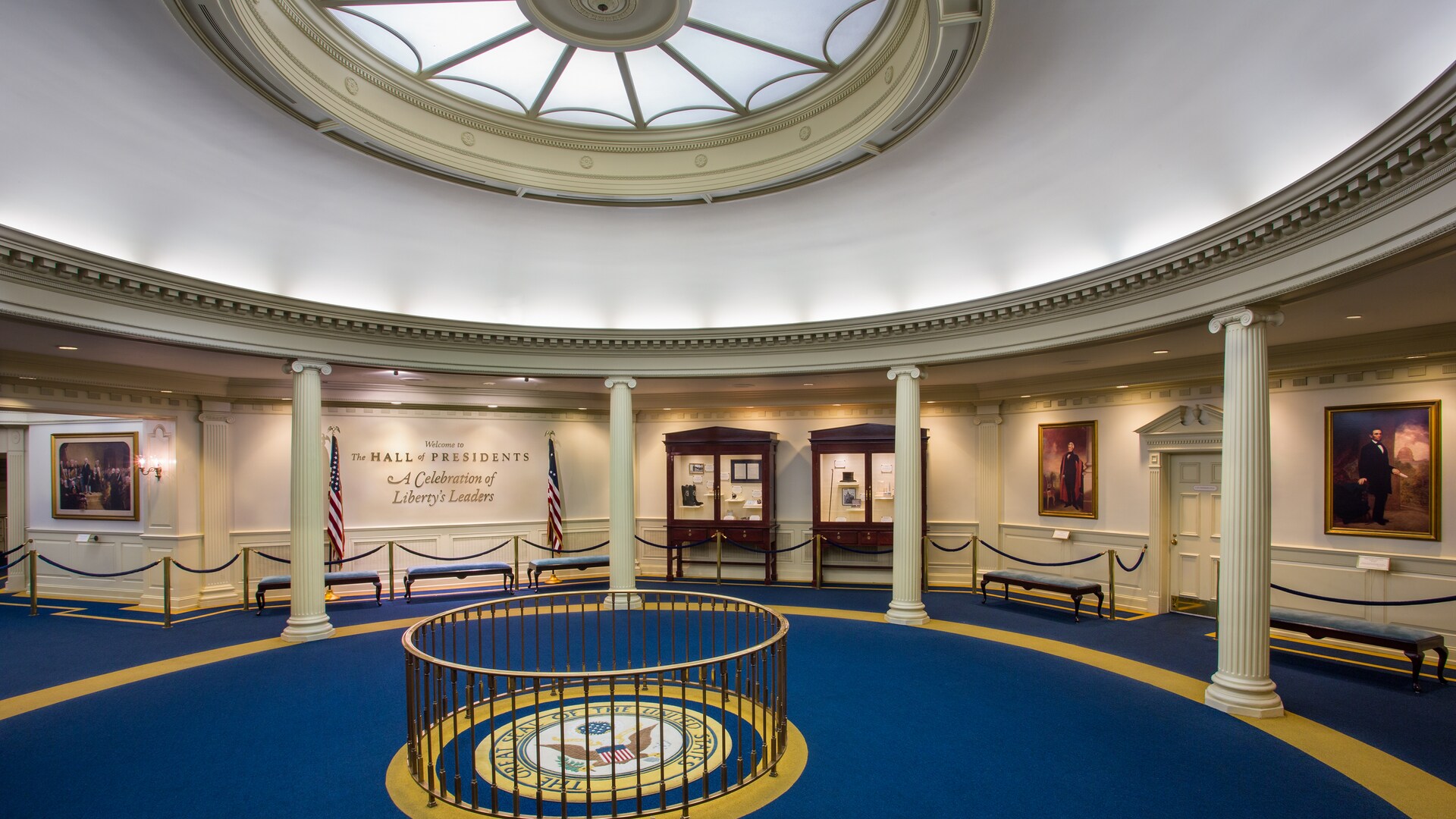
Perhaps the Imagineers consciously chose to be architecturally quirky, even rebellious. Or maybe they were just trying to make the rotunda look conspicuously different from its counterpart at the Hall of Presidents (below). And then there's always the possibility that they didn't actually know that they were breaking any rules.

hall-of-presidents-gallery04.jpg
 

larryz

I'm Just A Tourist!
Premium Member
Thanks for this example. Here, the "mistake" elegantly avoids the issue one typically has when Ionic colonnades turn the corner. I wonder if there are similar examples from antiquity or if this was a "modern" solution. It's interesting to note that the greater part of the memorial has the capitals oriented in the usual fashion:

jefferson-memorial-rotunda_medium.jpg


There are plenty of rotundas using the unmodified Ionic capital (see the photo above of the Jefferson Memorial, for instance). They are the "standard" to which I'm referring, since they are what we have to measure the rotunda of the American Adventure against.


Perhaps the Imagineers consciously chose to be architecturally quirky, even rebellious. Or maybe they were just trying to make the rotunda look conspicuously different from its counterpart at the Hall of Presidents (below). And then there's always the possibility that they didn't actually know that they were breaking any rules.

hall-of-presidents-gallery04.jpg
My guess: the contractor was working off of artists' renderings rather than blueprints. ;)
 

lazyboy97o

Well-Known Member
My guess: the contractor was working off of artists' renderings rather than blueprints. ;)
I know you’re joking, but a lot of the “concept art” recently released by Disney of buildings is the “blueprints.”

Ha! Part of me did wonder if it was a mistake that occurred at the building stage.
Contemporary classical columns are more show than column. If it were a mistake it likely would have been easy to correct.
 

LittleBuford

Well-Known Member
Contemporary classical columns are more show than column. If it were a mistake it likely would have been easy to correct.

I wasn't really being serious.

The question of why the columns aren't "correctly" oriented touches, I think, on the debate that some of you were having earlier. While I love Tony, I disagree with him wholeheartedly on the question of whether theming constitutes art. It most certainly does. But it's an art of its own, not bound by the rules of other art forms. And so to be bothered by the orientation of the Ionic capitals in the American Adventure (as I was) or by the use of a mansard roof for the crêperie (as you were) is perhaps wrongheaded, as we are expecting the Imagineers to conform to architectural norms that they are under no obligation to follow. World Showcase is full of all sorts of unlikely pastiches and aberrations, and these speak to the strength, rather than weakness, of the art of theming, which is at its best when it creatively adapts its source material.

(For what it's worth, I agree with you that the concept art for the crêperie isn't great, but not because it's architecturally inauthentic.)
 

Tony the Tigger

Well-Known Member
You’re the one asking “Are you an Imagineer?” If credentials are unimportant to you then there should be no purpose in asking such a question.

That's because, IMO, some people present themselves here as if they are. As Buford suggested, this is a unique field. Very few people are "experts" unless they have been Imagineers for WDW and/or Universal.

If you expect people to fall all over you because you've read some books on WDW and took a tour, or because you've been going since the 70's, or because you worked the counter at a QS for two years, or because a group of you blow smoke [at each other] I'm not your guy.

Maybe if some folks presented their ideas as ideas and opinions instead of with such obnoxious certainty as if they were in charge of the place, and with such condescension, they would be more palatable and better received by those of us who have no need to feel like experts because we derive meaning from our actual lives.

And for the slow to read: that does not mean I dismiss detail or artistic flourishes; it means I hold them in what I consider to be realistic context. The building could have just been made to look like any old building. That's what would happen at Six Flags. The fact that it appears to the majority of guests that it fits in with the rest of fake France is what happens at WDW. The fact that - wait, there are no facts, since nothing has been built yet. The supposition that there may be an incorrect architectural detail re: the roof after it is built based on a drawing is being too picky IMO (and too soon.) It reminds me of the people who critique The Last Jedi because, "How can Leia possibly breathe in space?" Get over it and enjoy the thing for what it is. Yes, I noticed it, so don't feel special for noticing. I just don't let it ruin the movie for me.
 

lazyboy97o

Well-Known Member
I wasn't really being serious.

The question of why the columns aren't "correctly" oriented touches, I think, on the debate that some of you were having earlier. While I love Tony, I disagree with him wholeheartedly on the question of whether theming constitutes art. It most certainly does. But it's an art of its own, not bound by the rules of other art forms. And so to be bothered by the orientation of the Ionic capitals in the American Adventure (as I was) or by the use of a mansard roof for the crêperie (as you were) is perhaps wrongheaded, as we are expecting the Imagineers to conform to architectural norms that they are under no obligation to follow. World Showcase is full of all sorts of unlikely pastiches and aberrations, and these speak to the strength, rather than weakness, of the art of theming, which is at its best when it creatively adapts its source material.

(For what it's worth, I agree with you that the concept art for the crêperie isn't great, but not because it's architecturally inauthentic.)
Those architectural norms are what distinguish the architecture of different styles, places, times and uses. Themed entertainment is a storytelling medium and communicating requires some common base. When a story has to be filled with asides of “I actually meant this” then it is not well constructed. Much of World Showcase is composed of the same or similar building elements but it is in their particular norms of use that create the differences that make something French versus Italian. Even the Classical orders, typically presented as rather fixed in their form, have variations particular to different times and places. Non-fluted Ionic columns are non-standard but they make sense in The American Adventure because they became associated with Thomas Jefferson and Neo-Jeffersonian Greek Revival intended to celebrate republican ideals. City Hall at Disneyland is not described as French and wouldn’t make sense in the France Pavilion even though it’s style would be considered Second Empire. The Imagineers are not obligated to follow such norms, but in not doing so they become architectural Humpty Dumptys who present one thing but then declare it another.

Can you clarify what you mean? It’s impossible for these things to be built straight from concept art without technical drawings and plans.
You are assuming it is always art first, blueprints second. “Concept art” is a misleading term as it implies creation during the first two of Disney’s five phases of design (Blue Sky and Concept Design). While art is created during those phases, art continues to be produced throughout the rest of the design process and pieces chosen for publication are more often specifically made for the purpose of publication.

In regards to architecture and engineering, Walt Disney Imagineering has transitioned from CAD to BIM (building information modeling), specifically Revit. This means that blueprints are now derived from a 3D digital model of the building, not individually drawn 2D drawings (CAD can do 3D but it’s different and wasn’t often employed). In the case of the new hotel towers, almost all of the released art is very clearly images made using rendering software specifically intended for use with the “blueprint” model created by the architect, and many look like little more than default settings. Much of the Disney Springs art also used such tools, but were more heavily edited and manipulated by a digital artist. The art for crêperie also suggests such an origin.
 

Register on WDWMAGIC. This sidebar will go away, and you'll see fewer ads.

Back
Top Bottom