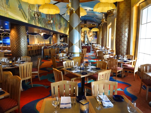
Major refurbishment of the Flying Fish Cafe beginning in February 2016

Tiggerish

Resident Redhead
Premium Member
Photo update as of Sunday, July 17. The exterior sign for The Flying Fish has been re-painted and neon fish restored. The awning over the door has yet to be installed. The staff will be training inside the building this coming week, but there is much to be finished both inside and outside. Looks like an early August opening would be appropriate.

View attachment 151597

Next door, a red awning over the front entrance to AbracadaBar has been installed....and spelling corrected.
View attachment 151598

I'm so relieved!!! :inlove:

I really would have hated to have to point it out...:oops: But I would have. :banghead:
 

Bocabear

Well-Known Member
I actually really liked the original interior... It was dramatic, whimsical but yet elegant... I loved the open kitchen, the elaborate tile work, the custom chandeliers and murals...I hope the redesign doesnt end up looking like " Any Upscale Steakhouse USA"... Disney has been doiong a very mediocre job with their interiors lately and I really hope they add some unique features and wow factor that the original dining room had...
Dining-with-an-Imagineer-at-Flying-Fish-Cafe-February-2013-02.jpg
 

Bocabear

Well-Known Member
I had not seen the concept art, but yes, I guess it will look just like any Morton's or Ruth's Chris out there... Such a shame that it is such a boring vision... Upscale dining in a predictable environment. Meh... Maybe Abracadabar will look more interesting...but this is a real snore.
 

ABQ

Well-Known Member
I had not seen the concept art, but yes, I guess it will look just like any Morton's or Ruth's Chris out there... Such a shame that it is such a boring vision... Upscale dining in a predictable environment. Meh... Maybe Abracadabar will look more interesting...but this is a real snore.
Though the concept art doesn't share the whimsy the original restaurant had, it's not as meh as either Ruth's on the left or Morton's on the right. It will retain the open kitchen too, which is always nice to see.
steakhouses.jpg
 

Bocabear

Well-Known Member
Seriously it is every bit as boring... It has some steel room divider panels, contract carpet, glass fish chandelier...which we see all the time down here in South Florida...There are probably a dozen restaurants down here in South Florida that are more interesting looking than that.
We recently had dinner at the California Grill after it's remodel, and the same thing... Ho Hum, current hospitality design... even the light fixtures I have seen everywhere recently... It is just not special... We can nit pick on the finer points, but this interior concept art looks no more special than any restaurant I would find down here... though dated (very) the original interior was at least whimsical and memorable... this looks to be neither...
 

Bocabear

Well-Known Member
restaurants-bars--v865070-12-720.jpg
4d6eab19af72bc7017a43eaade67cb1a.jpg


These are pictures of the restaurant at the W hotel nearby... and there are a lot more...Just seems like if they are going to go modern, do something exciting.. if they are going to do vintage boardwalk, do something exciting, but to just make it look like a nice dining room... seems like a missed opportunity and a downgrade.
 
Last edited:

COProgressFan

Well-Known Member
I had not seen the concept art, but yes, I guess it will look just like any Morton's or Ruth's Chris out there... Such a shame that it is such a boring vision... Upscale dining in a predictable environment. Meh... Maybe Abracadabar will look more interesting...but this is a real snore.

I agree. The new art looks nice, but a bit boring. Disney had traditionally been known to make their locations a bit more interesting and unique. Hoping it will look nice when we see it open soon.
 

ToTBellHop

Well-Known Member
I agree. The new art looks nice, but a bit boring. Disney had traditionally been known to make their locations a bit more interesting and unique. Hoping it will look nice when we see it open soon.
I literally cannot think of any recent example where this is true. Whether it be a restaurant or a hotel room, every recent renovation has made the space more modern and contemporary (boring?). Perhaps that is what's "in" right now.
 

Bocabear

Well-Known Member
I literally cannot think of any recent example where this is true. Whether it be a restaurant or a hotel room, every recent renovation has made the space more modern and contemporary (boring?). Perhaps that is what's "in" right now.
It's like whoever is on their interior design team right now doesn't have a sense of flair or an idea of what a thematic interior is supposed to be... it is all just modern, prefectly pleasant, but unremarkable... and the interior it is replacing, when it opened was quite a wow... It was interesting kind of zany, but altogether well designed... Seems like they keep hitting the Marriott Hotel Convention Room design theme... ho hum...
 

COProgressFan

Well-Known Member
I literally cannot think of any recent example where this is true. Whether it be a restaurant or a hotel room, every recent renovation has made the space more modern and contemporary (boring?). Perhaps that is what's "in" right now.

I guess so. Lots of the designs they've been doing look nice, but it's generic with subtle nods to the supposed theme. Using room refurbs as an example, the GF rooms renovated a few years ago caused a bit of stir online. They're bland. I know some people like them, but I preferred the previous more themed design. But I think you're right that playing it safe may be the "in" design, I don't know. I do know that Disney spaces used to feel different from the "real world".
 

Bocabear

Well-Known Member
And that is really the point....they used to feel different and special...and you felt surrounded by something special... Whether plain is in or not, it doesn't work in an environment that is supposed to transport you someplace else... These are spaces that are supposed to be extraordinary... not "the usual". You can eat in a Ruth's Chris in Orlando for less money...but you pay more for a slightly lower quality meal because you are immersed in Disney Magic... To me, these latest interior renovations are just plain fails... They could and should be so much more... It's like they aren't even trying anymore...
 

flyerjab

Well-Known Member
I literally cannot think of any recent example where this is true. Whether it be a restaurant or a hotel room, every recent renovation has made the space more modern and contemporary (boring?). Perhaps that is what's "in" right now.

I could not agree with you more. One of the things that I have really liked recently have been the room renovations. I have seen the older rooms and some of them were just gaudy. The GFs rooms looked like my grandmother threw up her style all over the place. Now I really like them. I have heard them described as understated elegance. But some of the recent additions to the resort as a whole over the last few years have been great. The Boathouse, Jock's, Trader Sam's, Tiffins, Nomad Lounge, Poly DVC rooms. And not to mention the GF villas are the most beautifully designed rooms on site.

However, in the end it comes down to style and appreciation of the approach. Some don't like the new designs. I happen to.
 

Bocabear

Well-Known Member
I could not agree with you more. One of the things that I have really liked recently have been the room renovations. I have seen the older rooms and some of them were just gaudy. The GFs rooms looked like my grandmother threw up her style all over the place. Now I really like them. I have heard them described as understated elegance. But some of the recent additions to the resort as a whole over the last few years have been great. The Boathouse, Jock's, Trader Sam's, Tiffins, Nomad Lounge, Poly DVC rooms. And not to mention the GF villas are the most beautifully designed rooms on site.

However, in the end it comes down to style and appreciation of the approach. Some don't like the new designs. I happen to.
The hotel rooms I think are fine...we stayed at the Poly bungalows and thought they were beautiful... where I have more of a problem is in the restaurant and theme park spaces that simply flatline...Jock's is great, Trader Sam's is fine Nomad lounge is pretty bland... The theme of your resort is the Jersey Shore Boardwalk, 1940.... Does this evoke a plain room with a contemporary chandelier and rather pedestrian decor?...Does that scream "modern understated standard"? and then you have a cocktail lounge themed to a magic show? that should actually make it even more whimsical...but it just fails to impress... Like the California Grill...the interior is fine...but less that landmark as it should be.
 

ford91exploder

Resident Curmudgeon
And that is really the point....they used to feel different and special...and you felt surrounded by something special... Whether plain is in or not, it doesn't work in an environment that is supposed to transport you someplace else... These are spaces that are supposed to be extraordinary... not "the usual". You can eat in a Ruth's Chris in Orlando for less money...but you pay more for a slightly lower quality meal because you are immersed in Disney Magic... To me, these latest interior renovations are just plain fails... They could and should be so much more... It's like they aren't even trying anymore...

Why should they people keep saying the current degraded product is the Best Evah!
 

flyerjab

Well-Known Member
The hotel rooms I think are fine...we stayed at the Poly bungalows and thought they were beautiful... where I have more of a problem is in the restaurant and theme park spaces that simply flatline...Jock's is great, Trader Sam's is fine Nomad lounge is pretty bland... The theme of your resort is the Jersey Shore Boardwalk, 1940.... Does this evoke a plain room with a contemporary chandelier and rather pedestrian decor?...Does that scream "modern understated standard"? and then you have a cocktail lounge themed to a magic show? that should actually make it even more whimsical...but it just fails to impress... Like the California Grill...the interior is fine...but less that landmark as it should be.

We'll just have to differ in opinion. I like the new concept art and thought the previous incarnation of Flying Fish Cafe was nice but aging (similar to how I feel about Narcoossee's - nice but seriously needs updating). But to say that Nomad Lounge is bland highlights how far apart you and I are in our opinion.
 

Bocabear

Well-Known Member
We'll just have to differ in opinion. I like the new concept art and thought the previous incarnation of Flying Fish Cafe was nice but aging (similar to how I feel about Narcoossee's - nice but seriously needs updating). But to say that Nomad Lounge is bland highlights how far apart you and I are in our opinion.
I would have to agree if you thought the concept art for Flying Fish looked like an exciting upgrade...lol Nomad Lounge is one of the few places I am judging by photographs... I have not been there... the others I know quite well...Maybe I have just not seen a photo that makes it look amazing... Generally Animal Kingdom does a great job on their thematics... But C'mon... does the concept art for The Flying Fish look any better than any expensive restaurant in anytown USA?...It's nice... but certainly not visually exciting...and I agree about Narcoosees
 

flyerjab

Well-Known Member
I would have to agree if you thought the concept art for Flying Fish looked like an exciting upgrade...lol Nomad Lounge is one of the few places I am judging by photographs... I have not been there... the others I know quite well...Maybe I have just not seen a photo that makes it look amazing... Generally Animal Kingdom does a great job on their thematics... But C'mon... does the concept art for The Flying Fish look any better than any expensive restaurant in anytown USA?...It's nice... but certainly not visually exciting...and I agree about Narcoosees

Haha! How about this - instead of judging based off of concept art or photos, you visit Tiffins and the Nomad Lounge and I'll visit Flying Fish and Abracadabar after they are actually open. Then we can have a real discussion. Do you live near the resort or do you visit frequently?
 

COProgressFan

Well-Known Member
Haha! How about this - instead of judging based off of concept art or photos, you visit Tiffins and the Nomad Lounge and I'll visit Flying Fish and Abracadabar after they are actually open. Then we can have a real discussion. Do you live near the resort or do you visit frequently?

It's a discussion board about WDW. Most of us don't live nearby. The locations we are discussing are new or soon-to-be opened. Of course, opinions can change when you see something in person. But for right now, all we have to go on is concept art and/or pictures.

Somehow it's wrong to discuss Disney things in a Disney forum?
 

Register on WDWMAGIC. This sidebar will go away, and you'll see fewer ads.

Back
Top Bottom