Main Street U.S.A. hub redevelopment at the Magic Kingdom

Goofyernmost

Well-Known Member
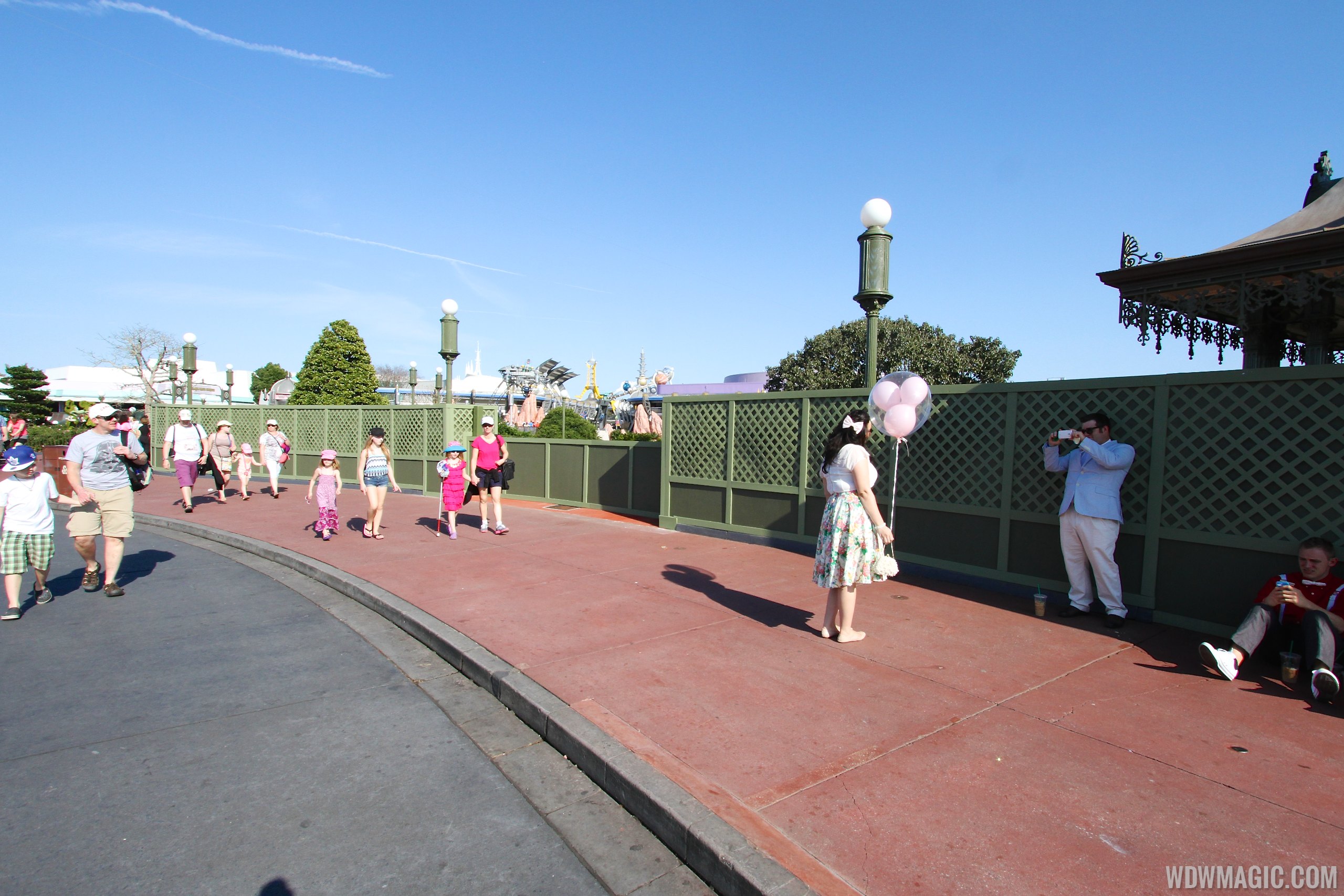
Lots of guests don't even notice concrete color clashes. I do. But it isn't just at Disney, it is anything with color that looks patched or skimped on vs doing properly. Last spring I looked at the entrance to the MK and wished those bean counters would look at the concrete in that area. There didn't seem to be any attempt to match colors. Just good enough.

IMG_0974-1.jpg
Sorry, I don't see it. I do see obvious differences in coloring but to me it looks intentional and part of an overhead design that we cannot see from street level. Probably a lot of fading from the Florida sunshine as well.

Not to pick on you guys - others have mentioned the speakers as well so I am just using your quotes to broach the subject.

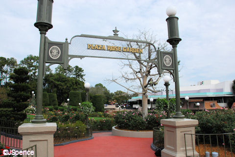
Why are some people so upset with the speakers on the lamp posts? For decades, the Magic Kingdom's Hub has had speakers integrated onto the lamp posts. Why the sudden disdain?

View attachment 84214

Roses%2002.jpg


Main-Street-USA_Full_20596.jpg
Just one more thing for people to complain about. It has nothing to do with anything, just a made up problem.

You might be right. I didn't realize that took so long, but based on last year it appears that it does.
No, last week all the lights were long gone and they were touching up spots on the castle either soiled or damaged by the lights and doing some roof top work as well. We wouldn't want the castle to look bad or leak would we?
 

Brian

Well-Known Member
No, last week all the lights were long gone and they were touching up spots on the castle either soiled or damaged by the lights and doing some roof top work as well. We wouldn't want the castle to look bad or leak would we?

I'm just grateful they're keeping up with the maintenance needed; lest it become a under-maintained "icon" like the Chinese Theatre at DHS.
 

Register on WDWMAGIC. This sidebar will go away, and you'll see fewer ads.

Back
Top Bottom