News Magic Kingdom's Main Street Confectionery closing for refurbishment

Magenta Panther

Well-Known Member
:hilarious:I do chuckle at people claiming the backstory is unnecessary while wearing an Orange Bird shirt and lamenting overuse of company IP elsewhere…

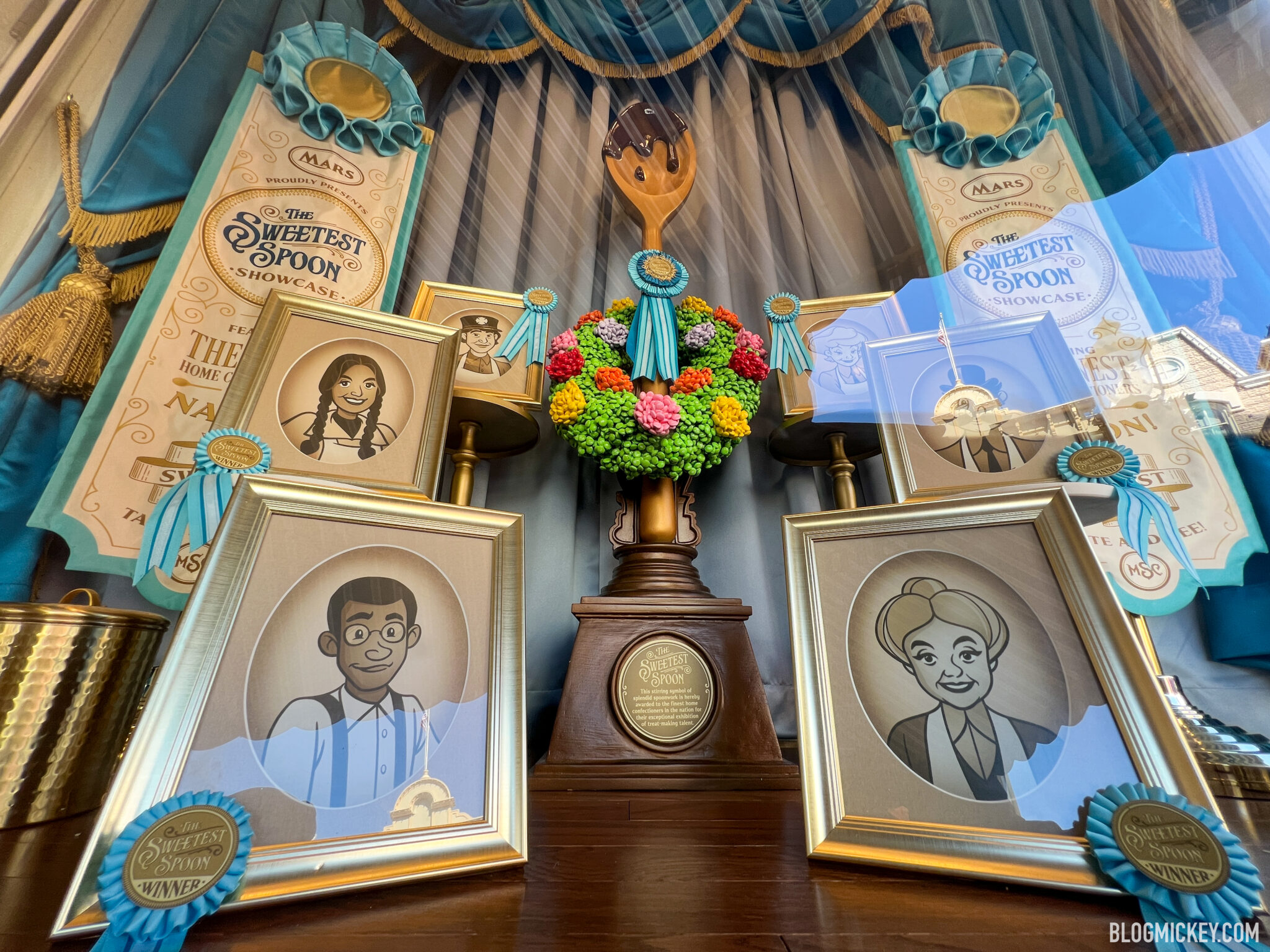
Fun fact, one of the characters is the first LGBTQ Disney Parks original character. About time!

Yeah, and he's totally into fashion...oh my god :hilarious:

Disney is so bad at this...
 

Sir_Cliff

Well-Known Member
I do chuckle at people claiming the backstory is unnecessary while wearing an Orange Bird shirt and lamenting overuse of company IP elsewhere…

Fun fact, one of the characters is the first LGBTQ Disney Parks original character. About time!
It's not that backstory is unnecessary, it's just that this is such a ham-fisted way to literally insert a backstory. I think, for example, the Imagineers having a backstory that guides how they design and decorate a location to be believable is a positive thing. When they just write fan fiction (as someone else put it) and paste it up in a way that it looks like they're presenting fan fiction, that undermines the believability of the theming.

I also honestly think this way of promoting inclusivity undermines the whole exercise. For example, the character of Alberta Falls is a nice way of creating more inclusive stories in the park. Presenting her with a CGI graphic that completely clashes with the time period in which her attraction is supposed to be set makes her stand out as an after-thought meant to make the attraction appear more inclusive. Similarly, it's positive to have a LGBTQ character represented in the park. Pasting up bios and graphics that look out of place on Main Street makes it seem contrived. On that note, Disney seems to have completely lost the ability to create period-appropriate graphics.

E07EE463-C390-47BF-9530-C5C14301CCE3-2048x1536.jpeg
 
Last edited:

Epcot82Guy

Well-Known Member
I agree with most of the responses. The layout makes sense, and I appreciate the more open concept (and certainly space for the cast)! The overall vibe is a bit too bland, and the photos and story are a bit odd (execution not idea).

This feels similar to the Poly to me. The ceiling is the biggest issue and missed opportunity (seeing a trend...)

It also feels like they are almost going for Snapchat Filter IRL. What I mean is there used to be a sense of realism in their place setting. It was always fantasy of some sorts, but it felt grounded and possible as a real place. These new adds feel hollow and artificial vs. "fantasy". It's like they are viewing the world as a cartoon.
 

Roger_the_pianist

Well-Known Member
I'm still trying to figure out how I feel about the Sweetest Spoon characters. It's obviously a response to claims that Main Street is a very white washed view of the era it represents.

I see the diversity, but something about it feels revisionist to me. It's as if they're saying this diversity has been there all along and it feels like "checking off boxes"...

It also feel like it's a move towards Main Street being a cartoonish representation of early 20th century America, but also these characters may not have been visible at that time.

If all they do is have this little corner and think they're done, that seems bad. But also if this is played out more through the whole land, I'm worried what that could look like...a Disney fantasy where everything seems ok and like it was always ok...
 

Joel

Well-Known Member
They ostensibly like park-exclusive characters. No touchy Figgy!
Yeah, they like cute mascots, obviously. But do they really care about backstories?

I'm all for mocking people for being selectively critical about things. Lord knows there are enough people on this board of all places who deserve it. I just think "Oh, you like Figment, the lovable purple dragon from the greatest dark ride of all time (calm down, Horizons gang)? Then why don't you absolutely love Willie Anderson, this normal human from Tulsa who works at his parents' bookstore, has lots of hobbies, and makes great pound cake? Hypocrite much?" is missing the target.
 

ToTBellHop

Well-Known Member
Yeah, they like cute mascots, obviously. But do they really care about backstories?

I'm all for mocking people for being selectively critical about things. Lord knows there are enough people on this board of all places who deserve it. I just think "Oh, you like Figment, the lovable purple dragon from the greatest dark ride of all time (calm down, Horizons gang)? Then why don't you absolutely love Willie Anderson, this normal human from Tulsa who works at his parents' bookstore, has lots of hobbies, and makes great pound cake? Hypocrite much?" is missing the target.
Orange bird—Sunshine Tree Terrace, a location that is about as iconic as the Confectionery. Therefore, it stands to reason, these new characters could be on t-shirts by the 100th.
 

castlecake2.0

Well-Known Member
Came back to say that the pink walls are actually textured wallpaper, just doesn’t show up well in photos. The store looks better in person for sure when not being adjusted/corrected by photo filters. I think they just need to send an imagineer out with $1000 to an antique market to buy a few props for the blank walls and it’d look more complete. They also could be waiting to see if they want to move any fixtures around due to guest flow before they add final touches.
 

JoeCamel

Well-Known Member
Came back to say that the pink walls are actually textured wallpaper, just doesn’t show up well in photos. The store looks better in person for sure when not being adjusted/corrected by photo filters. I think they just need to send an imagineer out with $1000 to an antique market to buy a few props for the blank walls and it’d look more complete. They also could be waiting to see if they want to move any fixtures around due to guest flow before they add final touches.
I would think they could go over to the warehouse and just pull things from the shelves, they have a huge store of stuff.
They have to have the will to do better than just good enough though.
 

ChrisFL

Premium Member
As someone who used to work at the confectionery about a decade ago...other than the wood flooring it's not too bad looking so far?

Funny, when I worked there, we still had the mechanical conveyor thing on the ceiling that apparently hadn't worked in years...people would ask us constantly why it's not moving...I see they removed it entirely a few years later.

Having said all of that, I am getting a common thread of "light theming" compared to the past few decades in the shops and places like Tomorrowland. The "less is more" approach I'm not sure is working
 

Communicora

Premium Member
As someone who used to work at the confectionery about a decade ago...other than the wood flooring it's not too bad looking so far?

Funny, when I worked there, we still had the mechanical conveyor thing on the ceiling that apparently hadn't worked in years...people would ask us constantly why it's not moving...I see they removed it entirely a few years later.

Having said all of that, I am getting a common thread of "light theming" compared to the past few decades in the shops and places like Tomorrowland. The "less is more" approach I'm not sure is working
Yeah. I don't want the shops to look like a Cracker Barrel or something but they should have more theming than your average store at a mall.
 

castlecake2.0

Well-Known Member
As someone who used to work at the confectionery about a decade ago...other than the wood flooring it's not too bad looking so far?

Funny, when I worked there, we still had the mechanical conveyor thing on the ceiling that apparently hadn't worked in years...people would ask us constantly why it's not moving...I see they removed it entirely a few years later.

Having said all of that, I am getting a common thread of "light theming" compared to the past few decades in the shops and places like Tomorrowland. The "less is more" approach I'm not sure is working
I don’t mind the less cluttered approach, but I think they went just a little too far, I’d like 10% more “stuff” added back, if that makes sense.
 

Register on WDWMAGIC. This sidebar will go away, and you'll see fewer ads.

Back
Top Bottom