News Hatbox Ghost coming to Walt Disney World's Haunted Mansion

Ayla

Well-Known Member
I get why some might be disappointed with the placement (for story purposes), but I don't understand the negativity about the lighting or presentation. To me, it's pretty clear that they've made HBG's corner an extremely dark corner at the near end of the hallway. The blue lighting is because it's meant to be moonlight rather than the warm light of candles and old-fashioned lamps in other parts of the house (like the hallway).

View attachment 756997

And his size? Seems from photos like he's set fairly close to the DoomBuggies, so I'm thinking they might be going for a bit of forced perspective (as the hallway uses it as well). If he were much larger, he'd appear even closer and also make the hallway look smaller.
If it's supposed to be moonlight, it's another fail on their part. Moonlight would only illuminate one side of him, not from below and straight above. The shadows/illimunations are all wrong to only be moonlight.
 

mickEblu

Well-Known Member
I’ve never even been to Disney World and think this is terrible. Obviously I understand how the Haunted Mansion should flow from Disneyland and putting the HatBox ghost anywhere before Leotas scene is really dumb. I’d prefer no Hatbox Ghost to that. I’d even prefer he become one random hitchhiking ghost to that since it’s at the end and they already messed up that scene at MK anyway. Or how about anywhere in the Graveyard?
 
Last edited:

Tom Morrow

Well-Known Member
I get why some might be disappointed with the placement (for story purposes), but I don't understand the negativity about the lighting or presentation. To me, it's pretty clear that they've made HBG's corner an extremely dark corner at the near end of the hallway. The blue lighting is because it's meant to be moonlight rather than the warm light of candles and old-fashioned lamps in other parts of the house (like the hallway).

View attachment 756997

And his size? Seems from photos like he's set fairly close to the DoomBuggies, so I'm thinking they might be going for a bit of forced perspective (as the hallway uses it as well). If he were much larger, he'd appear even closer and also make the hallway look smaller.

The hallway actually does not use forced perspective like the first scene on Tower of Terror does. It is a full scale hallway that uses mirrors and scrims to appear endless. So making the figure larger would not throw off the perceived size of the hallway.

I agree with the post above - the lighting doesn't look like a moonlight effect, it looks like he and the walls are all glowing blue, and it completely clashes with everything surrounding it.

Oh, and another issue - placing a windowed door here doesn't make logical sense, as just to the left of it is a door to an unseen room that now couldn't exist with a door right here.
 

_caleb

Well-Known Member
If it's supposed to be moonlight, it's another fail on their part. Moonlight would only illuminate one side of him, not from below and straight above. The shadows/illimunations are all wrong to only be moonlight.
I understand what you're saying, but I guess I'm seeing something differently than you are?

In the photos, the light seems to be coming from the window (see light from the window on the floor, and hitting the top left of the top hat, his right arm, and his foot), casting shadows down and to the right (see shadows on the side of his cane, on his legs below the knees, and the shadow of his collar on his shoulders).

But since this effect is created by lighting, and that window isn't really the source of light, I'm sure may be off a bit?

Also, as a ghost, maybe he's meant to be glowing (which could better explain the lighting on the walls above him and between him and the window? IDK...

Haunted-Mansion_Full_54195.jpg
 

Disney Analyst

Well-Known Member
I understand what you're saying, but I guess I'm seeing something differently than you are?

In the photos, the light seems to be coming from the window (see light from the window on the floor, and hitting the top left of the top hat, his right arm, and his foot), casting shadows down and to the right (see shadows on the side of his cane, on his legs below the knees, and the shadow of his collar on his shoulders).

But since this effect is created by lighting, and that window isn't really the source of light, I'm sure may be off a bit?

Also, as a ghost, maybe he's meant to be glowing (which could better explain the lighting on the walls above him and between him and the window? IDK...

View attachment 757006

Yes. He is a ghost, and has an ethereal glow, which is definitely intentional, followed by the moon also casting some light on the scene.
 

HauntedPirate

Park nostalgist
Premium Member
I’ve never even been to Disney World and think this is terrible. Obviously I understand how the Haunted Mansion should flow from Disneyland and putting the HatBox ghost anywhere before Leotas scene is really dumb. I’d prefer no Hatbox Ghost to that. I’d even prefer he become one of the hitchhiking ghosts to that since it’s at the end and they already messed up that scene at MK. Or how about anywhere in the Graveyard?
The graveyard was my thought as well. The HBG looks nice, but it's in the wrong place.
 

_caleb

Well-Known Member
The hallway actually does not use forced perspective like the first scene on Tower of Terror does. It is a full scale hallway that uses mirrors and scrims to appear endless. So making the figure larger would not throw off the perceived size of the hallway.
Hmm. I assumed the doors farther afield were shorter than those closer to the viewer. These guys seemed to think so, too:

Screenshot 2023-12-01 at 9.49.15 AM.png


Oh, and another issue - placing a windowed door here doesn't make logical sense, as just to the left of it is a door to an unseen room that now couldn't exist with a door right here.
Remind me, what was there before?
 

Tom Morrow

Well-Known Member
Hmm. I assumed the doors farther afield were shorter than those closer to the viewer. These guys seemed to think so, too:

View attachment 757007
This doesn't mention anything about the size of the hallway shrinking in the way that the Tower of Terror corridor does. The back wall is the same height as the front, whereas on Tower of Terror, the back wall with the projection of the floating window is actually only four feet tall.
Remind me, what was there before?

The "Donald Duck chair" and a curtain obscuring an exit that wasn't meant to be noticed, which this new door obviously replaced. But even if you notice the curtain, you don't assume that it leads to outside, but now you are meant to assume it does. If that makes sense.
 

yensidtlaw1969

Well-Known Member
Hmm. I assumed the doors farther afield were shorter than those closer to the viewer. These guys seemed to think so, too:

View attachment 757007


Remind me, what was there before?
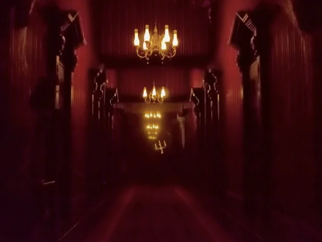
Impressively, the Endless Hallway does not used Forced Perspective - in fact, the Candelabra is itself oversized for an easier read. I'm trying to see if I can drum up a picture.

Prior to this, the scene was almost structurally identical to what it is now - the biggest change is the new Door and Transom Window, but the Doorway itself was always there. In it hung a billowing curtain that was lit from behind with an eerie blue light, instead of a Door that is lit from behind with an eerie blue light.

There's an identical doorway and curtain with blue light on the opposite side of the hall which are still there, no new door added. It was never fully clear where either of these doorways were meant to lead, but the one that remains butts up to the Conservatory Window Diorama (and I believe provides access to it), so it *is* arguable that both doorways always alluded to outside access.

To someone else's point, that wouldn't be the first place in the Mansion to imply unusually narrow design - the Thunderstorm Windows in the Changing Portrait Hall that are on the left side seemingly clash with the big Picture Window in the Music Room which is on the right side, suggesting at least one part of the Mansion that is, impractically, a long standalone corridor where the outside can be seen clearly on both sides. Not to mention that the lightning raging so fervently in the Changing Portrait Hall seems to have completely dissipated by the time we get to the Music Room a mere one scene later . . .

Point being that the architectural logic of The Haunted Mansion has always been a thread that could unravel the entire sweater if pulled at. People are free to dislike it, but this new Door is consistent with the Mansion's existing inconsistencies.
 

VicariousCorpse

Well-Known Member
Am I mistaken, but did the candelabra used to actually move at one time? Not just float, but move?
unnamed (17).jpg

Hmm. I assumed the doors farther afield were shorter than those closer to the viewer. These guys seemed to think so, too:

Forced perspective wouldn't work with mirrors. The hallway is the same scale all the way to the mirror at the end. It runs the entire length of the ballroom just on the other side of the wall.

unnamed (18).jpg
 
Last edited:

flynnibus

Premium Member
The hallway actually does not use forced perspective like the first scene on Tower of Terror does. It is a full scale hallway that uses mirrors and scrims to appear endless. So making the figure larger would not throw off the perceived size of the hallway.
It's not the effect IN the hallways he's referring to - but the relative size between the objects. Meaning, if you take something your brain thinks should be 5-6' tall ... but instead make it bigger... it will make whatever you put next to it to appear smaller to you as your brain tries to make the familiar thing 'work'.

I agree with the post above - the lighting doesn't look like a moonlight effect, it looks like he and the walls are all glowing blue, and it completely clashes with everything surrounding it.

The color is made to look like moonlight... but as noted it's too uniform. I think it would have been better if they actually made the moonlight visible in the room with shadows. Imagine selling the light effect using a scrim and seeing the light beam from the window across to the wall... vs having the whole wall lit up, etc.
 

Magenta Panther

Well-Known Member

Register on WDWMAGIC. This sidebar will go away, and you'll see fewer ads.

Back
Top Bottom