-
Welcome to the WDWMAGIC.COM Forums!
Please take a look around, and feel free to sign up and join the community.
You are using an out of date browser. It may not display this or other websites correctly.
You should upgrade or use an alternative browser.
You should upgrade or use an alternative browser.
EPCOT Guardians of the Galaxy Cosmic Rewind attraction confirmed for Epcot
- Thread starter wdwmagic
- Start date
Where did the money go?The shadowy place confirms there will be no AAs.
Very unfortunate.
UNCgolf
Well-Known Member
The shadowy place confirms there will be no AAs.
Very unfortunate.
Hard to believe they spent that much money on an attraction that doesn't have any AAs.
It means the attraction must rely heavily, if not exclusively, on screens, which means it will likely be a disappointment at best for me.
I do wonder if that solely refers to the attraction itself or if it includes the queue/preshows, though -- I was hoping there would at least be one in a preshow, but sounds like they could be entirely screen-based as well.
Last edited:
ToTBellHop
Well-Known Member
The Nova Starblaster can, in fact, travel to Mars. Spared no expense.Where did the money go?
UNCgolf
Well-Known Member
This came up in response to a poster (no disrespect!) criticising the queue for having nothing that would suggest it was a Marvel attraction. So, I can kind of see how they have gone with a more restrained aesthetic to fit the park but added this to reassure people that they are going on a fun attraction based on Guardians of the Galaxy. In that context, it doesn't seem like a terrible choice.
As someone else said above, though, seems like they could have done it without being so in your face about it -- it takes up the entire projection screen at one point.
Either way, it's minor. My main disappointment is that the projection is less impressive than what I could get at a planetarium. Again, though, it's just the queue. It's not like it's the attraction itself.
UNCgolf
Well-Known Member
The Nova Starblaster can, in fact, travel to Mars. Spared no expense.
Can it create one of those forcefields as well? Built in crowd management!
Mickeynerd17
Well-Known Member
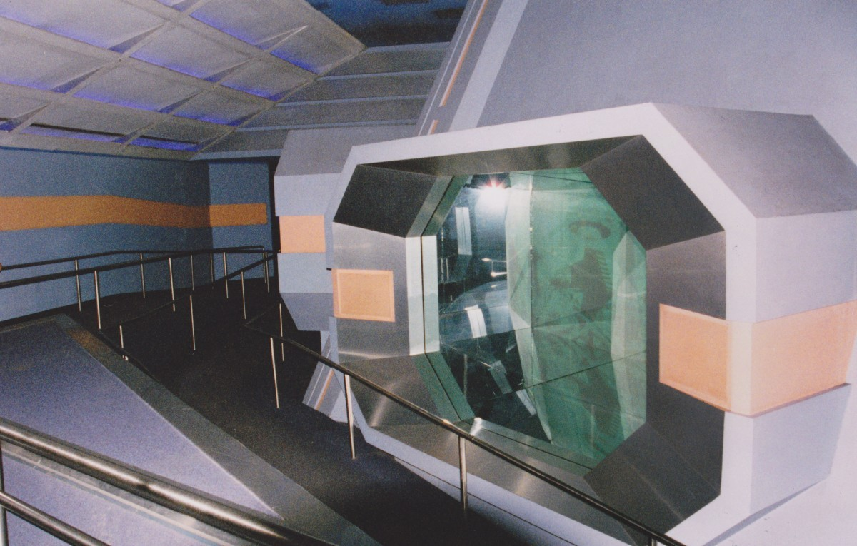
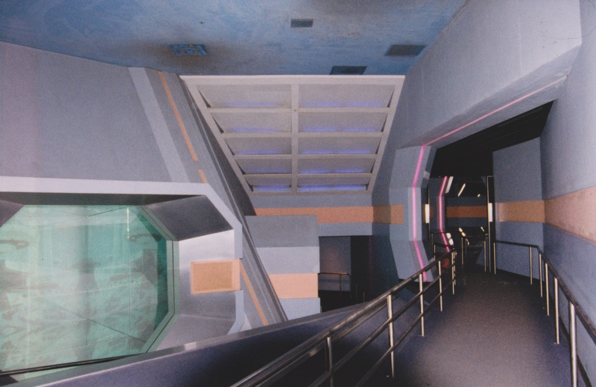
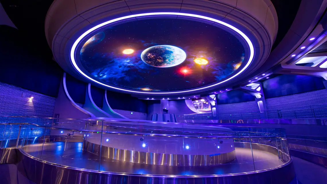
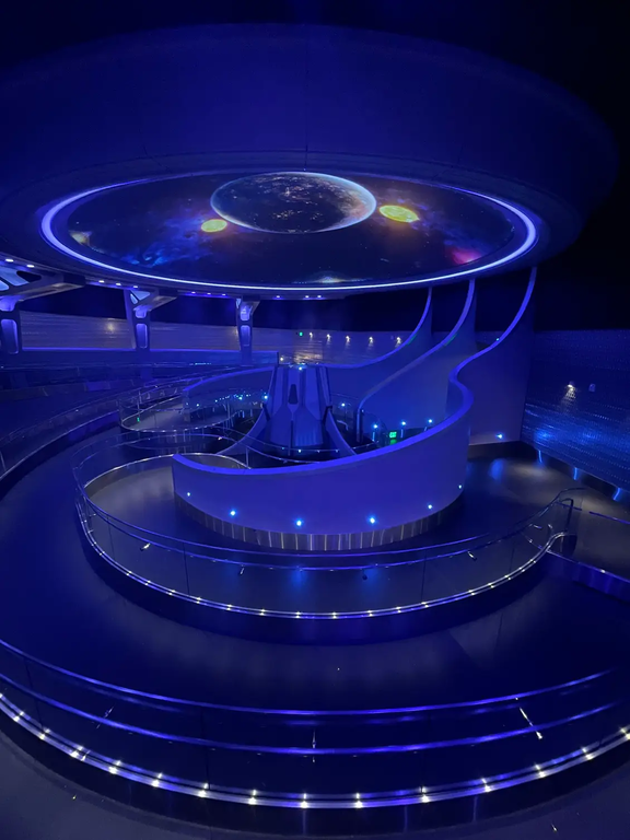
Ok, with all the controversy already surrounding this first room of the queue, lets compare a "classic" epcot queue with the galaxarium:
Horizons:


Cosmic Rewind:


It won't be the most popular opinion in the room, but they honestly share a lot in common. Only differences are quality of video and a few more colors used in Horizons. Considering how short the very front of Energy is, I'm expecting this to be a smaller space than it looks. I might be wrong though.
Now, I'm not a fan of every single queue in EPCOT being purely blue lights. We need some variety in that department.
Horizons:
Cosmic Rewind:
It won't be the most popular opinion in the room, but they honestly share a lot in common. Only differences are quality of video and a few more colors used in Horizons. Considering how short the very front of Energy is, I'm expecting this to be a smaller space than it looks. I might be wrong though.
Now, I'm not a fan of every single queue in EPCOT being purely blue lights. We need some variety in that department.
Casper Gutman
Well-Known Member
Remember, the Guardians queue was meant to be built by an alien civilization to showcase their advanced society. There's a LOT an imaginative design team could do with that. And this is what we've got.
lazyboy97o
Well-Known Member
This is just getting ridiculous. We have to keep in mind the constraints this team was working under. They had more money than anyone else has ever had available for building a roller coaster. Nearly half a billion dollars only goes so far and you have to stretch it.Remember, the Guardians queue was meant to be built by an alien civilization to showcase their advanced society. There's a LOT an imaginative design team could do with that. And this is what we've got.
As a lifelong EPCOT Center fangirl,….Ok, with all the controversy already surrounding this first room of the queue, lets compare a "classic" epcot queue with the galaxarium:
Horizons:
View attachment 629765View attachment 629768
Cosmic Rewind:
View attachment 629770View attachment 629771
It won't be the most popular opinion in the room, but they honestly share a lot in common. Only differences are quality of video and a few more colors used in Horizons. Considering how short the very front of Energy is, I'm expecting this to be a smaller space than it looks. I might be wrong though.
Now, I'm not a fan of every single queue in EPCOT being purely blue lights. We need some variety in that department.
THANK YOU!!
This is the correct answerPeople are complaining about how the style of this first preshow room matches that of test track and mission space- is that supposed to be a bad thing? I mean if you don't like how it looks, that's a matter of personal preference and it's fine, but imo this helps to make World Discovery feel more like a cohesive area. The neighborhood concept is still weird, but at least these areas are starting to have some semblance of individuality and I imagine Journey of Water will do the same for World Nature once that's open. I actually appreciate how this side of (the area formerly known as) future world has more of a space age / industrial look whereas the former future world west has / will have a more natural look once it's complete.
Video showing the entrance -
INJECT THIS DIRECTLY INTO MY VEINS
Casper Gutman
Well-Known Member
But this is an "Other World Showcase" pavilion. Why would it be aesthetically linked to other World Discovery pavilions? Is Test Track meant to be a showcase for an alien civilization?This is the correct answer
Casper Gutman
Well-Known Member
Wait, so the ceiling-screen room is followed by a long series of ramps through an entirely unthemed area? I honestly didn't expect that.INJECT THIS DIRECTLY INTO MY VEINS
UNCgolf
Well-Known Member
Wait, so the ceiling-screen room is followed by a long series of ramps through an entirely unthemed area? I honestly didn't expect that.
I think everything in that video is still in the "galaxarium" -- I don't think it shows anything past it.
But this is an "Other World Showcase" pavilion. Why would it be aesthetically linked to other World Discovery pavilions? Is Test Track meant to be a showcase for an alien civilization?
It’s the first room. The entire Universe of Energy pavilion is the queue. Remember how HUGE that building is??Wait, so the ceiling-screen room is followed by a long series of ramps through an entirely unthemed area? I honestly didn't expect that.
Look guys, and I’m typing this as I’m watching Martin’s Communicore tribute video,….this looks cool! It fits the “Epcot” aesthetic. And it’s gonna be a fun experience! People are gonna love this. And World Discovery is going to feel kinda unified when this opens.
The Epcot we have in 2023 is going to be light years better than the Epcot we had for the last like 15 years or so.
It’s okay to enjoy fun!
Casper Gutman
Well-Known Member
At one point, around 1:35, he seems to show the next lengthy expanse of queue in a connected but distinct room.I think everything in that video is still in the "galaxarium" -- I don't think it shows anything past it.
UNCgolf
Well-Known Member
At one point, around 1:35, he seems to show the next lengthy expanse of queue in a connected but distinct room.
Yeah, I saw that, but I thought it may have just been the final part of the "galaxarium" room considering it immediately goes back to the projection ceiling.
In looking at it again, it does look like it might be another area -- looks like a relatively narrow hallway though. It could be leading into another room with some kind of theming, but who knows. They had to spend that $450m on something, and it wasn't AAs or a massive projection dome, so...?
No Name
Well-Known Member
The concept art made it seem like the projection would have some kind of depth to it, and considering their recent space screens do, I thought this would too. And I thought the projector in the middle would have lights coming out of it or something. Of course concept art isn’t realistic, but for the amount they’ve been promoting this specific thing, they set our expectations high.As someone else said above, though, seems like they could have done it without being so in your face about it -- it takes up the entire projection screen at one point.
Either way, it's minor. My main disappointment is that the projection is less impressive than what I could get at a planetarium. Again, though, it's just the queue. It's not like it's the attraction itself.
And to an earlier comment you made, I think they would’ve liked to have made it bigger but the ceiling isn’t high enough in that part of the building.
Register on WDWMAGIC. This sidebar will go away, and you'll see fewer ads.
