Eddie Sotto's take on the current state of the parks (Part II)

Omnispace

Well-Known Member
Imagineer Bob Gurr has a fun and refreshing article about how cars and the love of them has have changed over the decades. A nice break from globalization and janky moldings.

This sketch he did reminds me of the Batmobile. Alex Kerr did the one for TV but this one from the 1940's sure looks like an inspiration. Bob is a great guy and true talent.

http://micechat.com/42676-design-those-were-the-times-no-18-1946-futuristic-cars-arrive/


Great article -- nice to see Bob Gurr's artwork! Of course the vehicles he designed for Disney were first-rate.
 

tirian

Well-Known Member
I've almost given up on the architects and interior designers in today's WDI. They seem to know only how to do Bavarian (e.g. Fantasyland) and grungy realism (e.g. Animal Kingdom). Even DCA's Buena Vista Street isn't as impressive or detailed as the front half of Hollywood Studios. Look at the bland interiors of WDW's new MS bakery and the one going into DL.

Is it a result of using CAD without understanding the design principles behind the results? Does the lesser quality come from lower personal standards of art? We know the budgets are still astronomical. These are rhetorical questions for now but we can't deny the symptoms of a weaker Disney.

I thought it would be interesting to compare the AA bathroom work with a similar work by classical trained architects. How's that for synergy, two subjects rolled into one? :)
The building volume and style are roughly the same. The execution is very different. Is that owing to a clear difference in mastery of the subject matter? The setting and use are of course entirely different. Are the designers of the AA aiming for a different application of classical style elements altogether? A contemporary, experimental one?

The-American-Adventure-Pavilion_Full_19498.jpg;width=638

US-pavilion-venice-2007.jpg

The-American-Adventure-Pavilion_Full_19500.jpg;width=638


The architect is William Delano, trained in beaux-arts. The pavilion is from 1930, the 'Stati Uniti d'America' in the tympanum reveal it is located in Italy, build as the American entry for the Venice Biennale.

Bonus!
We all loves us some art, so here is a modern use of the American pavilion. A threadmill on an inverted tank. What delightful wit and social commentary! :)

images
 
Last edited:

Eddie Sotto

Premium Member
We went through all the orders our sophomore year, then were required to spend two semesters in Rome studying, and traveling throughout Italy 3rd year. We weren't allowed to use CAD until our fourth year (of a 5 year professional - B.Arch program). It's a pretty cool program, and pretty unique.


Sadly I do not. The one project I can take full credit for designing is a classical project no-less, but my preference is modern, and my "designer" days are behind me. (I did interview with imagineering after Rome) My career has taken me in a more technical direction, designing and developing details that support other designers visions.

I do know many people who are practicing classicists - some of whom would make Wren jealous of their talents.

The Tuscaloosa Federal Courthouse by HBRA is, in my opinion, the best work of classical architecture in nearly a century.

Sounds good. We do a variety of modern and themed or representational projects today, so it's varied.
 

lazyboy97o

Well-Known Member
Is it a result of using CAD without understanding the design principles behind the results? Does the lesser quality come from lower personal standards of art? We know the budgets are still astronomical. These are rhetorical questions for now but we can't deny the symptoms of a weaker Disney.
I think part of it is that there is no concern for historical authenticity. They need to make some pretty, that is "Disney" and not make the parks "into museums." The idea of spending weeks researching period materials, techniques and details seems completely anathema to their current intents. Why does it matter if Buena Vista Street is not as rich when its supposed to be about Walt, not Los Angeles? And see, they named stuff after things Walt did (suggesting I guess that before Oswald was stolen from Walt, Walt stole Oswald).
 

Eddie Sotto

Premium Member
I think part of it is that there is no concern for historical authenticity. They need to make some pretty, that is "Disney" and not make the parks "into museums." The idea of spending weeks researching period materials, techniques and details seems completely anathema to their current intents. Why does it matter if Buena Vista Street is not as rich when its supposed to be about Walt, not Los Angeles? And see, they named stuff after things Walt did (suggesting I guess that before Oswald was stolen from Walt, Walt stole Oswald).

There is truth to this. The parks are more theatrical, designed to make emotional impact, not appear in the Smithsonian. Herb Ryman and John Hench both said things like that. I was obsessing on some detail and missing the bigger point and Ryman pulled me aside to mention that what matters is how the space makes you feel. We can obsess on the details, but in fact they only need to be there to reinforce (or sustain disbelief) in the "big idea",in this case "Walt's romantic vision of California". That's where the focus should be as we are always entertainers first. Where the discussion begins is when things slip so far that the environment recalls a modern "Barnes and Noble", then we are distracted from the "big idea" by a space that does not hold together.

The Garden outside the AA Restrooms is an opportunity to reinforce the Americana idea. Does it need to be a masterpiece? No, it's a Restroom. It plays a supporting role to the pavilion. But it could have been better (even simply) if the design was informed. DL Main Street is a great example of a beautifully proportioned, romanticized movie set of Victoriana. It holds together even though the details are not super rich, but they are consistent. Good details are never there for their own sake, but to "suspend disbelief" in the fantasy we're asking you to buy into.

We long to hear "I guess we're not in Kansas anymore".
 
Last edited:

flynnibus

Premium Member
There is truth to this. The parks are more theatrical, designed to make emotional impact, not appear in the Smithsonian. Herb Ryman and John Hench both said things like that. I was obsessing on some detail and missing the bigger point and Ryman pulled me aside to mention that what matters is how the space makes you feel. We can obsess on the details, but in fact they only need to be there to reinforce (or sustain disbelief) in the "big idea",in this case "Walt's romantic vision of California". That's where the focus should be as we are always entertainers first. Where the discussion begins is when things slip so far that the environment recalls a modern "Barnes and Noble", then we are distracted from the "big idea" by a space that does not hold together.

The Garden outside the AA Restrooms is an opportunity to reinforce the Americana idea, but says nothing. Does it need to be a masterpiece? No, it's a Restroom. It plays a supporting role to the pavilion. But it could have been better (even simply) if the design was informed. DL Main Street is a great example of a beautifully proportioned, romanticized movie set of Victoriana. It holds together even though the details are not super rich, but they are consistent. Good details are never there for their own sake, but to "suspend disbelief" in the fantasy we're asking you to buy into.

We long to hear "I guess we're not in Kansas anymore".

Best way I've heard you describe the 'idealized' vs 'historically accurate' tact of Disney design. It's all about supporting the postulation or setting of the tale being woven.
 

lazyboy97o

Well-Known Member
There is truth to this. The parks are more theatrical, designed to make emotional impact, not appear in the Smithsonian. Herb Ryman and John Hench both said things like that. I was obsessing on some detail and missing the bigger point and Ryman pulled me aside to mention that what matters is how the space makes you feel. We can obsess on the details, but in fact they only need to be there to reinforce (or sustain disbelief) in the "big idea",in this case "Walt's romantic vision of California". That's where the focus should be as we are always entertainers first. Where the discussion begins is when things slip so far that the environment recalls a modern "Barnes and Noble", then we are distracted from the "big idea" by a space that does not hold together.
I should clarify that this sort of focus on creating an emotional impact is what I intended with "historical authenticity" and that may have been a poor choice of words. In order to create a convincing illusion there does need to be some degree of realism. We can't buy into the American Adventure restrooms because they completely lack in Classical authenticity. To me, details are only details and not mere ornament if they support the bigger narrative.

This is part of my problem with Buena Vista Street. It consistently contradicts the idea of "Walt's arrival" if you know the story and not even with small items. Just from the beginning, we have a supposedly 1920s story starting in the 1930s (Pan Pacific Auditorium) and then jumping to 1928 (it seems a lot of people don't realize that Walt made Oswald cartoons for less than a year). It's hard to buy into a place as 1923-1928 when almost everything is referencing 1928 and later.
 

Eddie Sotto

Premium Member
I should clarify that this sort of focus on creating an emotional impact is what I intended with "historical authenticity" and that may have been a poor choice of words. In order to create a convincing illusion there does need to be some degree of realism. We can't buy into the American Adventure restrooms because they completely lack in Classical authenticity. To me, details are only details and not mere ornament if they support the bigger narrative.

This is part of my problem with Buena Vista Street. It consistently contradicts the idea of "Walt's arrival" if you know the story and not even with small items. Just from the beginning, we have a supposedly 1920s story starting in the 1930s (Pan Pacific Auditorium) and then jumping to 1928 (it seems a lot of people don't realize that Walt made Oswald cartoons for less than a year). It's hard to buy into a place as 1923-1928 when almost everything is referencing 1928 and later.

You know too much :) so the architecture is sending mixed signals others don't get. That is the "theatrical" aspect of taking some license, as most just love it and accept it as the Hollywood or LA "that never was but always will be". Nevertheless, to your point, it does not work for you because you see all of these stolen icons for what they are, stolen references from different times all out of order. I'm not sure they meant it to be a linear experience or story, just a basic premise and relied on the inside jokes of the names of things to justify it. . Still, when we recycle design from the "real world" we do run the risk of doing what has happened to you, we can send the wrong message or set the wrong expectation. For example, Sleeping Beauty Castle being ripped off from Neuschwanstein Castle may remind Germans of their homeland instead of a Disney film. That was Herb Ryman's argument way back in 1953 so he turned the top of the Castle around to make it less recognizable. The symbolism can confuse when it is too literal. The wrong reference can distract by sending it's own message. (I think of the movie Xanadu when I enter DCA).
 
Last edited:

lazyboy97o

Well-Known Member
You know too much so the architecture is giving you mixed signals. That is the theatrical aspect of taking some license as most just love it and accept it as Waltywood, but to your point, it does not work for you because you see all of these stolen icons for what they are, stolen references. When we take and recycle things from the real world we do run the risk of doing what has happened here, we send the wrong message or set the wrong expectation. For example, Sleeping Beauty Castle being ripped off from Neuschwanstein Castle may remind Germans of their homeland instead of a Disney film. Too close of a reference can distract.
That so much worked in this manner is a big part of why I fell in love with Disney. If you're going to aim for specificity of a certain story or time period, I think you need to aim for a greater degree of specificity than if you were doing a more general tableau. In once had acquaintances comment on my world travels when they were looking at photos of World Showcase. People who know architecture and bought right into the illusion.
 

Omnispace

Well-Known Member
This is part of my problem with Buena Vista Street. It consistently contradicts the idea of "Walt's arrival" if you know the story and not even with small items. Just from the beginning, we have a supposedly 1920s story starting in the 1930s (Pan Pacific Auditorium) and then jumping to 1928 (it seems a lot of people don't realize that Walt made Oswald cartoons for less than a year). It's hard to buy into a place as 1923-1928 when almost everything is referencing 1928 and later.

I tend to agree about the Pan Pacific Auditorium themed entrance. It's out of place in the sequence of events that are supposedly unfolding. Something that was more Arts & Crafts or California Bungalow would have been more time-appropriate but your average guest doesn't have the knowledge of what early Los Angeles actually looked like. The Art Deco style of the current entrance fits that expectation of Walt arriving in Hollywood. Of course a good argument to that is you educate your guests by what you create.

I also wonder if at some point there was some sort of combined strategy that was developed for DCA and DHS in Florida -- that they would eventually be branded the same.
 

Eddie Sotto

Premium Member
That so much worked in this manner is a big part of why I fell in love with Disney. If you're going to aim for specificity of a certain story or time period, I think you need to aim for a greater degree of specificity than if you were doing a more general tableau. In once had acquaintances comment on my world travels when they were looking at photos of World Showcase. People who know architecture and bought right into the illusion.

I'm all about making things rich, but reinventing the references too, making them come off in a more emotive way. Scaling things down to add intimacy, or working the rooflines or depth for charm. Herb Ryman was driven to change the Castle based on his confidence of the Jet Age coming. He argued that more people will eventually see the real places in the future and that you cannot depend of stealing from far away references and calling them your own as they do in movies. Then you have to have the "Disney difference" in translation of these things. Universal has copied in some cases the same Hollywood references but usually at full scale and while they feel very real and immersive, can lack warmth.
 

Eddie Sotto

Premium Member
I tend to agree about the Pan Pacific Auditorium themed entrance. It's out of place in the sequence of events that are supposedly unfolding. Something that was more Arts & Crafts or California Bungalow would have been more time-appropriate but your average guest doesn't have the knowledge of what early Los Angeles actually looked like. The Art Deco style of the current entrance fits that expectation of Walt arriving in Hollywood. Of course a good argument to that is you educate your guests by what you create.

I also wonder if at some point there was some sort of combined strategy that was developed for DCA and DHS in Florida -- that they would eventually be branded the same.

The Pan Pacific reference is an obscure one but I like it. I doubt most people know what it is from. I look at it as an optimistic "portal" that sets a festive expectation, not so much for the moderne year it was constructed (as they are only using the spires), but for the overall DCA experience. I see it as a bookend to the DL entry where one is 19th C, the other quintessentially 20C. It has that feeling of a fair or festival.
 

Omnispace

Well-Known Member
The Pan Pacific reference is an obscure one but I like it. I doubt most people know what it is from. I look at it as an optimistic "portal" that sets a festive expectation, not so much for the moderne year it was constructed (as they are only using the spires), but for the overall DCA experience. I see it as a bookend to the DL entry where one is 19th C, the other quintessentially 20C. It has that feeling of a fair or festival.

Your point is very well made and I do love the Pan Pacific Auditorium design. It deserves a fitting honor after the unfortunate demise of the original and you are absolutely correct that it fits the bill for creating an upbeat start to a day at DCA. As I mentioned before, it meets guests expectations for what 20th century Hollywood (and California) was all about.

But at the same time I take a look at what the intent of Buena Vista Street is supposed to be about and wonder if there wasn't a lost opportunity here. Walt Disney came to Los Angeles in the early 1920's -- a time that had a respectable amount of festivity in itself, not to mention that Los Angeles was on the verge of an explosion of prosperity and growth. I can't say at the moment how it could have been pulled off but to capture that moment in time when there are the beginnings of something great about to happen -- that would be quite an experience to allow guests to enjoy. And to enter such an experience with the thoughts that this is the same world that Walt Disney was about to become a huge part of -- that only heightens the emotional impact. Perhaps the Pan Pacific spires do that for most people -- I'm only wondering if there could have been a more genuine (as opposed to iconic) solution.

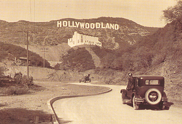
Hollywoodland_1923.jpg


Btw, I couldn't help but include this awesome pic I found...

kt087028h9-d3e3407.jpg
 
Last edited:

lazyboy97o

Well-Known Member
I tend to agree about the Pan Pacific Auditorium themed entrance. It's out of place in the sequence of events that are supposedly unfolding. Something that was more Arts & Crafts or California Bungalow would have been more time-appropriate but your average guest doesn't have the knowledge of what early Los Angeles actually looked like. The Art Deco style of the current entrance fits that expectation of Walt arriving in Hollywood. Of course a good argument to that is you educate your guests by what you create.

I also wonder if at some point there was some sort of combined strategy that was developed for DCA and DHS in Florida -- that they would eventually be branded the same.
I like the Pan Pacific Auditorium as an entrance. I'd much rather Buena Vista Street ditch the emphasis on Walt and just let it be Los Angeles in the late-1920s/1930s.

I think the similarities between the parks is more the result of Bob Weis having a second chance at the idea. He knew what worked on Hollywood Blvd and Sunset Blvd.
 

RandySavage

Well-Known Member
I like the Pan Pacific Auditorium as an entrance. I'd much rather Buena Vista Street ditch the emphasis on Walt and just let it be Los Angeles in the late-1920s/1930s.

But aren't the references to Walt on BVS just obscure or subtle backstory (unknown by most visitors or easily ignored by those who have read up on it) to an area that was well-rendered, physically (to represent romanticized pre-War LA)? Just as a satifactory backstory for Chester and Hester's Dinorama doesn't justify mundane, cheap, parking lot midway area in Animal Kingdom, I don't think any anachronisms/errors in the "Walt Comes to LA" backstory damages what physically surrounds you on Buena Vista St.
 

Omnispace

Well-Known Member
I like the Pan Pacific Auditorium as an entrance. I'd much rather Buena Vista Street ditch the emphasis on Walt and just let it be Los Angeles in the late-1920s/1930s.

I think the similarities between the parks is more the result of Bob Weis having a second chance at the idea. He knew what worked on Hollywood Blvd and Sunset Blvd.

Thanks for that insight on Bob Weiss. One can see the refinement in the Buena Vista Street design. I have to differ on ditching the emphasis on Walt though. I thought it was a great way to tweak the concept of DCA and has opened the door for revisiting the older work of Disney. It adds some depth to a park that felt superficial before. I only wish they could strengthen it somehow as it doesn't extend much beyond BVS. There is so much that can be done with it. But if they don't, then I agree it may be best to try and not force the Walt thing and just let the park be a jumble of what it is currently.
 

lazyboy97o

Well-Known Member
But aren't the references to Walt on BVS just obscure or subtle backstory (unknown by most visitors or easily ignored by those who have read up on it) to an area that was well-rendered, physically (to represent romanticized pre-War LA)? Just as a satifactory backstory for Chester and Hester's Dinorama doesn't justify mundane, cheap, parking lot midway area in Animal Kingdom, I don't think any anachronisms/errors in the "Walt Comes to LA" backstory damages what physically surrounds you on Buena Vista St.
As Eddie said, there is likely a good bit of over-familiarity on my part. I know Walt's story. I also know architecture and history. I know Walt did not show up with Mickey Mouse. I know there was not some singing trio turned restauranteurs behind the names of the Three Little Pigs. I know the Pan Pacific Auditorium and Carthay Circle Theater were not yet open. And it's not so much that the added story damages the physical environment if separated, but it does contract it by pointing towards an earlier time than the one portrayed. I am also not one to accept the justification of "most people will not know." To me, a big part of why I fell in love with Disney's built environments is because they were not purely fictional, they had a solid anchor that opened up new avenues of curiosity beyond the parks.

Thanks for that insight on Bob Weiss. One can see the refinement in the Buena Vista Street design. I have to differ on ditching the emphasis on Walt though. I thought it was a great way to tweak the concept of DCA and has opened the door for revisiting the older work of Disney. It adds some depth to a park that felt superficial before. I only wish they could strengthen it somehow as it doesn't extend much beyond BVS. There is so much that can be done with it. But if they don't, then I agree it may be best to try and not force the Walt thing and just let the park be a jumble of what it is currently.
As a starting point and reason, I can appreciate the Walt angle. Just as Main Street, USA was inspired by Walt's time in Marceline, and the lives of other Imagineers in similar towns, but is not supposed to be explicitly about Walt's time there.
 

HMF

Well-Known Member
As a starting point and reason, I can appreciate the Walt angle. Just as Main Street, USA was inspired by Walt's time in Marceline, and the lives of other Imagineers in similar towns, but is not supposed to be explicitly about Walt's time there.
In those days lands only needed a time, Place and feeling to work. Nowadays, It has more or less become WDI Policy that everything must have a contrived backstory to justify it's existence.
 

Bairstow

Well-Known Member
I thought it would be interesting to compare the AA bathroom work with a similar work by classical trained architects. How's that for synergy, two subjects rolled into one? :)
The building volume and style are roughly the same. The execution is very different. Is that owing to a clear difference in mastery of the subject matter? The setting and use are of course entirely different. Are the designers of the AA aiming for a different application of classical style elements altogether? A contemporary, experimental one?

The-American-Adventure-Pavilion_Full_19498.jpg;width=638

I think the look they were going for was "1970s Lutheran Church".
 

RandySavage

Well-Known Member
In those days lands only needed a time, Place and feeling to work. Nowadays, It has more or less become WDI Policy that everything must have a contrived backstory to justify it's existence.

Hasn't this phenomenon been forced upon WDI via executive (who care/understand/know little about theme park design) - orders regarding park development. I imagine the process is something like:

OLC Exec: "Because it's popular and meets our budget/financial goals, we want you to put a Turtle Talk with Crush in the 1915 NYC S.S. Columbia."
WDI: "Well, we have some ideas for that space that are original and better fit the theme of the area."
OLC Exec: "No. Crush lives in the ocean. The Columbia is a boat. The safer, proven option is Turtle Talk. Do it."
WDI: "Oh, boy." [comes up with backstory to justify]

Or:

WDI: "We have an idea for a replacement for The Timekeeper 360 at MK."
Exec: "Monsters Inc is a box office smash. Whatever you do, make it themed to that film."
WDI: "But that movie doesn't take place in the Future."
Exec: "Doesn't matter. Make it fit."

I imagine if WDI were in charge of park development, versus being the design vendors for WDP&R, you'd see less need for backstory because there'd be greater theme coherence.
 

Register on WDWMAGIC. This sidebar will go away, and you'll see fewer ads.

Back
Top Bottom