I've met them both, and Syd is a true innovator and does so through his "parties" (we always see something cool going on) that are thrown in his work. Ralph is the Yoda of illustration. Tight yet magical.
Isn't that the "Tomorrowland 2055" project that would had Plectu's Intergalactic Revue in the Carousel building and Lucas's original version of Alien Encounter replacing Mission to Mars?
Here's the rendering of the Carousel "Ship" that was on my office wall in this 1988 video. Back then you could keep your original art in your office! You can make out the vertical "Engines" and giant ATAT inspired "Feet", mock hydraulic pistons (cladding existing columns) that "lowered" the rotating theater out of the main hold (Can you say "Thunderbird 2"?). The yellow represented a digital marquee ringing the lower theater exterior. The dark upper gap through the ship is the second floor balcony where guests would exit as they do the Carousel today. There you have it. This rendering accompanied the model Lucas was looking at in the hallway.
Here's a link to the Moebius work I saw back then. His version of the same Carousel theater. Humbling...Cool huh? Check out the rest, I wish they would have used it...I recall seeing the brown drawings during the Lucas period. The B/W line drawings look like an addition to Tim's Discoveryland in DLP because he references the Orbitron and Videopolis in their proper locations in his art.. http://theairtightgarage.tumblr.com/post/21022199466/career-timeline-1986-tomorrowland-disney
Must click...And visit his french site linked on that page for more jawdropping art.
Thanks for digging that out. You can see how it is inspired of the original design but has developed in another direction that is less Star Wars stylistically now that Lucas is not involved.
It's funny. I saw a sign up for the coming attraction while I was strolling Disneyland. I took that photo of the art for Plectu that was displayed there because I just "had a feeling"...
I do remember that from the New York World's Fair, although we never went inside (there was a charge for that). We had a neighbor though who had quite an elaborate fallout shelter back in the day.
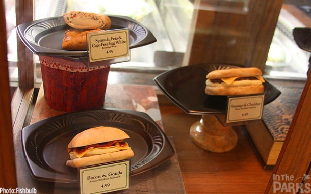
This Miceage picture at the DCA Starbucks says it all.
Nothing like great presentation techniques. Resting their "chins" on the signs. No napkins,showbiz,nothing. LOL. This is the kind of thing that makes the Starbucks folks go nuts. I have toured their design studio and they are very brand and display conscious. Impressive group. I would guess they are more worried about Disney messing up their brand than the opposite.
Here's the real Starbucks...Real china to suggest real food, each on a wire grill to make them look warm, handmade menu tags to suggest homemade. One example shows that you care to some extent and the other begrudgingly "slings" it out there. To me this small observation says alot and in the case of the latter, you don't pay anything to experience it.