Eddie Sotto's take on the current state of the parks (Part II)

Pixiedustmaker

Well-Known Member
I just read my own post. "Chill out Eddie...they're only icons!" Heads for the DeCaf.

Here's a comparison of the old versus the new icons:

http://techland.time.com/2013/06/13...side-by-side-ios-6-and-ios-7-icon-comparison/

I guessing that they went with the new icons because the old ones were maybe "too cute" for serious business smart phone users. The old icons had a lot of 'gloss', looked like over-stylized buttons, and perhaps this distracted from seeing the iPhone as a serious tool versus a toy. I think the new iOS7 is beautiful in a minimalist sort of way.

I think a big improvement, perhaps ignored by the media, is the battery life improvement for the macbooks. No doubt we'll see in the future the iPhone that is between the size of the current iPhone and an iPad, plus other products.
 

Pixiedustmaker

Well-Known Member
To me it's like all of the Disney details in the parks. All of the little things on their own might not be a big deal, but when you add them all up they make something cooler, or make something less cool if you take them away, similar to the "decling by degrees" scenario we talk about on here.

While there are always ways to improve performance, I don't think that the iPhone saves much battery power by using icons which are graphically . . . less complex.

I think that when the iPhone first came out, the icons were cool, these magical shiny button-like icons. But I guess that with time, the iPhone isn't magical anymore, but banal like many other smart phones, and the gloss and perhaps overly stylized icons were kinda too cute and super-sweet to be used on a daily, hourly basis. Kinda like how seeing Sugar Rush land for the first time is cool, but I wouldn't want to live there.

I'm guessing that Apple wants to become more mainstream, and make its icons look more iconic by producing minimalist versions of them. I think some of the new icons look better, but some don't.

Maybe they'll offer the option of having different "skins" for the icons, based on user preference.
 

lazyboy97o

Well-Known Member
Really? Do you love it? How does it work? Any latency?

I honestly did not notice it until I saw you mention it and I looked to see if it was happening. It is a very small thing.

One aspect I really do not like is the new lock screen. The time needs some sort of drop shadow. I listen to podcasts so the art for a show is displayed and if the art is a color close to white the time essentially disappears. The black band in previous versions prevents this from happening.
 

flynnibus

Premium Member
I guessing that they went with the new icons because the old ones were maybe "too cute" for serious business smart phone users. The old icons had a lot of 'gloss', looked like over-stylized buttons, and perhaps this distracted from seeing the iPhone as a serious tool versus a toy. I think the new iOS7 is beautiful in a minimalist sort of way.

That might have been a feasible argument... five or so years ago. But reality is the iPhone is by far the dominate business phone already and took over the market quicker than anyone... and basically killed RIM in the process. iPhone demand was so massive it FORCED IT departments to incorporate it. Ironically, you talk about it being cutesy.. but it was adoption of iPhone by executives that forced IT to implement the phone in their systems (even before it was a complete business solution). iPhone adoption by decision makers (based on the phone itself.. not their IT departments) strong armed enterprise IT into adopting iPhone sooner.

Instead of being pushed by IT - iPhone was something PUSHED by users onto IT.
 

Eddie Sotto

Premium Member
I honestly did not notice it until I saw you mention it and I looked to see if it was happening. It is a very small thing.

One aspect I really do not like is the new lock screen. The time needs some sort of drop shadow. I listen to podcasts so the art for a show is displayed and if the art is a color close to white the time essentially disappears. The black band in previous versions prevents this from happening.

To me using a fine light font is really risky as for the most part it does not pass the "squint your eyes" test for readability.
 

Eddie Sotto

Premium Member
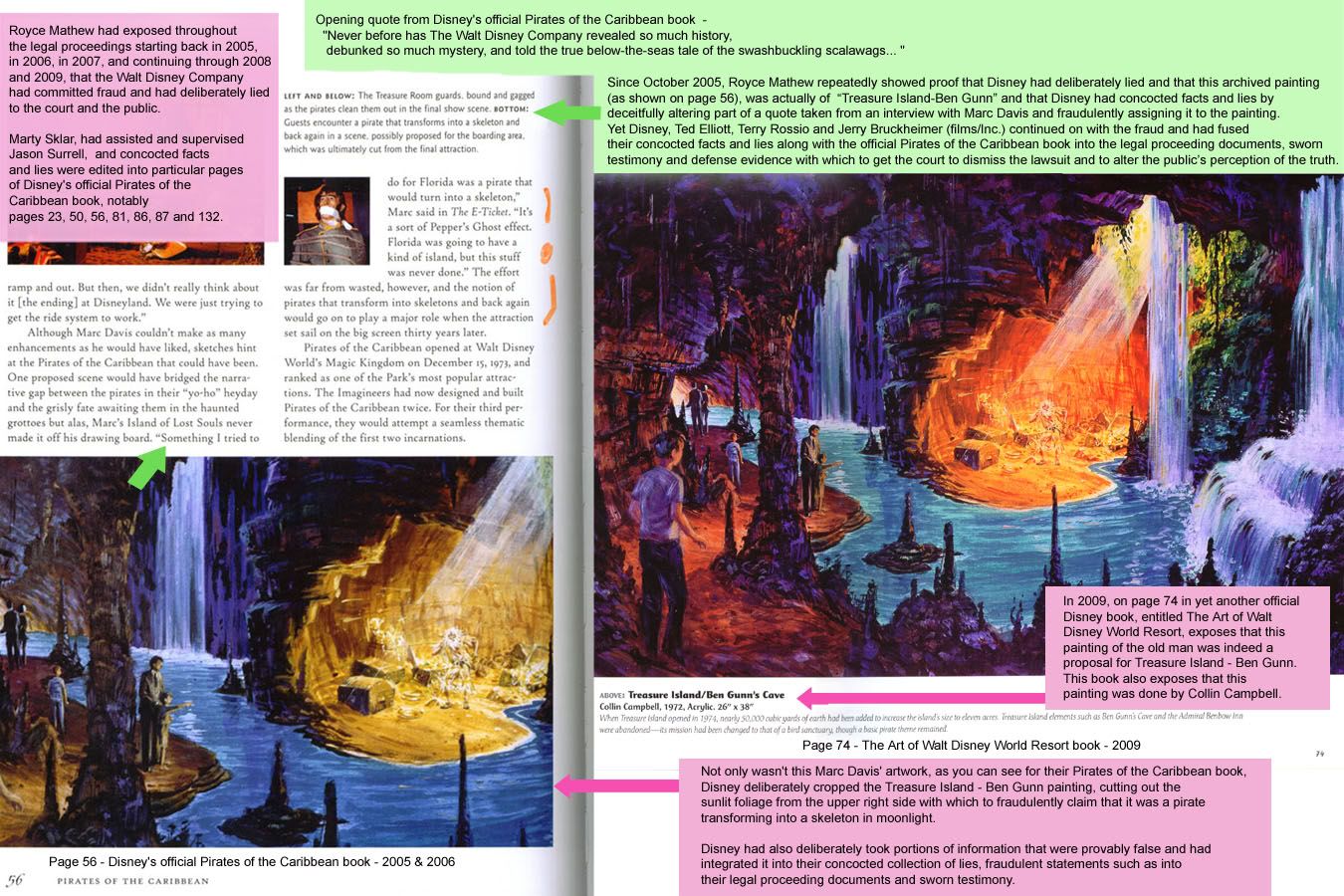
I'm kind of enjoying this continuing saga over the rights to the Pirates Movies. I thought it was settled and so did the company. Now the defendant claims he was misled into signing a release based on false information..According to the defendant, they essentially told him that this piece of art (below) was done by Marc Davis and that it was a missing scene from the ride where "Pirates turned into skeletons". Marc is quoted as describing a "Lost Island" idea where this happens. The defendant later learned in the 2009 "Art of WDW" book that the lost scene was by Colin Campbell, not Marc Davis' and was for a proposed Ben Gunns Cave for Discovery Island, not a "lost scene" from the POTC. He also claims that the Sorrel Pirate book changed the color of the art and cropped out the daylight so it looks more like a moonlit scene. Maybe not intentional, but that is a big color shift and the image does tell a bit of a different story. That is Ben Gunn on the beach, not a typical Pirate.
Article here.
http://www.hollywoodreporter.com/thr-esq/disney-sued-billions-pirates-caribbean-560640.

Case or no case....It's funny how what we would consider Disney trivia (Marc or Collin) has become the struggle for literally Billions! Did the ride have a supernatural "story" or not? Marc's comments have great import decades later. You can't write this stuff.

Here's the defendant's site. The actual claim is interesting reading http://disneylawsuit.com
ARTofWaltworld4.jpg
 

Pixiedustmaker

Well-Known Member
That might have been a feasible argument... five or so years ago. But reality is the iPhone is by far the dominate business phone already and took over the market quicker than anyone... and basically killed RIM in the process. iPhone demand was so massive it FORCED IT departments to incorporate it. Ironically, you talk about it being cutesy.. but it was adoption of iPhone by executives that forced IT to implement the phone in their systems (even before it was a complete business solution). iPhone adoption by decision makers (based on the phone itself.. not their IT departments) strong armed enterprise IT into adopting iPhone sooner.

Instead of being pushed by IT - iPhone was something PUSHED by users onto IT.

iPhone isn't the dominate business phone with about 40% of the smart phone market. The smart phone market is competitive, and ever changing. It was blackberry everywhere years ago, and then, yes, IT departments were pestered like heck to adopt the iPhone, but they are also now adopting other smart phones.

Fact is that the iPhone started off as a personal smart phone, without much, if any, business support, its standing has grown as a business smart phone, and as such it is entirely possible that Apple received feedback regarding the look of the iPhones' icons and a desire to look more . . . professional/all bussiness.
 

flynnibus

Premium Member
iPhone isn't the dominate business phone with about 40% of the smart phone market. The smart phone market is competitive, and ever changing. It was blackberry everywhere years ago, and then, yes, IT departments were pestered like heck to adopt the iPhone, but they are also now adopting other smart phones.

The market share #s are misleading just like the old mac vs PC stats are because they are comparing essentially one maker vs all other makers combined. Android vs iOS... and my observations.. there is no contest.. iOS by like a factor of 4 or 5 these days. Even with the success of the SIII.. its not even close.

Fact is that the iPhone started off as a personal smart phone, without much, if any, business support, its standing has grown as a business smart phone, and as such it is entirely possible that Apple received feedback regarding the look of the iPhones' icons and a desire to look more . . . professional/all bussiness.

I think it's 100% the opposite. The fact the phone was adored and forced into business IT.. WITHOUT any of the business support it needed... shows the 'look/feel' were not holding it back, but in fact what was what people wanted!

The things it lacked were not it's cosmetics or UI.. it was the tools IT expected. Professional Grade encryption, remote management, remote wipe, policies, integration with the mail servers, VPN, etc. Things that normally would keep a phone OUT of the network.. but the iPhone was enamored by the execs and that plus the pure ground swell made IT adopt it even if 'unofficially'.

Its crazy when you go back and look at what was the leading blackberrys of the time.. like the pearl.. and compare to what phones are now.

It wasn't a lack of professionalism in the UI holding this storm back...

edit: and here's some numbers for it all...
http://techland.time.com/2013/04/16/ios-vs-android/

Check out the chart about Citrix reporting on it's apps in business.. and see how that contrasts with the overall marketshare of iOS vs Android. This specifically is an area where iPads are exploding.. insanely.
 

Omnispace

Well-Known Member
I'm kind of enjoying this continuing saga over the rights to the Pirates Movies. I thought it was settled and so did the company. Now the defendant claims he was misled into signing a release based on false information..According to the defendant, they essentially told him that this piece of art (below) was done by Marc Davis and that it was a missing scene from the ride where "Pirates turned into skeletons". Marc is quoted as describing a "Lost Island" idea where this happens. The defendant later learned in the 2009 "Art of WDW" book that the lost scene was by Colin Campbell, not Marc Davis' and was for a proposed Ben Gunns Cave for Discovery Island, not a "lost scene" from the POTC. He also claims that the Sorrel Pirate book changed the color of the art and cropped out the daylight so it looks more like a moonlit scene. Maybe not intentional, but that is a big color shift and the image does tell a bit of a different story. That is Ben Gunn on the beach, not a typical Pirate.
Article here.
http://www.hollywoodreporter.com/thr-esq/disney-sued-billions-pirates-caribbean-560640.

Case or no case....It's funny how what we would consider Disney trivia (Marc or Collin) has become the struggle for literally Billions! Did the ride have a supernatural "story" or not? Marc's comments have great import decades later. You can't write this stuff.

Here's the defendant's site. The actual claim is interesting reading http://disneylawsuit.com

Very interesting, though that disneylawsuit website is extremely long and tedious, sort of like the POTC movies... Hey! Perhaps there's something to this lawsuit after all!!

Although I am pretty much okay with the changes the movies wrought on the original attraction in Disneyland, (adding the Jack Sparrow characters and such), the overpowering music in the battle scene has shattered the magic that I remember being there previously. You had that suspenseful build-up through the long dark tunnel under the railroad tracks, listening to warnings from disembodied voices. Then you were thrust into the middle of the battle -- and it was staged as if you were actually in a real battle scene! Now with the music it just feels like you are in another overproduced movie. meh.
 

Eddie Sotto

Premium Member
The POTC movie music feels a bit discordant with the ride in the caves. A bit too sedate? Preferred the original "scare me" music better but that could just be the nostalgia talking. What you say? I have to pay more attention to the battle scene next time to sense your concern.
 

Omnispace

Well-Known Member
The POTC movie music feels a bit discordant with the ride in the caves. A bit too sedate? Preferred the original "scare me" music better but that could just be the nostalgia talking. What you say? I have to pay more attention to the battle scene next time to sense your concern.

Hopefully these two videos can illustrate what I am trying to say about the added music in the battle scene. Perhaps they were trying to enhance the experience by adding the dramatic score? Perhaps Walt Disney intentionally left music out of this scene to make it feel more realistic...

Before: >>>

After: >>>

To be honest, I was enjoying the new effects and staging -- then I noticed the music and it took my mind to the movie. I'm not sure that is essentially a good thing.
 

lazyboy97o

Well-Known Member
I'm seriously thinking of renaming this thread "Eddie Sotto's take on the current state of Apple".

Now iOS7 is a masterpiece. http://www.cultofmac.com/232040/why-ios-7-is-a-masterpiece-of-design/
As somebody who does the big "no no" of loading up the iOS betas on my personal, everyday device, my biggest disappointment with iOS 7 so far is that it just doesn't work. I know this is a beta, but I did the same thing last year with iOS 6. I don't like the cutesy animations in OS X and I don't like them in iOS 7. I get a lot of freezes and crashes. The biggest offender is, not surprisingly, Apple's own Podcasts app which is basically non-functioning (although many would argue that's nothing new).

I do like the new control center that comes up with a swipe. It's a nice, easy way to toggle features.

As somebody who bought a Palm Pre when it came out in 2009 and even a TouchPad, multitasking is unimpressive and slow. If you're goin to copy webOS, just do it completely. HP is done with it, I doubt they'll dump much into a fight over the card metaphor.
 

Omnispace

Well-Known Member
I like the watch that does not have to be a watch. I'm gonna work on stuff for this if Apple does not get on the ball.
http://www.cultofandroid.com/29968/sony-opens-the-smartwatch-its-about-time/

The idea of opening up the watch to new uses is intriguing. Seems like they are taking precautions though. If you flash the firmware they are taking no responsibility for the function of the device and it sounds like it will be close to impossible to reinstall it once you do... "Consequently, if Sony performs a warranty repair, Sony will likely charge you a significant service fee for the additional costs caused by your modification of the software."

I had hoped it would be more "open-friendly" rather than a hacked watch -- but hey, someone might come up with something very interesting for these. I recall reading about another piece of hardware that was designed to be adaptable to whatever one could conceive of for it. I wish I could remember what it was. Think...Think...
 

Omnispace

Well-Known Member
I recall reading about another piece of hardware that was designed to be adaptable to whatever one could conceive of for it. I wish I could remember what it was. Think...Think...

Okay. I guess I was thinking of the Raspberry Pi -- but that's basically a tiny computer on a circuit board as opposed to an complete device like the Sony smartwatch.
 

Eddie Sotto

Premium Member
Hopefully these two videos can illustrate what I am trying to say about the added music in the battle scene. Perhaps they were trying to enhance the experience by adding the dramatic score? Perhaps Walt Disney intentionally left music out of this scene to make it feel more realistic...

Before: >>>

After: >>>

To be honest, I was enjoying the new effects and staging -- then I noticed the music and it took my mind to the movie. I'm not sure that is essentially a good thing.

I fully get why they would want to make it more like the films, as going forward the audience more and more will associate the films with the ride.

I think the decision to not have a score in the background was likely for that reason.
 

Register on WDWMAGIC. This sidebar will go away, and you'll see fewer ads.

Back
Top Bottom