News Disney Riviera Resort announced

briangaw

Active Member
Excellent procataleptic straw man! I think it will work to suppress alternative points of view that we don't want here!

I don't think this will be the best themed DVC, and it's hard to see how it will be the flagship property - and certainly it won't be architecturally. Though I do think I might be more inclined to stay here rather than the horribly named Reflections property.

I suppose there's no hope that the interior will be more interesting than the outside?

The one interesting aspect from the concept art is the big arched exit-way from the hotel to the pool area with the fountain in it. Does anyone see evidence of this architectural feature in the construction photos?

This you win! This is the exact correct approach to this. That fountain is interesting and there are interesting architectural references. I don't this is a masterpiece, but it is definitely not a disaster.

This is just ugly, my hospital looks better.
looks like a hotel you'd see on Idrive..... yikes.
You forgot the detialed building in the backgournd. Your arguement just fell apart. Riviera’s Tower looks like a housing project.

You guys are being a bit ridiculous. Find me a French, Mediterranean, or even Mexican Riviera themed hospital that looks better. Further any examples of hotels on I drive or even further a housing project that looks better. Would love to see the pictures. So far the outside doesn't make a statement, but it isn't terrible.
 
Find me a French, Mediterranean, or even Mexican Riviera themed hospital that looks better.

Freudian slip? Actually it does somewhat resemble a hospital near me, but the hospital doesn't have gondolas or pools. I agree that this art piece is intended to highlight proximity to the gondolas and fireworks, rather than the architecture.

With that said, its outward appearance thus far doesn't "jump out." From what I've seen so far I would put this a notch above Bay Lake Tower in terms of outward appearance. Prior to last year I had zero enthusiasm for the BLT theme nor interest in staying there. Then I stayed in a lake view room that also had a castle view and fell in love. I would probably stay in that room every trip if I could because of the view (and 2 bathrooms in a 1-BR).

At the end of the day, the room layout, interior theme, view and location/transportation options are the selling points I will be looking at. On a 1-10 list of important factors, outside theme of the resort probably ranks about #10 for me. Much more of my time is either spent in a park or inside of the room rather than outside of the room looking at the outside of the building.
 
The mid-rise seems to be the preferred way to go with Disney these days. Gone is their classic concept of clusters of multiple smaller buidings. Not sure if that’s pure cost cutting or more of an architectural trend (I assume mostly the former).

From the RCID 2020 Comprehensive Plan:
As the supply of vacant land becomes smaller, new development is projected to occur at somewhat higher densities or on somewhat
smaller sites. Infill development within existing activity areas will also tend to increase the overall density of developed areas. While there will be exceptions to this assumption, the overall trend is expected to be towards more dense development.
 

briangaw

Active Member
Freudian slip? Actually it does somewhat resemble a hospital near me, but the hospital doesn't have gondolas or pools. I agree that this art piece is intended to highlight proximity to the gondolas and fireworks, rather than the architecture.

With that said, its outward appearance thus far doesn't "jump out." From what I've seen so far I would put this a notch above Bay Lake Tower in terms of outward appearance. Prior to last year I had zero enthusiasm for the BLT theme nor interest in staying there. Then I stayed in a lake view room that also had a castle view and fell in love. I would probably stay in that room every trip if I could because of the view (and 2 bathrooms in a 1-BR).

At the end of the day, the room layout, interior theme, view and location/transportation options are the selling points I will be looking at. On a 1-10 list of important factors, outside theme of the resort probably ranks about #10 for me. Much more of my time is either spent in a park or inside of the room rather than outside of the room looking at the outside of the building.

The hospital has domes and dormers on its roof? But I do agree 100% with you this isn't an architectural wonder and the exterior isn't fantastic. I guess I was just tempering the "omg it is a horrid (insert diminutive building here)." I agree the inside and amenities where you spend most of your time will be the biggest factor. And perhaps the exterior design suffers from site choice and placement. With the shutter detail and all the other details I think they want a French Riviera theme. The landscaping also seems to be leaning on French Riviera gardens and landscaping, but then as it is in the heart of Caribbean Beach and they wanted to tone it down so it wasn't a huge clash. Seems to me exactly what happened. Which then bodes the question of why force it where they did? And now back to transportation connection and views of fireworks etc.
 
And perhaps the exterior design suffers from site choice and placement. With the shutter detail and all the other details I think they want a French Riviera theme. The landscaping also seems to be leaning on French Riviera gardens and landscaping, but then as it is in the heart of Caribbean Beach and they wanted to tone it down so it wasn't a huge clash. Seems to me exactly what happened. Which then bodes the question of why force it where they did?

Yes, I think being across from and in clear view of Caribbean Beach might have had some influence on design choices. The shutters are actually kind of puzzling to me. They don't suggest "riviera" to me nor do I understand why they are different colors. I actually thought they were one of the more subtle elements designed to blend in with CBR's more colorful theming. You don't see them on the front of the building in the original concept art. Or its entirely possible they're just concept art and the finished shutters look nothing like that.

As for the location, rather than refurb moderate/deluxe rooms the trend seems to be to either retrofit them or tear them down completely to build DVC. It's partly for land-use reasons and mostly for financial reasons. Converting regular resort rooms to DVC is a win/win/win for Disney's bottom line. I would have preferred they add another back entrance into World Showcase around Germany with a bridge/walkway from Riviera, but the Skyliner being so close is good too.
 

GoofGoof

Premium Member
From the RCID 2020 Comprehensive Plan:
Makes sense. Disney once had the blessing of what seemed like an almost unlimited amount of land. Over the years they have used a lot of the good land and sadly sold some of it to outsiders too. I don’t think that the rising value of existing land is the only factor but it could be a big one. I also think a mid rise saves on practical things like number of elevators, size of roof, number of AC units needed to cool common areas, etc... It’s more practical and inexpensive to build a mid rise over a more spread out series of 2 to 3 story buildings.
 

Movielover

Well-Known Member
Some of us don’t need to.

Some of us have a degree in business and have actually worked in the industry and understand what yesterday was all about.

Now hang on there mister! Some of us here have played Roller Coaster Tycoon, and I'm not talking about the cake walk that was the third one. I mean the battleground that was the original game, where boys became men! I'm talking about the struggles that men have not face since Omaha Beach!

What I'm trying to say is that some of here know how to run a theme park! ;)
 

jaxonp

Well-Known Member
The points are not for sale yet so there is nothing to sell. This is part of the overall DVC marketing. They tease a new resort when appropriate to wet people’s appetite and get them in the door then when the time is right the sales guys come in with all of the fine print and details and close the buyers.
.

So we agree...

Showing artwork of what's coming is a type of promotion garnered to build awareness and customer interest. You may not be able to buy 150 points today but you might have began thinking about it (planting the seed, todays goal aka step one in selling)

however marketing is apart of selling so..
https://www.merriam-webster.com/dictionary/marketing
 

GoofGoof

Premium Member
.

So we agree...


however marketing is apart of selling so..
https://www.merriam-webster.com/dictionary/marketing
Yes, we have been saying the same thing all along pretty much as it relates to this art. Great minds think alike;)

Sales and marketing are not the same thing. In most large businesses there are separate sales and marketing departments. Marketing has higher level goals like creating brand loyalty, brand recognition and shaping public opinion about a company or product. Sales is the direct to customer group closing the deals. For example, the naming rights for the Superdome in New Orleans belong to Mercedes Benz. There’s nowhere at the stadium where I can buy a Mercedes. That’s creating brand recognition, that’s marketing. The guy on the Mercedes lot who tells me he has to check with his manager before giving me a great deal on my trade in is doing the actual sales. As you said the goal of marketing is to ultimately increase future sales so me being more familiar with the brand because of the naming rights may have influenced my decision to come to the dealership in the first place even if I am not directly buying the car at the stadium.

For DVC and this project in particular the concept art released isn’t intended to solicit direct sales. The DVC sales guys will need to have details including pictures of the inside of rooms (or a sample room), detailed pictures of the rest of the resort and also specific point chart and pricing info. This art will likely get prospective buyers excited for the project, but the sales guys still need to close the buyers.
 

ToTBellHop

Well-Known Member
Now hang on there mister! Some of us here have played Roller Coaster Tycoon, and I'm not talking about the cake walk that was the third one. I mean the battleground that was the original game, where boys became men! I'm talking about the struggles that men have not face since Omaha Beach!

What I'm trying to say is that some of here know how to run a theme park! ;)
Yes. Develop a popular coaster and then build it four more times in the same park.

And clean up vomit.
 

xdan0920

Think for yourselfer
Some of us don’t need to.

Some of us have a degree in business and have actually worked in the industry and understand what yesterday was all about.

Pete, answer this, or don't...

Are you on the Sales team for this resort?

If so, I understand your vehement defenses and your oddly vague talking points. If not, then I find those same things very confusing.
 

peter11435

Well-Known Member
But what is it?
This was not a media/press event. This was a D23 event for Disney fans. The release of this artwork has nothing to do with marketing the resort or attempting to sell it to customers. It was about selling D23 memberships and tickets to these events. This art like nearly everything else at that event were minor announcements and releases designed to make event guests feel like there was value in paying to attend the presentation.
 
Last edited:

peter11435

Well-Known Member
Pete, answer this, or don't...

Are you on the Sales team for this resort?

If so, I understand your vehement defenses and your oddly vague talking points. If not, then I find those same things very confusing.
No, I am not part of the sales team nor do I work for them.

I bet Disney hasn’t even fully put together their sales team for this property yet.
 

RandySavage

Well-Known Member
For me, hotel architecture (exterior in particular) is of paramount importance because it was able to distinguish the entirety of WDW as something apart from today's norm (with Downtown Orlando, I-4 or the Lake Buena Vista Official Hotels offering perfect examples of the norm).

BLT tower was the beginning of the loss of this uniqueness, which is now accelerating to a nightmarish degree under Chapek & Iger. Some have noted, "I don't care what a building looks like, as long as the room's nice and it gives me a great view." Maybe if it were off in some distant corner of the World. But as it stands, these things going up in highly visible prime locations is like someone building a really badly-designed, ill-fitting condo in previously-pristine or historic place (e.g. Venice or Nantucket Town) affording themselves nice views of the beauty that was previously well-stewarded, while costing everyone else the same... and beginning a domino effect that leads to the end of the beauty that lured the development in the first place.

It could have been a win-win had there been executives and designers in place with a modicum of vision and knowledge. Footprint and floor-count don't necessitate a bland, every-day, degraded piece of architecture (although that's what we end up in 95% of cases around the world).

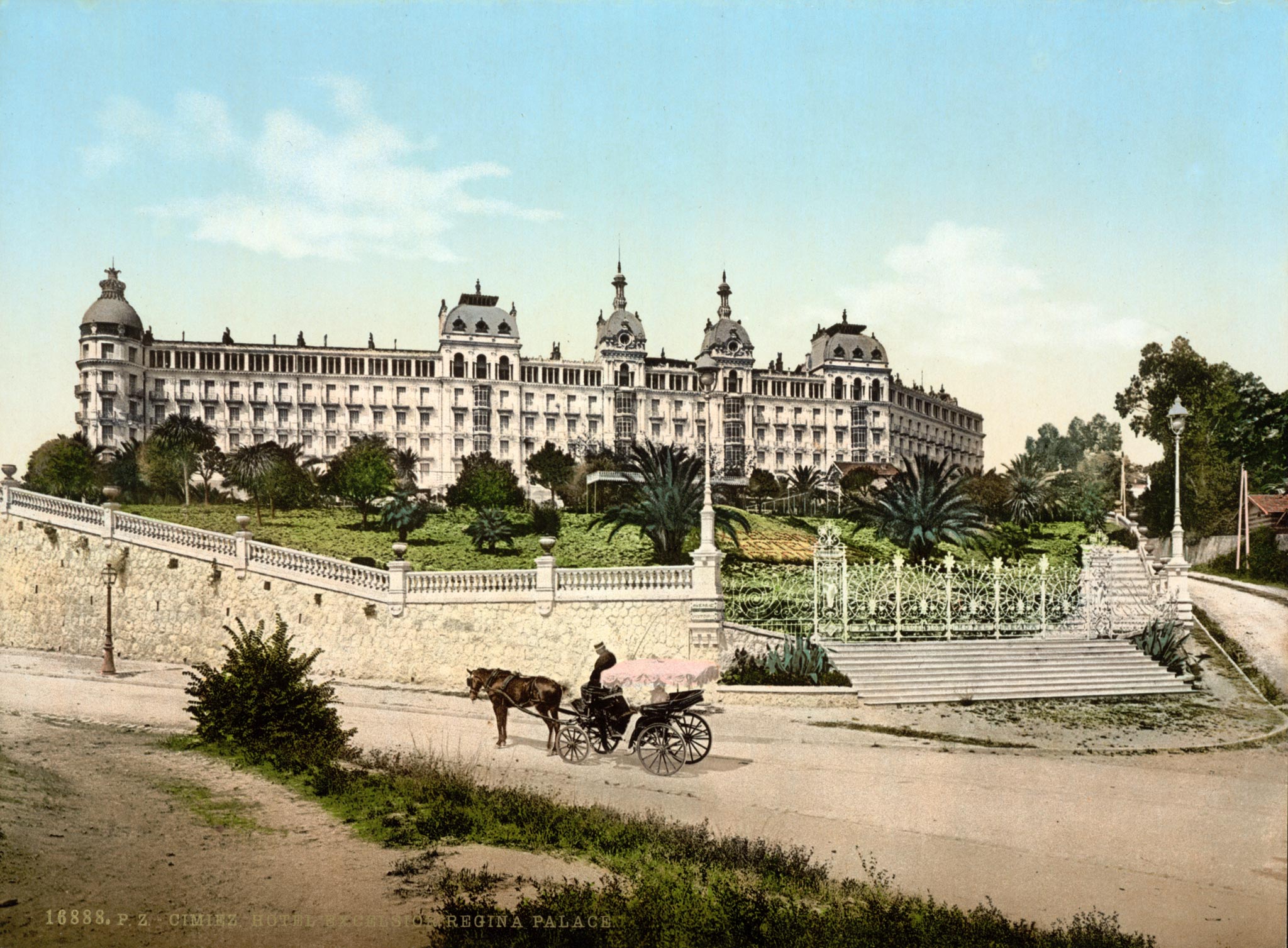
Here's a couple hotels from the actual Riviera that might be one of numerous archetypes that could have inspired Disney to build a resort themed to the Golden Age of European Travel:
Excelsior-Regina-Palace-Hotel-Nice.jpg


RL-Postcard-LL-Monte-Carlo-The-Casino.jpg


While places like the Wilderness Lodge or Grand Floridian or Beach Club did an admirable (not perfect, but probably best-in-class) job of evoking that lost, romantic age of grand hotels, why could this Riviera, architecturally, not have strove for the same? Instead it is an ugly and inept looking building (went downhill from the first very bland rendering) - the shutters presence alone show the degree of cluelessness.

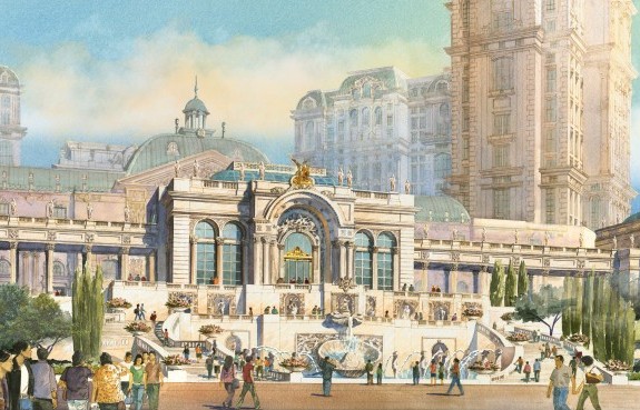
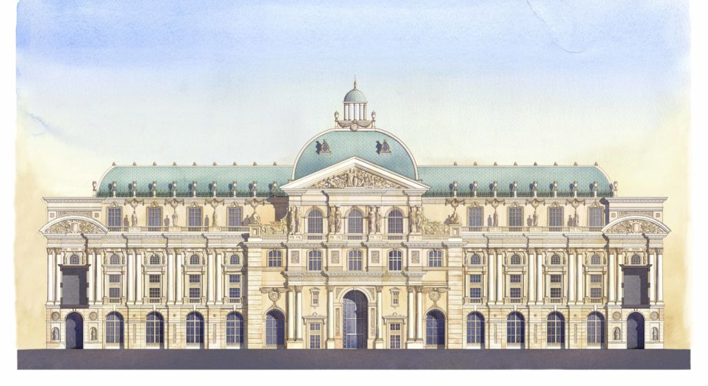
I'm not a big fan of the kitschy tower-portions of themed resorts in Macau (example below) and Vegas, but AT LEAST - at ground level - the designers and developers study and go for the architectural aspects that define a historic style (Beaux-Arts in this case). With Riviera, they couldn't have been cheaper or more lazy in this respect - like what you'd expect from an average (average = awful when compared traditional design standards) local condo development. I will take a pic of a nearby above-average condos that have much better application of traditional, historic elements than the "themed" Riviera.

Again, when a company tries to design something to evoke European resorts of old:
Summer-Pavillion_Lisboa-Palace-e1399948299387.jpg

Grand-Lisboa-Palace_South-Elevation-1024x558.jpg


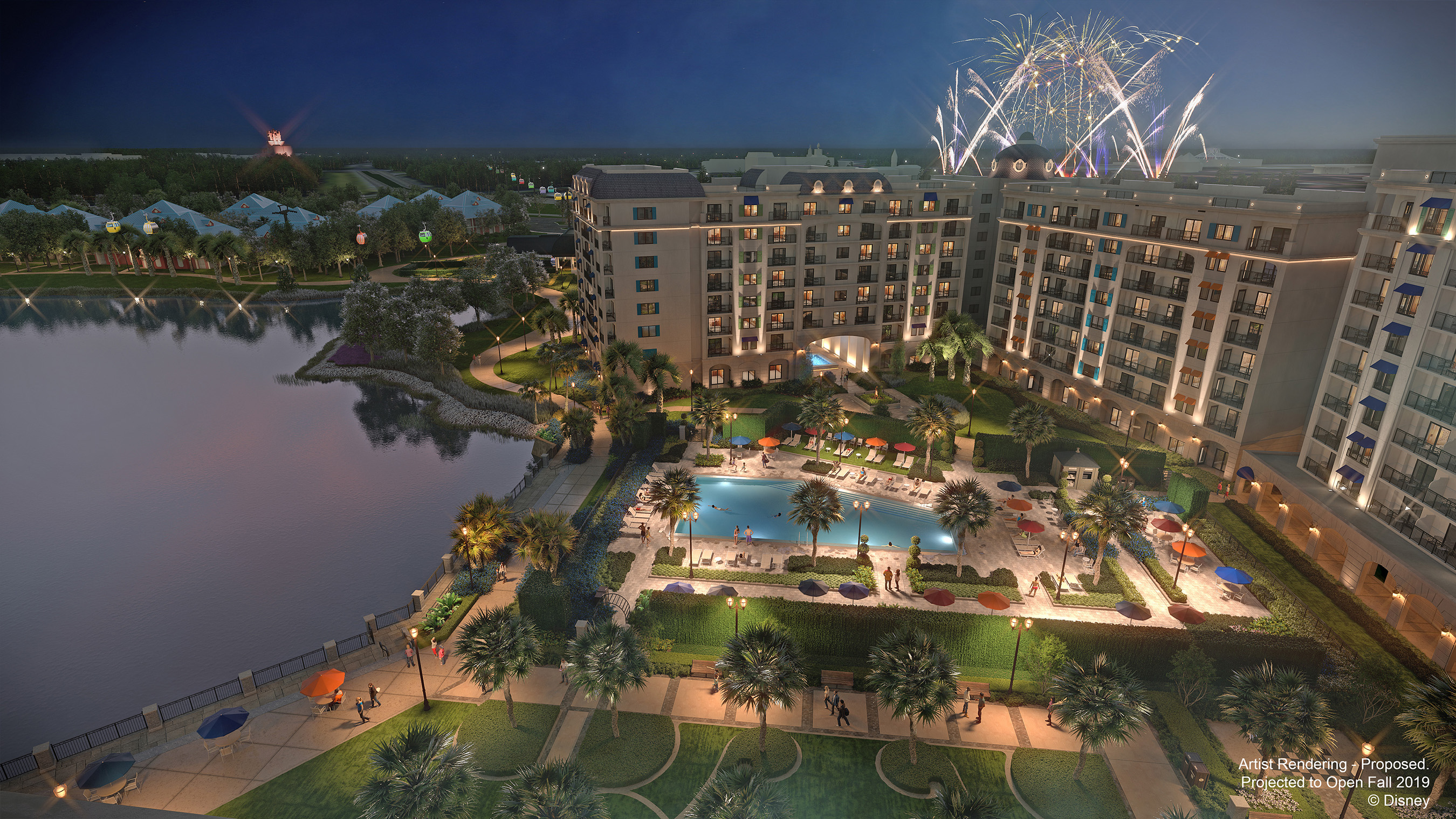
And former-themed-resort-hotel-leader-and-massively-profitable DisneyCo's effort at something similar:
Image_WDW_Riviera-Resort.jpg
 

jaxonp

Well-Known Member
This was not a media/press event. This was a D23 event for Disney fans. The release of this artwork has nothing to do with marketing the resort or attempting to sell it to customers. It was about selling D23 memberships and tickets to these events. This art like nearly everything else at that event were minor announcements and releases designed to make event guests feel like there was value in paying to attend the presentation.

But I don’t need to be a member of D23 to see any of this so how does that sell memberships?

So you’re saying The artwork become a marketing tool for the sales team once it’s shown at a media/press event?
 

peter11435

Well-Known Member
Nah I understand how marketing and sales work. It’s your opinion that a fan event isn’t a marketing tool. Bro you naive.

Disney blasted that information all over the net min after the event. You say it’s not marketing. Disney most definitely does.
You sir don’t know how Disney works.

Show me where Disney blasted that riviera art all over the net.
 

Register on WDWMAGIC. This sidebar will go away, and you'll see fewer ads.

Back
Top Bottom