jt04
Well-Known Member
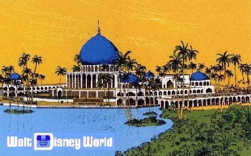
Yeah, because mud huts totally fit in with the western theming.
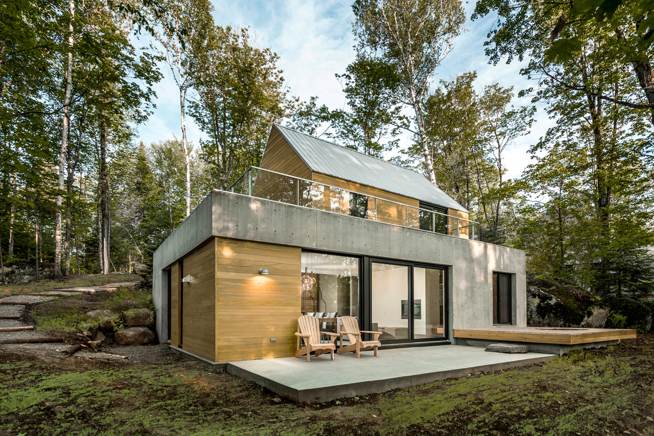
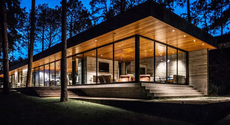
The concept art actually looks pretty nice. I just question the location.
Fair enough. Didn't mean to be so blunt.
Yeah, because mud huts totally fit in with the western theming.
The concept art actually looks pretty nice. I just question the location.
Yeah, but this ain't that. What that looks like is another tower(far from the nature) and a plain looking one at that. Looks like the Hyatt I stayed in in upstate new york"Natural" doesn't mean "old." This is a pretty common design aesthetic.


This is literally the Villas at Kenny's House
This one of the few things I miss from the Eisner era. The architects for other resorts that looked unique.Ehh. It looks really nice, but too bland for a Disney hotel. Michael Eisner had the right idea by hiring world-renowned architects from outside of the company to help create the iconic resorts WDW is known for.
At least the postcards looked good.With every new hotel at the lakes the unifying concept of a seven seas area is further abandoned.
'Persian, Asian, Venetian / Mediterranean, Polynesian, contemporary American'.
The first three unbuild. The Polynesian and contemporary American losing their common concept of big centre high rise with sprawling wings along the way. Then the Floridian, which followed its own design altogether but at least paid lipservice to being a geographical location. Then the Wilderness resort, which is looks set in the northwest of the Americas but has no real place whatsover. And now just a nature one.
On the upside, perhaps a new common theme is being developed along Bay Lake's southern shore. Wilderness resort, Nature Resort, and Fort Wilderness. If TDO weren't so sad and uninspiring, they could develop some nature trails, perhaps reopen Discovery Island with a new theme.


So now we've got at least an additional 1,745 rooms coming to WDW, and that's not counting the Star Wars hotel (number of rooms hasn't been released). That's a crazy number. @ParentsOf4 What do you think?
Fallingwater did it first.
This guy gets it.
I think it is one of them most beautiful hotels Disney has ever built but that is just my opinion.Seriously? The Disneyland Hotel Paris is saccharine vomit of a hotel. It's the lodging equivalent of the 25th anniversary cake Cinderella Castle.
I agree that this doesn't echo modernist architecture in any real sense, beyond maybe some mid-century modernist flourishes blown up to the point of exaggeration in the porte cochere. The first thing it reminded me of is a contemporary suburban apartment complex. Indeed, take away that port cochere and it looks exactly like countless bland apartment complexes with a few fancy finishes that have sprung up in major cities all over the world during the past decade or so.I’m not really seeing much in the way of real Modernism. It looks like the same sort of contemporary design being applied to apartments and hotels all over the place. Being “nature inspired” should be more than just finishes applied to the surfaces. Seeing all the different angles I’m doubting there is anything like real solar orientation or anything else meaningfully inspired by nature.
It looks very nice in the context of Disneyland Paris and serves as a fitting entry to the park. One of the nicest design elements of the resort is that it comes into view as you drive into the resort as the focal point at the end of the Avenue Paul Séremy before you turn off for the resorts, parking, etc. Basically, it serves the same function as the castle at the end of Main Street USA.I've never been to DLP, so I guess I can't really judge the hotel. But from your picture it looks nice...
I'm not sure which of the two threads to post this in, but bioreconstruct posted an aerial for us. Maybe we could consider this the "before" shot?
...so why is that “good”?People need to chill. It’s adding a good amount of capacity of rooms as well as DVC. It’s 4 years away so let’s not judge from one picture.
Register on WDWMAGIC. This sidebar will go away, and you'll see fewer ads.
