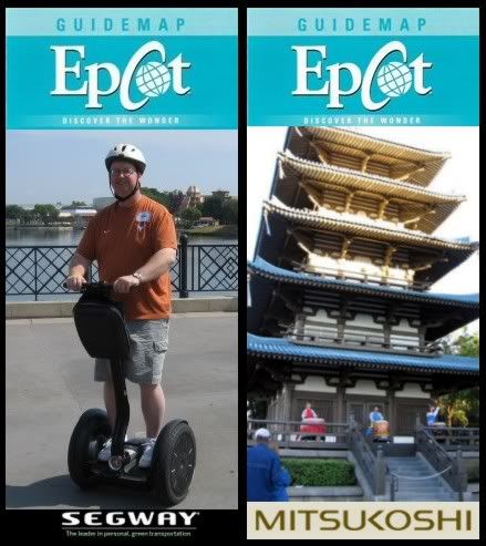
-Design a new Guide Map for EPCOT-

ttalovebug

Active Member
Oh, and the current guidemaps don't have Nemo on the front anymore, it's the Mission: SPACE image they used a few years ago.

picture.php


It really bugs me, though, that they kept the teal, ocean-like blue color for the top bar. Previously it was gray with the M:S picture. And also, that gold bar on top of the very silver spaceship? The colors really clash. I know, not that big of a deal, but it bothers me. They used to put so much thought into things like that. But color in the parks is my majorly particular thing, so maybe others don't notice.
 

DisneyMusician2

Well-Known Member
I know I'm in the minority, but I LOVE M:S, and I tihnk that even though it is not as fitting as SE, it captures the imagination and is worthy of being on the cover. I like it!
 

Mr.EPCOT

Active Member
I like the timeline in your signiture!:)

Why thank you! That's just the very beginning, I have many, many more dates compiled, and have a big website in mind!

It really bugs me, though, that they kept the teal, ocean-like blue color for the top bar. Previously it was gray with the M:S picture. And also, that gold bar on top of the very silver spaceship? The colors really clash. I know, not that big of a deal, but it bothers me. They used to put so much thought into things like that. But color in the parks is my majorly particular thing, so maybe others don't notice.

I agree. I think it's just simply time for a major redesign of the whole set of guidemaps. Just curious, since you're big on color in the parks, what's your opinion on purple being so prevalent in Future World in recent years?

I know I'm in the minority, but I LOVE M:S, and I tihnk that even though it is not as fitting as SE, it captures the imagination and is worthy of being on the cover. I like it!

I would be happier with it if I knew they'd change the cover more often. Right now, I'd agree that Spaceship Earth should be there. It'd certainly be a small, but nice sign that perhaps maybe EPCOT is getting back to basics.
 

ttalovebug

Active Member
Why thank you! That's just the very beginning, I have many, many more dates compiled, and have a big website in mind!


I agree. I think it's just simply time for a major redesign of the whole set of guidemaps. Just curious, since you're big on color in the parks, what's your opinion on purple being so prevalent in Future World in recent years?


I would be happier with it if I knew they'd change the cover more often. Right now, I'd agree that Spaceship Earth should be there. It'd certainly be a small, but nice sign that perhaps maybe EPCOT is getting back to basics.


Well, I think purple is a whimsical color, definitely more so fitted for a "future that never was", like Tomorrowland. Future World is (or, was) about what the real future can be. It should be more streamlined and serious, I think. The blues at the entrance of SSE are great, it would be cool to see that kind of style extended into FW. The purple paint jobs, along with the whirlgigs and tarps and such, should go.
 

EPCOT Explorer

New Member
Well, I think purple is a whimsical color, definitely more so fitted for a "future that never was", like Tomorrowland. Future World is (or, was) about what the real future can be. It should be more streamlined and serious, I think. The blues at the entrance of SSE are great, it would be cool to see that kind of style extended into FW. The purple paint jobs, along with the whirlgigs and tarps and such, should go.

Purple is the color related to insanity....:lookaroun:lol:


Just sayin'.:lol:
 

Figments Friend

Well-Known Member
Original Poster
Well, I think purple is a whimsical color, definitely more so fitted for a "future that never was", like Tomorrowland. Future World is (or, was) about what the real future can be. It should be more streamlined and serious, I think. The blues at the entrance of SSE are great, it would be cool to see that kind of style extended into FW. The purple paint jobs, along with the whirlgigs and tarps and such, should go.

But wait! Purple IS a 'EPCOT Color'!

Anyone remember the original color sceme for EPCOT Center...and the famous 'John Hench Purple'?

I have no issues with purple in Epcot. I have a lot of issues with too many 'character overlays' in Epcot.

:D
 

Goofnut1980

Well-Known Member
so how do we get the clear symbol statue that used to sit on top of the fountain in front of SSE back.. I always loved that... the fountain looks stupid by itself and nothing on the top of it... why did they remove that anyways???? :veryconfu
 

EPCOT Explorer

New Member
so how do we get the clear symbol statue that used to sit on top of the fountain in front of SSE back.. I always loved that... the fountain looks stupid by itself and nothing on the top of it... why did they remove that anyways???? :veryconfu

The clear, sleek and futuristic look of the Lucite clashed with the marble and steel of a certain War Memorial.:lookaroun:lol:
 

Dwarful

Well-Known Member
I like what I am seeing. It is funny because today we were cleaning out the closet in our guest bedroom. The girls found a whole bag of WDW paperwork souvineers. The one thing the girls almost 'forgot' about was the kids Epcot Guide map/booklet. I do agree that Epcot maps need a bit of a shakeup. So much potential
 

EPCOT Explorer

New Member
I like what I am seeing. It is funny because today we were cleaning out the closet in our guest bedroom. The girls found a whole bag of WDW paperwork souvineers. The one thing the girls almost 'forgot' about was the kids Epcot Guide map/booklet. I do agree that Epcot maps need a bit of a shakeup. So much potential

Ooooh, what year was it from?
 

Register on WDWMAGIC. This sidebar will go away, and you'll see fewer ads.

Back
Top Bottom