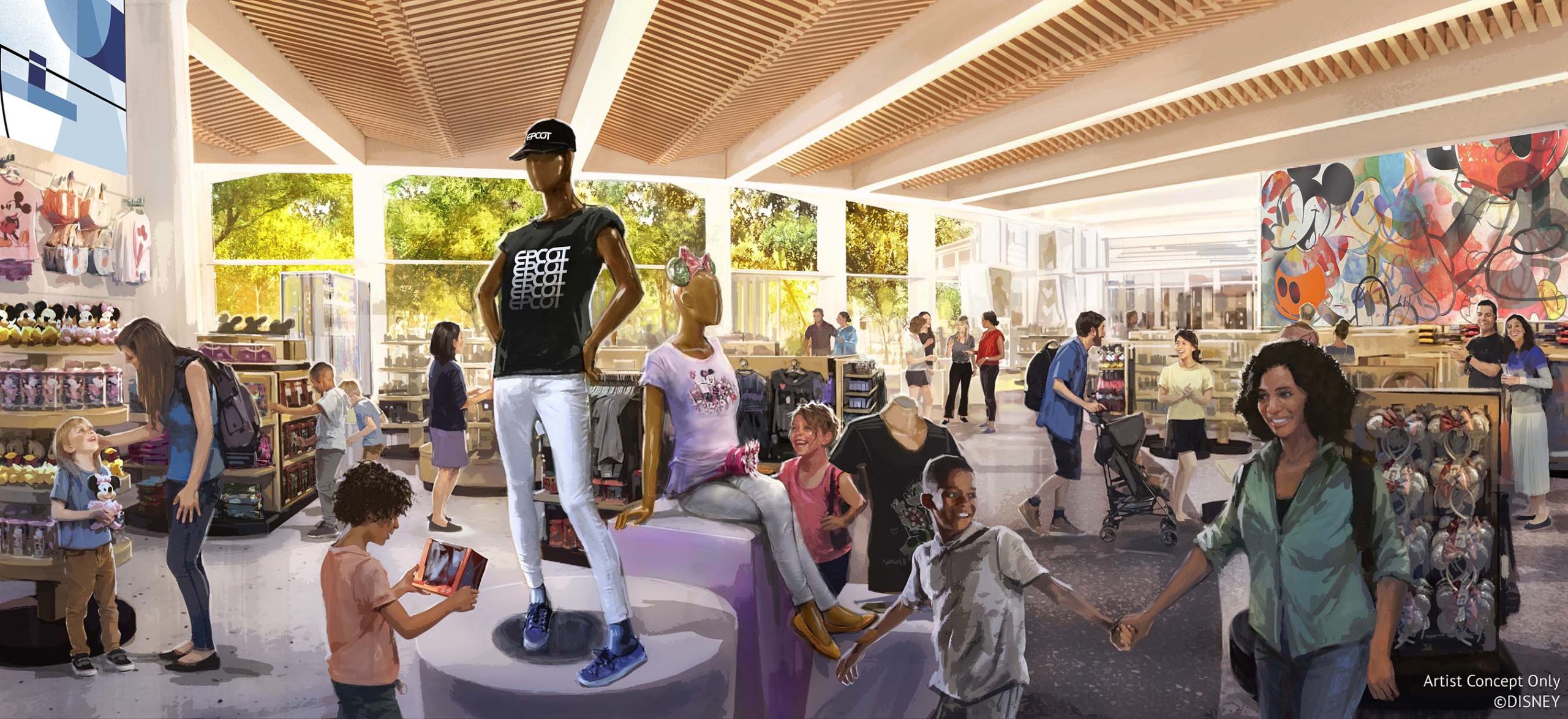
I'm a bit torn on this one. On the one hand, it does look a little generic like it could be a high-end mall store. On the other, the design is very sleek and modern and seems to echo mid-century modern aesthetics in its embrace of open spaces, natural light, and uncovering rather than obscuring the form of the building with all sorts of overlaid decorations. That stripped back, modern aesthetic actually seems appropriate for Epcot, certainly more so than the clutter of MouseGear. In terms of theming, I much prefer this approach than adding a bunch of props. It will be nice if it is reflected on the exterior of the building
It seems that the replacement for Earth Station has been axed, but I think this shop would have complimented the open, mid-century inspired architecture of that building very nicely.
View attachment 546942


