Creations Shop opening this summer

Sir_Cliff

Well-Known Member
Why does it need to be compared to Centorium? The fact is that the concept art looks like a Macy's, much like the current World of Disney looks like a random department store.

I don't see why the original look of Centorium matters beyond someone specifically saying they wanted that back -- which I haven't seen much of in this thread.
I guess the question for me is not so much whether Centorium is better or worse, but what would a themed store in that location look like for those who don't like this version? How would you theme it?
 

UNCgolf

Well-Known Member
I guess the question for me is not so much whether Centorium is better or worse, but what would a themed store in that location look like for those who don't like this version? How would you theme it?

I have no idea about the theming. I just know they had to be able to do something better than a generic department store.

On the other hand, there's not going to be any reason to go inside the store anyways. They're not going to sell anything different from what you can get at World of Disney and in the other three parks, outside of maybe a handful of EPCOT specific items.
 

Inspired Figment

Well-Known Member
A Whole New World of Merchandise
The ending to Epcot Forever all makes perfect sense now. LOL! The theme of “creativity”/One Little Spark leading up to ‘that’.... smh 🤦‍♂️
Heck, it takes creativity to make any real good merchandise people want to buy. Not everybody wants the exact same thing I can buy at any outlet like Target or ShopDisney.
 

raymusiccity

Well-Known Member
I have no idea about the theming. I just know they had to be able to do something better than a generic department store.

On the other hand, there's not going to be any reason to go inside the store anyways. They're not going to sell anything different from what you can get at World of Disney and in the other three parks, outside of maybe a handful of EPCOT specific items.
Agree 100%. They could name this new concept of a department store, 'BLAH', or maybe 'MEH'. 😪 You can find more magic and creativity in any Disney Outlet!
 

Sir_Cliff

Well-Known Member
I have no idea about the theming. I just know they had to be able to do something better than a generic department store.
To me this is more like a generic Apple Store, which honestly doesn't seem that inappropriate for this location. It also gives me Barajas Madrid Airport vibes, which again isn't super original but not super inappropriate either.
 

UNCgolf

Well-Known Member
To me this is more like a generic Apple Store, which honestly doesn't seem that inappropriate for this location. It also gives me Barajas Madrid Airport vibes, which again isn't super original but not super inappropriate either.

It looks kind of like a Macy's to me, although I can see the Apple Store comparison too.
 

Sir_Cliff

Well-Known Member
It looks kind of like a Macy's to me, although I can see the Apple Store comparison too.
Could well be that, because of where I live, I've been in Barajas Airport or an Apple Store far more recently than a Macy's so I'm not recognising some of those connections!
 

The Empress Lilly

Well-Known Member
I guess the question for me is not so much whether Centorium is better or worse, but what would a themed store in that location look like for those who don't like this version? How would you theme it?
I would use EPCOT for experimental retail of tomorrow. Sell the space as a test or flagship ground for digital era shopping.

How is physical shopping space still relevant in an age when Amazon can deliver the same product to your hotel room upon your return, cheaper too? Work on this question, with outside partners.


lazyboy97o

Well-Known Member
To me this is more like a generic Apple Store, which honestly doesn't seem that inappropriate for this location. It also gives me Barajas Madrid Airport vibes, which again isn't super original but not super inappropriate either.
I’d say more Apple Store imitation, which is the big trend in retail. Apple is the one retailer who has since the beginning bucked the trend of declining sales. An Apple Store drives so much traffic that landlords offer Apple generous terms on rent (likely why the Apple Store at Disney Springs fell through). Everyone saw this success and thought it was all about the look and they’ve tried to copy it, but they don’t put in the effort that Apple does. It’s not just glass with wood accents. Too many wrongly assume that minimalism means minimal work and it often shows.
 

Animaniac93-98

Well-Known Member
I’d say more Apple Store imitation, which is the big trend in retail. Apple is the one retailer who has since the beginning bucked the trend of declining sales. An Apple Store drives so much traffic that landlords offer Apple generous terms on rent (likely why the Apple Store at Disney Springs fell through). Everyone saw this success and thought it was all about the look and they’ve tried to copy it, but they don’t put in the effort that Apple does. It’s not just glass with wood accents. Too many wrongly assume that minimalism means minimal work and it often shows.

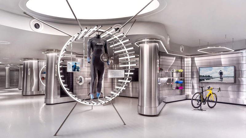
Also what suits Apple products and their sales/service process from a store design/layout standpoint may not make sense for other retailers.
 

UNCgolf

Well-Known Member
Could well be that, because of where I live, I've been in Barajas Airport or an Apple Store far more recently than a Macy's so I'm not recognising some of those connections!

I must have been in Barajas Airport (flew out of Madrid to end a trip) a few years ago but I have literally no memory of it.
 
Last edited:

Sir_Cliff

Well-Known Member
I’d say more Apple Store imitation, which is the big trend in retail. Apple is the one retailer who has since the beginning bucked the trend of declining sales. An Apple Store drives so much traffic that landlords offer Apple generous terms on rent (likely why the Apple Store at Disney Springs fell through). Everyone saw this success and thought it was all about the look and they’ve tried to copy it, but they don’t put in the effort that Apple does. It’s not just glass with wood accents. Too many wrongly assume that minimalism means minimal work and it often shows.
Also what suits Apple products and their sales/service process from a store design/layout standpoint may not make sense for other retailers.
Both very good points. It looks like an Apple Store... but not quite as nice. Then again, this is a store that they want to be packed with theme park crowds pawing over plush toys and t-shirts which is not generally how an Apple Store is run.

I guess we will see how it turns out, because it's a little hard to tell from the concept art whether it will be a minimalist design executed to a high or low standard. Looking at the artwork, though, the design itself honestly looks quite nice to me. Reminds me not just of Barajas in Spain, but museum shops and other places I have been in Scandinavia.
 

ifan

Well-Known Member
I’d say more Apple Store imitation, which is the big trend in retail. Apple is the one retailer who has since the beginning bucked the trend of declining sales. An Apple Store drives so much traffic that landlords offer Apple generous terms on rent (likely why the Apple Store at Disney Springs fell through). Everyone saw this success and thought it was all about the look and they’ve tried to copy it, but they don’t put in the effort that Apple does. It’s not just glass with wood accents. Too many wrongly assume that minimalism means minimal work and it often shows.
Yea - I agree. I worked in visual merchandising for Apple Retail for years and other companies copy the wrong aspects. While Apple stores have always been minimalistic - they do this at great cost. Handcrafted tables that cost 10k each to make cable management hidden. $600 stools. Stone floor from the same quarry so that if they need to replace one, they can get make it look the same. Special ceilings that absorb, not reflect sound. Carefully thought out planograms that try to tell a story or enhance a user experience. A focus on experiencing vs loss protection. Stainless steel and glass designs that are so outrageously expensive that no other company can even find an an architect/general contractor willing to copy.

However, some of the concepts have rubbed off on other retailers and some stores have greatly improved with online competition!
 

Register on WDWMAGIC. This sidebar will go away, and you'll see fewer ads.

Back
Top Bottom