News Coronado Springs Expansion - Gran Destino Tower

Casper Gutman

Well-Known Member
*enraged conventioneer storms up to front desk*

“Sir, I am APPALLED! When my company chose to have their convention at Disney World, they did so because of your resort’s well known reputation for minimalism and mundanity. But now I stand in this towering, intricately themed lobby, with nary a plain, flat white wall to be seen. How are my people meant to think about accounting practices in an environment like this? Earlier today our CFO saw an angle that WASN’T exactly 90 degrees and now he’s up in his room vomiting! If you MUST theme, confine the frivolity to light fixtures and PERHAPS a vase. This is simply wretched excess! Sir, earlier today I heard the laughter of children! And if these rumors of a nearby theme park are true, I can assure you you will not be receiving our business again!”
 

SorcererMC

Well-Known Member
*enraged conventioneer storms up to front desk*

“Sir, I am APPALLED! When my company chose to have their convention at Disney World, they did so because of your resort’s well known reputation for minimalism and mundanity. But now I stand in this towering, intricately themed lobby, with nary a plain, flat white wall to be seen. How are my people meant to think about accounting practices in an environment like this? Earlier today our CFO saw an angle that WASN’T exactly 90 degrees and now he’s up in his room vomiting! If you MUST theme, confine the frivolity to light fixtures and PERHAPS a vase. This is simply wretched excess! Sir, earlier today I heard the laughter of children! And if these rumors of a nearby theme park are true, I can assure you you will not be receiving our business again!”
"I'd be happy to upgrade you to club level for a history lesson, Mr. Iger."
 

Calmdownnow

Well-Known Member
When you surround these with solid walls it directs all the noise straight up and you barely hear anything around them.

Much as I like the interior of the GD Tower, I have to say (regardless of any noise) these HVAC things are an eyesore and clearly detract from the ambiance of the neighbouring non-Tower rooms at Coronado Springs. I wouldn't be happy if I was allocated a room next to them.
 

DDLand

Well-Known Member
The outside of this thing is an atrocity. It looks likes a soviet brutalist building with flourishes:
Old_soviet_building_(8229119199).jpg

Add some yellow paint and some decorations on the outside, and you have Disney's Grand Destino Tower!

What a boring, ugly, sad building. Worst of all, it overlooks one of the most beautiful Resorts in the Walt Disney World family. Coronado Springs is a gem. The perfect mixture of story and hotel. This is a resort I've stayed at for years. More than most, I have a special affection for Coronado. Luckily most of the resort remains untouched. But the damage is pretty significant nonetheless.

Let's start by stating the obvious. It is a sprawling resort. It's so big, that sometimes it's a little cumbersome. But that size is also its strength. It allows for some of the most beautiful spaces in a hotel. I can understand the appeal of having a more dense development at this Resort. When they undertook this project, they essentially gave a middle finger to the original designers and story. Like so many Walt Disney Imagineering Projects, they have no sense of respect for what came before. I'm not sure if this is only executive laziness, or if this is a design problem. It strikes me that this is happening over and over again. It seems like I can't only blame the MBAs. It has to be a design problem too.

Whatever the reason, here it is. Let's talk about everything wrong with Grand Destino's story.

Disney’s Coronado Springs is a celebration of the destinations Coronado visited in his search for Cibola. The locations of Coronado Springs are not random- instead they are part of a story. Obviously time frames are not rigidly set, but the architecture is a close recreation of Spanish Colonial and other older styles. This is something totally different. Instead of faithful recreations, we have a modern hotel with some Earthy colors. What if we had a modern Main Street USA, that took "influence" from turn of the century towns in the same way this hotel does? Or what about an Africa that was "influenced" by African towns? Or better yet, what about a Star Wars Land that has some fun decorations on the wall?

This design would never be accepted in a theme park. It would be laughed out of a design meeting. It has an out of scale design, a totally random assortment of styles, and is inharmonious. Further, the story is corrupted. Now we have a hotel set firmly in Spain (the restaurants are a dead giveaway... I'm looking at you Toledo and Barcelona). The mystery and romance of Latin America are the focus of the Resort. You're supposed to feel like at some point you might stumble on some treasure yourself. Now we have this strangely modern building that doesn't transport you anywhere. It's not set anywhere. It's decorated.

So what happened to staying inside a story? What happened to the theme park experience extending to the hotel? Apparently Disney has abandoned this style. Disney has struggled to produce any compelling hotel development since Aulani. Even hotels like Explorer's Lodge at Hong Kong Disneyland came through crippled. Fun hotels like the Toy Story Hotel at Shanghai don't come close to the audacity of Disney's past exploits in story or immersion. If Disneyland's failed hotel development was any indication, they weren't going to push the bar farther. Even Tokyo Disney's two new hotels look unambitious to hideous.

What's sad is Disney's hotels were perfectly suited for the future:
“The trademark of the boomer was that they wanted familiarity, safety, and comfort,” says Wolfgang Lindlbauer, chief discipline leader, global operations at Marriott International. “As an international hotel company, Marriott has leveraged its scale as a competitive advantage for many years, but what we’re finding is that the next-generation consumer wants the exact opposite of what we’re delivering.”

Young people want exciting and exotic. They want different. Almost like the experience Disney has been delivering for decades, but is now losing. Increasingly, people might ask why they're staying "in the Magic" when there isn't any Magic left. No two images demonstrate that more than a look at the two lobbies (the old and the new). One beautifully crafted, and the other Courtyard Marriott. Does the interior look bad? Not terribly, but it isn't worthy successor to the original. It's not Coronado Springs.

Even their lake project ended up falling flat. It looks far too modern.

I also find amusing that some say they want a more traditional hotel. Walt Disney World is special because it's not traditional. Why would you host a convention at a place that you fundamentally don't understand or appreciate? People knew exactly what they were getting when they stayed at a Walt Disney World hotel. It was the theme park experience at a hotel.

Can Disney do no right these days? It's misfire after misfire. To be fair, Universal's hotels haven't been much better. But is this really the best we can do?
 

dreday3

Well-Known Member
Point - counter point.

Yacht/Beach is my favorite, feel immersed in the magic hotel. It was Polynesian for my nostalgia factor, but I stayed there a couple years ago and it just didn't hold the same appeal anymore.

Coronado Springs was always the last on my radar, even out of the values. I said earlier in thread, reminded me of 90's trying to be Southwestern decor.

Now I can't wait to stay at Gran Destino.

There's a lid for every pot... :)
 

note2001

Well-Known Member
Looks like you wrote a whole bunch more words, but you totally lost me after this. 🤦🏻‍♀️
I'm impressed by his imagination (or prescription) if that even comes close to resembling GD.
I get it though - it's plain. Yes, it needs a certain umph added and they just haven't seemed to provide it.
To compare it to what seems to be a jail is unfair though.
 

Kram Sacul

Well-Known Member
In the Parks
Yes
The outside of this thing is an atrocity. It looks likes a soviet brutalist building with flourishes:
View attachment 390176
Add some yellow paint and some decorations on the outside, and you have Disney's Grand Destino Tower!

What a boring, ugly, sad building. Worst of all, it overlooks one of the most beautiful Resorts in the Walt Disney World family. Coronado Springs is a gem. The perfect mixture of story and hotel. This is a resort I've stayed at for years. More than most, I have a special affection for Coronado. Luckily most of the resort remains untouched. But the damage is pretty significant nonetheless.

Let's start by stating the obvious. It is a sprawling resort. It's so big, that sometimes it's a little cumbersome. But that size is also its strength. It allows for some of the most beautiful spaces in a hotel. I can understand the appeal of having a more dense development at this Resort. When they undertook this project, they essentially gave a middle finger to the original designers and story. Like so many Walt Disney Imagineering Projects, they have no sense of respect for what came before. I'm not sure if this is only executive laziness, or if this is a design problem. It strikes me that this is happening over and over again. It seems like I can't only blame the MBAs. It has to be a design problem too.

Whatever the reason, here it is. Let's talk about everything wrong with Grand Destino's story.

Disney’s Coronado Springs is a celebration of the destinations Coronado visited in his search for Cibola. The locations of Coronado Springs are not random- instead they are part of a story. Obviously time frames are not rigidly set, but the architecture is a close recreation of Spanish Colonial and other older styles. This is something totally different. Instead of faithful recreations, we have a modern hotel with some Earthy colors. What if we had a modern Main Street USA, that took "influence" from turn of the century towns in the same way this hotel does? Or what about an Africa that was "influenced" by African towns? Or better yet, what about a Star Wars Land that has some fun decorations on the wall?

This design would never be accepted in a theme park. It would be laughed out of a design meeting. It has an out of scale design, a totally random assortment of styles, and is inharmonious. Further, the story is corrupted. Now we have a hotel set firmly in Spain (the restaurants are a dead giveaway... I'm looking at you Toledo and Barcelona). The mystery and romance of Latin America are the focus of the Resort. You're supposed to feel like at some point you might stumble on some treasure yourself. Now we have this strangely modern building that doesn't transport you anywhere. It's not set anywhere. It's decorated.

So what happened to staying inside a story? What happened to the theme park experience extending to the hotel? Apparently Disney has abandoned this style. Disney has struggled to produce any compelling hotel development since Aulani. Even hotels like Explorer's Lodge at Hong Kong Disneyland came through crippled. Fun hotels like the Toy Story Hotel at Shanghai don't come close to the audacity of Disney's past exploits in story or immersion. If Disneyland's failed hotel development was any indication, they weren't going to push the bar farther. Even Tokyo Disney's two new hotels look unambitious to hideous.

What's sad is Disney's hotels were perfectly suited for the future:
“The trademark of the boomer was that they wanted familiarity, safety, and comfort,” says Wolfgang Lindlbauer, chief discipline leader, global operations at Marriott International. “As an international hotel company, Marriott has leveraged its scale as a competitive advantage for many years, but what we’re finding is that the next-generation consumer wants the exact opposite of what we’re delivering.”

Young people want exciting and exotic. They want different. Almost like the experience Disney has been delivering for decades, but is now losing. Increasingly, people might ask why they're staying "in the Magic" when there isn't any Magic left. No two images demonstrate that more than a look at the two lobbies (the old and the new). One beautifully crafted, and the other Courtyard Marriott. Does the interior look bad? Not terribly, but it isn't worthy successor to the original. It's not Coronado Springs.

Even their lake project ended up falling flat. It looks far too modern.

I also find amusing that some say they want a more traditional hotel. Walt Disney World is special because it's not traditional. Why would you host a convention at a place that you fundamentally don't understand or appreciate? People knew exactly what they were getting when they stayed at a Walt Disney World hotel. It was the theme park experience at a hotel.

Can Disney do no right these days? It's misfire after misfire. To be fair, Universal's hotels haven't been much better. But is this really the best we can do?

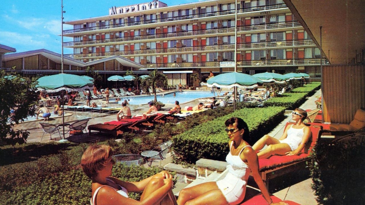
Sometimes people don’t want to admit the obvious. It’s too depressing. The resort is great but the tower was half-assed. Maybe in 10 years they’ll try to fix it but it what it is.
 

lazyboy97o

Well-Known Member
I'm impressed by his imagination (or prescription) if that even comes close to resembling GD.
I get it though - it's plain. Yes, it needs a certain umph added and they just haven't seemed to provide it.
To compare it to what seems to be a jail is unfair though.
Compare it to the photos posted by @ptaylor earlier. It’s a flat wall with square windows. The front isn’t much different without the ornamental grille.

I was very surprised to see all this exposed HVAC machinery. And this thing it LOUD. It is very close to the beach area and rooms.

View attachment 388918

View attachment 388919

View attachment 388920
 

Register on WDWMAGIC. This sidebar will go away, and you'll see fewer ads.

Back
Top Bottom