Connections Cafe and Eatery

wdwmagic

Administrator
Moderator
Premium Member
Original Poster
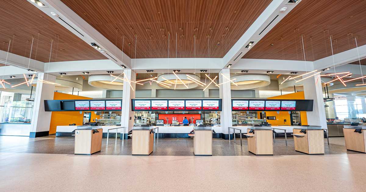
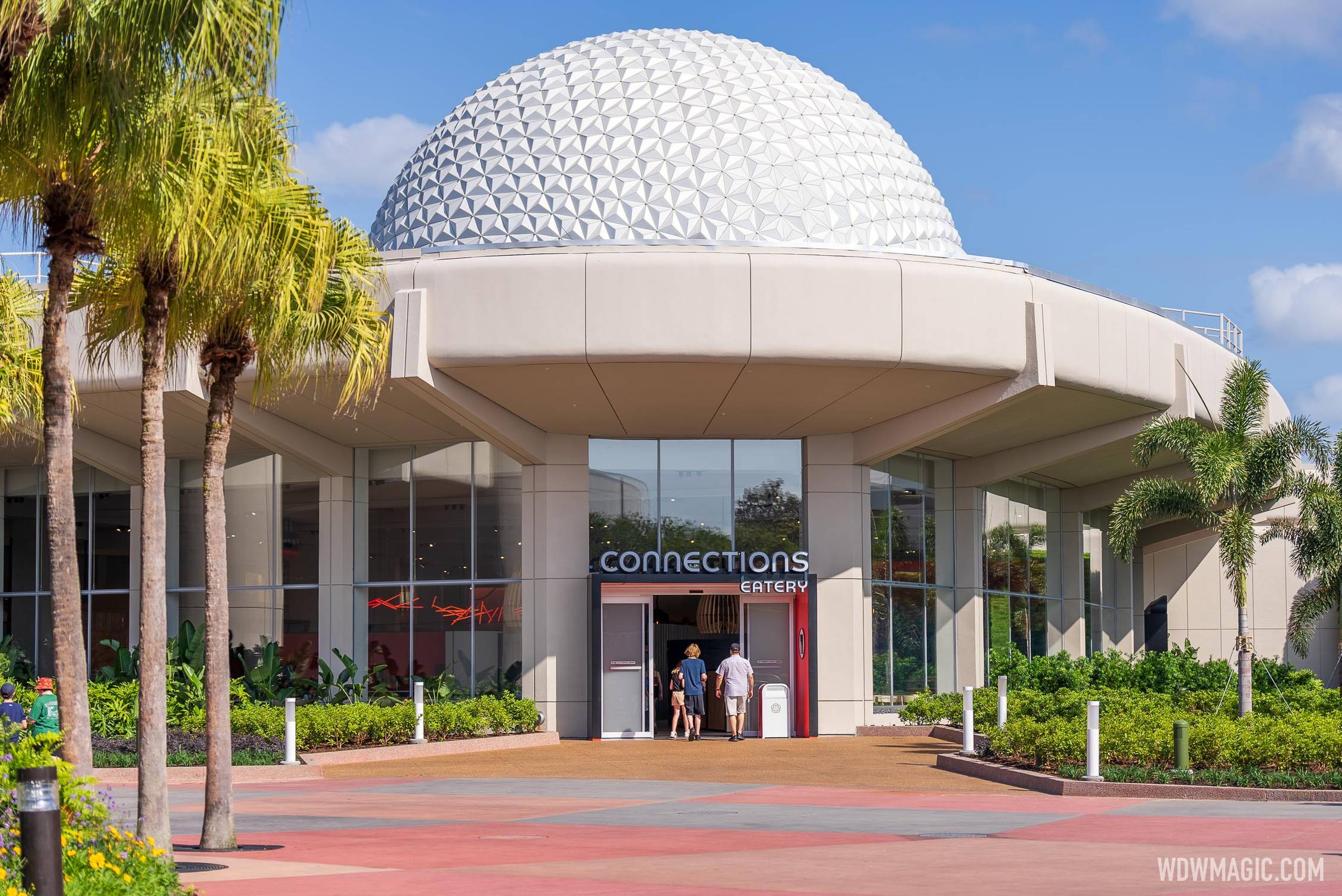
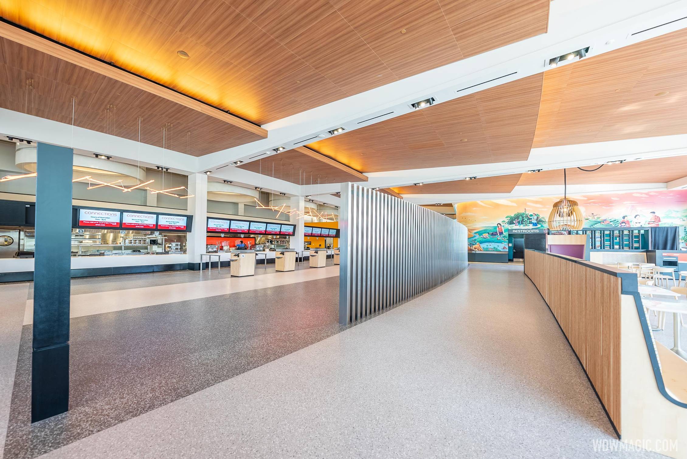
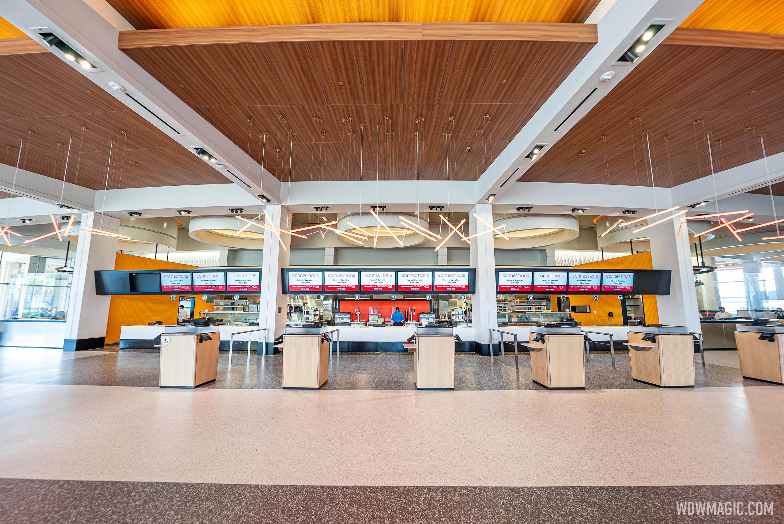
Our photo set of Connections Eatery

Inside Connections Eatery restaurant​


Connections-Cafe_Full_47198.jpg


Connections-Cafe_Full_47186.jpg
 

Haymarket2008

Well-Known Member
View attachment 634727

For your viewing pleasure. The wonder that was this location during EPCOT Center, if I'm correct.

Noteworthy is how much that 1982 sign looks like a 2022 iPhone screen, complete with icons. The 21st century began right here.

Also, if some malificent power had cast a sleeping spell upon EPCOT Center, and it would awaken now just as it was, without any afterwards tinkering, it would be the most gorgeous place on earth. A marvel. Look at those colours, look at those icons. All that light, all that vegetation, the elegance of those lines and forms.

Praying these directional signs make a comeback.
 

Epcot82Guy

Well-Known Member
The more I look at this, the more I'm ok with it. But, it 100% baffles me why they didn't continue this around the circle. (Ego, I know) It actually would have felt like a huge throw back to Communicore to have Creations (shop), Connections (restaurant), Celebrations (Festival Center) and XXXX (new attraction or space with a C name - Conversations, Collections, etc.) That would have given the entire "pavilion" an identity and made each of the parts feel more impressive. I get that half of it is kind of that way, but it just doesn't work that well.

In short, "the whole being greater than the sum of its parts."
 

The Empress Lilly

Well-Known Member
Many people seem to be comparing this to airports, but before the demolition there were still parts of Epcot that look like 1980s mall/airport. The Land still has a lot of 80s mall vibes I think.
This area at least looks current.
0b94cbabcbf15238a09c4b367d1e6647.jpg


Current Land, yes a bit mall-ish. Classic The Land not so much, if distinctly 80s.
 

Bocabear

Well-Known Member
It looks nice... And Electric Umbrella was just nostalgic to many of us...no amazing design. This is clearly fresher and very nice and bright. I guess a lot of us expect something you can't see everywhere else... And While the Land might look a bit like a mall, but when EPCOT opened, it was definitely not the current look of every mall USA...
 

michmousefan

Well-Known Member
I can’t be the only one who thinks Connections looks fabulous…? The sunken floors, the planters, the murals and friezes are all very EPCOT-chic.
It *does* look fabulous, particularly at night. There's just a lot of folks on the board tripping over each other in an effort to out-crack wise about virtually anything that is tied to the current management. They wouldn't be happy with *any* design.

There are directives to question about the current state of things at Epcot and WDW, but this really isn't one of them.
 

180º

Well-Known Member
The more I look at this, the more I'm ok with it. But, it 100% baffles me why they didn't continue this around the circle. (Ego, I know) It actually would have felt like a huge throw back to Communicore to have Creations (shop), Connections (restaurant), Celebrations (Festival Center) and XXXX (new attraction or space with a C name - Conversations, Collections, etc.) That would have given the entire "pavilion" an identity and made each of the parts feel more impressive. I get that half of it is kind of that way, but it just doesn't work that well.

In short, "the whole being greater than the sum of its parts."
Totally agree. With how beautifully they’ve restored Communicore East, it’s a shame we lost West and what could have been.
 

Register on WDWMAGIC. This sidebar will go away, and you'll see fewer ads.

Back
Top Bottom