Club 32 Lounge

mickeyfan5534

Well-Known Member
New Thought Process on the Pan/Adventureland Transition....


Fantasyland_Full_15912.jpg


What if we had a tropical "Neverland Jungle Grotto" Area to transition into Adventureland? It could have the animals from the "Following the Leader" sequence in the movie. Hippos, Monkeys, Rinos, Bears... Maybe even Tick Tock. It'd be our "unique" solution to the "Liki Tikis" found in Hong Kong and WDW.


PP103.jpg

Track_2.gif


Thoughts? o_O I know it sounds weird.... But it could work as an "tropical Jungle" to Tiki room transition.
That would work.
 

MonorailRed

Applebees
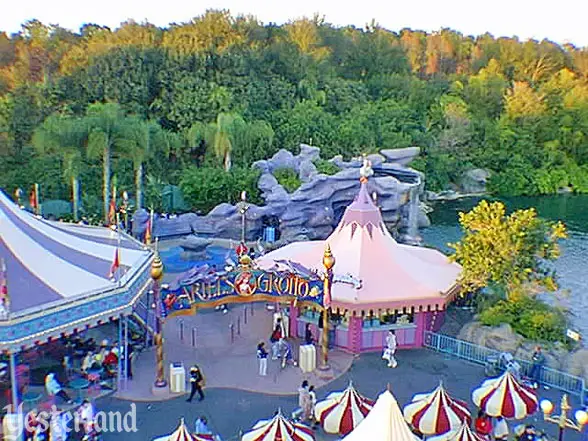
Building off of Space's idea of using the area of the Neverland pool, anyone remember this? :hilarious:

arielsgrotto_entrance1998ah.jpg


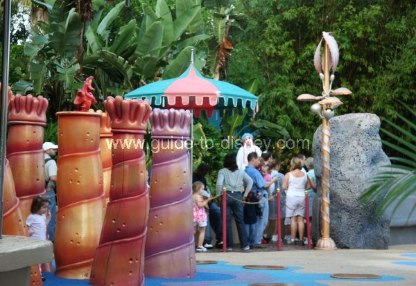
A water play area/meet and greet/rest area. Very 90's... But I feel like space wise we could use this as a template. :D

If I remember right, there was a Kodak station, Quick Service (with Scuttle), Rest Area, Water play area, and Meet and Greet.
ariel-s-grotto3-big.jpg


I think we could theme it much better, but I think for the "Sub area" it would work quite well.... Especially if the Peter Pan attraction exits nearby.... It'd take you from London to "Neverland" :D
 

spacemt354

Chili's
Original Poster
I like the idea if we decide to do the Classic DLP Pirates transition! :D

If we don't go that route, I feel like having Hook's ship as a Adventureland Transition and Pirates on the other would be a bit odd though. o_O
Actually now that I think of it -- I know @gonzoWDW was interested in helping us with Sydney stuff, how the resort flows with the city surroundings and so forth.

Since most of us have never been to Sydney, I'm wondering if there are some Australian tourist specific needs. For instance the research for Shanghai found that guests in the local area like to be entertained moreso than big, fast attractions. So while there is a mix of everything, some of the park is catered to those needs.

I don't know if that makes sense but that may help us design some of these transitions, seating areas, and entertainment options
 

MonorailRed

Applebees
Actually now that I think of it -- I know @gonzoWDW was interested in helping us with Sydney stuff, how the resort flows with the city surroundings and so forth.

Since most of us have never been to Sydney, I'm wondering if there are some Australian tourist specific needs. For instance the research for Shanghai found that guests in the local area like to be entertained moreso than big, fast attractions. So while there is a mix of everything, some of the park is catered to those needs.

I don't know if that makes sense but that may help us design some of these transitions, seating areas, and entertainment options

That's brilliant actually! :D You're totally right, an Australian tourist or local perspective would be really helpful.

I wish @WED99 was on the forums again :(..... He'd be a great resource as well!

I'm trying to think of other members on WDWMagic from Australia :bored: I feel like there's more than we think.... o_O
 

spacemt354

Chili's
Original Poster
That's brilliant actually! :D You're totally right, an Australian perspective would be really helpful.

I wish @WED99 was on the forums again :(..... He'd be a great resource as well!

I'm trying to think of other members on WDWMagic from Australia :bored: I feel like there's more than we think.... o_O
@LSCreative who designed one of the in-park Fantasyland shows a few weeks ago -- but he hasn't been online in a while.
 

mickeyfan5534

Well-Known Member
Since most of us have never been to Sydney, I'm wondering if there are some Australian tourist specific needs. For instance the research for Shanghai found that guests in the local area like to be entertained moreso than big, fast attractions. So while there is a mix of everything, some of the park is catered to those needs.
Some tourism reports
http://www.destinationnsw.com.au/wp-content/uploads/2014/04/Sydney-YE-Dec-16.pdf
http://www.destinationnsw.com.au/to...m-statistics/sydney-precinct-visitor-profiles
http://www.destinationnsw.com.au/to...ional-markets/international-market-factsheets
 

D Hulk

Well-Known Member
IMG_2322.JPG


Pacific Wharf layout proposal.

Mostly like what you've created, @spacemt354, but with some differences. Two main streets from other lands lead directly to Tower of Terror in Barbary Square, with cable cars circling a fountain in a park-like setting. Terrific Street and Eureka Blvd., I call the streets; both names have historical precedents. Cable cars travel these and the Embarcadero.

Museum of the Weird gets the location I'd earmarked for the Chinatown dark ride (tentatively, depending on these attraction(s) final forms). Like POTC in Disneyland's NOS, entry is on the main walkway, but it lets out deep within the city's sidestreets, here in Chinatown Square. Chinatown is set apart from Terrific Street (like the NOS layout) with archways and such. Creates the sense that our "city" is larger than it is, with subtly curving streets and plenty of second floor balcony detailing.

Pacific Wharf is tiered on hills like San Francisco and indeed like NOS. Nothing hugely steep or tall, no hillier than NOS from the river to the train station. The Embarcadero walkway near the Bay is lower, with stairs sometimes connecting to the main roads above. Shops here face the Bay, with pedestrian walkways on the water's edge. I'm not planning any shows like Fantasmic, so let's populate the docks with piers and schooners and such like DisneySea purely as placemaking, and as places where guests may dine on quick service treats. Captain Bluebeard's stuff sits out on the water opposite Sydney Duck's Saloon.

I've added a small Presidio Park green space towards Frontierland next to Club 32. This is a simple calm decompression area, and if Pacific Wharf gets more features added, we could easily slide Club 32 closer to Gold Rush Bridge and add, say, Lombard Street Joyrides or whatever where Club 32 is now. (That ride, if used, needs Convict Island views).

So basically one main street through the land, with side street circuits on either side creating depth and texture.
 

spacemt354

Chili's
Original Poster
View attachment 201337

Pacific Wharf layout proposal.

Mostly like what you've created, @spacemt354, but with some differences. Two main streets from other lands lead directly to Tower of Terror in Barbary Square, with cable cars circling a fountain in a park-like setting. Terrific Street and Eureka Blvd., I call the streets; both names have historical precedents. Cable cars travel these and the Embarcadero.

Museum of the Weird gets the location I'd earmarked for the Chinatown dark ride (tentatively, depending on these attraction(s) final forms). Like POTC in Disneyland's NOS, entry is on the main walkway, but it lets out deep within the city's sidestreets, here in Chinatown Square. Chinatown is set apart from Terrific Street (like the NOS layout) with archways and such. Creates the sense that our "city" is larger than it is, with subtly curving streets and plenty of second floor balcony detailing.

Pacific Wharf is tiered on hills like San Francisco and indeed like NOS. Nothing hugely steep or tall, no hillier than NOS from the river to the train station. The Embarcadero walkway near the Bay is lower, with stairs sometimes connecting to the main roads above. Shops here face the Bay, with pedestrian walkways on the water's edge. I'm not planning any shows like Fantasmic, so let's populate the docks with piers and schooners and such like DisneySea purely as placemaking, and as places where guests may dine on quick service treats. Captain Bluebeard's stuff sits out on the water opposite Sydney Duck's Saloon.

I've added a small Presidio Park green space towards Frontierland next to Club 32. This is a simple calm decompression area, and if Pacific Wharf gets more features added, we could easily slide Club 32 closer to Gold Rush Bridge and add, say, Lombard Street Joyrides or whatever where Club 32 is now. (That ride, if used, needs Convict Island views).

So basically one main street through the land, with side street circuits on either side creating depth and texture.
Thank you for this! I'll make the necessary changes to the map.

In addition -- I'm working on the cumulative thread. I have up till Adventureland (Waterfront, Wharf, Frontierland, Critter) complete.

Since it's roughly the halfway point I will post what I have and see how everyone likes the organization of it. There are several placeholder posts for attractions yet to be complete...so that once they are done, I can add them in and it'll still be in the proper order.
 

D Hulk

Well-Known Member
Here's the link to the cumulative thread...let me know what you think of the layout so far.

http://forums.wdwmagic.com/threads/club-32-sydney-disneyland-cumulative-draft.926539/
This is impressive! I like the layout and organization. It definitely follows from Thor's advice, and once it's fleshed out this should be exactly how a new reader can best understand the project. (A website eventually would be great too, so readers aren't trapped into a clockwise journey.)

I'm seeing plenty of outdated statements in some of the posted writeups (certainly in my own), but that can be edited later. Lookin' good, space!!!
 

spacemt354

Chili's
Original Poster
This is impressive! I like the layout and organization. It definitely follows from Thor's advice, and once it's fleshed out this should be exactly how a new reader can best understand the project. (A website eventually would be great too, so readers aren't trapped into a clockwise journey.)

I'm seeing plenty of outdated statements in some of the posted writeups (certainly in my own), but that can be edited later. Lookin' good, space!!!
Thank you! Yes Tom's advice was something I was keeping in mind.

And yes! My ultimate goal would be at the end to make an interactive website for the whole project! I think from a presentation standpoint -- it would be better for the reader.

However at least everything is all in one place for if/when we move everything over to a website design!:bookworm:
 

Register on WDWMAGIC. This sidebar will go away, and you'll see fewer ads.

Back
Top Bottom