Club 32 Lounge

MonorailRed

Applebees
Dude, you may have some idea...but no idea, but some idea.

Red and I got paired up rather early (pre-Vox even)...

Me and Red and....who else was on our team Red? It was one other guy, a good friend I can't remember his nick right now... a killer combo if you could see our PMs, the three of us...

That's when the "make a website for the presentation" stuff started here...

Zweiland and Ctxak if I remember correctly? o_O

That's when the "make a website for the presentation" stuff started here...

Are you open to making a website for this project when it's done? o_O Bring back the classic Team Fantasy Style? :cool:

Zweiland! That was who.

It was me, Red and Zwei.

Yep Yep.

Team Fantasy. :D

Then Vox in '14 (SA2).....Space in '15 (SA3)
 

spacemt354

Chili's
Original Poster
A website is useful only if it can relate your presentation.

But, it did make for a "media arms war" in the forum...

People boning up on how to make websites and videos, etc...

You came in about in the middle of that, iirc. @spacemt354
Yeah I missed the peak though..came in once it was established as the norm. And I agree....the things that made your websites great were that they were part of the story of the project. Just one of the top of my head was the cruise ships and radio broadcasts. You can't have that on a forum setting...so the site is necessary.

But if you're just doing a restaurant menu or something simple where it's mostly a list...there's no need for a site.
 

spacemt354

Chili's
Original Poster
What you didn't see that Red did was the call for media as I was throwing it all together for these custom sites.

"Red, I need x or y"

(15 minutes later, here comes the file!)

That, was amazing.


While it wasn't a custom site...the Xanadu project last year with Red basically had that dynamic between us back and forth...tons of immediate content -- it was....amazing.
 

englanddg

One Little Spark...
It definitely was and really hasn't been duplicated since (discounting Wix/Weebly)
I'm not against wix or weebly (I use wix for some professional stuff, frankly)...

But, that isn't programming. It also isn't really web work.

But, I also don't think a good presentation NEEDS a website. And, for a bit, that was the status thing here..."look, we have a website, so we are cool"...

No, that doesn't make it the better presentation.

What it can do, along with videos, etc...is be a good PRESENTATION.

Ya know?
 

spacemt354

Chili's
Original Poster
I'm not against wix or weebly (I use wix for some professional stuff, frankly)...

But, that isn't programming. It also isn't really web work.

But, I also don't think a good presentation NEEDS a website. And, for a bit, that was the status thing here..."look, we have a website, so we are cool"...

No, that doesn't make it the better presentation.

What it can do, along with videos, etc...is be a good PRESENTATION.

Ya know?
Exactly! The status thing for websites has kinda faded over recent months and it seems more that it's just used for organizational purposes. Like if you have a land -- you make a map on the site as a homepage and click around to view the attractions.

But that's not all for the best presentations -- videos, I remember we even made a comic book to describe a backstory once. Inventive things that push the envelope do it too! (esp if you don't know code)
 

spacemt354

Chili's
Original Poster
Yeah... Xanadu was very similar.

That and the Timber Peak Project. That was excellent as well! :D
Which ....now exists:p
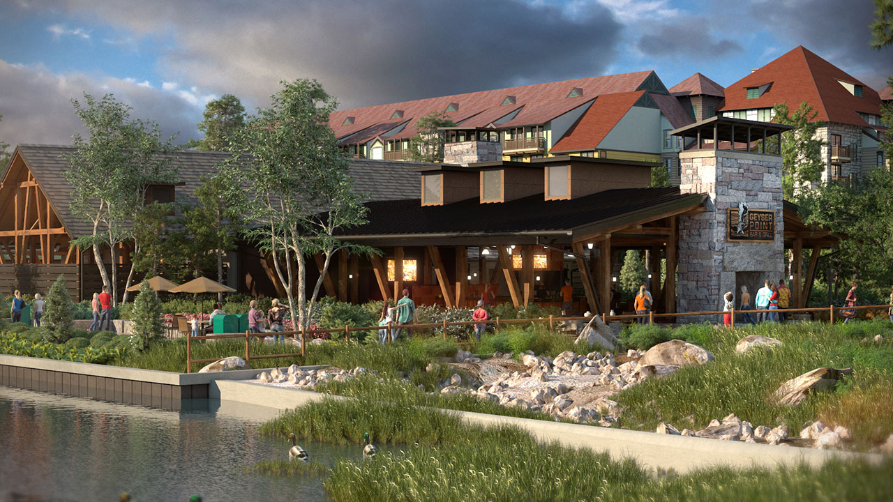
wildernesslodge_GeyserViewBarandGrill2016.jpg
 

englanddg

One Little Spark...
Exactly! The status thing for websites has kinda faded over recent months and it seems more that it's just used for organizational purposes. Like if you have a land -- you make a map on the site as a homepage and click around to view the attractions.

But that's not all for the best presentations -- videos, I remember we even made a comic book to describe a backstory once. Inventive things that push the envelope do it too! (esp if you don't know code)
Well, that was where it started (if you look at the link I posted earlier)....

Makes it easier to click around, and visualize the place.

Not tabs per area...like you get with a wix or weebly...

http://63.135.165.8/lotr/

You can click around and "see" how the area works. Explore it.

Or, as you mentioned, the Cruise challenge with me and Zwei...that is still live too.

http://63.135.165.8/dcl/
 

spacemt354

Chili's
Original Poster
Well, that was where it started (if you look at the link I posted earlier)....

Makes it easier to click around, and visualize the place.

Not tabs per area...like you get with a wix or weebly...

http://63.135.165.8/lotr/

You can click around and "see" how the area works. Explore it.

Or, as you mentioned, the Cruise challenge with me and Zwei...that is still live too.

http://63.135.165.8/dcl/
Yeah I actually never saw the Epcot one you posted earlier...that one was good too! I enjoy being able to click around the areas because it adds another layer (layers!) makes the project interactive and forces the reader to take an active role in acquiring the content...which from a psych perspective...makes them inevitably more invested in the project than just scrolling through text.
 

englanddg

One Little Spark...
Yeah I actually never saw the Epcot one you posted earlier...that one was good too! I enjoy being able to click around the areas because it adds another layer (layers!) makes the project interactive and forces the reader to take an active role in acquiring the content...which from a psych perspective...makes them inevitably more invested in the project than just scrolling through text.
Hence the idea.
 

spacemt354

Chili's
Original Poster
It was also why I was so against a wix/weebly being a "website"...

We didn't use websites for every challenge, but for a whole park, or part of a park, it made a lot more sense to engage the "reader"/"audience"...

It was a tactic. Not a go to practice.
Makes sense when you think about it from that perspective. Plus while I don't know code I'm sure it takes a lot longer to actually design the website from scratch rather than from a template. It's more personalized (and also personalized for the specific project at hand)
 

spacemt354

Chili's
Original Poster
But, by a point it got to this...which is still better than a wix, imho...

http://63.135.165.8/pokemon/

I rather like this one...video aside.
If you cut the video...maybe just put something Pokemon related in its place...it'll still be impressive. That goes back to what you were saying about how each component of the project should improve the experience and relate back in some way, where that seemed more like just a side bar type gag not home page material.
 

englanddg

One Little Spark...
Makes sense when you think about it from that perspective. Plus while I don't know code I'm sure it takes a lot longer to actually design the website from scratch rather than from a template. It's more personalized (and also personalized for the specific project at hand)
Funny thing was, I had a template based off that first epcot one I worked within for most sites.

The first redesign was when Vox and I went nuts with this:

http://63.135.165.8/starkindustries/

I used that same core design for every future site.
 

Register on WDWMAGIC. This sidebar will go away, and you'll see fewer ads.

Back
Top Bottom