Citrus Dreamin' - Game Thread

Pi on my Cake

Well-Known Member
Original Poster
In the Parks
Yes
Imagineering Expedition #07

pMZcD8f.png


cR9Fl6a.png


Let's take a little rest

--What you need to know--
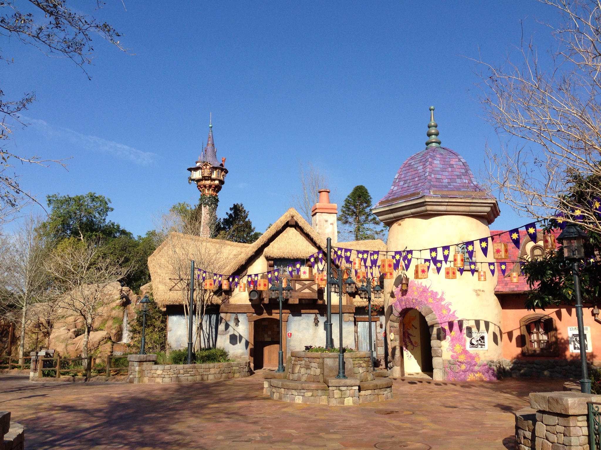
tangled.jpg


The Tangled Restrooms are more than just bathrooms, a photo-op, and a meme. In between them and the nearby Colombia Harbor House restaurant is small sitting area. It isn't much and is probably overlooked by most, but it has some nice shade provided by the trees. There's spots to charge your phone while you sit and unwind a bit. Despite the crowded area, it feels set apart. There's hidden "Pascals" (Rapunzel's chameleon friend) to find scattered about. A simple fun activity for kids to do while parents rest. It is a perfect example of what Disney sometimes refers to as a "D-Zone"

A "D-Zone" is a Disney-fied way of saying "De-Stress Zone" or "De-Compress Zone." An area to relax a bit. A quiet spot for those who need it. An oasis in the middle of all the chaos that comes with theme parks. Rapunzel might be the most well known, but it is far from the only one. The sitting area between Brown Derby and the old bakery at Studios. The quiet side path between Africa and Asia in DAK. Pretty much the entirety of the new World Celebration Gardens at Epcot. There's at least a couple intentional "D-Zones" throughout every Disney Park.
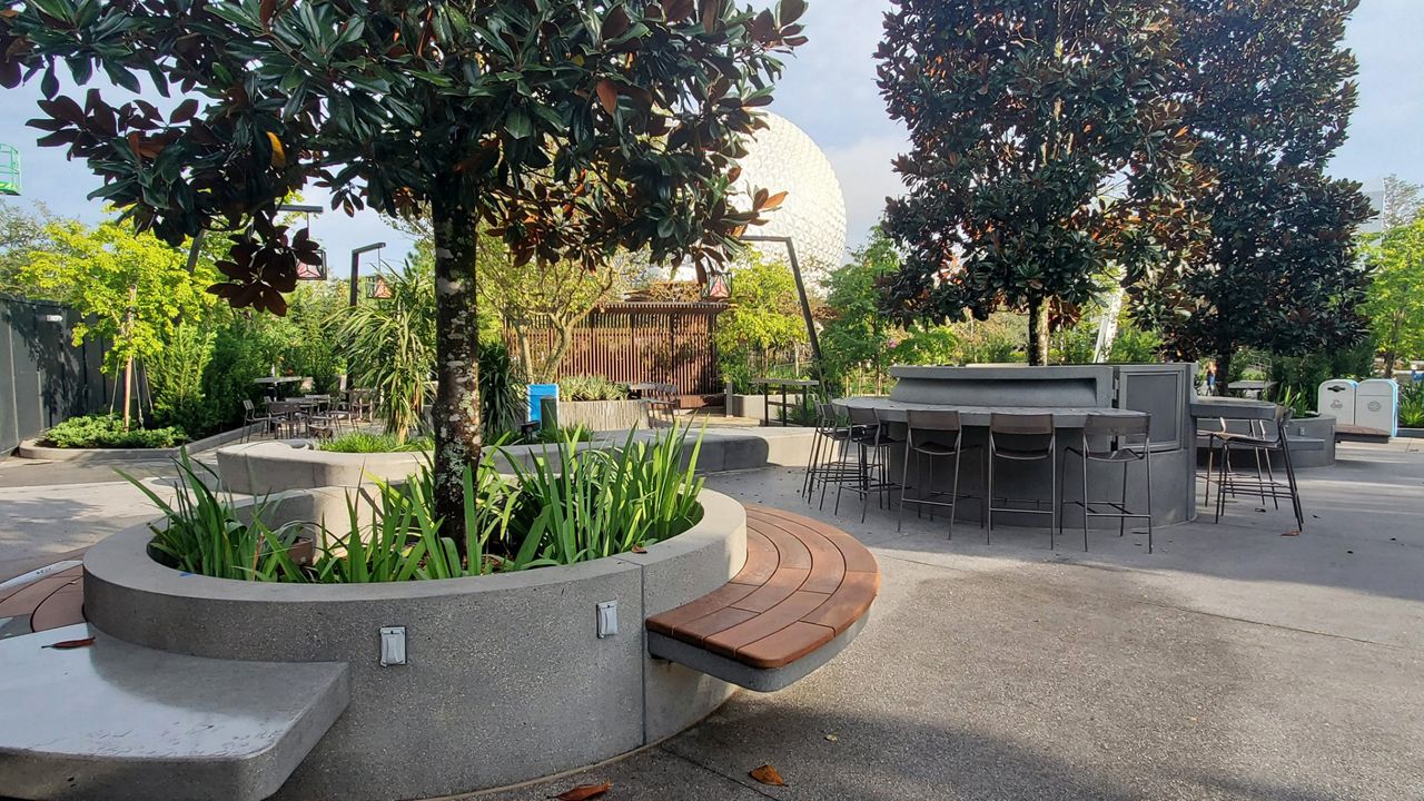
n13_disney_epcot_world_celebration_gardens_2_attr


While their amenities can change and some are more bare bones than others, the best of them provide not just a quiet area, but a place to sit, a bathroom nearby, a way to charge your phone, food/water closeby, and some much needed shade.


--The Prompt--
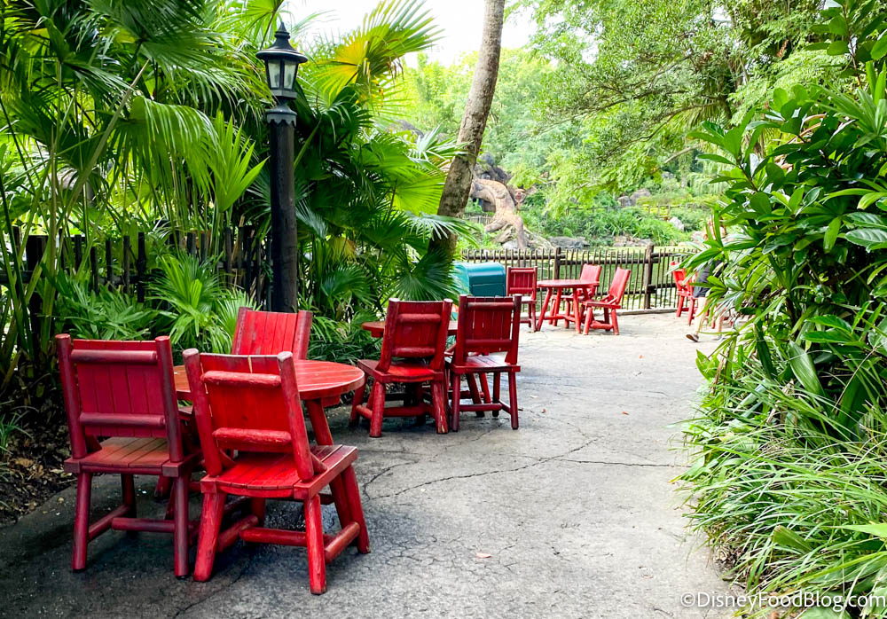
2021-wdw-disney-world-animal-kingdom-whats-new-atmos-seating.jpg


Design a "D-Zone" for the Disney Park of your choice

It is up to you to decide exactly what it will be like, but you must include at least a place to sit, a bathroom, and a snack and/or drink stand.

tLMfp0a.jpeg


No Wilderness Explorer's Guide (didn't feel needed, you all presumably know what benches and bathrooms are), but if you have any questions let me know. Disney does provide a list of quiet areas on their page on "Services for Neurodivergent Guests" and while it is not exactly the same thing, there is a ton of overlap and this can help give you more examples.

There will be no Eliminations or Awards during the Rapid River, but rather at the end of the River (Expeditions 6, 7, and 8) Awards and Eliminations will be based on the River as a whole.


--Team Skippers--

Give it up for...


Skipper @spacemt354 on Team Boats
&
Skipper @JokersWild on Team Birds

If your team wins, you will be granted immunity for the next Elimination

--Helpful Advice--

These shorter rounds are a great place to try something new!
A new type of presentation? Try out a different art style? Go for something more out there and more unique? There is less pressure and lower expectations on these quicker rounds which makes them the PERFECT time to try something different and work on your presentation and other things that can "plus" a project


--When is it due?--

This project is due in 4 Days on Thursday, April 25th, 2024 at 11:59 pm WDW Time
(9 pm Disneyland Time, 11 pm Six Flags over Texas Time, 2 pm the next day Tokyo Disneyland Time)

--Some Brainstorming Music--


Pi on my Cake

Well-Known Member
Original Poster
In the Parks
Yes
Please explain.
Toilets and benches both involve sitting down. But while the physical act is the same or similar, the purpose is very different leading to it being very very important to not get the two mixed up. Benches are used for when you need to rest. Toilets are used after eating at Pecos Bill's
 

Pi on my Cake

Well-Known Member
Original Poster
In the Parks
Yes

JokersWild

Well-Known Member
Toilets and benches both involve sitting down. But while the physical act is the same or similar, the purpose is very different leading to it being very very important to not get the two mixed up. Benches are used for when you need to rest. Toilets are used after eating at Pecos Bill's
Pi, I cannot express how much you've done for me with this, saving me from a life of continued hardship and a now, god willing, formerly growing list of trespass warrants. Thank you, truly.
 

Pi on my Cake

Well-Known Member
Original Poster
In the Parks
Yes
Pi, I cannot express how much you've done for me with this, saving me from a life of continued hardship and a now, god willing, formerly growing list of trespass warrants. Thank you, truly.
That's just what I do. I change lives. It's my thing. It's how I roll. #lifechanger #dealwithit
1713760298300.png
 

TheOriginalTiki

Well-Known Member
With three eliminations, were overdue for another DRAFT UPDATE!!

After taking an early lead via MVP wins and @Pi on my Cake's team having the first eliminated player, Disney Dad's exit along with a current MVP win from Pi's side puts Tiki's team on the board. As it stands now, if the next elimination comes from Tiki's team the points will be neck and neck. We'll be doing the podcast on the EPCOT festivals this Wednesday, so the MVP is going to really start to matter to the draft scores even between eliminations.

Team Pi (29)
1180w-600h_IRIS_1-771-297c.jpg


Pi on my Cake

Well-Known Member
Original Poster
In the Parks
Yes
Team Boats Reviews

1713758300374-png.780811

  • First Impressions​
    • This was joy to read with a stylish presentation that really helped to elevate it. Considering the importance of concerts/music to all the current festivals (including the Festival of the Arts which does focus on visual arts, but still includes Broadway showcases and mentions of musical art too), this is arguably a bit redundant to the current offerings at times. But ya'll smartly kept this focused as a small Summer music festival with some really charming details that helped it stand out and find its own voice. Which renders any feelings of redundancy moot.​
    • The use of Professor Owl as a Festival mascot is a deep cut, but one that works perfectly the same way Spike the Bee works so well for Flower & Garden. Love that choice. I would've appreciated a quick blurb about where he came from, but luckily I'm already familiar with him as the host of the old sing-a-long tapes so I already get what makes him perfect here!​
  • Presentation​
    • Google Slides were a great choice here. That presentation style excels at visual/graphic heavy projects without much actual writing. Great work by @Outbound on it. The bright pinks/purples give this a very unique feel and are just a fun poppy style that compliments the EPCOTchella theme well. With the pops of blue from the Owl complimenting it nicely. The gags with the fake news articles and stuff about EPCOT-chella catching on as a meme name was perfect and exactly the kind of goofy plus I love seeing in these short rounds. The extra Easter Eggs @spacemt354 added were nice too.​
    • The logo and merch by @Brer Panther was fantastic too. Really love the art of Figment as the conductor! And the Professor Owl ear concept is great! Merch is another one of those great plusses that can really push a project over the top. Especially in the short rounds like this​
    • @Lord Fozzinator had some excellent concept art here too! Love seeing you branch out a bit from maps onto other bits of art. The design for the Rock Stage is great and a ton of fun. And while a simple facade, I appreciate the roto-scoped realism of your Barbados booth as a fun visual touch
  • Team Dynamic​
    • Honestly, don't have anything to really add here. @Outbound did a great job as Skipper. Things flowed smoothly especially considering the tighter time frame. One or two miscommunications here or there on who was doing what and what would go where, but nothing that didn't seem minor at least from an outside perspective. Ya'll have truly found your stride!​
  • Introduction - @Outbound
    • Love the light hearted tone to the presentation set by the info. This is meant to be a very fun festival and you embrace the fun of it all right away. The simple division of the presentation into three parts as well as setting that up early on make it all feel cohesive too (alongside the strong visual design of the Slides tying it all together)​
    • That photoshop of me reviewing the festival is a lot of fun, though the nearly 200k views is sort of optimistic lol
    • Very minor note: You say there is 5 music venues on Slide 11, but there are only 4 discussed and the map only shows 4. I'm not sure if originally the theater showcases were meant to have their own venue or if its just a typo. Either way critiquing typos is obviously nitpicking, but sometimes even tiny nitpicks like that can be a deciding factor if a round is close enough
  • American Gardens Theater - @Tegan pilots a chicken
    • Love the choice of showcases here and the variety on display across the week. Definitely gives locals a reason to keep coming back, but without any day feeling like it would be a let down. Using this space as a way to showcase college groups and giving them a chance to perform at Disney is a fun way to get "real" people involved (and to up the number of offerings without upping the budget which is a low cost way to increase the "music festival" feeling)​
  • The World Showplace Theater - @Architectural Guinea Pig
    • I love the international music showcases here. Great way to further EPCOT's themes while also showing what makes a music festival such a great idea for the park. Having it all culminate with the Small World concert every Sunday as a fusion of the different regional styles is a perfect touch, though I do think that would've been strong as the Friday or Saturday concert at the end of the week for the busiest day. But that's a minor squabble with a great idea! Might be my favorite set of concerts just for how well it works in epcot​
  • Rock Stage - @Tegan pilots a chicken
    • The stage concept art, as mentioned before, is very well done, @Lord Fozzinator
    • I appreciate the thought behind making the more "extreme" concert hidden behind a paywall. I usually dislike upcharges for things that feel like they should be included, but that does give you the freedom to go wilder with genre and tine in ways that general guests might not appreciate lol​
    • Using this space for during regular park hours for more "fun" and "Goofy" concerts like Dr Teeth or GotG is a great touch and its nice to see more "Disney" touches like that without it being too overt the top or pandering The Halyx tribute band might be a bit toooooo armchair imagineering fan servicey, but for a small part of the project I think it is a fun touch!​
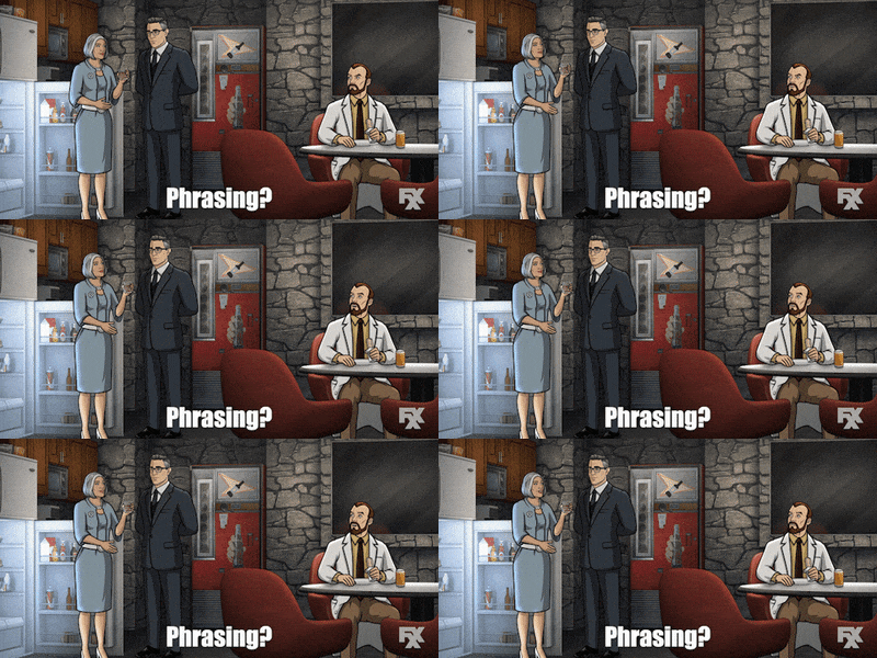
    • The "Evening Under the Covers" might be a logical name for nighttime performances by cover artists, but also...​
    • Awkward Krieger GIF by Archer
  • Communicor Stage - @Tegan pilots a chicken
    • I was going to make fun of Taylor Tuesdays being an upcharge event when Tayor isn't even there, but honestly if it happened this year at least it probably would be popular enough to justify that lol. In general while, again, I have mixed feelings about upcharges for shows that feel like they should be free. But you do a good job justifying them by offering something unique or using the extra income to attract bigger names.​
    • I like that this stage focuses on pop. In general I admire how distinct each stages offerings are and I appreciate the level of thought and care that went into that. But this specific location being pop is smart given its central location meaning its tough to avoid. Keeping this stage focused on the safest, most accessible, least objectionable songs/events is a good call​
  • Theatrical Showcases - @ThemeParkPriest
    • I love getting to see your love of theater take center stage (pun intended) a bit here!​
    • The variety of shows is great, from Muppets to musicals to Hamlet, there's something for everyone! The thought put into adapting these to EPCOT and to the Festival setting is great!​
    • Tomorrow's Child as an original musical/homage to classic EPCOT Center is an excellent nostalgic throwback. A very simple show, but simple in a way that works well for a theme park musical and pays tribute to the history of epcot. One of my favorite Festival features!​
    • I will say though, while I love the theater stuff I am a bit confused as to why there are non-musical options in the Festival of Melodies. I know there's was talk of making it the Festival of Melodies and Art at one point to justify that, but there already is an art festival with a theater showcase. I think if you had just focused on musicals it would have tied into the festival as a whole better because Hamlet, while great, feels somewhat out of place here.​
  • Food - @spacemt354
    • I was hoping for a bit more of a theme to the food to tie it into the music festival. Maybe a "Melody of Flavors" with the focus being complementary flavors the some together like an orchestra. Like how Sweet and Spicy compliment each other well in trendy hot honey things the same way drums and a bass guitar compliment each other in a rock band. Or maybe it is food featured in songs? Idk, but "cuisine is a a part of culture so sharing these meals in these food booths is showcasing these cultures" is great but more or less the whole theme of Food & Wine without any real ties to melodies. Flower & Garden has a more healthy/plant focused theme to their booths. FArts has a focus on artistic presentations for the food. Festival of the Holidays focuses on food that are traditionally a part of holiday celebrations. I'm not seeing the connection to your festival with these booths​
    • That being said, you did a great job designing these menus and finding underrepresented cultures to showcase here! Feels in equal parts unique and realistic and delicious! I would spend so much money at the South Africa booth for sure!​
    • Also want to shout out the menu graphics. They really show your eye for simple visual plusses and your eye for design​
    • Great use of the scavenger hunt game to do another educational/cultural showcase experience for the festival. Teaching kids about musical instruments from across the globe and allowing them to use what they find to design their own orchestra is a blast. Great use of Professor Owl here too!​
    • I have some questions about exactly how the "prize" works and where the secret room full of an orchestra of animals is meant to be. Are the animals animatronics or a screen? Do they only get to see the instruments they find or is it a set show? Feels like a very cool and unique prize (most of the time the festival prizes are like... a cup), but I think either the simpler prize like the irl scavenger hunts OR more details on how this prize would work was needed. but this is too big of an idea for just a sentence and a half to explain it.​
    • I love getting a sample of the instruments and some info about where they would be hidden. It's fun getting to picture these spots and how I would go about searching for them IRL (the scavenger hunts tend to be my favorite parts of festivals)​
  • Conclusion​
    • There is a lot to love here! And some great visuals (both the presentation and the art) to tie it all together! Some minor issues with stuff feeling here or there that doesn't fuuullllly fit the festival as a whole, but little bits like that are sure to fall through the cracks in a rapid round like this and overall ya'll did amazing making something fantastic in a short timeframe! I loved it!​
 

Pi on my Cake

Well-Known Member
Original Poster
In the Parks
Yes
Team Birds Review

fcPbIqs.png

  • First Impressions
    • Making the theme "stories" was a great choice and feels so very "Epcot." I love tying it into October as a birthday party for the park of sorts. Telling the story of EPCOT while also using EPCOT to celebrate the stories that tie us all together. Very sweet, very thematically rich.
    • Just like last time, I feel like I'm going to have a lot less to say here than I did with Boats (which has been the pattern), but please don't take that as a knock against ya'll or that I'm less engaged. This team has a real talent for streamlined projects. This one especially was stripped back with the shorter turn around. That's not a bad things though. Sometime less is more, especially when discussing a simpler topic
  • Presentation - @AceAstro
    • A nice and simple forum post. A perfect fit for a small project like this! Give you full control of the pace and order its read without any fluff distracting from the meat. I would've like to see a bit more to break it up though. Maybe some more images throughout? Or putting some longer sections (Like keep the introduction to the theme of the food booths, but then seperate out the menus in a spoiler or something. Same with the fireworks show) in Spoiler tags? Something that both break up the flow of reading so it doesn't feel like a wall of text and so it is easier to find specific parts when scrolling through. Heck, even just color coding the different headers.
    • That being said, these are minor nitpicks about the presentation that don't have a huge effect when the project is as simple as this one.
    • The logo by @MonorailRed is naturally amazing. Very clean/simple yet still distinct and vibrant
  • Team Dynamic
    • Ya'll did this with only 3 pages of brainstorming. Usually I'd be really concerned with that few pages in the team thread, but in this case it really goes to show how efficient this team is and how quickly you're able to come together, develop and idea, and make it sing. Nearly everything was figured out by the end of page 1!
  • Festival Description - @DisneyManOne
    • You do a great job selling me on the theme, what makes it significant, how it ties to the park, and what you're going to offer. This is a simple introduction setting up the main features, but simple isn't bad. You took 2 paragraphs and already I'm hooked!​
  • Food Offerings - @MonorailRed
    • I love the theme of the food booths! It feels exactly like the kind of thing you'd see in an epcot festival. Its enough of a theme to make it feel special, yet simple enough that there's still a ton of variety here! Adding in the passport stamps was a nice realistic touch that shows either your familiarity with he festivals or your research skills!
    • I mentioned it in the presentation area, but bringing it up again here: this is a bit of a wall of text. Some color coded text, maybe a few reference photos of food or folklore characters taken from Google Images, separating the menus out of the main presentation to break the flow a bit (either spoiler tags or make a Doc/Slide just for food booths that you link to). Idk something to spice up this part of the presentation.
    • That being said, while visually basic, this part of the presentation is great! You went above and beyond with the food booths and the detail/care here is astounding. I love the details of adding displays nearby explaining the history/inspirations behind the food/folklore chosen
    • I won't go into every booth unless I specifically have something to say since I feel like that would get repetitive fast with me just saying "I like it!" over and over, but I will shout out some of my favorite items!
    • Brunch of Legends - Davy Crockett's Sausage and Biscuits
    • Greek Grub - Zeus' Thunder Fries
    • Mythical Bubble Brews - Monkey King Bubble Tea​
  • Unique Offerings - @JokersWild
    • I love the storytellers of the holidays they do around Christmas. The street shows like that sharing legends from different cultures adds so much tot he World Showcase that it boggles my mind that no other festivals really do anything like that. A new storytellers offering like that but centered around folklores/legends and how they influence and are influenced by these different cultures is such a great idea!
    • The tech showcase in the Festival Center is also very cool, but I'm not sure that fits into the final version of the festival? I know there was an early plan to make the festival have more of a tech angle, but as it developed it seems like the team moved away from that with the Festival Center interactive exhibit being the only real remnant of it. But like I told Boats, minor inconsistencies are bound to pop up in these kinds of Rapid Rounds. And while I question it as a thematic fit it is very fun and it would be nice to see a spiritual successor of sorts to Innoventions be a part of the Epcot birthday festival!
  • Dreamfinder's Story Search - @PerGron
    • The only real negative here is using Dreamfinder as the mascot. I get that he and Figment (mostly Figment) are the de facto Epcot mascots, but Figment is already very heavily promoted as the mascot/host for Festival of the Arts. Which is probably why you focus solely on Deamfinder. But Dreamfinder without Figment feels like he's missing someone. I think a different mascot for the game would've been a better pick. That being said, this is meaningless nitpicky stuff not a serious issue. I don't even know if I actually even consider using Dreamfinder a "negative" or if I just feel like a different character could've been a bigger "positive"
    • With that out of the way, let me just say that this is adorable and a perfect fit for one of these games. Searching for storybooks that serves as both things to find AND as showcases of different tales that otherwise haven't been included here is great! I love the variety too going from ghost stories to myths to fables to the Divine Comedy. Great selection and I love seeing the hiding places. Plenty of passion on display here
  • EPCOT in Concert - @DisneyManOne
    • You're one of the best at show writing and I love seeing the talent on display here!
    • The show feels like a perfect birthday celebration for the park. Looking back at its past, celebrating its futures, showing how its themes are timeless and how they can resonate with the humanity inside each of us. Serving as a spiritual successor to past epcot shows in many ways as well as serving as a perfect set up for Luminous and its themes. A great mix of fan service, fun, spectacle, and grandeur.
    • The ties to the Festival of Stories theme is a bit loose. Not to the point of being an issue, but even just an extra line at the end. "This is our story, the story of EPCOT, that we share with you. Now, we go on to create the story of the future" or something cheesy like that to bring it back full circle.​
    • I love the music selection. Including the songs here was a nice touch and helped visually break up the text a bit which was nice.
    • I like the detail of using this as a sort of practice for Candlelight for the orchestra/chorus. Clever realistic touch
    • There was a lot of "Easy" directions to go with this show, but you avoided them and made something much more meaningful and strong.
  • Final Thoughts
    • There's some minor issues here and there with cohesion, but that's to be expected in a rapid round and when they did show up they really were minor, small things. You did a great job making something that feels so real and so fun at the same time!
 

Pi on my Cake

Well-Known Member
Original Poster
In the Parks
Yes
After thoroughly reading both and doing reviews, I think that I like the core of Team Bird's project/theme more. But there was a lack of any "plusses" or anything to add some extra spice there. Meanwhile Team Boats I think had a tad bit weaker of a festival overall, but the presentation and bonus stuff like the merch really helped the Festival of Melodies sing (pun intended).

But did Bird's plusses add enough to overtake Boat's stronger festival?

And which team ultimately won?


Find out tonight 9:30 EST on the podcast!
Going live tonight at 9:30PM Eastern/6:30PM Pacific!

(and posted here after of course)
 

Register on WDWMAGIC. This sidebar will go away, and you'll see fewer ads.

Back
Top Bottom