News Cítricos to reopen July 15 reimagined to the whimsy and elegance of Mary Poppins Returns

LittleBuford

Well-Known Member
At one point the bedspreads had characters on them, although it was subtle and fit the overall style of the resort.
Some images if anyone is interested:

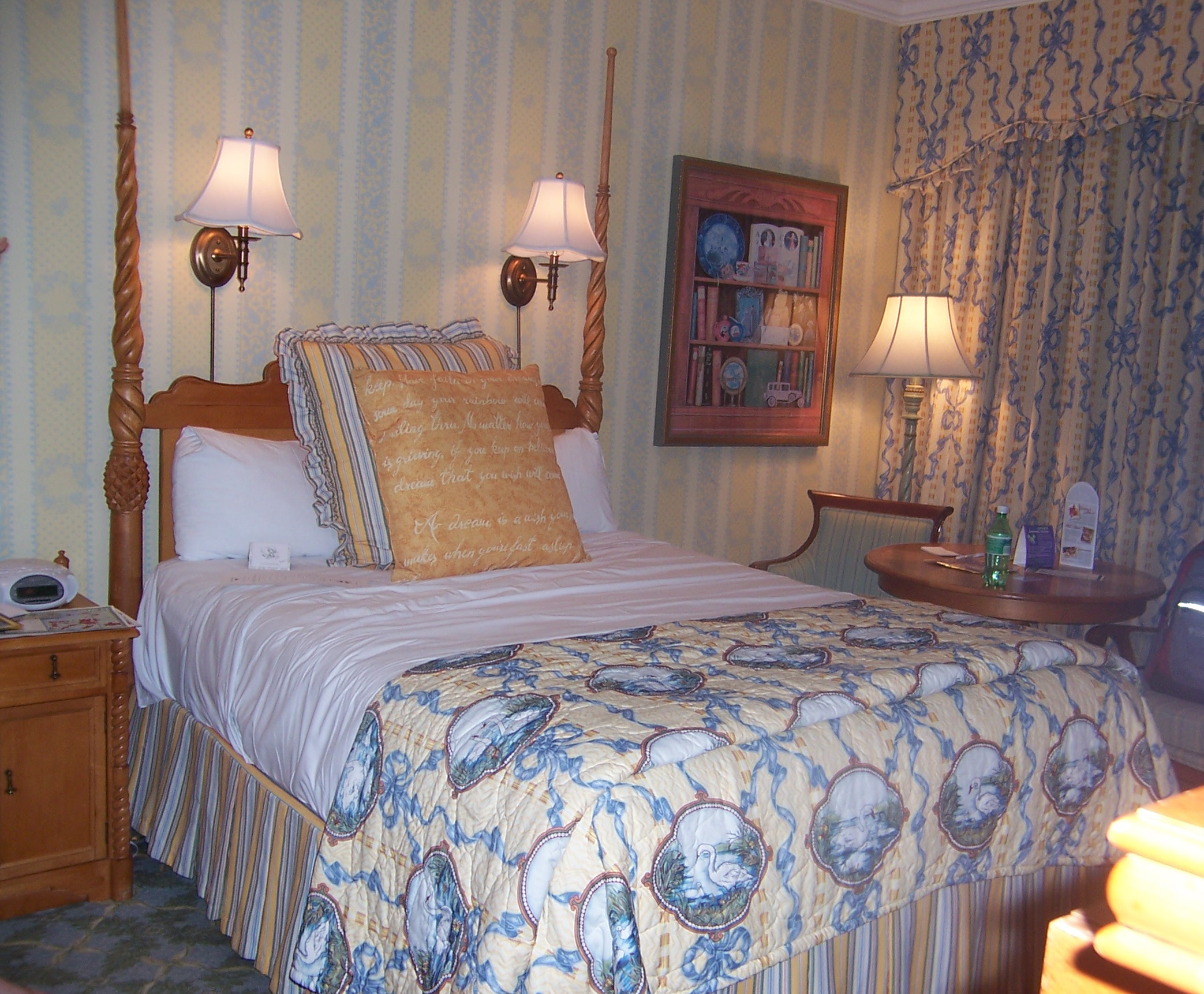
And characters were present in the old bedspreads of the Grand Floridian (the first of the photos below was shared a few pages back):

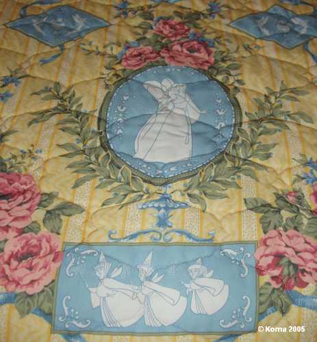
1614974125804-png.537448


gf205.jpg
I know the prevalent view here is that Disney used to be spot-on with theming, but to my eyes, the pictures above evoke the 1980s more than they do anything else.
 

No Name

Well-Known Member
Some images if anyone is interested:


I know the prevalent view here is that Disney used to be spot-on with theming, but to my eyes, the pictures above evoke the 1980s more than they do anything else.
It’s incredible® to see how far things have come in the last 30-40 years. Seriously, that room in the picture above is awful, and I wonder if people will feel the same about today’s rooms 30 years from now. I just can’t imagine it.
 

UNCgolf

Well-Known Member
Some images if anyone is interested:


I know the prevalent view here is that Disney used to be spot-on with theming, but to my eyes, the pictures above evoke the 1980s more than they do anything else.

The patterns etc. aren't really from the 80s -- meaning that a house built in the 1980s with new furniture and so on in a contemporary style almost certainly wasn't going to have a bedroom that looked even remotely like that -- but I can see an argument that they're 1980s rooms that just incorporate styles from an earlier era.

It's certainly not what a hotel room from the 1880s would have looked like, although I don't think the vast majority of guests would actually want to stay in a room that did.

I don't think those old rooms are attractive at all, but I do prefer the attempt (even if it wasn't a great one) at incorporating the right styles, as opposed to the current rooms which don't even really try to be anything other than a standard generic hotel room.
 
Last edited:

LittleBuford

Well-Known Member
The patterns etc. aren't really from the 80s -- meaning that a house built in the 1980s with new furniture and so on in a contemporary style almost certainly wasn't going to have a bedroom that looked even remotely like that -- but I can see an argument that they're 1980s rooms that just incorporate styles from an earlier era.
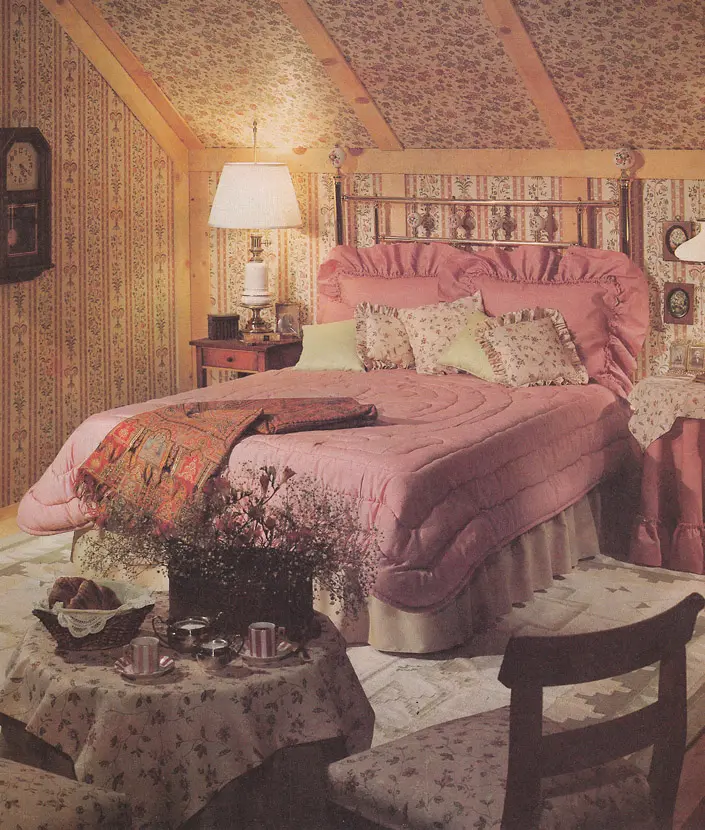
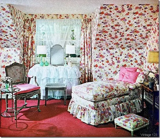
The chintzy pseudo-Victorian aesthetic was very much in vogue during the '80s (we had elements of it in our flat). Here are just two examples:

80sdesign6.jpg.webp


80sdesign12.jpg.webp


I don't think those old rooms are attractive at all, but I do prefer the attempt (even if it wasn't a great one) at incorporating the right styles, as opposed to the current rooms which don't even really try to be anything other than a standard generic hotel room.
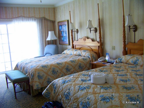
Just as the old scheme reads to me as an '80s interpretation of Victoriana, the current one feels like a contemporary take on the same aesthetic:

orl010_01.jpg


In both cases, the decor says more about the period in which it was created than the one it's trying to evoke.
 

LittleBuford

Well-Known Member
It’s incredible® to see how far things have come in the last 30-40 years. Seriously, that room in the picture above is awful, and I wonder if people will feel the same about today’s rooms 30 years from now. I just can’t imagine it.
I like it on a camp level, but yes, it is a bit of an eyesore!
 

Prince John

Active Member
Poppins. Never, ever just Mary.
But "It's a jolly holiday with Poppins" doesn't have as catchy of a ring to it.

(I just realized I made a reference to the original, 5-time Oscar-winning classic Mary Poppins from 1964 that has been beloved by global audiences and critics alike for decades... and not the lukewarm sequel that apparently Disney wants all the focus to be on. My apologies to any of the Bobs or other corporate big-wigs who might be reading. I won't let it happen again. )
 

LittleBuford

Well-Known Member
Interesting article from 1988 in which some of the original designers of the hotel discuss their approach:


An excerpt:

"This is a mixture of styles, images and usages," said James Isola, senior associate at Intradesign, the Los Angeles firm responsible for the Grand Floridian's interior. "We decided not to take a historically correct, authentic approach to the design here -- it couldn't be done, and it wouldn't be the Disney approach. This is a fantasy."​

Isola and his partner, interior designer Jennifer Burton, borrowed their "happy, eclectic" style from sources as varied as San Franciscan, Floridian, Bahamian, English and Australian Victorian.​
 

castlecake2.0

Well-Known Member
There were images on the walls to look like bookcases and tea cups and the wallpaper was themed as well in some rooms

gf_guest_rooms.jpg
I just have to say I cringe anytime I see bed spreads on hotel beds. I trust Disney washed them between guests but still ick. The trackers stayed at endless summer in a recent blog and the beds there HD scratchy comforters on the bed and all I can think of is bed bugs.
 

UNCgolf

Well-Known Member
The chintzy pseudo-Victorian aesthetic was very much in vogue during the '80s (we had elements of it in our flat). Here are just two examples:

80sdesign6.jpg.webp


80sdesign12.jpg.webp


Just as the old scheme reads to me as an '80s interpretation of Victoriana, the current one feels like a contemporary take on the same aesthetic:

orl010_01.jpg


In both cases, the decor says more about the period in which it was created than the one it's trying to evoke.

As someone who grew up in the 80s and 90s and spent basically all his time in houses that were built/furnished in the 1980s, no one had any rooms that looked even remotely like that here. I know it was a thing in places, but it was an attempt to be Victorian (in a rather gaudy way) and that doesn't disagree with what I said in the first place -- it's a 1980s attempt at Victorian styling, which is what I said. It's not a 1980s contemporary style that would tell you the room was from the 80s (people built rooms that looked like that going back to at least the 1950s).

I don't get what you're seeing in the recent room photo. There's little to no attempt at Victorian theming in the second photo with the possible exception of the drapes. Nothing else in that room really has the patterns or styling of anything Victorian. If you showed me that photo and said it was a room from a Marriott in Atlanta, I'd believe you because there's nothing that would look out of place in a generic hotel room.

The first room, while kind of ugly, would not be confused for a standard hotel room at the time -- and that's the whole point. It's not that I want the rooms to look like the original (I don't); it's that I'd like them to design something that evokes the time period instead of being a room you might find at any random hotel.
 
Last edited:

LittleBuford

Well-Known Member
As someone who grew up in the 80s and 90s and spent basically all his time in houses that were built/furnished in the 1980s, no one had any rooms that looked even remotely like that here. I know it was a thing in places, but it was an attempt to be Victorian (in a rather gaudy way) and that doesn't disagree with what I said in the first place -- it's a 1980s attempt at Victorian styling, which is what I said. It's not a 1980s contemporary style that would tell you the room was from the 80s (people built rooms that looked like that going back to at least the 1950s).

I don't get what you're seeing in the recent room photo. There's little to no attempt at Victorian theming in the second photo with the possible exception of the drapes. Nothing else in that room really has the patterns or styling of anything Victorian. If you showed me that photo and said it was a room from a Marriott in Atlanta, I'd believe you because there's nothing that would look out of place in a generic hotel room.

The first room, while kind of ugly, would not be confused for a standard hotel room at the time -- and that's the whole point. It's not that I want the rooms to look like the original (I don't); it's that I'd like them to design something that evokes the time period instead of being a room you might find at any random hotel.
I grew up in the same period. It’s OK that we had different experiences and saw different things. Laura Ashley was a huge aesthetic force at the time. Chintz screams ’80s to me, even if it doesn’t to you. I’m not alone in this association.

I see what you’re saying about the newer scheme. It is indeed more generic, though I do think it feels a little more (intentionally) old-fashioned than your bog-standard Marriott room.
 

UNCgolf

Well-Known Member
I grew up in the same period. It’s OK that we had different experiences and saw different things. Laura Ashley was a huge aesthetic force at the time. Chintz screams ’80s to me, even if it doesn’t to you. I’m not alone in this association.

I see what you’re saying about the newer scheme. It is indeed more generic, though I do think it feels a little more (intentionally) old-fashioned than your bog-standard Marriott room.

I think either you misinterpreted what I said or I didn't communicate very well. I wasn't claiming that aesthetic didn't exist in the 1980s; it absolutely did. The problem is that it's not unique to the 1980s. You can find rooms that look very similar to what you posted going back to at least the 1950s (and probably earlier) -- my grandparents had a guest room like that in their house that hadn't changed since my mom was a child. It's not really the stereotypical 1980s bedroom, or something that's uniquely identifiable as from the 80s.

It doesn't really matter though, since my main point was about the more generic nature of the newer rooms.
 
Last edited:

LittleBuford

Well-Known Member
I think either you misinterpreted what I said or I didn't communicate very well. I wasn't claiming that aesthetic didn't exist in the 1980s; it absolutely did. The problem is that it's not unique to the 1980s. You can find rooms that look very similar to what you posted going back to at least the 1950s (and probably earlier) -- my grandparents had a guest room like that in their house that hadn't changed since my mom was a child. It's not really the stereotypical 1980s bedroom, or something that's uniquely identifiable as from the 80s.
I didn’t misunderstand you. What I’m trying to say is that it’s a distinctly ’80s interpretation of that aesthetic—at least in my eyes. It’s clear we’re seeing things differently, and that’s fine!
 

UNCgolf

Well-Known Member
I didn’t misunderstand you. What I’m trying to say is that it’s a distinctly ’80s interpretation of that aesthetic—at least in my eyes. It’s clear we’re seeing things differently, and that’s fine!

Yeah, it's difficult for me to see it as distinctly 80s since my grandparents had that room from the 50s that was incredibly similar to the one you posted. Not identical, of course, but similar floral wallpaper, furniture, etc. -- I've always looked at that chintz 80s aesthetic as an attempt to recreate earlier styles with a slight spin rather than something new and contemporary to the 80s.

When I think of a stereotypical, uniquely 80s bedroom (i.e. something you wouldn't really see in any other time period, beyond some bleeding into the early-mid 90s), I think of stuff like the below photos. But there's certainly no definitive answer and YMMV.

iu


Pastels.jpg
 

TrojanUSC

Well-Known Member
I continue to believe that what most people mistake for theming was a distinctly 80s/early 90s interpretation of luxury with a hint of theme. I have no problem with some sleeker, more modern elements that people gripe about. The issue is that Disney really seems to have forgotten there is much of a difference between how a value or moderate resort room should be appointed, as compared to a deluxe hotel (the "wood" floors with no carpets, over-the-top character integrations, etc).

One only needs to visit the FS or the new JW to see really great iterations of a modern, five-star hotel room that are both luxurious and classy. Disney could have absolutely used these properties as a model for the deluxe refurbs, while putting their own spin on it.
 

UNCgolf

Well-Known Member
I continue to believe that what most people mistake for theming was a distinctly 80s/early 90s interpretation of luxury with a hint of theme. I have no problem with some sleeker, more modern elements that people gripe about. The issue is that Disney really seems to have forgotten there is much of a difference between how a value or moderate resort room should be appointed, as compared to a deluxe hotel (the "wood" floors with no carpets, over-the-top character integrations, etc).

One only needs to visit the FS or the new JW to see really great iterations of a modern, five-star hotel room that are both luxurious and classy. Disney could have absolutely used these properties as a model for the deluxe refurbs, while putting their own spin on it.

I really don't think that's the case. You were not going to find anything that looked like that Grand Floridian room in a new luxury hotel in the late 1980s or early 1990s. That is not the aesthetic they were using.

They were definitely interpretations that were heavily influenced by the time period when the rooms were built, but they generally had a clearer theming intent than the current rooms. That doesn't mean the rooms were all successful, of course.
 

Register on WDWMAGIC. This sidebar will go away, and you'll see fewer ads.

Back
Top Bottom