The Empress Lilly
Well-Known Member
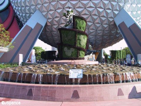
The original plaque capitalises EPCOT, as it should be. The new plaque confusingly uses both 'Epcot' and 'EPCOT Center'.
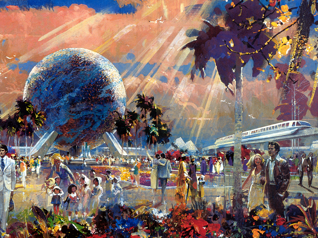
What I love about the original is not just the vision expressed, but also the expression of vision through unity of style. From the plaque to the prism. You could slide the hexagonal plaque into the top of the (incomplete hexagonal) prism and make it fit like a jigsaw puzzle.

Compare:

Although I guess the new colour scheme is consistent too in its browns (earth tones, to complement SSE?). And in flat surfaces. Maybe it just sucks.
Also, its funny to see how Mickey tends to replace the other symbols of Disney, here taking over EPCOT with the wand and topiary. Not dissimilar to how Mickey has replaced the old hub in the MK, and is possibly replacing the GMR. It is an expression of Disney taking over Disney. 'Disney' having almost two meanings, the semantic reason behind much forum confusion, that of 'toon IP' and also that of 'anything build or produced with Disney sentimentality, quality, and popularisation'. Even Bob Chapek speaks of making EPCOT 'more Disney', when to me, and to many EPCOT fans, to make EPCOT more Disney is akin to saying you are going to make Pinocchio more Disney.

