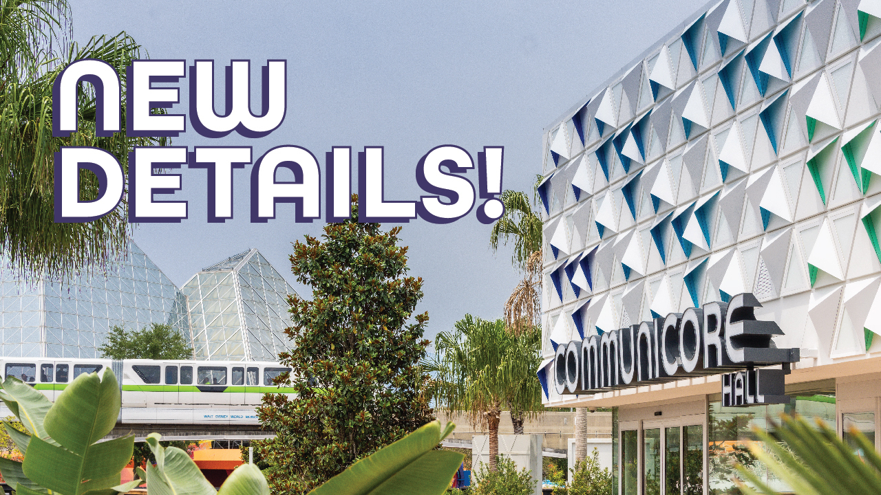
Saw all the changes with walls down in person this weekend and the new hub is just... strange. It felt lifeless, claustrophobic and closed in during the day. Too hot and barren, even with all the trees. The old hub, with its wider vistas, grace, symmetry and kinetics (provided by the fountain and excited guests headed off in different directions) built anticipation and excitement. The new hub felt to us like a competent city park or downtown core redevelopment, well-intentioned but value engineered and lacking true inspiration or excitement.
Communicore Hall had interesting architectural "add-ons" in the form of the triangles, but aside from the facade, it's a fairly cookie-cutter building. The stage was... there, and the concert was... also there? Too hot to enjoy much of this and the choice of entertainment seemed a total mismatch for the area or theme of the building. The inside of Communicore Hall is... a lifeless wasted effort. It really did look like a hospital waiting room, community college student union or a local rec center activity area but nothing more. It's not even large enough to really do anything with so... why did they bother? A waste of time and resources for something that could and should have been more.
At night, the hub did seem more expansive due to the interior and exterior lighting on the surrounding structures providing an illusion of depth. The central planter lighting was... okay. Still not fully functional and definitely value-engineered. The white plastic covering the in-ground LED lights was already scuffed, worn and molding underneath in several spots. I fear this area will not age well.
A couple of additional thoughts. Journey of Water seemed popular but claustrophobic and again, woefully out of place. Incongruous. A wonderful diversion at Animal Kingdom but not in the heart of Epcot.
And that seems to be the biggest takeaway from the entire re-do. As the gateway to the lands and attractions beyond, the reimagining of Epcot's hub should excite, inspire, build anticipation and provide a clear set of choices. We found it closed in, lifeless, discordant, disorienting, insufficiently inspirational and completely lacking charm.
At the end of the day, the two
biggest sins are the lack of a water feature and the destruction of Comminicore West and the grandeur, grace and symmetry it provided. Why engage in the wholesale destruction of classic architecture when a reskin would have been far less expensive, more fiscally responsible to shareholders, less disruptive to guests, and less destructive to the park?
What remains is a feeling of lost opportunity and a questioning of the company's leadership, vision and priorities. More than a half decade and untold millions for... something I guess.
What was gained and/or lost in the process is open to debate, but I have to wonder--would it have been wiser to simply spend a modest amount of time and money on a less-destructive refresh of the hub, building on its inherent strengths without throwing out the baby with the bathwater?
What if Disney had, instead, spent just a portion of all that time and money restoring and refreshing Journey Into Imagination and Spaceship Earth?


