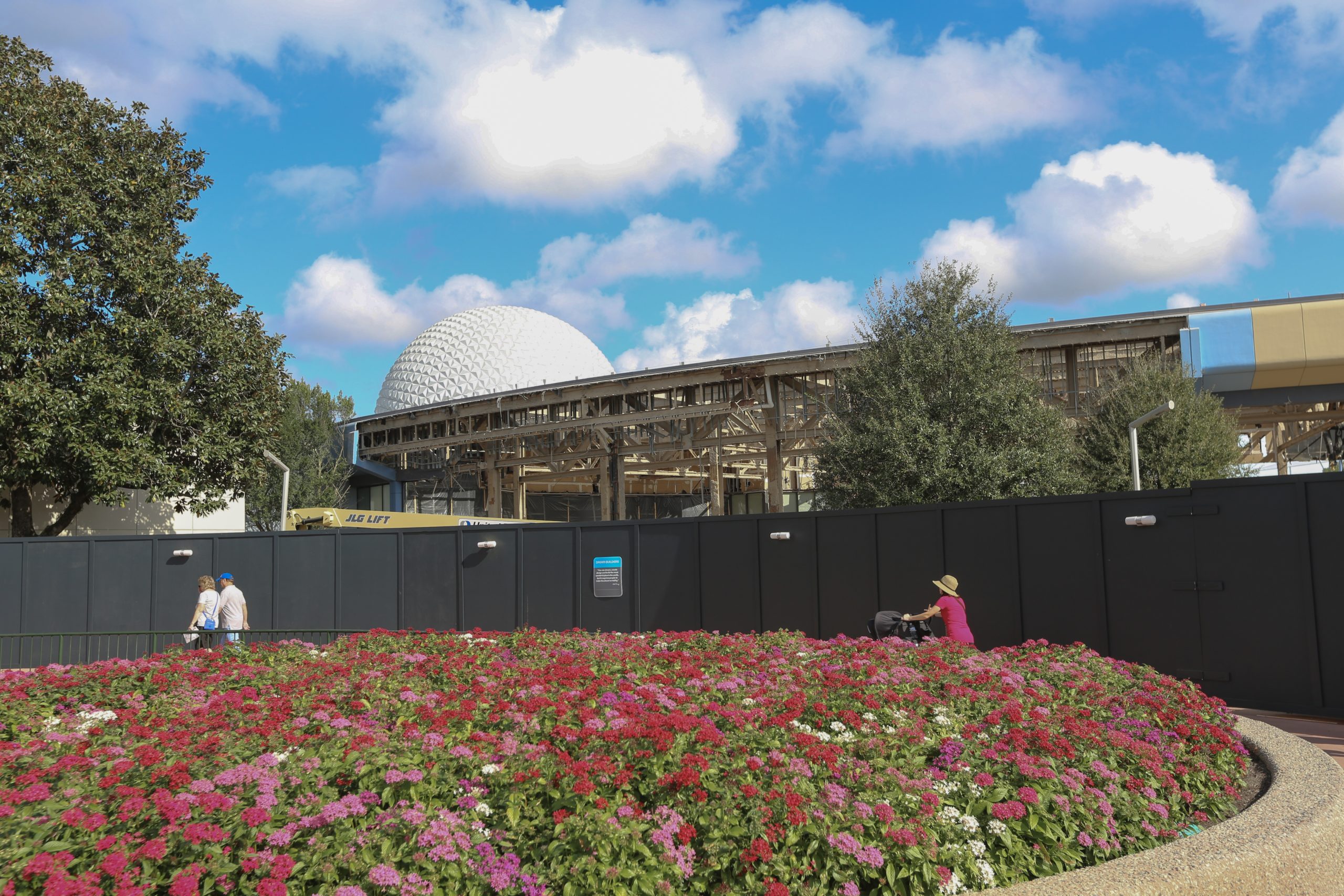
News Big changes coming to EPCOT's Future World?

jt04

Well-Known Member
While I can understand that, I guess to me it doesn't forgive poor design for the interim (likely a decade) on the chance that could happen. That's what got Epcot (and Studios) into the mess they are in. And, it's more frustrating for Epcot because the park layout and design balance was, IMHO, the best of any park in the world.

And, it would suggest even more so the reason to knock the whole thing down if flexibility was desired. (Again, not disagreeing with you! I think you are likely right. But, I think that's a poor decision on their part if so.)

Appreciate your opinion. I can see both sides of the argument.

For me the Studios works well as it is developing organically like most towns. I hope they continue with that aesthetic. Your are meant to wander and discover surprises it seems. Not sure that was the original plan but it works imo.

Time will tell with Epcot and the neighborhood concept. I think Imagineering will surprise us long term.
 

Rich Brownn

Well-Known Member
Yes.
Not at all what I described.

Also, I've experienced Epcot and Communicore through all of its phases- from classic beige to neopolitan.

I appreciate how Epcot tried new things. Not all of them worked. World Showcase is probably the most easy read of any park. You can stand on the shore and see what every location is and how to get there. Doesn't make it visual chaos or a strip mall. Doesn't mean this is the best either. Future World is the opposite. Stand at it's core and you know little of what's out there. There has to be a way to suggest what is where. Land and Sea. Imagination. Motion. Space. It shouldn't be hard to at least stand in the core and have a sense of which points on the compass would lead to such themes.

Now that I write that it makes the park even more of an oddity. I know there was always the story of shoving two disparate models together and calling it a single park, but no other place operates under two vastly different design philosophies and visual languages- to put it in an extreme, it's as if one hemisphere is in English, and the other in Swahili.
Probably because it started out at two entirely separate parks - World Showcase and Future World Theme Center.
 

lazyboy97o

Well-Known Member
Yes.
Not at all what I described.

Also, I've experienced Epcot and Communicore through all of its phases- from classic beige to neopolitan.

I appreciate how Epcot tried new things. Not all of them worked. World Showcase is probably the most easy read of any park. You can stand on the shore and see what every location is and how to get there. Doesn't make it visual chaos or a strip mall. Doesn't mean this is the best either. Future World is the opposite. Stand at it's core and you know little of what's out there. There has to be a way to suggest what is where. Land and Sea. Imagination. Motion. Space. It shouldn't be hard to at least stand in the core and have a sense of which points on the compass would lead to such themes.

Now that I write that it makes the park even more of an oddity. I know there was always the story of shoving two disparate models together and calling it a single park, but no other place operates under two vastly different design philosophies and visual languages- to put it in an extreme, it's as if one hemisphere is in English, and the other in Swahili.
Future World and World Showcase do not operate under two vastly different design philosophies. Both utilize objects in space with the objects arranged radially to define an edge boundary. Their different means of circulation, node versus a loop, aren’t radical differences in that context, they create a spatial distinction that is important to the use of objects in space so that they are not just an assortment of buildings placed without a relationship to one another.

And again, none of your criticisms are addressed in the new scheme. World Discovery will still be hidden behind the east CommuniCore building. Standing in the old center may let you see parts of what was west Future World, but nothing will spatially tell you that CommuniCore East behind you, the “Egg” and Imagination behind it are one Neighborhood while the other buildings are a different one. Just being able to see stuff doesn’t help anything if there is no visual or spatial hierarchy or distinctions.
 

412

Well-Known Member
I am surprised by how many people dislike the new festival center design. Bar on legs? Really?

Future World took a different approach to Disney park architecture, replacing Magic Kingdom's warehouses-with-facades approach with show buildings that are architecturally distinctive in their own right. With this new festival center, Disney has returned to that EPCOT tradition in 21st-century style.

I understand concerns about the festival center being monopolized by upcharge events, but I don't understand the hate for the building itself. It's a sleek, futuristic structure that you won't find elsewhere. And its green roof represents the direction that Future World needs to take: fewer cold concrete expanses, more spirited spaces showcasing harmony between technology and nature.
 

Bocabear

Well-Known Member
I am surprised by how many people dislike the new festival center design. Bar on legs? Really?

Future World took a different approach to Disney park architecture, replacing Magic Kingdom's warehouses-with-facades approach with show buildings that are architecturally distinctive in their own right. With this new festival center, Disney has returned to that EPCOT tradition in 21st-century style.

I understand concerns about the festival center being monopolized by upcharge events, but I don't understand the hate for the building itself. It's a sleek, futuristic structure that you won't find elsewhere. And its green roof represents the direction that Future World needs to take: fewer cold concrete expanses, more spirited spaces showcasing harmony between technology and nature.
I don't think it is hate for the bar on legs perse, but the destruction of everything in order to put it in... The loss of the symmetry of the park entrance, the loss of what was beautiful futurist architecture (that had been badly re-purposed over the years). I am not sure why the festival (or whatever they are calling it this week) building could not have just been built spanning the Club Cool portion of the old Communicore... Move the fountain to the center of the plaza rather than the choke point, and it would have all felt fresh and new... This is going to basically tear down everything and after passing under Spaceship Earth you will be in a plaza several football fields long with nothing to see or do...
well except for the splash zone water play area... Seems like there were better ways to getting where they are going without tearing everything down...
 

tirian

Well-Known Member
I think the aspirational and inspirational objectives of the first 15 years of Epcot need to be brought back. The last 22 years have been piecemeal changes with little to no connection to the original.

That’s the point. I don’t know any classic Disney fans who want 1982 Epcot Center back. Everyone knows tech and styles have progressed since then. I know plenty of people who want to reclaim the optimistic, groundbreaking spirit of Epcot ‘82.

This renovation is schizophrenic. It restores much of the original aesthetics while ruining the skyline with the Guardians box, and adding questionable IP choices. It‘s also going to destroy FW’s simple geometry, yet add a very attractive festival center—which we know will be booked for upcharge events. For every step forward, there are two steps backward.
 

tirian

Well-Known Member
Yes.
Not at all what I described.

Also, I've experienced Epcot and Communicore through all of its phases- from classic beige to neopolitan.

I appreciate how Epcot tried new things. Not all of them worked. World Showcase is probably the most easy read of any park. You can stand on the shore and see what every location is and how to get there. Doesn't make it visual chaos or a strip mall. Doesn't mean this is the best either. Future World is the opposite. Stand at it's core and you know little of what's out there. There has to be a way to suggest what is where. Land and Sea. Imagination. Motion. Space. It shouldn't be hard to at least stand in the core and have a sense of which points on the compass would lead to such themes.

Now that I write that it makes the park even more of an oddity. I know there was always the story of shoving two disparate models together and calling it a single park, but no other place operates under two vastly different design philosophies and visual languages- to put it in an extreme, it's as if one hemisphere is in English, and the other in Swahili.

Epcot followed the standard World’s Fair model of showcasing future aspirations and classic world culture. It never felt disparate because in 1982, people were already familiar with the “World Expo” presentation format.

Now we’re accustomed to it through Epcot itself.
 

trainplane3

Well-Known Member
And a few in their full, not shrunk down, quality, for maximum zoom-in-ability:
46DBE143-22CE-45DC-B873-BF92F3FC01E7-scaled.jpeg

9377B5AD-B417-48E6-8C44-B879A0253356-scaled.jpeg

B15E4270-E61C-43FA-9804-CF9D3D7DA93F-scaled.jpeg


*I still don't think this is the point of "no return". They're going to go through with the demo, but the buildings were near this state when they were refurbed in the early 90s but they weren't missing the roof*
 
Last edited:

ChrisFL

Premium Member
I don't recall how the Communicore buildings were in 1982 (I was only 4) but I feel like they never really fulfilled the "futuristic" main street that was mentioned about their purpose. What I mean is it didn't ever seem in the later years that they were the main point where people walked through before going to the rest of Future World or toward the World Showcase.

For example, where the Art of Disney store is now, was that ever a direct entrance to the rest of the Communicore building? I'm guessing it was but its too long ago for me to remember. I do know where Guest Services is now was an entrance/exit because that is where the Astuter Computer Revue/Backstage Magic area was.

What I'm getting at is that I would have originally designed the buildings to be the place where people do walk through more directly. before going to the other areas instead of being off to the sides, if that makes sense. It always felt optional vs. Main St. where you're always walking through there.
 
Last edited:

griffin ferrari

Well-Known Member
And a few in their full, not shrunk down, quality, for maximum zoom-in-ability:
46DBE143-22CE-45DC-B873-BF92F3FC01E7-scaled.jpeg

9377B5AD-B417-48E6-8C44-B879A0253356-scaled.jpeg

B15E4270-E61C-43FA-9804-CF9D3D7DA93F-scaled.jpeg


*I still don't think this is the point of "no return". They're going to go through with the demo, but the buildings were near this state when they were refurbed in the early 90s but they weren't missing the roof*
Does anyone have pictures of them in this stare in the 90’s?
 

lazyboy97o

Well-Known Member
I am surprised by how many people dislike the new festival center design. Bar on legs? Really?

Future World took a different approach to Disney park architecture, replacing Magic Kingdom's warehouses-with-facades approach with show buildings that are architecturally distinctive in their own right. With this new festival center, Disney has returned to that EPCOT tradition in 21st-century style.

I understand concerns about the festival center being monopolized by upcharge events, but I don't understand the hate for the building itself. It's a sleek, futuristic structure that you won't find elsewhere. And its green roof represents the direction that Future World needs to take: fewer cold concrete expanses, more spirited spaces showcasing harmony between technology and nature.
There is nothing really futuristic about the new festival center. Pilotis are one of Le Corbusier’s Five Points of Architecture, so the new festival center should be ready to celebrate the centennial of Towards an Architecture in 2023.

Elevating a building is a gimmick that has been done before. It works to varying degrees in highly urban area as a means of adding public space (Lever House in New York, or many apartment buildings in Singapore), but in less dense areas it is less useful. The festival center has no reason to be elevated. It removes the building from the realm of pedestrian activity and replaces it with an expanse of empty hardscape. That’s a big complain about the current center of the park, that’s it’s a big paved over area with little to do, but the festival center will be better shaded. The slender legs of the structure are completely contradicted by the massive, rectangular service core.

A green roof is easily something that could have been added to the CommuniCore buildings. It doesn’t require a completely new building and it is often “greener” to reuse an existing structure, especially if that structure was built for a similar purpose.
 
Last edited:

jt04

Well-Known Member
There is nothing really futuristic about the new festival center. Pilotis are one of Le Corbusier’s Five Points of Architecture, so the new festival center should be ready to celebrate the centennial of Towards an Architecture in 2023.

Elevating a building is a gimmick that has been done before. It works to varying degrees in highly urban area as a means of adding public space (Lever House in New York, or many apartment buildings in Singapore), but in less dense areas it is less useful. The festival center has no reason to be elevated. It removes the building from the realm of pedestrian activity and replaces it with an expanse of empty hardscape. That’s a big complain about the current center of the park, that’s it’s a big paved over area with little to do, but the festival center will be better shaded. The slender legs of the structure are completely contradicted by the massive, rectangular service core.

A green roof is easily something that could have been added to the CommuniCore buildings. It doesn’t require acompletely new building and it is often “greener” to reuse an existing structure, especially if that structure was built for a similar purpose.


Looking at the artwork it appears they are taking the green roof concept to the next level. No pun intended. Of course it is just artwork but I think the concept may exceed expectations. IMO.
 

tirian

Well-Known Member
I don't recall how the Communicore buildings were in 1982 (I was only 4) but I feel like they never really fulfilled the "futuristic" main street that was mentioned about their purpose. What I mean is it didn't ever seem in the later years that they were the main point where people walked through before going to the rest of Future World or toward the World Showcase.

For example, where the Art of Disney store is now, was that ever a direct entrance to the rest of the Communicore building? I'm guessing it was but its too long ago for me to remember. I do know where Guest Services is now was an entrance/exit because that is where the Astuter Computer Revue/Backstage Magic area was.

What I'm getting at is that I would have originally designed the buildings to be the place where people do walk through more directly. before going to the other areas instead of being off to the sides, if that makes sense. It always felt optional vs. Main St. where you're always walking through there.
When they were light blue with soaring glass walls and surrounded by gardens and ponds, they drew guests inside.

Come to think of it, the new Apple store “city park” concept is an update of the old Communicore buildings, even though nobody probably realized it.
 

marni1971

Park History nut
Premium Member
I don't recall how the Communicore buildings were in 1982 (I was only 4) but I feel like they never really fulfilled the "futuristic" main street that was mentioned about their purpose. What I mean is it didn't ever seem in the later years that they were the main point where people walked through before going to the rest of Future World or toward the World Showcase.

For example, where the Art of Disney store is now, was that ever a direct entrance to the rest of the Communicore building? I'm guessing it was but its too long ago for me to remember. I do know where Guest Services is now was an entrance/exit because that is where the Astuter Computer Revue/Backstage Magic area was.

What I'm getting at is that I would have originally designed the buildings to be the place where people do walk through more directly. before going to the other areas instead of being off to the sides, if that makes sense. It always felt optional vs. Main St. where you're always walking through there.

Art of Disney was added in 1994.
The original building layouts were so much more permeable than what they became. Plus you could see though them in the majority of the places. They weren’t a barrier.

the blue Square was the original entrance in the area you mentioned:

BC7345B0-A322-47FC-87C4-D7713A7B7461.jpeg
 

marni1971

Park History nut
Premium Member
I don't think it is hate for the bar on legs perse, but the destruction of everything in order to put it in... The loss of the symmetry of the park entrance, the loss of what was beautiful futurist architecture (that had been badly re-purposed over the years). I am not sure why the festival (or whatever they are calling it this week) building could not have just been built spanning the Club Cool portion of the old Communicore... Move the fountain to the center of the plaza rather than the choke point, and it would have all felt fresh and new... This is going to basically tear down everything and after passing under Spaceship Earth you will be in a plaza several football fields long with nothing to see or do...
well except for the splash zone water play area... Seems like there were better ways to getting where they are going without tearing everything down...
B I N G O
 

Dr.GrantSeeker

Well-Known Member
Art of Disney was added in 1994.
The original building layouts were so much more permeable than what they became. Plus you could see though them in the majority of the places. They weren’t a barrier.

the blue Square was the original entrance in the area you mentioned:

View attachment 432186

I haven't seen your CommuniCore ultimate tribute in a while. Cant remember if you have the floor plans for CC vs Innoventions in there.
 

Register on WDWMAGIC. This sidebar will go away, and you'll see fewer ads.

Back
Top Bottom