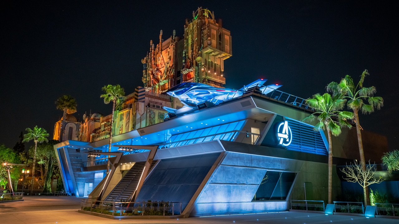
Avengers Campus - Reactions / Reviews

waltography

Well-Known Member
I still think they could have figured out a way to create more dense pockets in the land; before they locked it up, Court of Angels was my favorite spot in NOS for the same reason.

I wish there were more capillaries and side streets like that in Batuu. (That and I wish there were some color on the hanging tapestries above the marketplace!)
 

Ismael Flores

Well-Known Member
I still think they could have figured out a way to create more dense pockets in the land; before they locked it up, Court of Angels was my favorite spot in NOS for the same reason.

I wish there were more capillaries and side streets like that in Batuu. (That and I wish there were some color on the hanging tapestries above the marketplace!)
The whole layout is a bit off when they decided that they needed a large wide walkway on the south side of the land. I am sure they did it so that all buildings had a direct connection to backstage entry but i still think they should have broken up that large walkway with more than just PADS and mostly lifeless ships behind barriers.

I really do like the idea of the land and I also like the look of it. It reminds me of some of my travels but it seems they had great ideas that just stopped short in areas where they should have not. They layout is great on the town side of the land but that huge expanse on the west side needed to have been altered a bit. smaller paths that lead to hidden ships and outpost booths would have made the place feel more lived in and hidden instead of the long walkway.

I kind of hate that the beautiful work they did on the crashed ship used for unload is mostly hidden from view and not appreciated by most guests. Maybe the walkway should have had a secondary path that curved closer to that part of the building, of course the narrow piece of property there might have been the issue
 

MarvelCharacterNerd

Well-Known Member
So the consensus is Galaxy's Edge needed to be more like the Morocco Pavilion at EPCOT or Africa in Animal Kingdom?

Because both of those have details that make them look either artistic and inviting:

1617673457910.png


or genuinely lived in:

1617673601748.png


And oh yes - COLORFUL!!!


(That said, I'd rather have Big Thunder Ranch BBQ back vs. any of them!)
 

Mac Tonight

Well-Known Member
it’s crazy that they were apparently studying NOS for certain design aspects of GE. NOS feels lived in. GE feels like nobodies lived in it for decades which is the opposite of what they were going for.
The pinnacle of theme park land design is clearly making the land look like it just went through years of abandonment and trauma. "To all who come to this war-torn place... Welcome."
 

George Lucas on a Bench

Well-Known Member
You should see the angle behind the AT-AT. It's even better.

See, I know what you're doing there because they're what I guess they'd call False Fronts or "Facades" on the internet and Disney blogs. When you go behind that stuff, you see that they're just movie props with a matte painting on the building. But that adds to the charm. You're on a movie set and then you enter the movie, as opposed to just wandering through a tunnel and suddenly being in SW land. It's classic MGM Studios!
 

SSG

Well-Known Member
"Pym Test Kitchen is a food innovation science lab where the food and drinks tell a story. "

Even the food has a backstory 🤷‍♂️

Kidding aside, I have to admit Avengers Campus looks pretty good. How it is in execution still TBD.
 
Last edited:

Register on WDWMAGIC. This sidebar will go away, and you'll see fewer ads.

Back
Top Bottom